
A good game is made up of players, easy to understand rules, a theme and a comfortable space to play it in. It engages the players to want to come back and play it again. The game and bring about different emotions. It can be funny, serious, difficult, stressful, or exciting. It can be based on luck or strategy but the key element of a good game is engagement. Are players bought into the theme of the game and understanding the rules or are they distracted and confused? The games I keep going back to keep my engagement and allow me to interact with others while I play.
Five Game Ideas: Theme of Collecting
Roll to Build
This is a dice game where players roll dice in order to choose legos to build with. When it is a players turn, they roll all six dice. There are six bags with different legos inside. Each bag has a number on the outside. Whatever number is rolled on the dice corresponds with the bag. That player takes one piece out of each bag with the corresponding numbers they rolled. Then they must build something out of those lego pieces. Each player does the same thing. Once everyone builds something, everyone votes on whose sculpture is best.
Ice Cream Scoops
This is a card game where players earn ice cream scoops when they complete a task. Whoever has the most ice cream scoops at the end of the game, wins. Each player is given an ice cream bowl of their choosing, then adds velcro ice cream scoops to their bowl as the game goes on.
Build Your Sentence
This is a card game where players are given seven cards with different words and letters. The goal is create a sentence with your hand of cards in order to lay down. The first player to lay their sentence down wins that round. That person should write down their sentence in order to remember it later in the game. At the end of seven rounds, players combine all the sentences they won together to make a paragraph. Whoever has the most sentences at the end of seven rounds, wins.
Wanted
This is a card game where each player is a wanted by the FBI in a city trying to escape. The players know someone who can get them out of the city but they need to gather a list of things in order to make that happen. Players trade and pick up cards in order to gather their list of things before the other players. Who gathers their list first, wins.
Warnings
This is a card game where players take on the identity of a troublemaker in school. Players must try to make it through a day of school without getting sent to detention. When a player gets in trouble by the teacher, they are given a warning. After three warnings, that player is sent to detention and is eliminated. Whoever makes it through the full day and has the least amount of warning cards wins the game.
Game Review: Bohnanza
Bohnanza is a card game where players build and trade beans in order to harvest and earn coins. The game finishes once the deck of cards is shuffled three times through. Whoever has the most coins from growing beans, wins.
It took a couple rounds to understand the rules and play of the game. There are a couple rules I still need clarification on but overall, it is a simple game to play. This is a game all players need to stay engaged with even if it is not their turn because trading goes on in and and outside a players turn. That was different for me because in other games, I am used to waiting until it was my turn again to become engaged. It kept me engaged the whole time; I like it.
Five Game Ideas: Theme of being lost
Bag of Things
In this game, there is a bag of 100 pieces of mini characters and things. Each player is given a list of what is in the bag. Then, each player goes around and takes one object out of the bag without showing the other players. The objective of the game is to find what pieces are missing from the bag before the other players do. When a player thinks they have figured out all of the pieces missing, they hit the buzzer to confirm their findings.
Arrow Treasure
Arrow Treasure is a card game where players are given a map that leads to the pot of treasure. They must pick up cards in order to map out their steps. Each player is given a different blue print of a maze. The pile of cards consists of arrows in different directions. Players need to pick up the arrow cards necessary to complete their maze to the pot of treasure.
Lost Balloon
Lost Balloon is a board game where players help a young boy find his balloon he lost. Players must go through different obstacles in order to find the balloon. The first player to reach the balloon, wins.
Secret Message
Secret Message is a board game where players are given secret messages on cards that can only be read by a certain flashlight. These messages can either help you or hurt on a players journey to find their way to freedom. Players are stuck in a cave and must read the secret messages in order to escape before the others.
Lost Without You
Lost Without You is a board game where players need to work together in order help the women character and male character find their way to one another. There are obstacles and relationship struggles that get in the way of uniting the two lovers. Do not give up hope but work together so the two lovers can meet.
Game Review: Carcassonne
Carcassonne is a tile-based German-style board game. Don’t ask me how to pronounce the game, lol. The goal of the game is to collect the most points by the number of cities and roads you own by the time the tiles run out. It look me awhile to get the hang of this game because the meaning of the pieces took time to remember. I enjoyed being able to place the tiles in mostly any way you wanted. Each time you play, the way the tiles are laid out will look different. There is a nice element of creativity to that. We played the easy version but it sounds like the longer version invites more of a story into it by using a dragon and a princess. I would revisit this game again even though I lost, lol.
Five Game Ideas: Mechanic or Metaphor
Flight
Flight is a board game where someone is killed on a plane and players need to find out who the killer is before the plane lands.
Brown Sugar
Brown Sugar is a board game where players try to make plans Monday through Sunday throughout the week without getting overbooked and burned out.
Trade Show
Trade Show is a board game where each player is told by their employers to collect three items from three different show booths. Each player is trying to impress their employer so be the first one to collect your items and leave the trade show.
Music Producer
Music Producer is a party game where one player in the group is the producer and the rest are artists. The artists get to pick their genre and are given a song. They must create a name and sales pitch to the producer. Whoever song gets chosen by the producer, wins.
Secret Admirer
Secret Admirer is a party game where each player is given a paper airplane with a note from a secret admirer. Before the note is delivered, each person is given a role for a student in class. There is one teacher. All of the airplanes are distributed through the teacher and given to the classmates. Goal of the game is to try and guess your secret admirer.
Game Review: Pandemic
For starters, this game is ironic because we are in a pandemic. The game has a board with a map of the world. Each player is given a role: Medic, Researcher, Scientist, Dispatcher, and Operational Expert. Each role had different skills and abilities. The goal of the game is to work with the other players to cure the pandemic. We were playing against the game itself. We lost. Different outbreaks of the disease would occur and once you get to 8 outbreaks, you lose the game.
I enjoyed this game because I do not remember the last time I played a game where you had to be collaborative with other players rather than competing against them. Another thing that helped me understand and play the game is, one player in our group knew how to play so he was able to explain the game in a more tangible way. Someone started reading the directions in our group. As different steps were read, other players began setting up the board. Also, the narrative/theme of the game was something that I could grasp. When games begin to become too abstract and something I cannot relate to, I begin to lose focus and understanding. I would play this game again.
Five Games Ideas: Cards
Character Matching
In a deck of cards, there are 10 characters divided up into different sections. For example, one of the cards might have a characters arm or leg. The objective of the game is to collect all of the pieces to your character before other players do. One of the challenges can be other players might be going for the same character. Each player receives 7 cards to start out with. The person to the left of the dealer goes first. They can either pick up a card from the deck or discard pile. Then they have to discard a card. You must only have 7 cards in your hand the whole time. The game keeps going until someone finds their character.
Ennegram Personality
The Ennegram is a personality test. The personalities are explained by numbers 1 – 9. Each number explains a different personality. This game will test the knowledge of the different personality types. Each player is given 9 cards with the descriptions of each personality on the back to get a good understanding of each one (1 – 9). For example, a type 8 personality is called a challenger, therefore, they do not hesitate when an argument comes their way. Once everyone has a good understanding of the personalities, someone starts with picking up a scenario card. After the scenario is read out loud, each player must pick the number (personality) they think matches it. Whoever get it right, gets a point. The goal of the game is to have the most points at the end of 9 rounds.
Story-Telling
Some people are great at story-telling and some not so great. This game will challenge you to get creative in the way you tell stories because you are given different scenarios and items that you have to work together to tell your story. There is a deck of cards number 1 – 12. That deck is shuffled and everyone goes around the table and picks one of those cards. Depending on the number you picked, is the amount of cards you pick from the “Item” deck. The Item deck consists of different objects, places, people, etc. Your goal is to create a story with those items. Each player takes time to create their own story from their items. Then, one by one, each person tells their story. Each person votes on which story was the best.
Create Your Own Coffee
Each person drinks their coffee differently. There are a bunch of different beans, syrups, creamer, sugar, and toppings to choose from. In this game, you create your coffee drink and try to sell your invention to the other players. There are four decks of cards: Bean, Syrup, Toppings and Milk. Each player picks up one card from each pile. From the items on the cards, each player must come up with a name and business pitch to try and sell their coffee drink to the other players. Once everyone shares their business pitch with one another, there is a majority vote over which coffee drink wins.
Bridal Party
Sometimes being a part of a bridal party can be exciting, exhausting, fun, and stressful. In this game, everyone is given a role: Bridesmaid, Maid of Honor and the Bride. The goal of the game is to make sure the bride gets to her wedding day with everything she wants and needs. This card game will go through three phases: bridesmaid dresses, bridal shower and bachelorette party. Each phase will have different challenges with scenarios to encounter. If the bridesmaids and maid of honor fail to complete one of the phases , you risk putting the bride into a bad mood. If you fail all three phases, you lose the game. Different cards explain different tasks and abilities you are to take for the scenarios.
Five Game Ideas: Social Distancing
Hidden Objects
What is in the box? In a group of 4 or more people, you are given four plastic boxes and a bag of items. Each box is labeled: Person, Place, Thing, Idea. You are placed in teams. The goal of the game is to help your team guess what is in the box. One person is the clue giver and the rest of the people on the team are the guessers. The guessers have to guess what is in the box all at the same time. They cannot guess each box individually. Each team is trying to guess what is in the boxes before the other team does.
Similar to: Code Names, Clue, Taboo
Stolen Identity
Someone stole your identity in the group of people you are playing with and the goal of the game is to be the first one who finds out who. You stole someones identity in the group as well. You want to make sure you do not get caught by the others in the group.
To start, each person writes their name on a piece of paper and puts it in a bowl. Each person picks their new identity from the bowl. There is a deck of cards that have questions in the middle. Each time it is your turn, you pick up a card, read off the question and then answer the question how you think the your new identity would. You might have to be creative with your answers because you do not want people to find out who you are. After three rounds of answering questions, each person takes a guess who they think stole their identity.
Similar to: Bang, Clue, Guess Who
Build Your Way Out
This one needs some development but the theme is you and the people you are playing with are given a scenario where you are physically stuck somewhere (in a jungle, out in the ocean, underground, etc.) The goal is to be the first one to break free. I have not fully figured out what steps would be taken in order to get out and the different obstacles that would be included. The picture I have in my head is to have different questions you have to answer. If you answer incorrectly, it will be a struggle to try and get out.
Color Changes Everything
Color is important. It can be informational, emotional, exciting, scary, etc. It is time to see how other people see and feel color. You are given a color wheel. When it is your turn, you spin the wheel and land on a color. The other players do not know the color that you landed on. Your goal is to try and explain the color without saying what color it is. This game needs some obstacles because for most people, explaining colors can be easy. You win by guessing all of the colors on the color wheel.
Sell Yourself
How good are you at interviews and making yourself fit a role? For this game you are given a dice and a role (stay at home mom, grounds keeper, college student, etc.). In the game, you are applying for a new role. Every time it is your turn, you role the dice and depending on what number it lands on, you pick the card associated with that number. The cards are characteristics about your person. Once you pick up three characteristic cards, you then have to sell yourself with your characteristics to your new role. The people playing with you are the judges and have to determine if you got the job or not.
Similar to: Fun Employed
JackBox Game Review: Split the Room
I find some JackBox games interesting because most of the time you want to win in the end but you need the support of others to get you there. In Spilt the Room, you are given a hypothetical situation with a fill-in-the-blank. A few multiple choice answers are given. You win more points in a round if the majority vote picks the same multiple choice answer you did.
How long did it take you to learn the game?
At the beginning of the game, we are introduced to a narrator who looks like a cat butler. He explains the game and takes you through the different prompts that will show up on your phone. I have played JackBox before, therefore, I knew that I would using my phone to interact and a TV to see the responses. I thought it was helpful that the cat butler narrated through the whole game because it gave more context and personality to the game itself. After the second round of answering the hypothetical scenarios, I caught onto the game.
How do you interact with others?
You interact with other by seeing what answers they decide in each round. I find it interesting to see how everyone answers to a scenario. Depending on the people and scenario, you might not know how people will answer. There is not a lot of physical dialogue between players but I also think that depends on the group of people you are gathered around.
Would you play it again?
I would try it again. I would not play it as regularly as some other games I play because I think it requires a good group of people but given the right context, yes.
Dalziel & Pow | By: Alexa Headley
Overview
Dalziel & Pow is an independent creative agency based in London. Starting in 1983, David Dalziel and John Pow designed pubs, clubs and bars. Not so long after, they shifted into working with high street brands such as Timberland, Volkswagen, Google and more. These guys along with the creative agency they built have changed the game for a retail and brand experience. They come alongside these businesses to strengthen their brand by using much more than a logo and flyers to engage the companies audience.
As an agency, they have four different areas of expertise:
- Strategy & Transformation
- We define insights, strategies and bold, new ideas for consumer engagement, brand differentiation and growth.
- Branding & Communications
- We invent and reinvent brand personalities, and bring them to life across physical and digital channels.
- Digital Experience
- We create digital journeys and touch points to serve, sell or inspire, telling brand stories in ways that captivate audiences.
- Brand Environments
- We design engaging spaces that meet the needs of the new consumer and forward-thinking brands.
Each area of expertise has the same focus of engaging the whole brand. Like any equation, they are presented with a problem and with their team present a solution to encompass the identity of the company’s brand.
Aside from Dalziel & Pow’s website being exceptionally organized and appealing to look at, the examples of their work make what they do so special. I am going to walk through three examples of their work and focus in detail on one.
Work
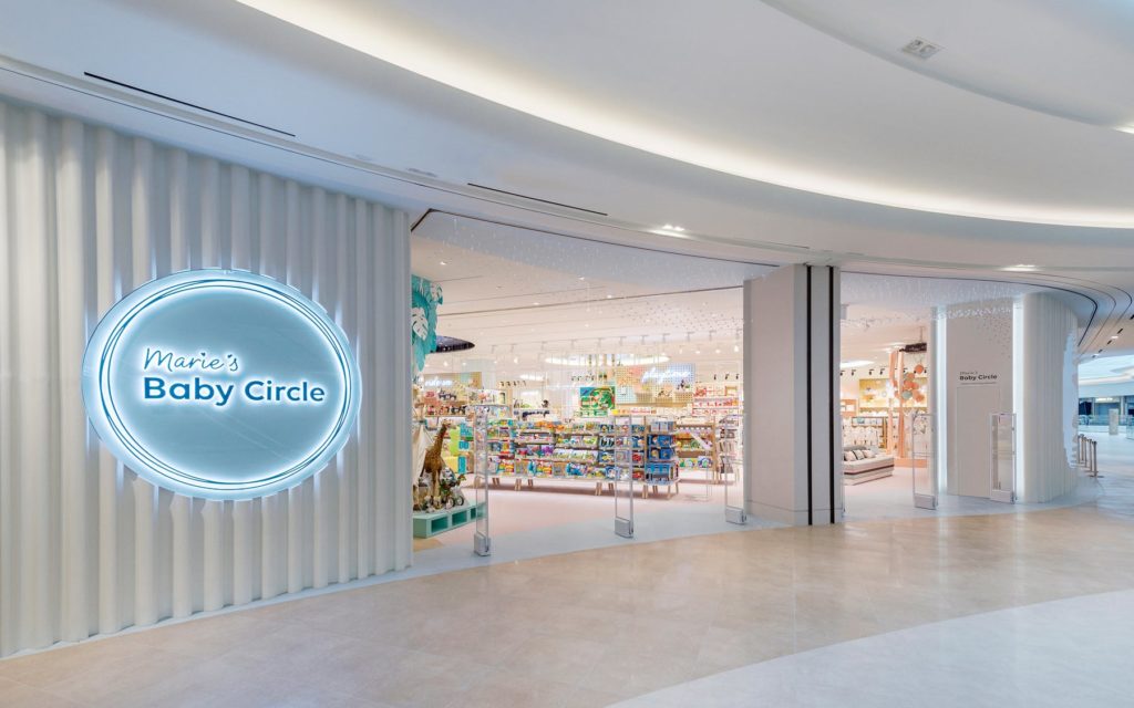
- Marie’s Baby Circle
- https://www.dalziel-pow.com/work/maries-baby-circle
- After watching the video or reading the name of the client, you can assume this project has something to do with babies. Marie’s Baby Circle is a store based in South Korea that focuses on coming alongside first-time mothers in their journey of parenthood.
- Challenge: This company came to Dalziel & Pow with the challenge of creating a place for mothers to find “knowledge and reassurance” in their journey along with making a trip to the store a more appealing option than ordering online.
- Solution: D&P used all of their areas of expertise to create a multi-function store that does way more than sell baby items. They built an interactive wall of animated characters that react by just a touch. Each section of the store has design elements according to its specific area whether that is strollers, baby food, clothing, sleep, baby showers and more. They created a “rest” room for mothers to breastfeed, change diapers and take a breather from the chaos that comes with shopping.
D&P accomplished the company’s goal of making first-time mothers feel welcomed along with creating a space that is engaging to visit.
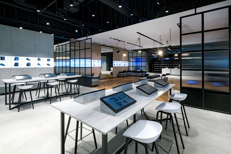
- Eobuwie
- https://www.dalziel-pow.com/work/eobuwie
- I tried to look up the definition of the word, Eobuwie, and I came up empty. Either there is not one or I did not look hard enough. Nonetheless, Eobuwie is one of the largest footwear retail companies in Central Europe.
- Challenge: Focusing on their store in Poland, Eobuwie came to D&P wanting to engage their customers in-store rather than the usual online ordering.
- Solution: D&P’s concept behind the store is very clever. There are two sections of this store. The first section is known as their “arrival zone.” This is for quick transactions and searches on their built-in tablets. The back end of the store is a relaxing space for a slower-pace journey of shoe shopping. Customers sit on the couch and browse on a tablet to see hundreds of shoe options. If they want to try on a pair, they simply type it into the tablet and a worker brings out the pair. They also use a screen that wraps around the room that rotates through different shoes to create a minimalistic approach to the overwhelming abundance of shoe options.
D&P accomplished the company’s goal of engaging their customers in an in-person retail experience.
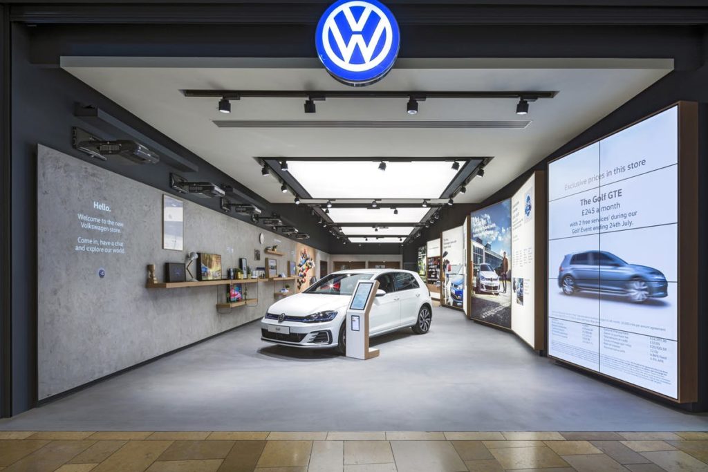
- Volkswagen
- https://www.dalziel-pow.com/work/volkswagen
- If you did not recognize the first two companies, hopefully this is a brand you are somewhat familiar with. Volkswagen is a car company from Germany. In German, the word, Volkswagen, means “people’s car.”
- Challenge: For a long time, people loved having the pleasure of owning a car. Nowadays, people prefer using app-based car services over owning one. Volkswagen came to D&P to see if they could bring back the joyful narrative of owning a car.
- Solution: “Human stories beat technical specifications.” D&P represented passions, dreams and everyday experiences throughout this store with Volkswagen. They set up wall length lightboxes that displayed “..everyday benefits of owning a Volkswagen…” They had ipads where you could personalize your own vehicle. If you wanted to test drive one of the vehicles, there is a space for that in their parking lot. Last but certainly not least, they incorporated light projection animations on a wall. These animations were playful ways to tell different stories of Volkswagen.
D&P accomplished the company’s goal in creating a very hands-on experience that represented a fun narrative of owning a car.
Work In-Depth
Out of the few pieces of D&P’s work I presented, I want to put the microscope over the Volkswagen project to see how the goals accomplished made an impact on the brand.
Audience
The Volkswagen product is normally geared towards adults because they are the ones who can drive and purchase it. Though this is true, D&P saw a greater message that includes more than the adult audience. Adults, teenagers, kids, and entire families experience transportation in a vehicle everyday. Even though not everyone in the audience can purchase the product, they are still involved in the experience of it. If younger kids do not like the comfort and experience of a vehicle, that has the potential of changing an adult’s choice in a car. Therefore, some of the design of the store was geared towards younger and older audiences alike. For example, the interactive light protections on the wall was fun for the customers to press the buttons and see things move. When families walk into this store, the kids are just as entertained as the adults because they are both interacting with the design. D&P did a really good job in helping Volkswagen identify their audience.
Story-telling
Similar to the idea of knowing who your audience is, everyone loves a good story. If someone walks into this store with their family who loves to go on road trips and sees interactions, pictures and stories gearing towards road tripping with the family, they might be more inclined to buy the product. People like products but I think they value the experience they’ll have using the products even more. D&P showed customers different ways they can use a Volkswagen car (road tripping, packing, shopping, etc.) and the joy that comes when you do own one. D&P did a great job showing the things you can experience by owning a Volkswagen.
Hands-on
Have you ever watched a How-To video? Those videos usually consist of how to make a product or attain a certain outcome. In a way, D&P took customers through that experience by their design. By using the ipads in the store, you were able to customize your own Volkswagen car. In the store, they had different fabric and parts of the car to display the items that make-up the vehicle. One of the light projections they had was changing the outside color and design of a car by a click of a button. This process of building something engages customers because people love seeing how things are made. Going back to the idea of knowing your audience, the hands-on experience is also for kids. Kids love to touch things, therefore, when they see the color of the car change, they experience can enlighten and engage them. D&P did a wonderful job of including the customers in the experience of building cars.
Overall
Dalziel & Pow do a wonderful job of engaging the whole brand of a company in their work. Their work is clean, intentional, purposeful and engaging. I am blown away by the experiences they create and how they engage people into those environments. I would love to work in a creative environment such as this one!
Alexa Headley Review #4
Playa Bowls sells açaí bowls and a variety of healthy shakes. If there is one thing that stands out about their website, it is their use of animation. There is a bar that automatically scrolls right after a certain period of time and gifs are used with some of the pictures of the bowls. If you click on their staff page, each person’s picture has a stop-motion element to it which shows their personality and it is entertaining to watch.
Their layout of text is centered while there are a balance of graphics on both sides of the page. The text is not only centered in the navigation bar but within each paragraph of text. This is a subtle layout feature I noticed but it goes a long way of keeping the website consistent. To break up different sections, they either use a straight line or wavy line. This balance of straight and wavy adds character to the page while still breaking up the information effectively. The overall layout of the website is simple but they make it stand out by their use of color and textured elements.
The colors for their website are very saturated. This color palette is appropriate because they are selling a variety of fruits which have those strong colors. It makes sense to highlight those colors. Three consistent colors they use throughout their site is sky blue, dark grey and white. The sky blue they use is very saturated. One thing they do to break it up is to add texture. The texture is similar to a watercolor look with different spot illustrations used throughout. The texture breaks up the solid colors and keeps the page interesting as you scroll. If there is one more thing that makes this website stand out, it is the navigation system.
One thing that stands out is their standard header and footer. The header stays at the top of the screen which is helpful while scrolling. When you reach the bottom of the screen, the footer appears which has all the categories in the navigation bar, the logo and other detailed information. There is no lag time on the scroll which is nice for the user to feel like they are in control. I am not confused if a word or button is clickable because whenever I hover over it, it changes color or the opacity goes down. Lastly, If I click on a link that takes me to another site, I am still able to get back to their site by the “BACK TO WEBSITE” button they offer.
The Playa Bowls website compared to our website will have a similar style in terms of colors and pictures. Our website will not stand out by the use of navigation or animation but by the colors and product itself. By taking our own photos, we took advantage of making the ingredients of our product stand out. Our logo colors are consistent with the overall site which makes it pleasing to look at along with consistent. Overall, our website has a simple layout that will go a long in users searching for what they need.
Alexa Headley Review #3
No9Park is a French restaurant in Boston. This is not your typical walk-in restaurant but a night out on the town. You come here to wine and dine. Their website represents the style of restaurant. They use a combination of serif and san serif font with a horizontal layout. As you scroll, all the text is center on the page giving it a clean, simple look. There is a combination of pictures and colored backgrounds. The pictures have a dark tint to them for the purpose of not mixing values when adding text on top. The site is balanced by its use of color, text and backgrounds. Emphasis and unity are represented in the consistency of the menus. You can choose what menu you would like to look at (bar, dessert, enter, etc.). Once you click on one, the title of the menu is at the top-center of the page in serif font. As you scroll down, the subtitles and items on the menu are a smaller, san serif font. The name and price of the item is bolded with the ingredients written below it, unbolded. All of these details show unity because they look the same and are shown in the same place on the page. Along with emphasis, the different fonts explain the categories represented and leads you down the page. Balance, unity and emphasis play into the big picture of style and layout. Their style was represented by using all of these elements.
Bakn is a restaurant in Warrendale, PA. This is the opposite of your wine and dine but a casual stop-in. This place is everything bacon. If you are a vegetarian, this place might not be for you. Their website is consistent in color: grey, white, reddish-brown. They balance their colors by using different values; if it is a dark background, the use of white text is used and vice versa. A piece of bacon is part of their logo aside from the typeface. They incorporate the bacon shape as a frame for pictures and text as your scroll. This show the unity of their logo and stylistic choice of the website. Emphasis is displayed in their consistent use of headings and placement. A user would not be confused what they are reading because sections are labeled. Lastly, the layout has a combination of organic shapes with a grid system. This makes the website easy to read while still making it look aesthetically pleasing.
Both websites do a good job of using Krug’s five important “things” which are to create a clear visual hierarchy on each page, take advantage of conventions, break pages up into clearly defined areas, make it obvious what’s clickable, and minimize noise. Text is broken up into different sizes to give hierarchy and it is broken up into defined areas on the page with white space. In both menus, the convention system is: name, ingredients and cost of item. Both websites follow the system which is helpful for the user to consume information. Buttons on both sites show they are clickable by an element of change that happens when you hover over the button. For example, on No9Park when you hover over the buttons in the top panel, it changes to a darker value. Lastly, noise is minimized on both sizes with the use of defined space; gives it breathing room.
If I had to choose between these two sites whether one is more effective at getting their message across, I would have to go with No9Park. This is due to the quality of their graphics and the scroll speed. On the Bakn website, the scroll time is delayed which can make it annoying to the user and the graphics are pixelated which shows poor quality. Other than those factors, I enjoy the Bakn website because of their theme and integrating that into their website.
Alexa Headley Review #2
https://owltastic.com/#contact-form
Meagan Fisher is a web designer for her own business, owltastic. On her page, she goes through her bio, recent work, what she is doing now, social media connections, and how to get in touch with her. Her page is organized from scrolling top to bottom. She has a strict color palette which goes with the theme she sets up among the page. Her colors are white, navy blue, tan and a variety of tones and shades of these colors. Her theme consist of stars and time. She accentuates the theme by incorporating simple animation to add an aesthetic look. The information is presented in rectangle boxes with white margin space in-between which helps cluster the topics while giving it a clean look.
As you scroll through her page, all of her buttons are represented as ovals, the words itself, an arrow or words underlined. When you hover over the button, the color changes which indicates it is something to click on. Some buttons direct you to other websites such as her social media pages, the workshops she participated in and her recent work. Some of her other buttons which say, “Let’s Work Together” “Sound good? Let’s chat” “Contact” and “Let’s Talk” all lead to a section on her page of where you can send her a message.
Fisher’s color palette uses the idea of night and day by the navy blue and tan. Instead of using black and white, these colors represent a pastel theme. This is effective when looking at the values. There is a combination of a navy blue background with tan text and vice versa. This setup balances out the page while making it more interesting to look at. The animated circles lead you through the page and set the pace of the mood Fisher wants to get across. The circles turn at a slower pace which indicates how she wants her audience to take their time scrolling through her page. She uses a combination of geometric and organic shapes. I believe she adds geometric shapes to add structure and organic shapes to give off comfortability.
Overall, Fisher’s page is a great design. The fact Fisher does web design for a living highly influences how her page is laid out compared to others. She knows how a strong color palette with simple text will keep her viewers interested. Her use of simple animation and shapes helps people navigate her site easily. Lastly, she is consistent in her theme which makes it a fun storytelling process for the viewers.
Alexa Headley Review #1
The first thing I noticed when I was directed to rue21’s website is a huge advertisement that filled almost the whole page besides the heading, categories, and search box. Valentines day is just around the corner. It is prime time for a retail company such as rue21 to come out with exclusive deals so their clients will buy more around this holiday. As I scrolled down the page to view their buttons, each one was a white outlined rectangle with white text inside. When I moved my mouse over the box, it became a solid white rectangle with black text overtop. This feature was simple and to the point. I did not have to question if my mouse was clicking on another item. When you moved your mouse over the items in the bar menu, they changed to an orange color and displayed an underline to show the subcategories underneath. This feature is also helpful because I know I am clicking on a certain button.
The color palette was black, white, and orange. When I clicked on the Blouses & Shirts button, the only parts that were orange were “Girls, Blouses & Shirts, and Featured.” This was indicating the process of how I got there. This was helpful to know the process of how to get there or how to go back if I would like to search for something different. The layout of their products were clean and simple. They bolded certain words to give emphasis towards what is important and spaced out the content so it is not too clustered. There was not a lot of words which helped me focus on the product. In the book, Don’t Make Me Think, it talked about how when people view a site, they do not read line by line but skim to achieve their desired goal. If I wanted more information about the product, I was able to click on the picture of the product to lead me to more information. On the picture, it had a rectangle that said, “Quick View” which meant a box would pop up instead of redirecting you to a new page. The color did not change when I hovered my mouse over the button so I was confused if I was going to be clicking it or not. The “Quick view” gave me the name, price, color, size, and quantity. If I needed more information, I could click on the button that said “View Full Product Information” which would lead me to a new page. The font was easy to read and every question I had about the product relating to myself was answered by the options listed (size, color, quantity, etc.).
After I added the item to my cart, a box appeared in the top right corner of the page telling me what I just added and leading my eye to an icon of a grocery bag with a number “1” on it. This indicated an item was added to my cart and notified me where to purchase my item when I am completed shopping. The box also had two buttons which said, “continue shopping” or “view bag. ” This directed me where I wanted to go.
Overall, the rue21 website does a great job in not make the buyer think of how to get to their product. Their layout is simple yet effective. I believe they were smart in limiting their color palette because it could make it more confusing if too many colors are represented. The slight change in color or shape with the buttons helped decipher what button I was clicking on. Lastly, they limited the amount of text on each page to make it easier to navigate.