Very professional looking. I am also impressed that you figured out how to make a contact form for your website. Your website has a very elegant design, and I especially like the inclusions of your signature as opposed to a simple typed name to add to that effect. I would recommend cutting down the amount of words on the main page, however. Too many words will make a viewer usually skip reading them. Instead, it is good to focus on what is most important and see how little you can write. Despite that, your website maintains a very professional appearance that is simple, to the point, and effective.
This one is beautiful. You have a very good eye for graphic design in my opinion. I would like to see more images, because I think that would make everything come together perfectly in my opinion.
I really love the title of your website and the typeface you chose! The minimalistic approach works really well, and I like how you added a contact form on the page. The only thing I would change would be adding your educational background. Looks really nice!
Your site is really sleek. I like the black and the white together. It is very simple but effective. The thing I notice is that it is hard to see any of the text inside the text box on the contact page. Maybe making it a darker gray would be better. The page is really cool. I like it. The script font is also really cool.
Update: There’s pictures on there and they look great!
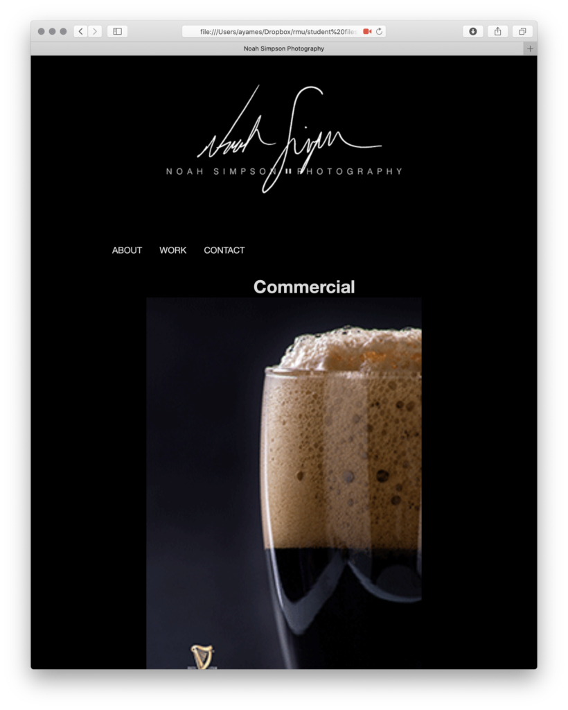
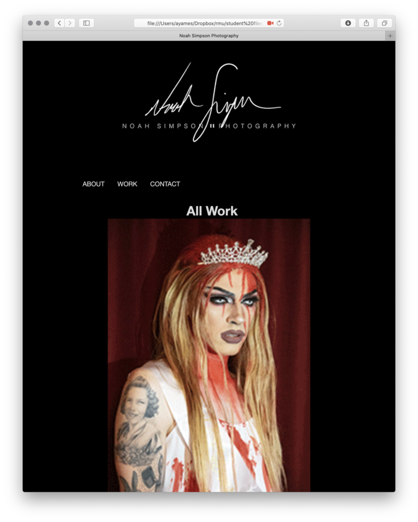
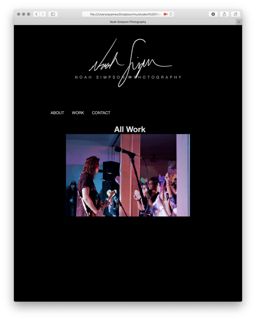
Your work is really cool. Maybe title the documentary but everything is really great. I previously made a comment before the photos being shown. It is really cool to show a variety of subjects. Good job!


Very professional looking. I am also impressed that you figured out how to make a contact form for your website. Your website has a very elegant design, and I especially like the inclusions of your signature as opposed to a simple typed name to add to that effect. I would recommend cutting down the amount of words on the main page, however. Too many words will make a viewer usually skip reading them. Instead, it is good to focus on what is most important and see how little you can write. Despite that, your website maintains a very professional appearance that is simple, to the point, and effective.
This one is beautiful. You have a very good eye for graphic design in my opinion. I would like to see more images, because I think that would make everything come together perfectly in my opinion.
I really love the title of your website and the typeface you chose! The minimalistic approach works really well, and I like how you added a contact form on the page. The only thing I would change would be adding your educational background. Looks really nice!
Your site is really sleek. I like the black and the white together. It is very simple but effective. The thing I notice is that it is hard to see any of the text inside the text box on the contact page. Maybe making it a darker gray would be better. The page is really cool. I like it. The script font is also really cool.
Update: There’s pictures on there and they look great!
Your work is really cool. Maybe title the documentary but everything is really great. I previously made a comment before the photos being shown. It is really cool to show a variety of subjects. Good job!