SMild – Week 1
- What are the goals of Apple’s website? How does Apple’s website address the needs of a user who has just purchased their first MacBook? (pp. 41-56)
I think the goal is to be user friendly just like their products. Apple is very simple and so is their website. Apple has a support page and they also have tons of tutorials and class.
- What are the functional specifications of Facebook’s wall? If you are not on Facebook what are the specs for the signup page? (pp. 72-75)
Facebook’s wall is all about being updated and the user gets notified when new “stories” are added. The book talked about frequency of updates, which with a website like Facebook, they rely on updates/new posts. Facebook also does this thing that if the user is friends with a person and that friend is friends with someone else but the original user is not, they suggest being friends. Basically, the user gets friend suggestions because they know someone who is friends with that person. I think that is what the book was referring to when they talked about prioritizing requirements.
- What are four architectural approaches to information structure? Find one example of each. (pp. 94-106)
Hierarchical – this is like a family tree. At least that is where I see them commonly used.
Matrix – any shopping website that lets the user break down the search into different categories.
Organic – I am thinking something along the lines of Pintrest just because when the user clicks on one thing it takes you to another and you end up lost for hours because Pintrest takes you anywhere. Or maybe YouTube because you could watch one video and then it suggests more and then you are somewhere in funny video abyss.
Sequential – reading an article because usually articles are read top to bottom as it is written.
- What percentage of The Huffington Post index page is navigation, and what percentage is content? What about Google, Wikipedia, and Etsy? (pp. 116-134)
The Huffington Post seems to be 100% navigation on the index page because everything takes the user to another page. I think the same thing for Google that it is 100% navigation because it is a search engine with take the user to the different pages that contain content. Wikipedia is also a type of search engine but the website actually takes the user to content within its website. On the homepage it is also 100% navigation. I would say that Etsy is probably 10% content and 90% navigation on the homepage. I say this because everything is linking to somewhere else but there are parts that do explain what the site is about and what to do.
- How does http://www.landor.com guide the readers’ eyes and focus their attention on what is important? (pp. 144-155 )
They use contrast and color and also a grid-based layout. Contrast is used to draw the user’s attention. The main focus on the page is what is already colored and all the other content is gray which provides the contrast.
Post #1_AWolfe
- What are the goals of Apple’s website? How does Apple’s website address the needs of a user who has just purchased their first MacBook? (pp. 41-56)
The goals of Apple’s website, in my opinion, are to get the costumer the best experience possible by making shopping for whatever they might need easy. If you are buying a macbook pro, 2-4 options on how you would like to upgrade it within each category. After customizing your laptop, it will then have items that pair up with that product easily, from wireless mouses to printers and more. It makes buying easy because you know the items will work with your product. Apple, on top of the normal manufactures warranty, gives you the option for applecare, which is an extended warranty that offers a lot more. You are given the option when you visit their website to use some helpful, free, services such as genius bar and apple support. The genius bar will show you how to use your new product and get you used to the shortcuts, while apple support gives you one on one support on anything that maybe wrong with your device.
- What are the functional specifications of Facebook’s wall? If you are not on Facebook what are the specs for the signup page? (pp. 72-75)
Facebook allows users to post pictures, statuses, events and more to their wall, as well as others. All the information is ordered by newer posts to older posts. There are subcategories that you can click on to see interests in movies, books, tv shows and more. And ones you can see information about their job and social life.
- What are four architectural approaches to information structure? Find one example of each. (pp. 94-106)
Organic: an example is an educational or entertainment based site.
Sequential: an example is articles, forums, books, etc.
Hierarchical: an example is software or navigational bars
Matrix: an example is if you wanted to buy a certain color and size shirt from an online store, you are able to sort it out.
- What percentage of The Huffington Post index page is navigation, and what percentage is content? What about Google, Wikipedia, and Etsy? (pp. 116-134)
I would say that about 20-40% of The Huffington Post’s website is navigation, and 60-80 percent is content. I think that Google is about 3% navigation, before you start a search. Wikipedia is about 5% navigation, 95% content. And Etsy, is about 15% navigation, 85% content.
- How does http://www.landor.com guide the readers’ eyes and focus their attention on what is important? (pp. 144-155 )
Their website uses images in color and in black and white to guide viewers to certain things. My eyes are attracted to the colored images first because they are more eye catching and then to the navigational bar and bolded words and sentences.
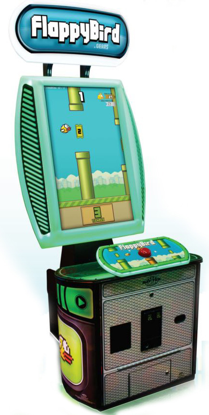
Flappy Bird Becomes an Arcade
Check out mashable’s story on the Flappy Bird Arcade, then ask: did this game need to leave our phones and become an arcade that lives at Dave and Busters or Chuck E Cheese?