Review #4

www.alleghenycreperie.com Review #4


For my final review I decided to critique aspects of Allegheny Creamery and Crepes, a local restaurant from my hometown. Upon visiting the Creameries website the first thing I noticed was how simple the layout is. The layout consists of a heading, a menubar, pictures, store hours, utilities on the top and bottom all centered in the middle of the page. The Creameries webpage has very little color consisting of primarily white with black text and pink buttons. It is obvious that the site relies heavily upon their pictures for aesthetic value. As far as navigation goes it is extremely easy to navigate the webpage due to the menu bar having “you are here” markers. The website also does a great job at directing the viewers eye to the navigation bar because the navigation bar contains the only color besides pictures of the food items. The Creameries website also lacks texture, besides the use of lines to create space between the heading and content there isn’t much going on.

When comparing The Allegheny Creamery and Crepe’s website to our website A La Shibab, the first thing that stands out is the fact that we have a warm color scheme making A La Shibab’s website more aesthetically pleasing to the user. Also A La Shibab’s webpages should feel more interactive with animations helping to navigate users eyes to important information. As for layout both webpages will offer a similar centered layout with a menu bar on the top, utilities and hours on the bottom. Although the Creamery and Crepes website does it job by showing necessary information A La Shibab not only shows necessary information, but does a better job at presenting it.

Review 4

A website that can be in competition with my group’s website is the restaurant, Meat and Potatoes, website.

The Meat and Potatoes website layout is very simple. They have the same logo on top of all their pages, with the same footer on these pages. The color scheme is predominantly black, with accents of gold and off-white. The texture of the website is clean, but grainy. The background is pure black, but the header and off-white section is a little grainy and textured. Navigation on this website is pretty unique. The home page has a picture of a cow, and different cuts from the cow are the different links to pages. On the different pages, there is the same header on all the rest of the pages. This links the navigation from the different pages and makes navigation use easy for the consumer.

My group and I did use Meat and Potatoes for some inspiration. We wanted to use the home page navigation with our logo to direct our consumers to the different pages. Our website will stand out due to a couple different ways. Our colors are more vibrant (blue, green, and red) than the black. Another issue with Meat and Potatoes website is that the print is very small and difficult to read. My group and I wanted to make sure that we had a font that is bigger than more clear to read.

Review 3

In my third review, I am reviewing No. 9 and Six Penn Kitchen websites. They both have a nice balance with their website. They have the main content centered and a black background. No. 9 takes another step and blocked off their text with a contrasting colored div and black text. This adds some emphasis to the text, and makes the website look cleaner. Six Penn Kitchen only has the pictures outlined with a small point boarder, and leaves the text on the plain black background. It makes it difficult to read because the text is such a difference from the background.
No. 9 has a small issue with unity throughout the pages of the website. They have some of the pages with just a picture as the header of the page. On the other pages, they have a picture as the header of the page, but with a blue colored div in the top left. Either one of these layouts look good, they should pick one and format the rest of the pages as that. They do continue to have the same layout, fonts, navigation panel, and footer throughout the whole website. This makes it pretty uniform, other than the headers. The navigation panel has a way for the user to go home, and to all the other pages of the site. They bold and italics some text to emphasize the point. They also have the navigation pane text in a light and bright blue. This may be too bright and can hurt some people’s eyes.
Six Penn keeps unity throughout all of the pages of the website. They keep the same color scheme, which uses contrasting colors to emphasize certain text. They have a varying layout within the text, but it is all still centered within a certain range. The navigation panel and footer are the same on all the pages. Six Penn’s navigation panel also has a way for the user to go home, and all the other pages of the site as well.
I believe that No. 9 is more effective at drawing my attention. The rotating pictures on their home page are definitely intriguing, and Six Penn does not have this feature. No. 9 website looks more clean cut and professional than Six Penn. I think the different colored divs blocking out the text really gives the website a little more depth.

Review #3

A review on http://sixpennkitchen.com/ and http://no9park.com/.

Six Penn Kitchen’s has simple yet aesthetically pleasing homepage. Sixpennkitchen.com not only offers aesthetic value with it’s simple color scheme, but also offers a user friendly navigation system due to its utilities on the top and bottom of the homepage. As far as balance goes Six Penn Kitchen’s webpages each offer the same centered style, pictures, and easy to read fonts that also makes it extremely easy to find what your looking for. The website effectively uses green text to emphasize and successfully direct the users eyes to important information. Also when using the navigation system the users place is held with a “You Are Here” indicator, which helps the user not get lost while searching through Six Penn Kitchen’s website.

No. 9 Park’s website offers an elegant design with its information laid out in the center of it’s pages creating a nice balance between the right and left margins. Navigating no9park.com is made simple with it’s local navigation and utilities on the left side, which also remains stagnant while exploring the various pages. Another pleasing aspect on No. 9 Parks website is that each page has a page name as well as a “you are here” indicator making it easy to navigate while maintaining its fancy design.

Both Six Penn Kitchen’s and No.9  Park’s website offer similar color schemes with the same centered layout. Although No.9 Park’s pictures help give the website a more elegant feel, Six Penn Kitchen’s website is more visually pleasing and does a better job of directing the users eye to important information. However both websites are easy to navigate due to there navigation bars and “you are here” indicators, but No.9 Park’s website does a poor job of emphasizing important information. Both websites use the same color scheme and for the most part the same layout unifying their webpages. Overall Six Penn Kitchen and No.9 Park are extremely identical with a few differences in layout, but Six Penn Kitchen’s website offers easier to navigate pages and colors that draw the eye to important information better.

Review 3

Review of sixpennkitchen.com and www.peterallens.com

Sixpennkitchen.com is a fairly simple, but soundly designed website. The homepage has the primary navigation bar at the top that stays there throughout the site including the site ID as the biggest icon. It has utilities in the top right and information at the bottom that follows on the whole site as well. When navigating to a different page, it has the “you are here” indicators as talked about in the book. On the menu section it has local navigation below the primary bar to go between the different menus.

Peterallens.com is another well designed site, but a little  bit fancier that sixpennkitchen.com, while still getting the point across. This site also has the site id, primary navigation, page name, utilities, and a bottom bar with information that is on every page. The menu bar is at the top along with the site id.  The differences are really just the placement and some more eye-pleasing attributes such as the gif of the food in the background, and the page name being placed under the navigation bar.  The home page has a welcome blurb talking about the restaurant. Overall though, the content is pretty similar between the two sites.

Compare: balance, unity, emphasis, and layout

Both websites have a good balance to them. They are both centered for the most part, but peterallens.com has the site ID on the left while sixpennkitchen.com has it centered in the middle of the menu bar. Sixpennkitchen.com has the site id slightly bigger than the rest of the menu, so with emphasis your eye goes to there first. It is the same with the other site, except it is way larger and definitely more appealing and holds your focus better. Peterallens.com does a good job of using emphasis on where to look first. It goes from the site ID to the background gif then to the page name or welcome blurb, and then the actual content. Sixpennkitchen.com also does a good job while being a bit more basic. The layout’s are both really similar with the menu bar, bottom bar, etc. They are both simple and effective and create a strong unity with both websites. Nothing looks really out of place and everything seems to fit together well on both sites. Both sites have everything included in the trunk test except a search bar, which really is not needed as much for a restaurant website. Overall, both sixpennkitchen.com and peterallens.com are solid designed websites according to the book and the principles of design. Sixpennkitchen.com is more basic, but still gets the job done just as well as peterallens.com

Tristan Coyle

Review #3

Of the sites listed, I chose to look at Peter Allen’s Italian Restaurant and No.9 Park. I haven’t viewed many restaurant websites before so I had little expectations for both places. Peter Allen’s chose went a common way with its layout; having the buttons run horizontally along the top to access key information. The logo is clear and prominent which shows emphasis on the most important factor of the restaurant; its name. However, there is not a unifying color palette and the layout itself seems almost too basic for a place that you’d think would be more sophisticated. Overall the most unappealing aspect of this site is it’s background, unfortunately its their product spaghetti with cheese sprinkles constantly floating. I think this animation takes away from its over all sophistication and the image itself along with its colors distorts the balance of the page. From the viewer’s point of view, every bit of information is easy to find and accessible because the site is so ‘basic’.

No.9 Park in comparison has a darker color scheme of coffee browns to give a sense of upperclass. The layout itself has the buttons on the side left vertically going down. As a whole this website reminds me almost of a blog rather than a restaurant. Unlike Peter Allen’s, the images of the food on this site are constantly changing and have a certain tone applied to them which makes it more unified. Overall I think this site has better composition and layout. But both are lacking the essence of truly portraying their restaurants appearance.

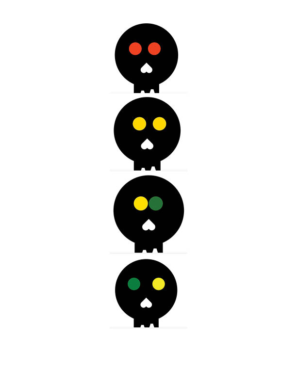
Challenge Set 3 2016

Animated Skull by Antoinette - note your version should animated the eyes moving and changing colors.
Animated Skull by Antoinette – note your version should animated the eyes moving and changing colors.


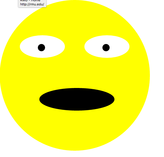
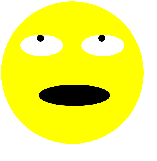
eye roll by Cameron note the eyes should be animated


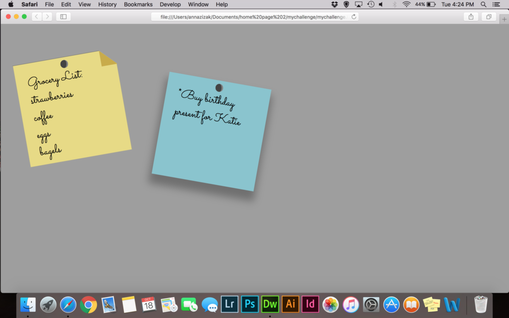
Post-it by Anna - note the text on the post-it notes should be editable
Post-it by Anna – note the text on the post-it notes should be editable

Review #2

For my one page website I decided to review brand.strv.com.  SRTV is a software development company that prides itself on beautiful design and intuitive functionality. Their “brand” section is an entire one page site devoted to sharing with potential customers the ideas behind their design while also showing off what they are capable of creating.


The experience begins with a fullscreen animated welcome screen with an arrow at the bottom prompting you to scroll down.  Upon scrolling, the welcome screen moves up and leaves the screen. The user is greeted with a page of mostly white space with a short paragraph about the company accompanied by some graphics in the center and a vertical menu on the left.  The menu allows you to skip up and down within the page, but it acts as a bit of a distraction from the experience.  Someone who wasn’t aware that the page was meant to be navigated as one page might take this as a typical homepage and use the navigation menu to, well, navigate.


As far as color and texture goes, the site keeps things simple.  Everything is flat, clean, and simplistic.  The majority of color on the screen is dominated by black, red, and white.  In fact, there’s a section on the page that shows these three colors and states that the company never uses anything else but these three.  The only use of other colors is when examples are given of what NOT to use, and even these are crossed out with red lines of the same color.  


Overall, I like the consistency within this site and I think the company who created it did a great job of portraying their brand’s idea and thought process.  As someone interested in design I learned a bit from this and might use some of their ideas of design in the future.
I give this site four <div> tags out of five, and I’ll throw in a bonus hex color code of #EFOD33 to honor their brilliant shade of red.

Review 2 thinkbear.net

thinkbear.net Review

Thinkbear.net is a portfolio website displaying Jens Nielsen’s work as a digital designer. It is a single page site sectioned off into four different areas. When you scroll, it goes to the next page. The website gallery also has left and right arrows to scroll through more work. The layout is very simple and intuitive. Everything is clearly laid out for one to learn more about the designer and his works.

The site is able to stay consistent without losing clarity. It sits in the perfect medium. Although very simple, the website has clear visual hierarchy on what is most important and the order to look at things. His name is the largest considering this is a portfolio of his. The social media links are grouped close together and are the same size. Each area of the website is clearly sectioned off when you scroll and each has a purpose. The different items that can be clicked are pretty noticeable and some are even animated. His photos zoom in when you hover over them indicating that you can click on them. They then take you to the actual Instagram photo. Overall, the site has good spacing and is lacking any clutter. It has a very crisp and organized feel to it.

Texture: The use of shadows and rotation on the website display creates a really intuitive 3d effect. The background is a very clean and minimalistic. The portrait on the first section has a grainy texture to give a really rugged look when combined with the black and white.

Color: The first web paige has a black and white background with very vibrant colors for the social media buttons. It then rotates to very vibrant colors involving his work. Then it alternates back to black and white for his summary and finally ends on more of his work in color. The alternating pages works really well. The background is a light shade of grey that does not distract from the important details on the pages.

In conclusion, thinkbear.net is a very well designed site with a simple purpose that executes quite flawlessly. It is simple, but intuitive. Everything is easy to read an navigate due to the lack of clutter and good hierarchy. The buttons and objects are easily defined. Each area looks unified to the whole site. The logo and social media buttons follow you as you scroll on every page except the photograph gallery and really help with the unity.  The site definitely creates a smooth and relaxing experience while you learn more about the artist himself.

Tristan Coyle

Review Number Two

The website that I chose to review is https://onepagelove.com/luca. Luca is a restaurant, and on the site is a full menu and a list of the workers, along with various other things. The color and texture of this website is very fun and pleasing to the eye. The color of this website, in my eyes, is defiantly a strong suit. The order in which the site is laid out is easy to understand, and it has a great sense of flow to go along with it. the list of different things to look at are put in place in a way that a small child would be able to understand. The way to get from one page to another is simply by scrolling up and down due to the fact that this is in fact, a single page website. It is very easy to understand and read what you are looking at in this website for a few reasons. One being that it clearly tells the reader what they are looking at in the top of each section. Secondly, it is broken off into different colors for each section giving the eye an easy understanding that it is looking at a different part. The location of things in this website are mostly centered and easy to keep your eye on. The layout of finding the Hierarchy in this page is also very easy to do, being that the top of each section will have the title of what we are looking at, and the there is a clear level of importance. This site has little sections at the bottom or middle of the pages that have a small box around text saying something like “map”. This is easy for the reader to tell that you can in fact click on those parts. There is a clear understanding of that can and cannot be clicked on in the page. And lastly, the amount of cluster that is put into this page is at a minimum. There is not much that makes this website too much to look at, and there is a great layout of clarity to view. Overall, I personally feel that this website is very well done. It has clear points of importance, and there is a comfortable amount of space between everything. You can easily navigate between the different pages, and you can clearly tell that is clickable. This website is one that anyone could easily use.

Review #2

https://www.zalarob.com

This website is the page of a german family business that revolves around the sustainability of natural resources with oak being a main contributor. The color pallet consists of soft whites, tans, charcoal gray; neutral earth tones. For the sections with a mainly white background, the outline of wood texture is overlapped to give variation in what you’re looking at. Being a single page site the general direction of the page is scrolling vertically, top to bottom, with some sections giving you the option to click right or left to slide through photos.

This website exhibits good design. Even though it was in a different language I was still intrigued by the design. As a whole it was easy to navigate with clear direction of where to find specific information. The text “Don’t Make Me Think” stresses the importance of the sites ease and readability for the user. This website uses the design elements of symmetry through its images and text and emphasis through its headings to assist in this. Each section is clean cut with minimal text to avoid clutter. Overall I love the design of this website, it’s simple and clean cut. I’m not used to single page sites so this was definitely a good one to look at. Although it is only one page it incorporated a lot of different elements into it to add variety such as a slideshow, interactive button, with varying layouts dependent upon the section. Chapter 3 mentioned a photo where if you toggled over a face a blurb would appear with their name. This concept was used with a bock of wood where different diets of the wood slab highlighted different information. I was very impressed and think this website definitely helps the family business.

Demo: CSS Dropdown Menu

I chose to create a dropdown menu using CSS. The menu should have a list of links that appear when you hover over the parent div. You can make the menu have as many links as you like. When you hover over each option, the background color should change as an indicator of which link you are about to click.

HTML
Make a parent div to hold everything- the main button and all the links that will appear when you hover over it. Mine is called “dropdown”.

Inside that div, make a button that will contain all of the links. Mine is called “menu”.

Also inside the parent div, but not inside the button, make a div that is the parent of all links that appear when you hover over the button. Mine is called “dropdown-content”.

Inside this div, create as many links to other pages as you want using .

Close all divs by using two

tags. This is all of the HTML needed.

CSS
Start your CSS with an id for your button. In this case, mine would be #menu. Use an id because it is unique. This is the only element that is visible at all times. Style it with background colors, changes to the text, and any other changes you like. How the button looks does not impact the functionality of the dropdown menu.

Next in your css, make a class for the div that holds all of your links. Mine is .dropdown.content. Add display:none to hide all of this until you hover over it. Add a width and background color.

Add .dropdown-content a. Adding “a” means these declarations will only affect links. Style the links however you want, but be sure to add display:block. Adding text-decoration:none stops the links from having an underline or color change when clicked.

Next, add the rule .dropdown-content a:hover. This will only make changes to the content when you hover over it. You can add a color change here so that each link’s background changes when you hover.

The final rule will be dropdown:hover .dropdown-content. Add the declaration display:block. Without this, the dropdown menu does not appear on hover.

Web Review #2

While searching for a one page website to write my review on I stumbled across a website named “Scroll For Your Health”. Although it caught my eye among a list of websites due to it’s blandness, upon visiting I quickly realized that it’s far from bland. “Scroll For Your Health” initially doesn’t offer aesthetic value besides giants white words with a solid black background that reads scroll for your health and some small different colored ribbons bordering the webpage. The ribbons turned out to be interactive and when clicked on they redirect the user to other sites that have nominated, mentioned, or criticized “Scroll For Your Heath”. I found this to be an extremely good idea allowing me to read up on what other people thought of the website. After reading a pleather of good reviews I decided to scroll through the website and find out what all the hype was about. As you scroll down, div shapes begin to fall into place to create pictures of various fruit and facts about the fruits appear in the upper right corner. Each fruit has a selected color that matches such as red for strawberries, orange for oranges and yellow for bananas. Although the site is extremely well made and teaches healthy food fact through an interesting interactive way, the site could use some improvements. First off there are only three facts about each food, I personally would find it more interesting if there were more facts for each food. Also I think it would be cool if the fruit pictures were interactive in the sense that if you clicked on one it would redirect you to something like more pictures of the selected fruit. Besides more content for the viewer to read “Scroll For Your Health” is extremely fun to play with and definitely gives me a few ideas for my own website.