Aubrey Piontek – 4D Final
Evelyn’s Final Project
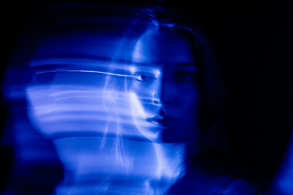

Here are the following steps in my design process:
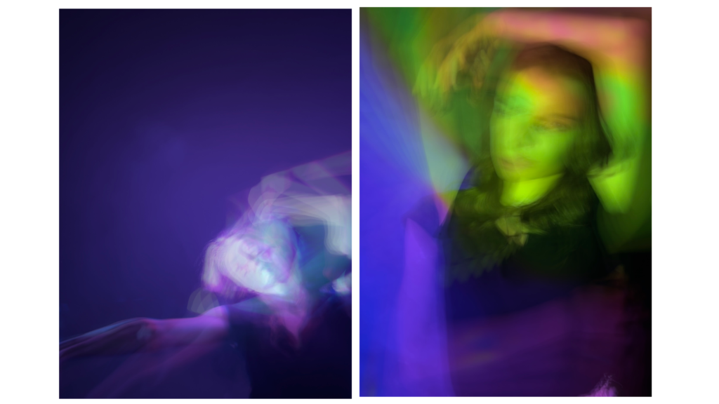
- Ideation > I brainstormed five different ideas to explore before ultimately settling on a projection portrait. My plan: project light (as a pattern or color) onto myself in a dark room and take a long exposure portrait.
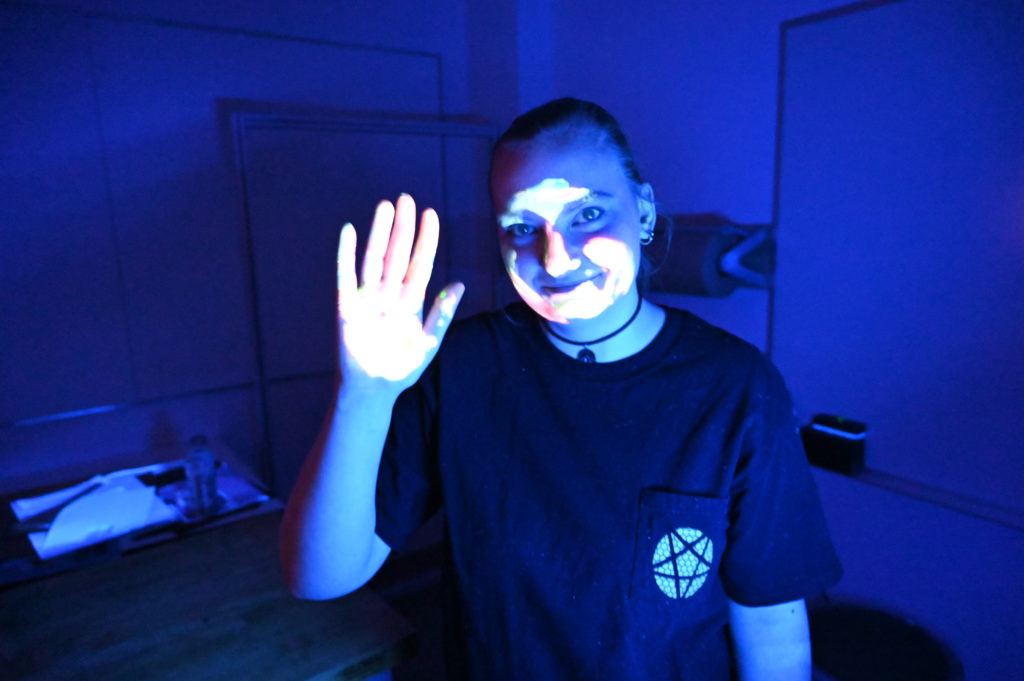
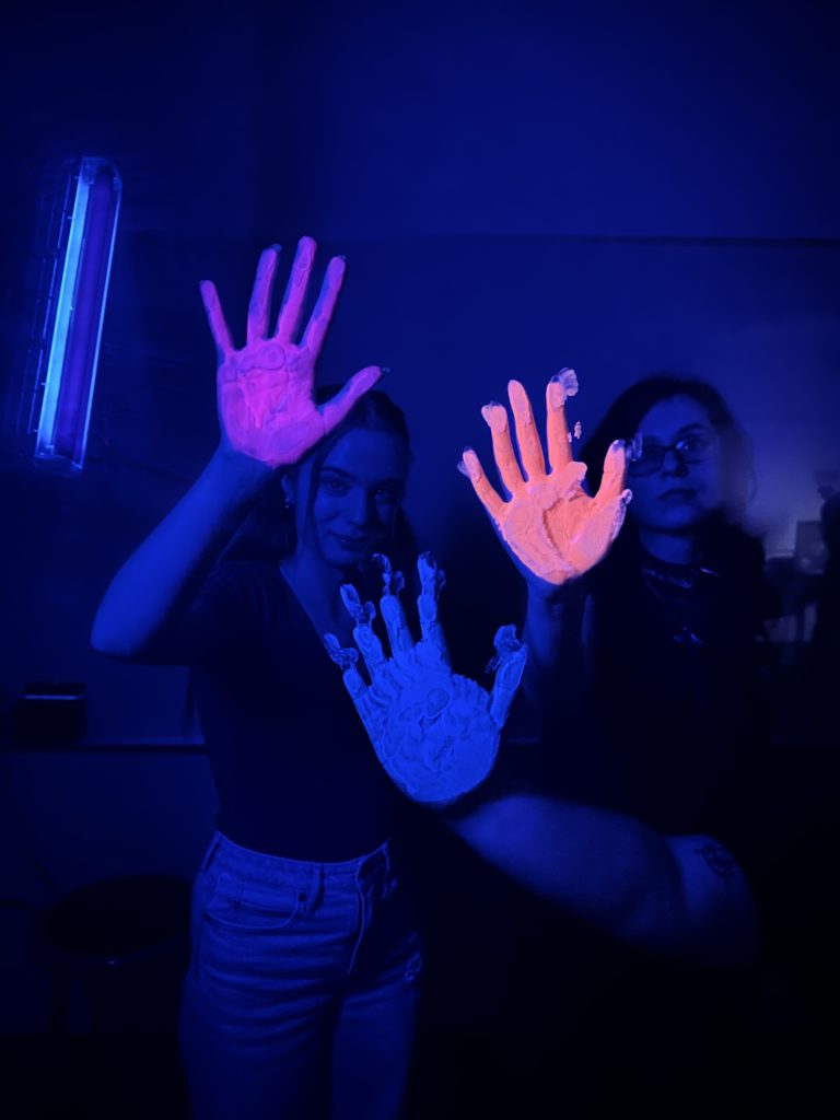
- Draft 1 > For draft one, I experimented projecting several different patterns and colors. This allowed me to flush out what had the best results. Another variable I experimented with was the placement of the camera and projector (did I want a colorful or dark background?). I used my iPhone to do my first rough drafts. Here are some first drafts:
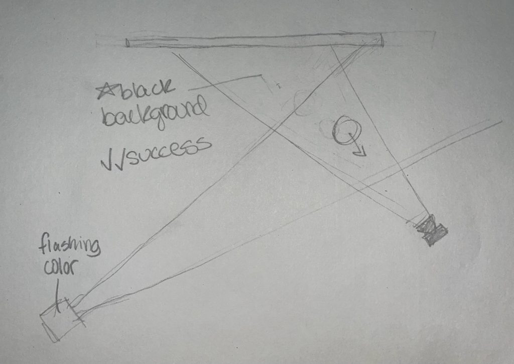
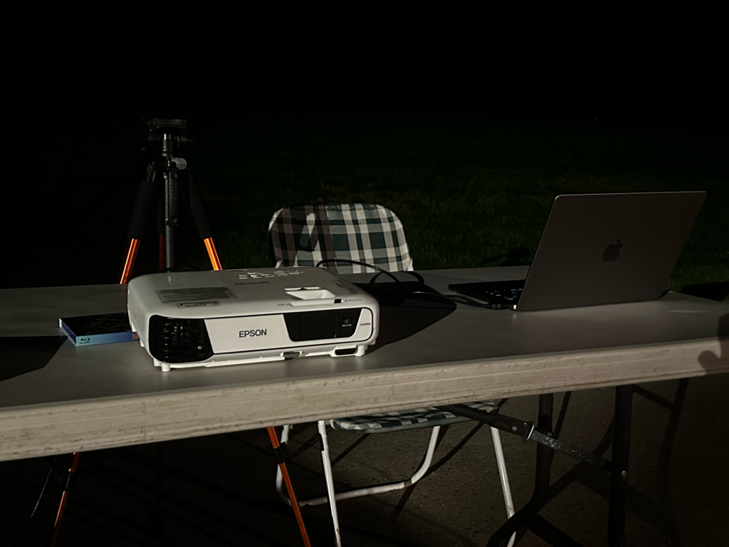
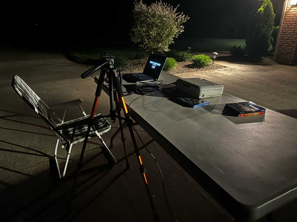
3. Planning and Revisions > After viewing the results from draft 1, I decided that I wanted to project slow, strobing colorful lights and I wanted a dark background. Having a dark background proved to be my biggest challenge. Below is the diagram of the setup.
4. Final Drafts > I followed the diagram and my goal of this final shoot was to nail down the correct camera settings. Here are some of the biggest tweaks I made on the manual setting: shutter speed 1″; F8.0; ISO 1600 in RAW format.
5. Polish > out of the shoot, I selected some of the best to edit in order to enhance the colors and overall clarity of the images.
Thank you for your time!
4D final kelsey
Whack-A-Short Human (Final – Carter Dunlap)
Final Project
Projection Project
Light Projection – Aubrey Piontek
Light Assignment (Will put in dome) – Maria
little alien kelsey
Light Projection Project – Carter Dunlap
Brick Light Projection Description – Carter Dunlap
Bricks are mundane, and don’t get that much of a second look. So, I thought it would be interesting if I projected the word brick onto each brick, and had the words move around and do different things. I created different patterns and a scroll/falling type of movement with the words to make the vibe/feel of these bricks more interesting/excitable. The story I wanted to tell was that just normal bricks being bricks can be seen as boring, unappealing, or mundane. However, if they spiced things up, moved around, and did something, they would seem more engaging, and to some or even themselves, have a purpose other than just existing. This story could also apply to people.
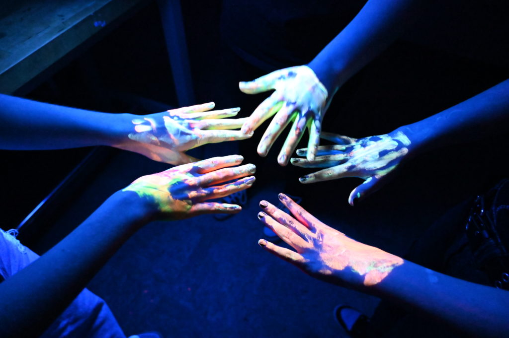
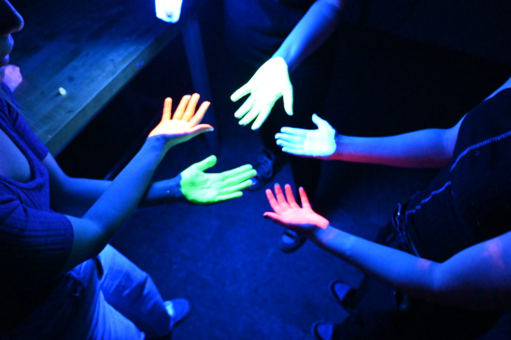
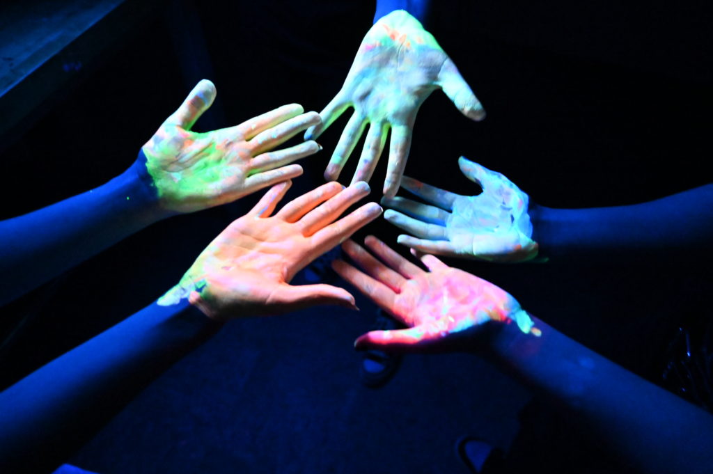
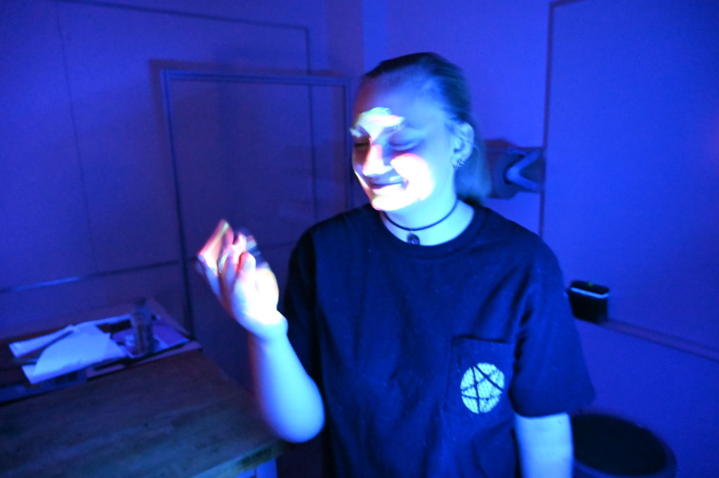
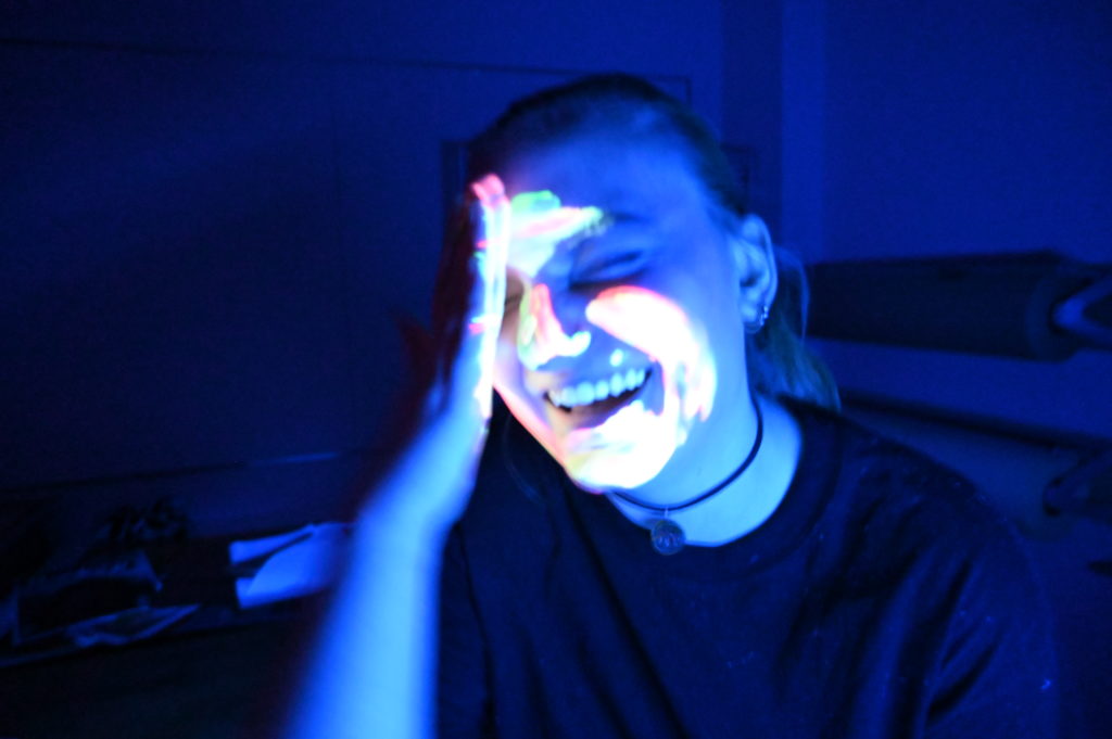
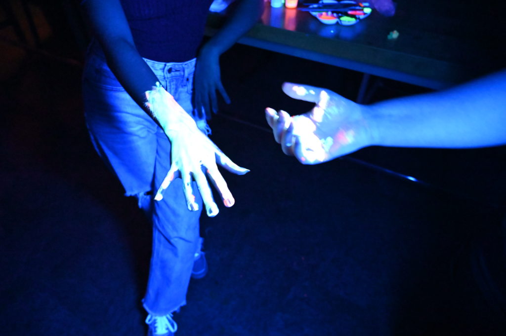
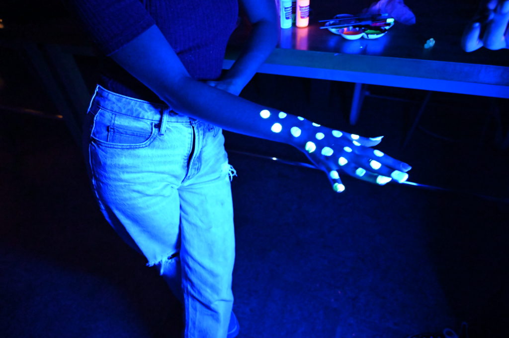
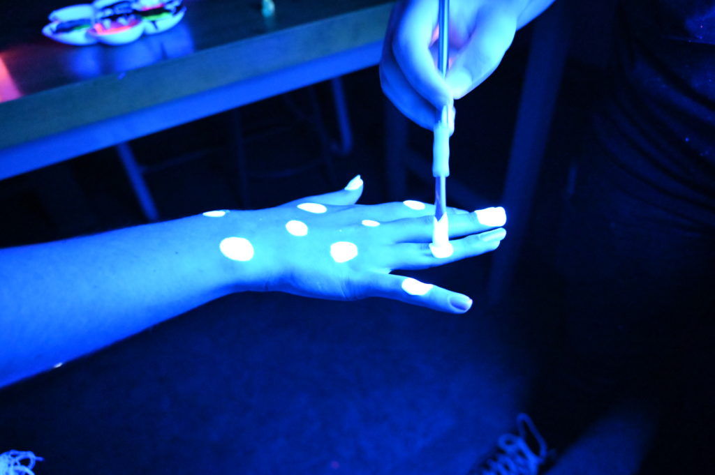
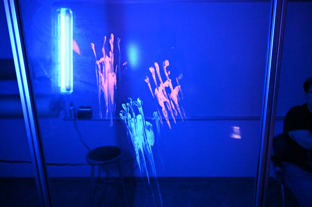
Sara Estus – Neon Florescence
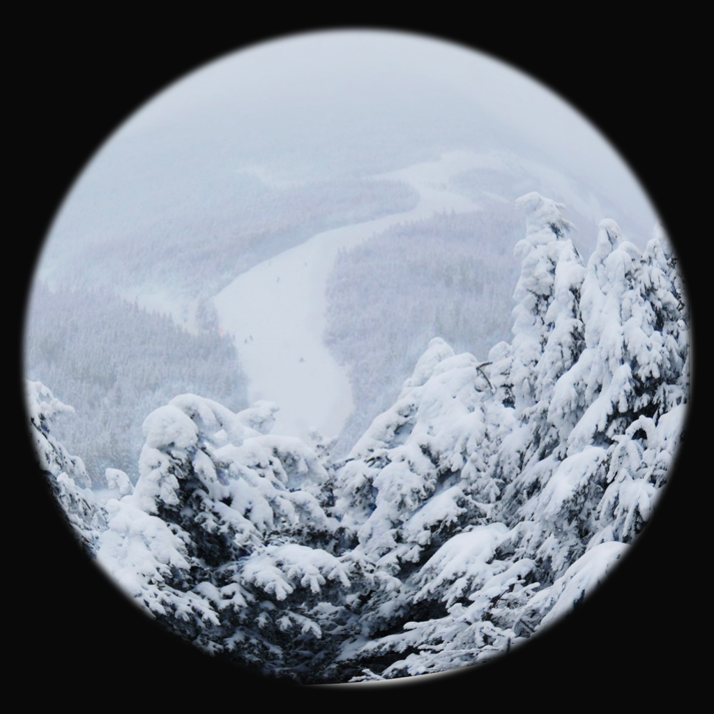
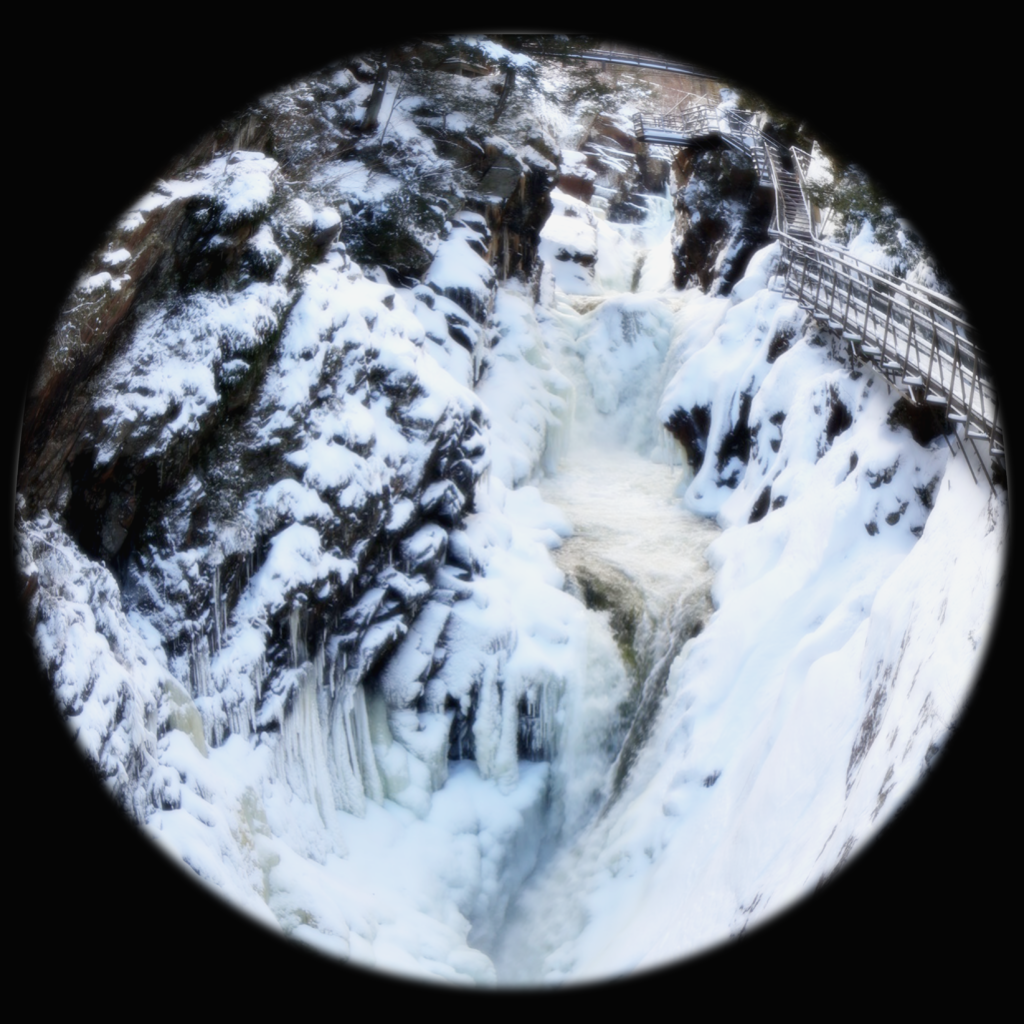
The adventure of a to-go container
It’s dinner time, and Connor is hungry. He grabs his to-go container, as viewers are shown what the to-go container sees during the expedition. Connor makes his way across the path, into the building and up the spiral staircase, straight to the cafeteria. The container is opened by the patty station, as Connor lays out a cheeseburger, and makes his way to the exit. After the travels back to the dorm, dinner is served, and the burger is enjoyed as the to-go container awaits its next journey. The visual elements of this video are utilized through perspective, such as the spiral staircase and the burger-eating. I chose this concept as a creative means of utilizing the “POV” aspect of something, with the 180 degree vision.
The Perfect Human -Colin Kenny
Rules:
Must use voiceover
Must include RMU somehow
Medium shots only
All shots must be static
^ with captions

