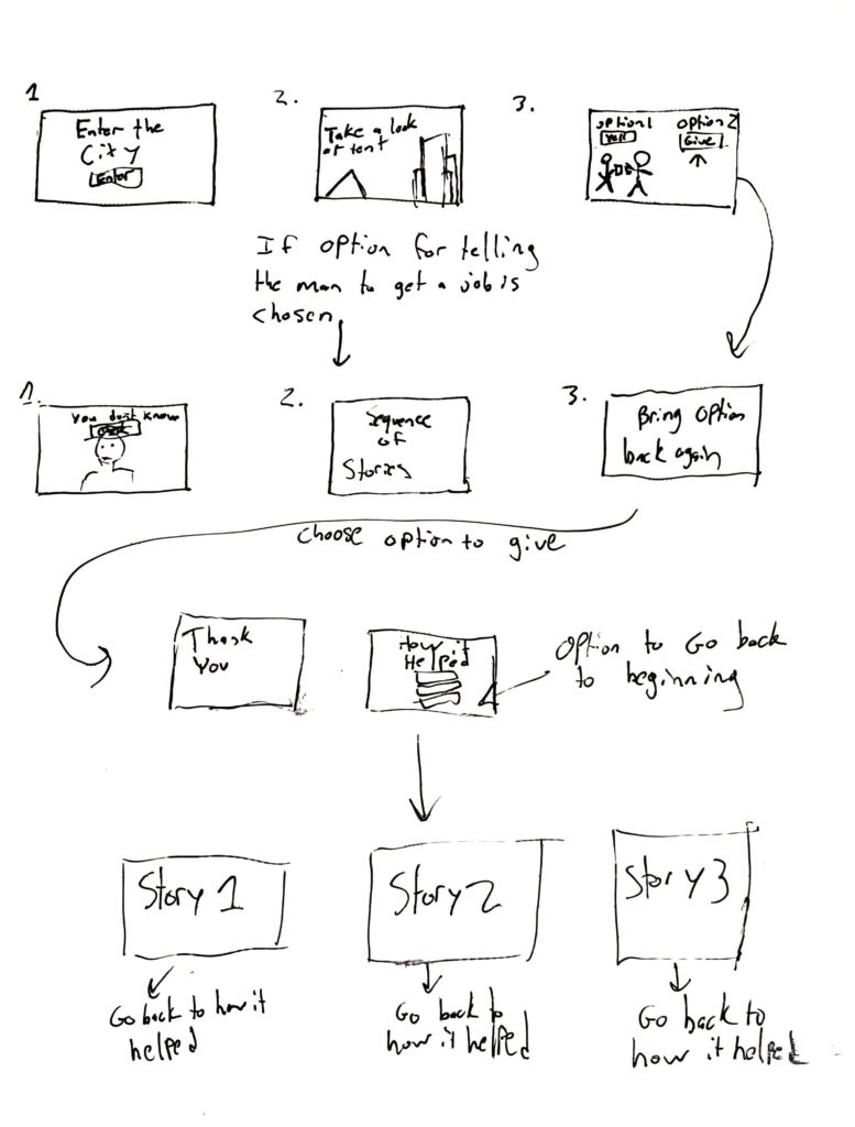
Project wireframe


design courses, syllabi, schedules, resources and policies

Mouna Andraos is a Co-Founder of Daily tous les jours. She Co-Founded this with Melissa Mongiat in 2010. The art studio in which they created is best known for it’s work in public places and is based in Montreal Canada. Mouna holds a Masters degree from New York University’s Interactive Telecommunications Program (ITP) and a Bachelor degree from Concordia University. She was a research fellow and is an alumnus of Eyebeam Center for Art and Technology in New York City, and in an adjunct professor at Concordia University’s Design and Computation Arts department, and UQAM’s École de Design. Prior to Co-Founding a design studio, Mouna worked under the label Electronic Crafts exploring the intersection of mass-produced electronics and handmade crafts to create playful, sustainable, or participatory objects.

Score is an interactive game created where the rules change each match. Players are prompted to step on different circles and must pay attention to the rule as they change and become more complex.
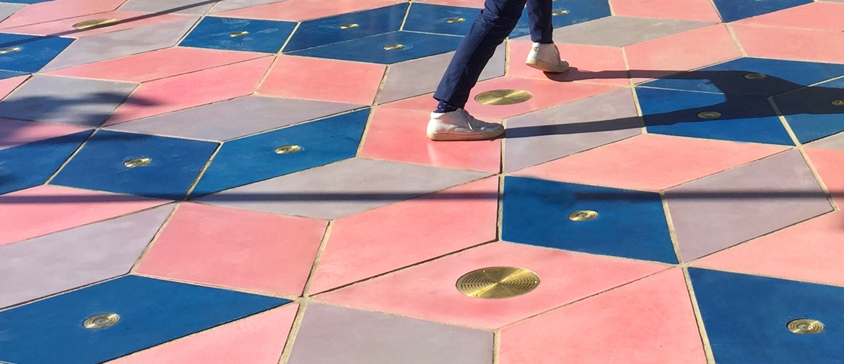
Musical Shadows is interactive pavement. It uses light sensors that are able to play different tones and music as your shadow moves or dances around, playing interactive music based on movement. The music will actually change throughout the day based on the intensity of the sun.
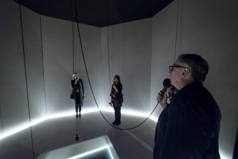
I heard there was a secret chord is an art installation that plays the song hallelujah. The sound can get louder or quieter based on how many people are listening to that song at a given moment and it displays the amount of people listening to that song. All of this takes place in an octagon room with microphones hanging from the ceiling.

This is my favorite one of her artworks that she was part of. This art installation consists of 21 musical swings that are all interactive. Each swing allows you to play music with your entire body by swinging and prompts you to collaborate with others and swing at the same time. Swinging at the same time will play better sounding music.
The Musical Swings installation was created in 2011, the installation has become a celebrated icon of Montreal’s entertainment district, returning seasonally every spring. As a result of its success, a touring version of the Musical Swings was created and has been traveling the world, receiving a number of international awards and recognitions. A new permanent version of the work is also available for cities around the world.
Each swing triggers notes from a classical instruments: piano, guitar, harp and vibraphone. A color code indicates which instrument is played and invites the public to try different seats. The higher the swing, the higher the note. When the swings move together in unison, they create a musical composition through which unique melodies can emerge if participants cooperate. The gentle, kinetic quality of the acoustic sounds blends seamlessly into the environment in which it is located in.
Collaboration is rewarded when participants swing at the same rate, triggering more complex melodies. This system allows for the people swinging to feel like they are writing and playing music with their entire bodies and encourages team work in order to produce the best musical sounds.
This designer really focuses on having the public come together and create something better. By having people come together and play games, dance, and make music she is creating a better world where people can interact with each-other in a fun manner.
The goals of Apple’s website were to be user friendly with a lot of support for the user experience. They want to make the customer feel as if they can feel and touch their products without actually seeing them and they want to make it as easy as possible for the user to learn how to use and buy their products.
There are many functional specifications on a Facebook wall. This is also another word for scope. Facebook wants you to be able to post pictures or anything. They make it so you can view other peoples posts and make it have tons of functionality. Some of this functionality is as simple as being able to like someone else’s posts.
Top down approach is when it starts from broad categories and gets more specific. An example of this is Insta print. There are broad categories to choose from and then you get more specific as you click through the different categories.
A bottom-up approach is when products are grouped based on their functionality. An example of this is Reebok hockey sticks. There are product lines where the hockey sticks are categorized into based on the quality and functionality of the hockey stick.
A hierarchial structure is when there is a main product and other products that stem from that one. An example of this is Nikon. Nikon has a top of the line camera but also has lower models that stem down from that one.
A matrix structure allows the user to filter by different categories. An example of this is Zillow. You can filter based on location, price, and property type.
I would say that the percentage of navigation and content is equal for all of these websites. Google is mainly based on searching and navigation but they have tons of content within the search results. If anything the amount of navigation may even be greater for these sites.
They focus on what is important by funneling in the users to make sure they experience everything important. They have interactive buttons that you need to press in order to move throughout the site and there are moving images to attract ones attention to read something.