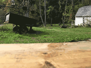
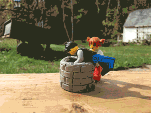
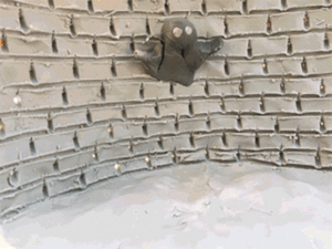
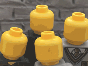
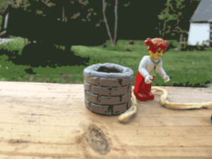
These animation are made in first and third person.
HTML Reading Response
What did the standards of the w3c provide?
The standards of the World Wide Web Consortium provided a sense of consistency in the process of designing websites. This made it easier for web designers to make a complex page and feel reassured that it would work properly on different browsers and operating systems.
What are some general guidelines for great markup?
There are seven main guidelines for a great markup. The first is to use a DOCTYPE. This identifies what markup language you are using to your browsers and the users. The second is to specify a language/character set. This marks your page with a particular language so that it doesn’t get translated a bunch of nonsense. The third is to title your page. This makes sure that your page will be titled in a browser or in a bookmark so that it isn’t just another generic page. Fourth, users must use the proper elements. This means that you use the right HTML for the right part of your page. For example, you do not want your header to actually have your footer in it because it can easily cause confusion when trying to fix or change something in the long run. The fifth thing is to avoid div-itis. This means do not overuse the div or span tags when there is something more proper to use in its place. This jumps back to using the proper elements as well. The sixth thing is to minimize markups. This relates to the last two guidelines in saying use only what you need and minimize the extra fluff that could cause slow downloads and huge files. The last guideline is to use class and id appropriately. If you use an id on something that will be used over and over again, you are going to have to make more and more ids and adding unnecessary fluff to your page. Instead you use a class and you only need one to do the exact same thing.
What are the benefits of standards?
Standards have many benefits. One benefit is that standards help to make smaller files and therefore quicker downloads. Another benefit of standards is that it increases portability. Css standards have specifications for different media types such as phones or computers. This changes the look of the page based on the media type and makes it work more efficiently for that specific media. A third benefit to standards is better accessibility. With so many new browsers popping up its difficult to stay current, but with standards its like a “one-size-fits-all” kinda thing where your page will work on almost any of the new browsers available just because of the standards. Lastly, standards lead to precise control. With the Css standards, you can position things anywhere you want and make them look just the way you want with precise control over your page.
Augmented Reality Project by Antoinette Antonacci and Lindsay Smith
Review 4 Lindsay Smith
For my final review, I chose a European Bistro called Euro Bistro. They are located in Grand Rapids, Michigan. This restaurant would be competition for my groups restaurant because they serve the same type of foods. Our restaurant is just a breakfast and lunch kind of restaurant. The Euro Bistro is the same as ours plus a dinner menu. I believe that even though they have more than ours, I think our restaurant wouldn’t need the dinner menu, too. I feel like our restaurant would be fine only serving breakfast and lunch. Their website is not what I would expect for a European Bistro. It is just a black background with a rectangle horizontal in the middle of the screen. The rectangle is cut in two evenly with a picture and the name on the left side and the tabs on the other side. It is interesting to me that the pictures on the left side stay the same on every tab but the private parties. I feel like it should change for everyone or none. I do not like the layout of their site either. The rectangle in the center seems too bland to me. I feel like it should cover more of the page. I think the color of the website suits the feel of the restaurant very well. It is black with dark reds and oranges. It sets the mood for the dinner feel of the restaurant. I do not think that it suits the breakfast and lunch part of the restaurant though. I think that if the website included some lighter colors than all dark colors, it would make it work better for all of the food times. I believe that our color pallet suits our style of restaurant with breakfast and lunch items. The only texture that is on this website would be in the pictures. I think that if this restaurant did want to keep the same look that they have with the black background and rectangle in the middle, adding a lacy texture to the black would look very nice. Our restaurant doesn’t have much texture besides the pictures also. We use the pictures as the background of our site with having the words or menu items in front of the picture. The navigation for this website is simple. There are tabs on the top of the rectangle. You can click the tabs to go to the menu, location and hours, private parties and their story. These different tabs are also accessible by swiping across the screen. I believe that their effectiveness at guiding the user through the website is very good. Our navigation is similar in its simplicity and usage. Our tabs will stay on the top of the page at all times and they are basic blocks that stretch across the screen. I believe that it would have been hard to screw up the Euro Bistros guidance because of how simple the website is. All their is to do is click on the four tabs and click to see their different menus. I believe that my groups website will stand out in comparison to restaurants like this one because our color scheme is bright and more appealing to the eye. Also, we have a wide variety of different types of food from different countries. I think that our restaurant would go over very will if it was actually introduced into the market.
Review 3 Lindsay Smith
For this Restaurant website review, I chose Peter Allan’s Italian restaurant and No. 9 Park. First, I looked at the home pages of each of the sites. These are two very similar restaurants in the choices that they offer and the theme that they have. They are both very elegant or high class restaurants, therefore their website should show that right off the bat. I believe that they both show that they are higher class on their home page in the layout and the pictures that they use. They use pictures of food on white plates that look clean and professionally done. The clarity of the navigation on both of the sites makes your choices practically mindless like Krug talks about in the reading. They also don’t have a lot going on on the homepage which makes the picture of the food the center of attention. This shows how they use the important things Krug talked about in the reading. He talked about keeping the noise down. Noise is referring to the extra stuff on each page. Both of these sites keep their extra stuff to a minimum so that the food is the central focus. This is carried though out both of the sites. This helps to unify the site. Also, This shows how Krug was talking about getting people off on the right foot. The pages and easy to navigate and you can clearly find the menu, about the restaurant, contact, and other necessary parts. Krug, also, talks about making navigation easy and effortless. Next, I looked at the menus for these places. The next thing the Krug talks about is omitting needless words. The menus on these sites are short and to the point. They give enough information for the customer to know what they are ordering, but not too many words that they don’t even want to finish reading. I know I hate when restaurants have such long and complicated descriptions because its hard to understand and it makes me loose attention to it. The next thing I looked at was the layout of the actual site. Did everything look like it lined up and look like it was supposed to be there. I believe that Peter Allan’s website looked pretty good. There was a nice header at the top. The text was easy to read. I would have to say that there was a bit too much white space in the menu portion of the site, though. It started to hurt my eyes to look at all that white. Also, I don’t like how the heading part comes down when you start moving the page. I believe that it should stay visible, but it looks like it is delayed in coming down the page. No. 9 Park’s website looked cool. I like how well the side navigation works for their site and I like the contrast in the colors of the pictures to the side navigation. One thing I do not like is that the information under each of the pictures is lined up with just the picture and not the entire grey box. I believe that is looks okay for all the section but the menu. I believe that it looks completely messed up for the menu sections and throws off the balance of the site. In my opinion, I believe that Peter Allan’s Italian Restaurant is the better website at drawing your attention for a few reasons. The first reason is the layout. No.9 Park has some issues with its layout that make it look off balance. Peter Allan’s is layer out in a way that balances it and unifies each page together. Another reason that Peter Allan’s website is better at drawing your attention would be the pictures. Their pictures move and the movement makes the food looks so much more appetizing than static pictures. No. 9 Park show pictures that are not always of the food and do not seem to be as intriguing to me as Peter Allan’s. All in all, these are both decent websites, but I believe that Peter Allan’s is definitely the better of the two.
Terms and Conditions May Apply (Bonus)
In today’s world, there are so many times that we have an agreement to sign. This can range anywhere from iTunes, Facebook, Amazon, and even for things like buying a house or car. With agreements coming up so often in our lives, half the time we don’t even care to read what it says. We think it will never affect us anyway. We are wrong to think it will never affect us. It could be affecting us right now and we not even realize it. There could be someone out there going through every purchase we made or every single letter we typed on our phone. Does this sound like privacy to you? We have a serious privacy problem on our hands and if we don’t do something about it soon, it will be too late to ever turn back. We have things like the Patriot Act that gives the government permission to seize information to try to fight against terrorism. Although this can be seen as a good thing to some people, it is clearly not a good thing. This is just like the situation Apple is facing right now. They have to face the fact that if they give up information to try to help the FBI out, they could lose a lot of their customers because their customers wouldn’t feel safe anymore with Apple having all their information. This isn’t the only thing that Apple is facing. If Apple gives in to the FBI that will cause an avalanche of other companies that think it is okay to share your private information just because Apple did. A few years ago, Facebook started changing its privacy policies to start publicly sharing your private information without the users knowing. By 2010, everything but your contact information and your birthday were shared publicly to everyone. That is a complete violation of our rights and privacy as American citizens. In this movie, they made a great point about deleting things that I had never even thought of before. They said that when you delete something that was out on the internet, It only deletes it from you being able to see that it is out there. It is still sitting somewhere, probably in Utah, in some data warehouse just waiting till the day it can be used or sold. This is not comforting to me at all. I know there are sometimes when I accidentally delete something and would love to get it back, but if I am trying to delete something of of the internet that I don’t deem worthy to be out their in reference to me, I want it gone for good! The NSA has been looking at our information for years and none of us even knew about it or would have ever known about it until the people came out and told us or we got a knock on our door. This scares me a little. We could be just like that little boy who was just trying to look out for the president and wined up getting a visit from the secret service instead. That probably crushed that little kid. He was just trying to be nice and then he gets interrogated and accused of something he never would have even thought of in a million years. The privacy standards in our society are well below the acceptable level and its just going to get worse from here unless somebody steps up and does something. Privacy will remain dead unless the behavior tendencies of the intelligence agencies that collect all this data change. Just like the guy in the movie said, we hop in one CM at a time thence look back and we are sinking with no way out. If we don’t change soon, there will be no way out and our privacy will be completely compromised.
New Idea
I was tasked with trying to figure out a new way to open a door using only your foot. I think that this would be a cool and sometimes useful invention to make. I had a couple of ideas for this project. The first idea I came up with was making just like a hole in the door that would be big enough for a shoe to fit in. This hole could have a fabric liner so that it would not scratch your shoe of your foot if you are barefoot. For this product, all the user would do is insert their foot into the hole and simple turn their foot up or down to grasp the door. Then the user would simply just pull their foot back until it opened and then remove their foot. The door would have to have some sort of spring on it so that once you start pulling it open it would open the rest of the way. Then it would stay open for a set period of time or until you pull it back shut with your foot. The next idea I had for this product was using a part of a saddle. My idea is that you could attach the foot holder from a saddle onto the bottom half of the door. To open the door, the user would simply place their foot in the foot holder and pull their leg back to pull the door open. My last idea is similar to hotel rooms with the key card slot. My product would have a sensor on the bottom and another sensor that would go in or on your shoe. The shoe sensor would just have to be waved in front to the door sensor to tell the door to open. having the sensor in the shoe would make it so that the door would not be opened due to an animal or pet running in front of the door. I believe that these ideas could all be useful, but all would need more work on them to make them ready to be produced.
Thoughts on Interaction design Ch. 3 4 & 5
Ethnographic tool are research tools like observation, interview, survey and analysis that help you to learn more about certain cultures. By using these tools you can get information to and for your customers or users in a way that they understand and that is relevant to their cultural ways. This is a good way to satisfy your customer and get them to return to you or your business.
Designs can be finished at different point depending on the designer and his or her point of view on the design. Some people think that as soon as someone has tested the ensign and it works for what it is said to then the design is finished. Others think that its just as soon as the design is able to meet the goals and objectives set forth for it then it is done. some designers believe that a design is never really done. They think that it can always be improved upon. In my opinion, a design is a success if it meets the criteria set forth for it and does so in a way that is easy for the user and is user friendly. The purpose of a design can come in many forms, but it is simply put as what the intended objective of the product is supposed to be.
I think that Apple products have influenced my life in many ways just since coming to college. I didn’t get my first smart phone until the end of me senior year of high school. Also, I didn’t really do much of anything besides basic phone things for the first six months or so. When I was looking at laptops for college I learned that I needed a mac with as much RAM and memory as I could afford. Since I got my computer, I started using my phone a lot more as well because the programs and applications as all so similar and run the same from machine to machine. I love the easy usability of Apple products and how easily you can catch on to them. Now as I am looking to get a new phone, I don’t even want to look at anything else. I don’t want to have to learn to use a new phone and since IPhones are all so similar, I don’t have to worry about that with a newer IPhone. This is why Apple is my new technology of choice.
Thoughts on Interaction Design Ch 6
Chapter six talks about judgement and shifting negative behavior. Norms are behaviors that are common for people within a certain culture or group. If someone thinks that one a design goes against the norms that they believe in then they tend to have a judgement of the design which could resulting a negative behavior. Judgements can cause a cultural shift in society if the judgement is spread wide enough throughout the viewers. This chapter also talks about discursive design. This is a category of design that treats products as ideas rather than just “instruments of utility”. The last thing talked about in chapter 6 is shifting negative behavior through design. Negative behaviors can be shifted by making people rethink their stance on a product. Also, negative behaviors can be shifted by changing a product and re-introducing it to the negatively influences customers.
Web site review 2
For my website review, I chose the site change-the-world.unltd.org.uk. This site shows how “social entrepreneurship can unleash the potential of young people”. With their audience being young people i believe that the site did a great job in the color and texture selection. The theme of the site is space with earth being in the middle of the first page making it seem the most important. it changes half way through to be like you are coming down from outer space all the way into a house. all of the colors used in my opinion are good in contrast to the different blue backgrounds that you go through on your way down. The are meteors and other planets and even the sun that you come across on your way through the space part of the site. Also, in the earth part of the site, you come across blimps, clouds, and even the house. All of these things are made to be cartoon like which would intrigue younger kids, but it is also not too kidish that a teenager would be turner off from it. As a single page site, it uses a top navigation that can take you through the different aspects of the site. However, this top navigation is not visible when you first get to the site. The user has to know to scroll down through the site to be able for the navigation to pop up. There is however an arrow that is pretty prominent on the screen that tells you that you have to scroll down. In my opinion, I would have the top navigation panel shown at all times so that the user is not confused by it not being there in the beginning. Also, some of the pictures are shown in these little circles that don’t really fit with the rest of the design, in my opinion. Some of the pictures are shown in planet or meteor looking shapes, but then the others are just in circles. I think that they should change them all the one or the other, but having both doesn’t make much sense to me. In my opinion, the site is pretty easy to navigate besides not having the top navigation shown ate the beginning. The site has a lot of content, but it is all divided up in small sections that makes it not as intimidating to users to have to read a lot all at once. Also, the site has so many visuals that relate to the content that they kind of help you through the reading. They also help to break up the reading as well without adding too much of a distraction to the reader. Lastly, I believe that this site, with a few minor adjustments, is a very well thought out and interesting design. I believe that it is able to keep the attention of a younger reader for a decent length of time due to the spacing out of the text and incorporation of the pictures in amongst them. Also, I think that since the site is made for younger people and trying to get them involved, it is okay if it doesn’t reach out to adults as much as it does kids. All in all, this site is a well designed sight with many good features and an interesting layout.
“Objectified” Movie Response
The movie “Objectified” was really eye opening for me. Before watching this movie, I did not really think about any of the things tat were talked about in the video. I didn’t think about how every little thing we use everyday has been designed specifically for a purpose and to try and make the use of the object as easy and as comfortable as they can for us. In the movie, on of the designers said, “ It should feel almost undesigned so that people think, ‘Why would you want it any other way?’”. I think this statement is so true about the products we work with everyday. The user would never even think to have it be any other way, but in actuality, there were hundreds or even thousands of other ways made before that one way was chosen. Nobody ever thinks of that part of the process when they are using it, besides the people who actually went through the process of making it. I also agree with the designer who stated that designers have to understand what people need even more than the people do themselves. If this were not true in the designers today, I do not believe that the products made would be successful. If the designers didn’t put as much thought into the products they make I believe that the users would not buy as much of the products because they would think that they could make something better for them then what is available. I know I think like this with some of the products I own because of their poor design. There were many things that some of the designers said that really made me think about how I actually thought of design before the movie. One of the designers said a quote from Henry Ford. The quote stated, Every object tells a story, you just have to know how to read it”. I believe that this can be applied to design and how easy designers make products for their user. Products should be simple so that even the least knowledgable person can figure it out. If a product has a bunch of different parts that have to attach a certain way of can only work ing a certain order and the instructions to use this object aren’t as clear as possible, the user will not be able to use it. In one of my other classes, I learned that a person who has a good experience with a product will usually tell 3-5 people about it. A person who has a bad experience with a product will tell at least nine people about their experience. If this word of mouth spreads far enough, the entire product could go under because no one will buy it. Another thing one of the designers said was that is is a designers job to look into the future, not what has happened, but what will happen. This sentence changed the way I had been thinking about designing. Even since I was little, I had been looking at things and trying to see how i could make it better. Although this is still a way that designers look at products, It is not the complete way that I should have been thinking about designing. I should have been looking to see how I can make a product last. Designers have to be able to make a product be able to stand the test of time and not just end up in a landfill in a few years or even a few months. I believe that this element will be key in our future to be able to minimize our carbon footprint and in making our world and products more eco-friendly. Lastly, each designer gave their own definition of designing. These ranged from everything from a puzzle to honesty. Before this movie, my definition of design was simple. It was the way in which you made a product with the features of additions that would work best for the user. I have drastically changed my definition of design after watching this video, because these designers really know what they are talking about and how to make their designs work for everyone. I believe that my definition of design now would be something like an ongoing and ever-changing process in which designers create products that will be long living, eco-friendly, and functional for the user that gives solutions to even the littlest problems.
Thoughts on Interaction Design Chapter 1&2
The book states that Interaction Design is a creative process focused on people. Interaction Designs are created through a process with various steps. These steps are called different things based on where you read but in this book the steps are define, discover, synthesize, construct, refine, and reflect. First, the designer must have a problem or definition that they must define and figure our a strategy to go forth with. Then, they must discover the wants and needs of the potential users. After all, the end result must be user friendly so the designer must research deeply into this section of the process. After this, the designer must figure out a focus for their research. This leads to the construction of the project and testing it. After being tested, the flaws are assessed and fixed. Throughout all of these steps, the main focus must be on the users and how it will affect them because this is the main purpose of Interaction design as a whole. One major challenge in this industry is point of view. The book says that everyone has a point of view and they both reveal and conceal. I believe that this means that some people are set ing their ways and it is hard to make them change their mind and try new things. Although, the book also says that if you are too openminded and approach things with a clean slate, it can be hard to accomplish anything because you don’t have any focus. Another challenge in the industry is when you have to use focus groups. Focus groups are needed because the design that the designer is making is ultimately going to be used by people so they have to know how people will respond to the design. In focus groups, conversation is key in sharing individuals opinions and getting points across, but if there is too big of a difference in personalities in a focus group, the whole thing can be compromised.
As stated at the beginning, Interaction design is a creative process focused on people, but what does that really mean? During this process interaction designers try to construct a visualization between people and what they are creating. one goal in interaction design is to assist people through a path as they used the product. Interaction design is evolving just like our world is evolving. With new technologies being produced rapidly, interaction designers change their works to go along with that. Interaction designers use data and information to understand digital-spactial relations in a complicated system. Interaction designers use the fields of Information technology and Knowledge management. these two fieldS analyze the path that users take to take data to information to knowledge and lastly to wisdom.
Elements of user Experience
Apples websites goals are to sell apples stuff mainly. Also, Apples goal is to support its customers and make their experience easy and memorable. Apples site helps a first time mac buyer because it has technical support online, in-store, or by phone. this means that new people can easily find answers to all the questions they have about their purchased product.
Facebook has specific parts of its website that helps users to create a unique looking page customized to their info and pictures. Also, Facebook has things like sharing posts, commenting, chatting, and liking posts that creates a connection between people over the internet.
The four structures that the book talks about are hierarchical, organic, sequential, and matrix. Hierarchical shows items in most important to least important and an example of this would be Apples website. Organic means that there is no set order to which things are organized. this is shown in Wikipedias site. Sequential structure is when there is one specific order in which information is organized. This is shown in books and movies. Lastly, the matrix structure is one that any page can be navigated to from any other page on the site. This is shown on Amazons website.
I think that practically 90% of the Huffington Post index page is strictly navigational and about 10% is content, but when you get to articles and things like that the pages completely flip on navigation vs. content. I think that google is about 90% navigation and 10% content too because once you get to more content you aren’t on googles site anymore. I think that wikipedia is split about 50/50 on navigation to content and Etsy is about split too because they are both focused on finding what you want and informing you on that when you get there.
Landor does a great job of showing you what is important because of the colors and the minimalistic layout. Also, it does a great job of guiding your eyes though its content by having only one content on the screen at a time.
Web design Site review
For my review, I will be looking at the positive and negative aspects of a site. The site that I chose to do my review on is Walmart. Upon first going onto the site, I see that it is a pretty clean and minimalistic site. There isn’t a lot of clutter or things to get you distracted along the sides. There are advertisements that have a click scroll at the top of the page under the menu bar. These ads show things that they think are popular like healthy foods, hygienic products, and popular holiday products. For right now, they have Valentines day gifts on there. Under this they have the sponsored links and then links to every department. I am going to see how well their check out is compared to other sites that we talked about in class that had a good checkout system like Amazon. I chose to look at clothing to see the color and style options they might have. Once I got into the clothing, sidebar menus popped up that showed me categories of clothing, sizes, and price ranges. Also, something surprising came up. At the top of the sidebar, there is an option already for delivery. This included whether to send to store or house. After you choose ad to cart, it sends you to a page to make sure your item is correct while also showing you things customers also bought. Once you go through that step, you can’t go any further without making an account. Even though you can’t go any further, I can already tell that this is similar to Amazon in many ways. Like Amazon, the goal of Walmart’s site is to sell their products. Walmart also differs from Amazon because Walmart has stores that customers can go to and buy the products too so their site has to reflect that aspect of their store. Walmart is, like Amazon, a matrix structure because in the book it says that a matrix is a structure that can get to any point from any point. I think that this site is very user friendly and is even friendly to elderly people too because Mostly all of the writing is big and in colors that are very easy and appealing to the eyes. All in all, I think that Walmart has a very good site that is user friendly and has many good features.

