
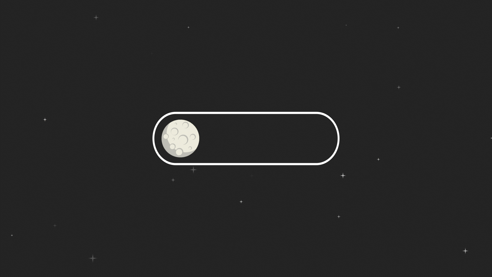
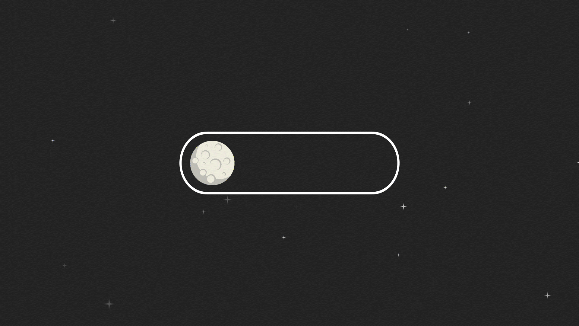
Experiment Animation 10

design courses, syllabi, schedules, resources and policies


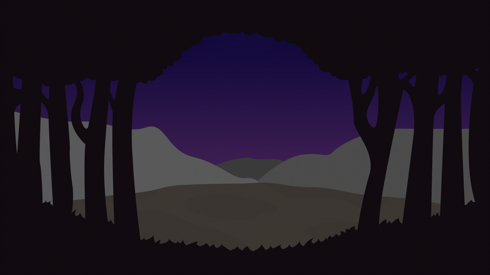
This bottom animation doesn’t include the clouds as I didn’t like how they restarted again at the beginning. With more time in the future I will fix the clouds to be continuously move to the right.
For my final site review, I decided to review https://shalomjapannyc.com, a fusion restaurant of Jewish and Japanese food. Where the one chef is Jewish and the other is Japanese, being the two chefs at the restaurant. The website was constructed in a simple and clean way, I found their color palette giving a sense of calmness and being at home. Their font choice also makes the restaurant look elegant and professional. I do however believe that their layout for their pages is very basic and doesn’t give them a feeling of being original or unique. Where my groups fusion restaurant I believe has a better layout in certain pages. For example our menu page is neatly laid out where their menu page is done in a single column making the page too long and not look professional. Our Header also seems to be better where when resizing their header it seems to get messy, our header stays intact and even changes when the website gets too small. One thing I did like about their website is their footer, I liked how they used they laid out their information, without having too much negative space. I would like to implement a footer in our website as I think that would make out website look much better.
The websites that I chose to review were the Burgatory and the No. 9 Park websites. Starting off with the Burgatory website, I feel that their website has a strong unity in style and overall look. It also has a strong balance with their colors being different shades of red with a creamy white, these colors create good contrast and are not so hard on the eyes when viewing. Another thing that is good is their decisions with their type, they have their important information displayed with more style and height, separating it from the sub text. There were however two things that I didn’t like with the website, being the header and the footer. I don’t like how the header and footer take up so much space creating a lot of pointless negative space when it would be solved with a better easier layout.
The next website, No. 9 Park have it similar as the Burgatory website, their website is clean and united with their style. A difference would be how their choice of color and type give it a more prestigious look. One thing that I didn’t like about the website was again the footer. With this website it is more worse than the Burgatory website. They have too much open space and the background color of the footer also looks off, where the whole website is brown and white, they made the footer a shade of teal.
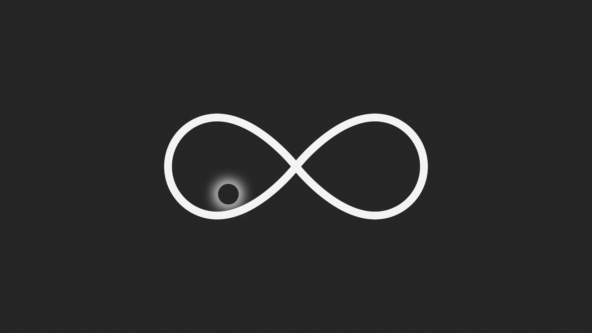
For my second site review I went with the website Redis.Agency: https://www.redis.agency/?ref=onepagelove. I. chose this website as it was the most unique website that I have ever seen. With the creative usage of color where there are only 4 colors, red, white, black, and green. Using black as the background and using the color red a few times, giving it more emphasis when present. The color white is used on the type and the color green is used around the border of the page, giving it a sense of contrast from the red. One thing I found very interesting about the page was the concept of infinitely scrolling down or up, the page is set up to never have an end or beginning as it keeps going in a loop. It was very confusing at first as it looked like the content was repeating until I hit realization that it was a loop after scrolling for a few minutes. I think the website was done very well and the concept of scrolling for ever is unique, however it would be nice to know that it is scrolling in a loop as it can be confusing at first. Another thing that the website did well was the usage of simplicity as the background is pure black and the text being in the center and being the color white really makes the text pop and show importance as it create contrast.
For my first site review, I decided to go with the Nike website and the product that I put on the cart were a pair of soccer cleats (Nike Tiempo Legend 9 Elite). The overall process was very smooth and simple, which was expected from a big company. The way that the website is designed creates is very nice from a design point of view, where on the middle top of the page it has different options, splitting up genders and ages, and once hovering over select gender or age, a set of drop down options appear, allowing the viewer to select the desired products. On the right side of the page it has a search option, a favorite item viewer, and the cart. The cart system was done well, allowing the viewer to see how many items they have in the cart with a number in the middle of the cart icon. However, I did see a possible issue with the cart icon, where it could be mistaken for another icon from the view of a newer user of the internet as it is not the iconic shopping cart icon, instead it is a handbag icon. From this website, I find myself using the simplistic style of the website in my homepage as I find it very appealing.