Check out my full project on my website !!
https://tueldesign.com/glen-the-ghost-the-game


Glen Plushie 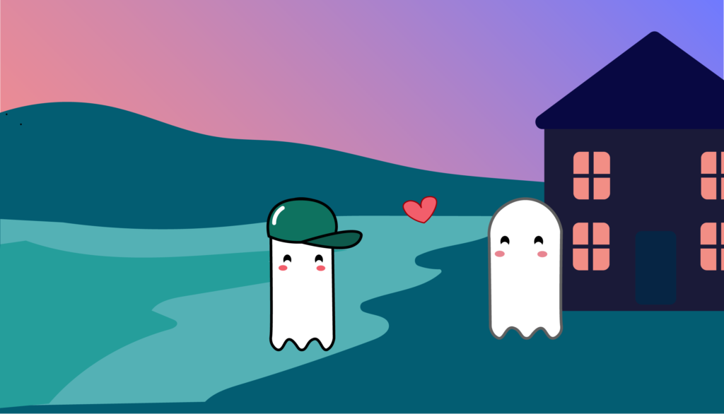


design courses, syllabi, schedules, resources and policies
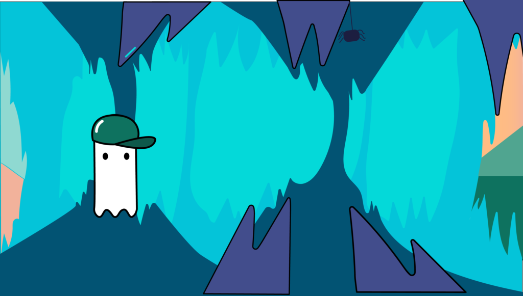
Check out my full project on my website !!
https://tueldesign.com/glen-the-ghost-the-game
About Marioneta
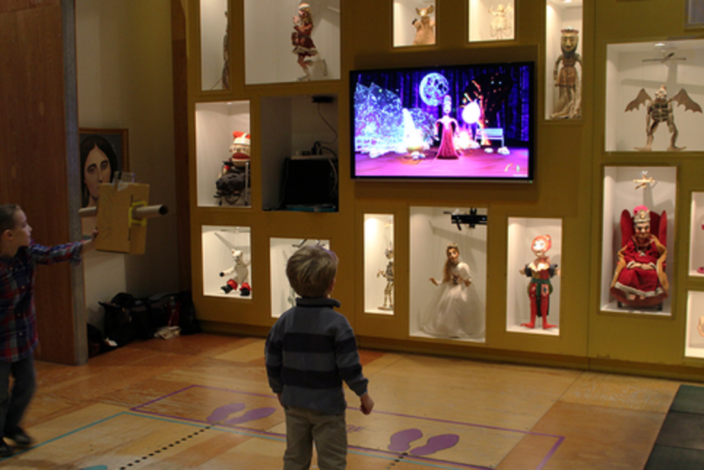
Marioneta is an installation for the Children’s Museum of Pittsburgh which uses the Microsoft Kinect v2 to allow guests to embody a collection of antique puppets in a virtual environment. The focus is on creating an experience wherein elements in the world react to the users’ actions through these puppets.
Why antique puppets?
Puppet models in the experience are based on a collection of puppets donated to the museum by Margo Lovelace. The original puppets are carefully exhibited in a large display case on the wall in the museum. Many of the puppets in the museum’s collection are antiques, fragile or valuable and not suited to hands-on play by the museum’s young visitors. Marioneta uses technology to make museum puppets available for imaginative and interesting play.
What is the experience like?
The experience is composed of auto-rotating seasonal stages and season-related interactive objects that have visual and audial feedback. Users can throw a pumpkin in the fall, pick up an ice ball in winter, play with cowbells in spring, and break a lantern filled with fireflies in summer.

Who worked on this project?
A team of students worked on this project including:
Christina Tarn as Producer
Maria A Montenegro as Tech/Programming Lead
Emily Chang as Programmer
Alex Moser as 3D Artist/Techinical Artist
Hyunghwan Byun as Experience Designer
I decided to look more into Hyunghwan Byun because I aspire to become a UX designer. It would be helpful for me to learn more about his work and his design process.
Link to project website:
http://www.etc.cmu.edu/projects/marioneta/index.html
About Hyunghwan Byun
Hyunghwan is an Experience Designer who wants to be a connecting point between technologies and human. He wants to design human-centered and amazing experience. He studied Materials Science and Engineering during undergraduate program before coming Entertainment Technology Center at Carnegie Mellon University. His experience covers various fields including Game Design, Sound Design, Film and Physical Computing.
Hyunghwan’s Experience:
Interaction Designer, Seerflix Inc. | 2015 – 2016
Experience design, rapid prototyping, UI design, qualitative user research, concepting, design system development, for Web-based interactive 3D authoring application
UX Designer, Adobe | Sep 2016 – Present
Experience design, rapid prototyping, qualitative user research for AI and machine learning features as part of the Photoshop team
Hyunghwan Byun’s Work
Marioneta
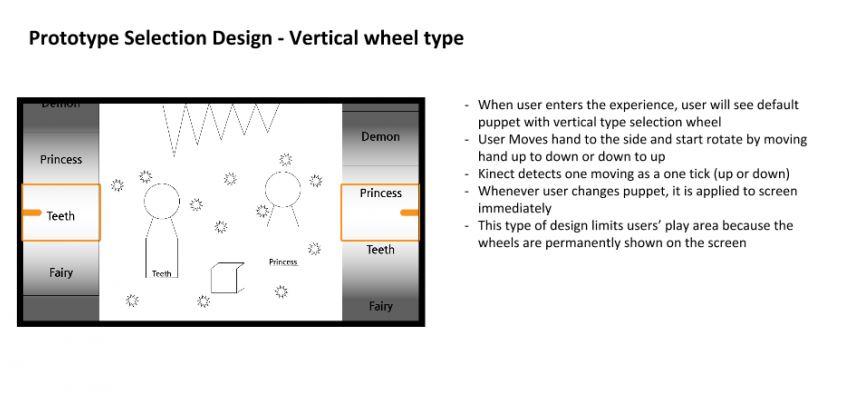
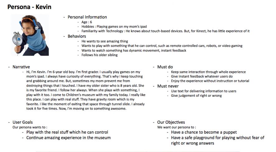
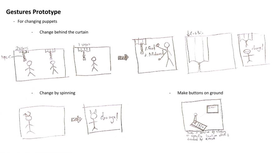
Here, he explains the design goals as well user journey maps, prototyping selection design, coming up with user personas, and gesture prototyping and more.
https://byun.design/marioneta
DESIGN GOALS

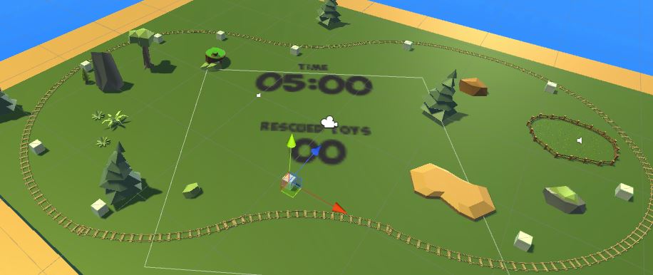
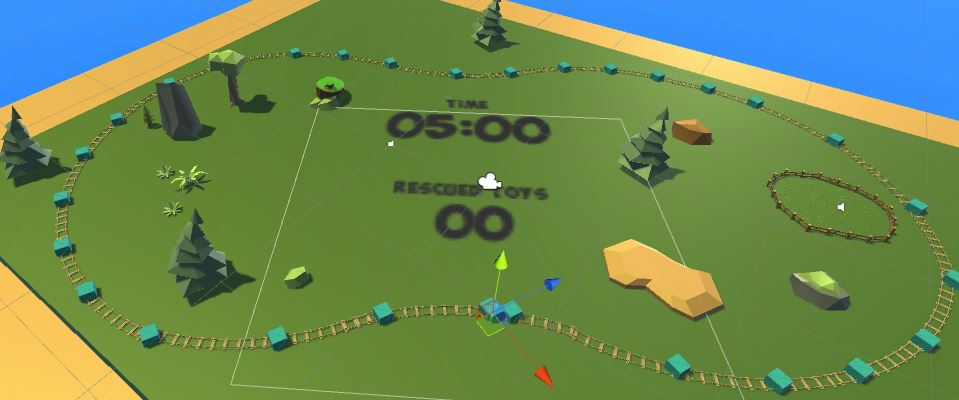
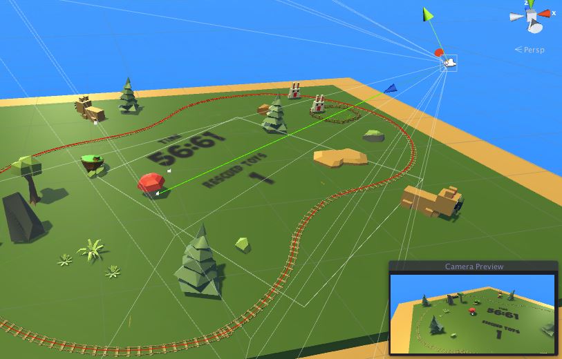
Toy Train’s Adventure VR Prototype
This particular work interested me because I am interested in game design and VR.
https://byun.design/toy-trains-adventure-vr
ABOUT
This prototype is a 2-week long one-man project running on the Google Cardboard VR platform. The objective is moving rabbits around a map to a safe area to avoid the lion’s threat. The player helps moving rabbits by keeping the train’s route safe.
GAME OBJECTIVE
GAME DESIGN
Rabbit spawner
Rabbits are spawned at one of the spawning positions randomly.
The spawning cycle is determined by the remaining time to create gradually increasing difficulty.
Lion spawner
Lions are spawned at one of the spawning positions randomly.
The spawning cycle is determined by the remaining time to create gradually increasing difficulty.
Lions are set to Navmesh agent and avoid props on routes automatically.
Mushroom spawner
The mushroom bomb is spawned at the position the player gazes at.
The mushroom bomb is spawned with a particle system and it destroys colliding lions.
I really enjoy how he breaks down the individual parts in the game design. He also talks about Future Improvements that he would make to improve the game.
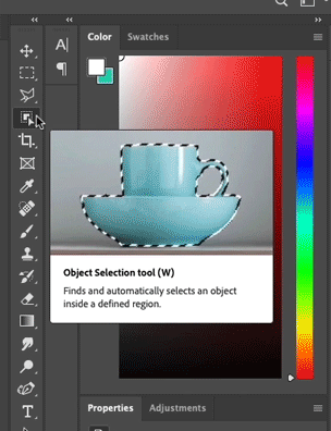
Object Selection Tool | Photoshop
This is his process of how he created a tool for photoshop.
You can find more information on his process by visiting his website:
https://byun.design/objectselectiontool
A Selection Tool with Intelligence
The Object Selection tool is a Photoshop tool that automatically creates a selection around the borders of the object users highlight. The tool simplifies the process of selecting an object in an image with the help of a semantic understanding of the image.
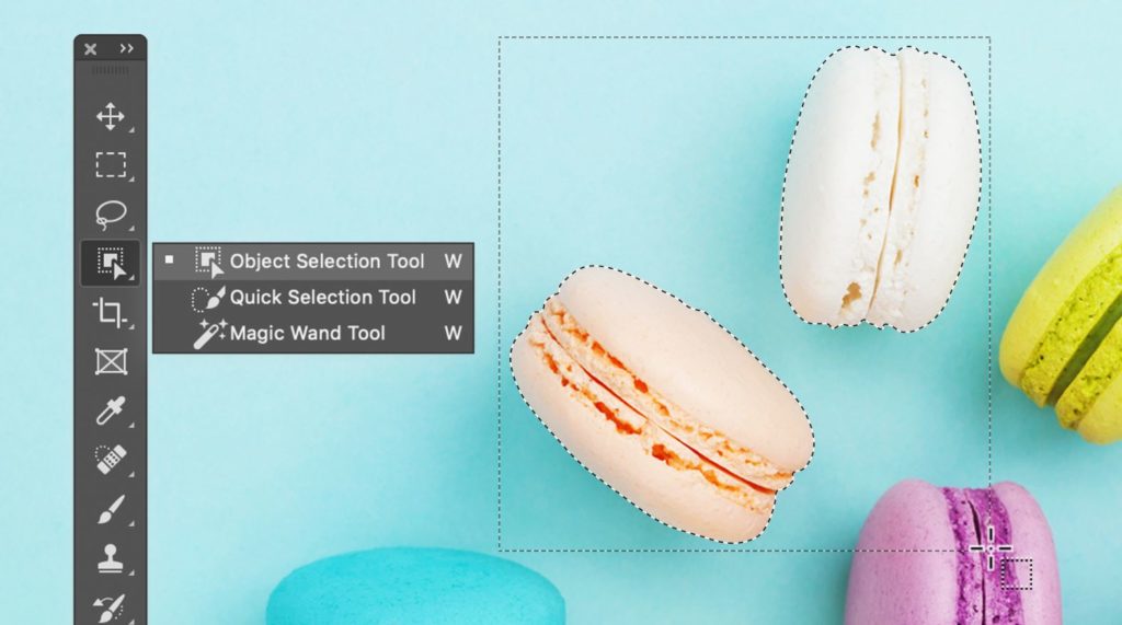
Select an Object EffortlesslyCreate a rectangular selection around the object. The tool automatically snaps the selection to object remove over-selected area or include less-selected area
HOW IT WORKS
Create a rectangular selection around the object.
The tool automatically snaps the selection to object.
Remove over-selected area or include less-selected area
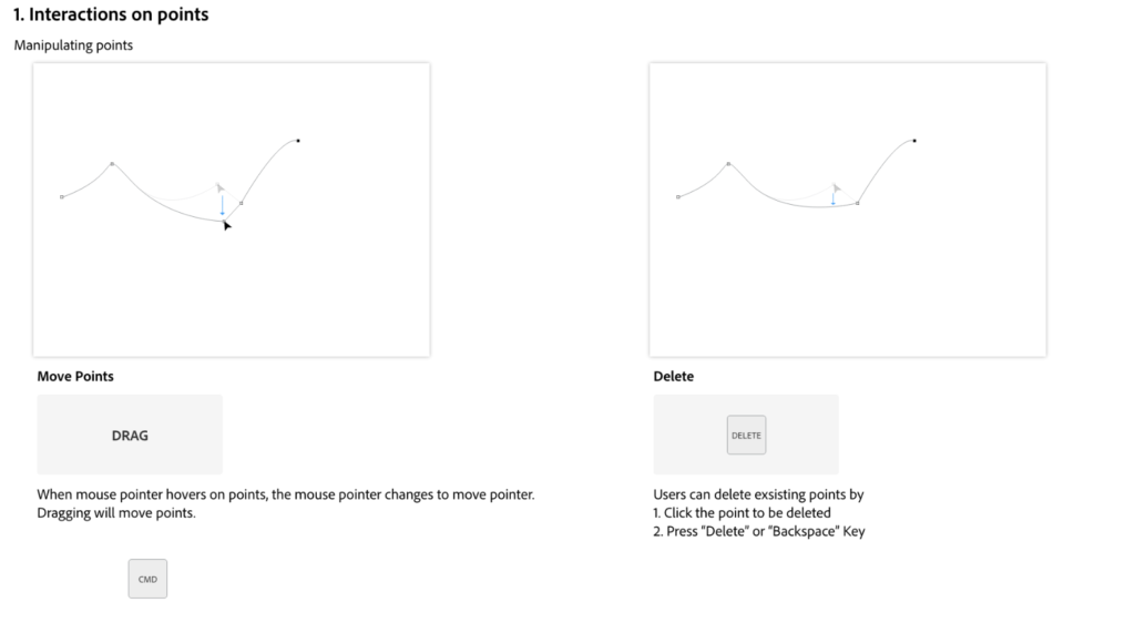
Curvation Pen Tool | Photoshop
This is another tool that he created for Photoshop. It is neat to see someone’s work with Adobe and how huge of an impact they can make.
https://byun.design/curvaturepentool
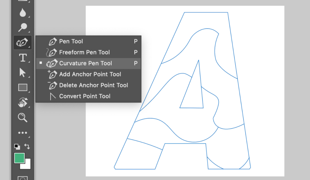
DRAW PATHS NATURAL
Curvature Pen tool in Photoshop is designed for users to create precise paths without dealing with confusing Bezier handles that we see from the traditional Pen tool. Path drawing is as simple as just placing points on the canvas.

Overview & My Thoughts
Overall, I really enjoyed looking into this Marioneta Project, understanding the process and the goals behind the project. Since I was able to experience this piece in the Children’s Museum I was really able to see the curiosity and care-free nature that it brought out of people including myself.
Throughout this research assignment, I didn’t realize that I would find another designer that I admire. Hyunghwan Byun has become a designer I look up to. Not only does he break down the process behind what he does, but he also pays close attention to detail along the way. I believe this is what makes him so successful and also land a job at Adobe. The impact that he is making with interactivity and UX Design is the same impact that I strive to make in the corporate field.
Ethnography is simple methods of understanding people and problems associated with work. You can use tools such as a ecosystem diagram, journey map to better understand the relationship between beginning to end. An ecosystem diagram tells the relationships between system touchpoints. For example, for an online banking website it may include the marketplace, partners, research company, the feedback from users, etc. This diagram will help the designer predict what the interactivity will be with the product, in this case, the website. For an Journey map, it tells a different story. It illustrates how a customer will engage with the various products and services over time. For a banking website, it may be a journey from how users get from looking at their account information to transferring money from one account to another. The ultimate goal is to understand how ideas connect so designers can make better decisions about the design going forward.
As designers we strive to improve all aspects of human life. Whether it be visual, emotional, and experimental. Interaction Design should be desirable, beautiful, and appropriate. For myself, what makes a design successful is if it does what it intends to. It could be communicating something, making people touch it, make people feel something. If you have an original goal of what you want this design to and that goal is accomplished, I think that design is considered successful. I think the purpose of it would be for the design to be impactful however big or small the impact may be.
I buy a particular type of shampoo and conditioner. Its from Renpure. I don’t particularly like the packaging or their branding, however I am loyal to that brand because 1. It works, 2. Its Sulfate Free, Paraben Free, Cruelty Free, 3. It’s relatively cheap for the about of product you get. So, I believe that sustainable design is a big factor when it comes to me purchasing products.
After watching, “Objectified,” I thought it was enlightening in some aspects and in others I agreed with the designer’s opinions. It was interesting to see how each designer has a somewhat different take on the design and interaction. The film focused a lot on the specific objects that could be everyday items that make a huge impact on everyone. I particularly liked the concept that everything in everyone’s daily life is designed and that our jobs as designers is to make people forget that it was designed. All the effort put in it is paid off because of that. I feel that the goal is to problem solve. To think about people’s lives and make one aspect in their lives that suck and improve it.
I didn’t quite agree with the one guy taking about how our phones should be made of cardboard, because I know as a consumer, I would not want to go out and buy a 300 plus dollar phone every other year because it degrades itself. Although, I do agree that when designing it is extremely important to design to protect the environment. I think overall, this film kind of validated my own opinions of design in a way. I am also of the opinion that everything around us is design. I did like when they said that consumers project themselves into the situation or using the product. It was something that I didn’t really think about in that way which was interesting.
I think I see design as a way to interact and deliver some sort of message. Whether that be a poster, an ad, the design of a toothbrush, or the way your coffee cup lid screws on your coffee cup. Everything is designed. It is the degree in which the design is functional as a product or communicates a message that determines if it is successful. There are so many elements to design other than functionality as well. A chair could function as a chair, but it may not have support or comfort that the consumers want and sales decrease because of it. However, when something is poorly designed it allows an opportunity for a better product to be designed. With problems comes solutions or at the very least improvements and I think that is what I like about design.
I chose Bugatory and Franktuary for the two websites to review. I should mention that I have been to both and love their food and atmosphere. I think they both demonstrate a sense of strong and well thought out design. Franktuary’s website is straightforward and simplistic. It has a nice sense of balance and unity making it easy to navigate and gage the sense of brand the restaurant is putting out. The strong photography and graphics also help build the branding and compliment each other nicely. As far as emphasis goes, the photography and the graphics of “franks” “poutine” “liberations” take strong precedent. There is an easy to use the navigation bar at the top that compliments the design of the site. It leads you to discover, ordering, catering, blog, menu, locations, and more. It does a good job at making the site easy to use with its use of the navigation bar and titles. You know where you are and how to get back to where you need to go. They don’t have a way to search, which I’m not so sure they really need a search bar on their website only consists of less than 20 pages (if not under 10 pages). The only thing I wish they had is a page describing how the food truck/restaurant came about, maybe a history of the name of the place, what their goal is as a company, and how they are different from others. Als0, more photography of what their food truck looks like so people know what to look for.
Now switching over to Burgatory, they also have a strong sense of design and branding attached to their restaurant. The unique graphic/logo and the bold photography give it a different and interesting feel. The balance of the website is heavily based on the graphic design of the menus and photography. The navigation is the same as Frankuary, but more content is involved. They have a navigation bar and with drop-down navigation, making it easy to find what you’re looking for. They have a large menu overall so the drop-down makes it more convenient for the user to find what they’re looking for. They have more options to pick from and are very interested in the customer to business dynamic. They have a social media page, encouraging customers to post and tag them. As well as merchandise, where people can add items to the cart and check out. The website emphasis is also based on the graphic design and friendly interface. There is also a description of their company and their mission statement, which is nice. Burgatory, demonstrates a more complex, yet simple and easy to use design overall.
I think that both websites have their own positives. You also have to keep in mind the way a company is coming up with branding. Frankuary is a newer and smaller company, so their site is going to be different than a company that is bigger and has been around for longer. I think Burgatory is more effective at grabbing my attention because they are so customer-focused, and their branding is stronger with the pun behind their name. That doesn’t mean I think that Franktuary is weak, they just need to develop their website a bit more, or expand their company.
I will be comparing our restaurant website, The Bastard Child, and Franktuary’s website. Our website is navigation is inspired by Franktuary’s website, so some of the same elements can be found on both websites. Franktuary’s layout involves location, menu, food truck, blog, as well as a slideshow on the homepage. Our website has a “let’s eat”, “find us”, “request us”, “our team” pages. Our branding is different than Franktuary. Franktuary has a simple and clean design concept. It has a responsive design which is something our website lacks. I think that our website branding is unique, but that’s the point of the food truck, to be something that stands out from the competition. The logo and branding colors for The Bastard Child is upbeat and fun. It is bright and attention grabbing, which you want in a food truck. Franktuary also has a great color scheme and logo, however, it has a softer feel to it. The texture is also inspired by Franktuary in the sense it has the repeating light opacity background texture and we tried to emulate that through the repeating truck. Overall, I think that with a few changes to the responsiveness and update some of the functionality of our website, that it could potentially be good competition to Franktuary’s website.
I chose the site, favoritealbums2017.yaybrigade.com, for my second review. This one page is what it says it is, Yay Bridgade’s top albums of 2017. This one page is extremely interactive and combines movement of the user with audio of a song from the album displayed. The site’s color is simply amazing. They essentially use the album cover as inspiration for the design. This lets the sound of the album translate into the design of the page. With every album that plays a different color scheme and design are displayed. It is almost as if you get a feel for the album through that design. I greatly appreciate the time and effort spent to make the users experience more aesthetically pleasing. Texture also plays a key role in the design of this site. It has a clean look with the circles and the movement of the individual records. This utilizes shape as one of its key design elements. The circles not only represent a clean interesting design, but actually basing it off of this idea of vinyls spinning is a really creative way to tie the piece together. This site also plays with repetition in the sense that it uses the album covers as a “nesting doll” like appearance, aka one inside of each other. This plays with the feeling of depth through layers. The usability of the site I would say is well thought out and contains some experimentation. All that you have to do is hover your mouse over the spinning records to listen to a sample song, know the name of the album, as well as the name of the song. As the sample song goes on, a rising color overwhelms half of the site, letting the user know how long the song will play until its over. Its little elements like this that help the usability as a whole. There is also a stacked way of using it where you can clearing find and preview the album and song. I think it is nice to have the two versions so as to please users. Especially viewers that want a more simplistic view of the albums. Overall, I would argue that site’s design is good in the sense it is well thought out and creatively experimental. I think that the design attracts users who want a little “spice” in their web design. I think that they have mastered a balance between making their site look complex without sacrificing usability and simplicity.
The site I chose for review is Amazon.com. I chose this one because I am familiar with the site because I almost exclusively use it for my online shopping needs. After analyzing the site carefully, I think that it has great usability, which is the main point that people look for in a website. It is easy to use so it passes the first law of usability which is “don’t make me think!” I think Amazon being as big of a company that it is, almost requires their site to be as easy as possible to use because its audience is so vast. Amazon is marketing for everyone, from young adults to the elderly. Bringing packages fast and killing the inconvenience. Nowadays you can buy almost anything by just simply searching the first word and a bunch of options pop up. Now, I do not want to make it sound like Amazon is the ultimate user-friendly website. They can sometimes be confusing with the constant running adds and deals that tend to pop up from time to time. For example, Prime Day is a day that prime members get exclusive deals to products that otherwise normal users couldn’t access. This meaning that it is more of an incentive to sign up for prime membership. However, also during this time they do give-aways where you click on the items and see if you won. To find this “giveaway” page it usually pops up in the home screen. However, sometimes it does not. This makes it extremely difficult to try to find the page again. Also, another issue that I found is that Amazon has a certain features. One of which is the “your garage” page. This is where you can enter the make and model of your car and you can search for parts and accessories that match your car. This feature however is not with the other featured pages and it somewhat makes it difficult to find. I think that I am guilty of what the “don’t make me think!” book said about muddling through when you have an issue with finding something. In the last two problems I mentioned I definitely spent way too long trying to search for these features. Overall, I think that Amazon is extremely user friendly. It is accommodating for people who really want to piddle through pages for items looking for something interesting and for the people who know what their looking for and want it now.