There are several things that make a game a good game. What a good game is that it has good mechanics. If the rules of the game are complicated a lot of people would not want to play. Having rules and metaphors that are easy to understand makes the game a lot more playable for people. A good game should have an easy learning curve. If a game is too hard to learn then people who have not played the game before would not want to play. If there is a storyline then the story has to be clear and not worded vaguely so people know what they are playing. A good game also has pleasing visuals and easy-to-use pieces. A good game should also have an instruction guide that has precise wording and visuals to explain how the game works to people who are playing the game for the first time. Visuals in the instruction guide are helpful along with examples. A good game should also be able to be replayed multiple times. If a game cannot be replayed multiple times then there is no longer any use or fun to that game. It’s like a used tissue. A good game should also be easily explained to another person even if it’s a complex game. For example, if there are different is a storyline that has characters with differing levels of power and scenarios and enemies the game could be explained as a fantasy roleplaying game that includes the usage of spells and other cards to win. A game should be enjoyable and it should also be playable no matter what experience of gameplay a person may have.
Experimental game design lost theme+ Game review
- Roll out is a board game in which players will find their way out of the maze by rolling even numbers that are higher than 6.
- Pipeline is a board game in which players will find their way out of a pile system by completing action cards and finding survival cards that will help them get out of the system.
- Maze is a card game in which players must get themselves lost in a maze by chasing cards that would get them the most lost.
- Missing Persons is a card game in which players will be teamed up with a person who is lost and the other platers must find them by using clue cards.
- Get Lost is a board game in which players will try and get the other person lost on their journey by using direction cards and scenario cards.
_________________________________________________________________________________
GAME REVIEW:
Persist. The game.
In the game we get a score card where we rank our live values and keep track of milestones. Milestones are equal to 3 cards of the same value. The higher the ranking the more milestones a player needs. The cards were funny and it reminded me of Cards Against Humanity. You got to know information about other players that you did not know before. It is a funny game and I actually really enjoyed it.
Tsuro:
In Tsuro we are given tile pieces that have lines on them which create a path on the board game. Players have to follow those lines and hope they do not end on the edge. If a player is lead to the edge they lose. I thought it was a fun game. For some odd reason it reminds me of Shoots and Ladders. I’m not sure as to why it reminds me of it- it just does. Overall it was a fun strategy game.
Takenoko
There’s a lot that goes on. The tallest person starts which with a bunch of shorter people does not help if we are all the same height. 5’3 gang! In the game you can play multiple objectives which help you grown and water and feed a panda and bamboo. The main pieces are in a big hexagon shape which I found interesting as I had not played a game like that with hexagon pieces. Have not played with large Hexagon game pieces in a while. This game was towards the end of class and I kinda stopped caring to be honest. Was not my favorite. Maybe if I had more time and was not sleep deprived I would’ve enjoyed it.
Card game ideas-experimental game design
#5
Trash layout-reverse trash idea. So when playing you would actually be playing trash on your opponents deck. You can then take the last card from their trash session and use it in your own pile. But a card is not guaranteed-since you already may have that card. If so you discard that card and move on with the game.
#4-1
Inspired by a world war 1/2 card game this game will have part of a maps instead of a Jack queen etc. the goal is to make your entire map but in the form of a spoons game. So it’s fast paced and you take only what you think you need. The first person to finish must sneakily take a token or whatever from the middle of the table without anyone noticing. The last to grab the token looses.
#3 pop culture
There will be a card master who will then choose a movie scene or meme and the players must decide where it is from. It can be played in either teams or individually. Kinda like it’s not who wants to be a millionaire it’s the other one
#2
there will be food cards that correspond to the number of players in the center. A player is assigned a food card and must ask players like go fish for ingredients to make their food card. The player could lie about having a card and you may have to call their bs. If you are wrong you must give that person one of your cards and must draw one from a pile. Outside friend players will have to guess the rules. They won’t be given.
#1
it’s a zombie apocalypse game. In this game you cards that vary in worthiness. Some supply cards are more abundant and some are more scarce. You will be given a zombie opponent each battle which is your actual opponent in the game. The supplies on their card is the supplies you need to kill them. The first to kill their zombie wins.
5 game ideas-social distancing theme + game review
1)2020: players will start at different corners of the board and will pick cards that corresponding to a 2020 event. The event card will have a number of steps going back and forward based on the event. The first person to get to the center loses. The person wants to stay as close to their corner due to social distancing. It’s 2020 6 feet apart people.
2) We’re Out!: players will have four cards in their hand and will have to ask others for a certain supply card. The player has to find all four of the supply card. A social distancing card can take place of a supply card. The person who gets all of the same supplies wins.
3) Anti- maskers: players must stay away from the anti maskers as they deny or play out scenario cards. These cards would have scenarios on them that would keep you away or closer to the anti masker(plastic piece not tag) depending on the scenario. The way you answer the scenario will either make you win or loose.
4)Socially Distant: Players are provided images with and must come up with a caption that is the funniest. The head masker will choose the answer and after five rounds the person chosen the most wins.
5)Infection!: players must infects with others with an infection card( cough cough covid-19) the first person to get the infection card is out for the next round and must give it to another person. The person who has gotten the infection card the most looses.
GAME REVIEW: Love Letter+Zombie Fluxx
Love letter was the easiest to learn after playing Zombie Fluxx. The game was much more simpler and was way faster. I liked the design of the game and how cute it was. I have not played a game where I had an actual target. The word target actually being put on the card itself. That was new. Overall I had a better experience with this game.
Zombie Fluxx:
No. My brain hurt trying to figure out that game especially in the beginning. After a while of playing I got used to it but it was something that I had never experienced before. I’m not sure if it’s something I want to play again. I like easy going games and this just had to make me think much more than I was prepared to. It did get exciting at times or you knew another player was going to win looking down at the cards on the table. Overall it was eventually enjoyable but not something I would willing play again at 10 am.
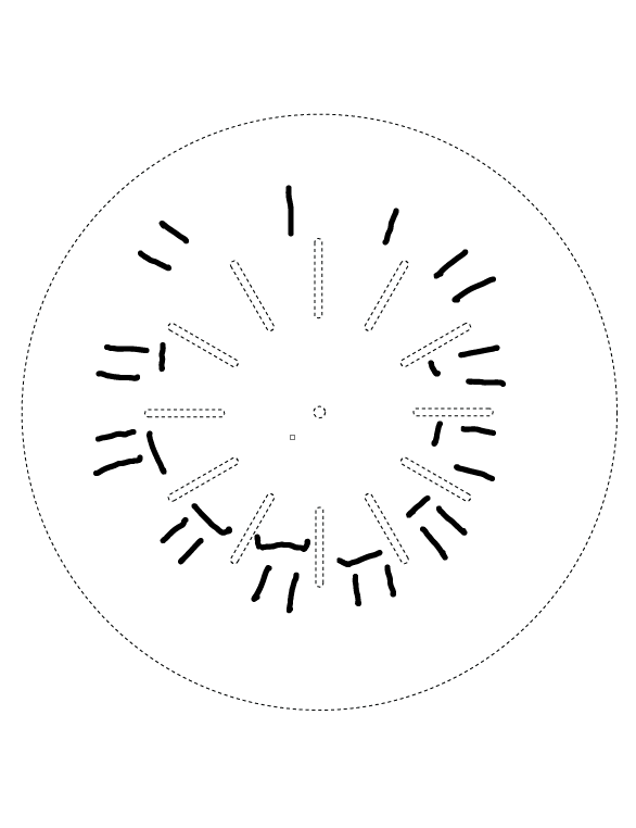
phenakistoscope-Interactive Web Animation
Phenakistoscope for Interactive Web Animation
Game Design JackBox TV games-Split the Room
Split the Room is in a room that has a line down the center. This room shows us how many people end up on each side. The more split the room is on the prompt the more points the player gets. Whenever the game is starting a cat guy starts talking and tells us how to play the game. The cat also shows us an example of the game and what would happen. It is really interesting seeing what answers people choose with the given prompts. The last few questions are then doors which have a generated answer to the prompt or our own answers. We are then given a player and have to guess what they would answer. The game is pretty fun and it’s cool seeing what people come up with for answers to the prompts. I would play it again.
Allee Thompson-Review 4(last review)ITWD
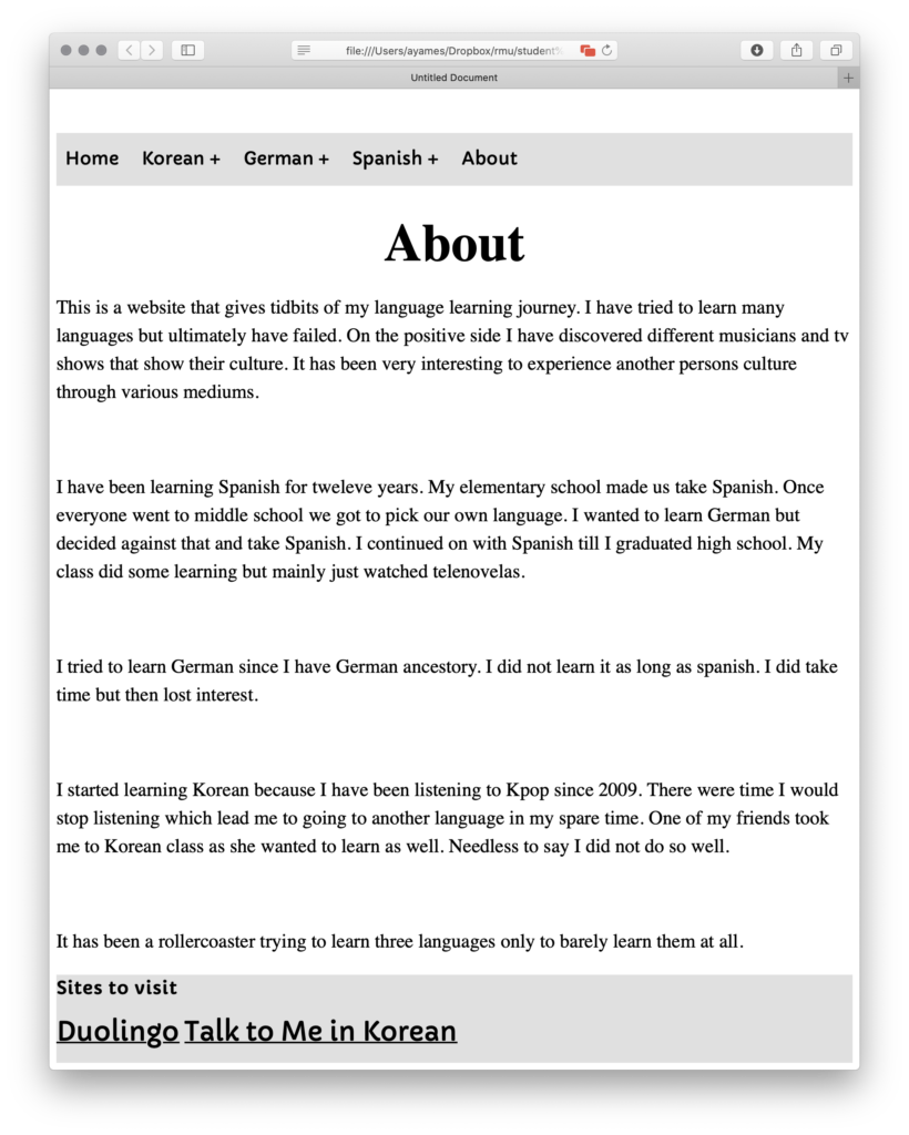
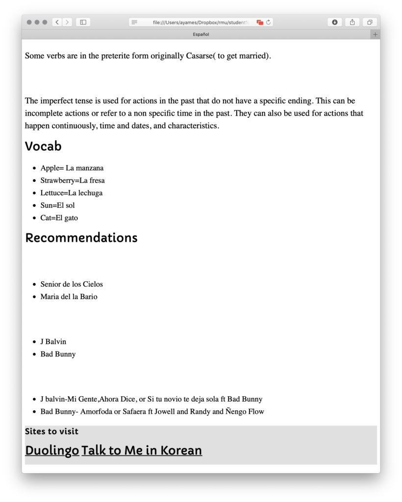
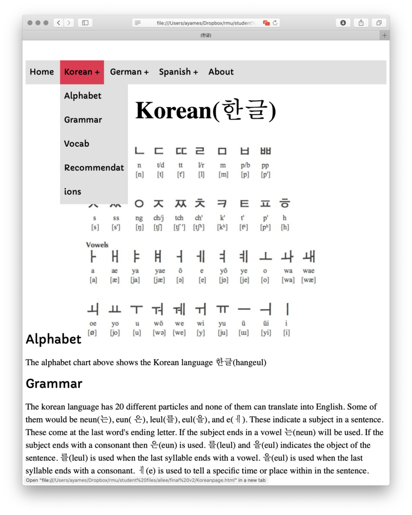
I am going to be comparing two different artists portfolio’s since I do not have one. http://blublu.org/sito/blog/ The artist that goes by Blu is a street artist. The portfolio site is very interesting. It is done in a way that all the work is put into a journal/sketchbook. I find that very interesting. Although that is really cool navigation it can be easy to miss. The messy font seems to work with this but I can be a bit hard to read. Maybe there could be a bit more clean and readable. The second artist “Space Invader” http://www.space-invaders.com/projects/ . is also a street artist as well. His site has a cleaner and more recognizable navigation. He also has a very interesting interactive world map. It is very interesting that he keeps with an invasion theme and mission rather than a regular portfolio. The page even allows a translation preference. Overall I like the second site over the first site because it is more clean , easy to navigate through and that I can clearly read what is being said on the website. With that said I do enjoy the minimalism of the first site and its uniqueness in style to a regular portfolio.
Allee: Intro to Web Final
One page site-Intro to Web Design-> Allee Thompson
The color is limited to six pastel colors. It is flat in illustration but done very well. There is a button to download the site and a video to play. They just scroll down to navigate. They scroll down by using their computer mouse, trackpad or sidebar. The drawings are very simple and it is not too complicated or distracting to look at. The text is big and easy to read. The site is done well as it is easy to navigate and get information. It is not too distracting or hard to read. The site has nice simplistic drawings. The flow is well and it scrolls down without any trouble.
Objectified- Allee Thompson
- Do you agree or disagree with any of the designers’ statements, why?
I agree with what the German designers says. I agree because designers and producers need to think clearly about how a product is being created and manufactured. Not just producing something in mass just to put something out. I also agree with his “good design is…” statements.
- Has anything the designers said changed how you thought about design?
I thought that design had to be something very visually stunning all the time. There have been products that never fully change after each update. Those updates and changes are subtle but they try to be better than before. Now a design just has to be functional and visually appealing.
- Each designer interviewed for “Objectified” defined how they see Design, how would you define design and how has that definition changed?
I would define design by saying that design is a process that includes drawing a future product, testing the design, revising the design, and then finally finalizing the design and producing. It has changed because I always thought that design was something visual and artistic rather than a process.
Thoughts on Interaction Design 1&2- Allee Thompson
- What makes up interaction design and what are some of the industry’s challenges?
Interaction design is made up from a designer, technology, and communication between a consumer and designer. Some industry challenges would be tight budgets and lack of creative freedom from companies.
- What is interaction design, how its evolving. What fields does it draw knowledge from?
Interaction design is the creation of communication between a person and a product or system. It changes as the communication changes. It changes when consumer and clientele needs change. It draws from cognitive psychology.
Chapter 6 Response -Allee Thompson
Cultural norms seems to factor into the creation of products. Products are created and produced for the society they live in. That may not end so well because it can sacrifice the real need for functionality of a device. Even though a decision may seems small it can have a big impact on public and the device in the future. It was very interesting to see all the different things people have created within this chapter like One Laptop Per Child.
Thoughts on Interaction Design: chapters 3,4,5 Questions- Allee Thompson
What information can ethnographic tools give you to improve the interactivity of an online banking website?
It can provide insight to see if the website is easy to use and the common issues among the users when using the website. Also how the users navigate through the website and what they commonly gravitate towards on the site.
At what point is a design finished? What makes it a success? What is its purpose?
The design is finished when it satisfied the clients needs or when a deadline is approaching. A design is also finished when it is put into production to be created and mass produced. The purpose is to create something for people to use. A finished design is able to be manufactured and then it becomes useful in everyday life depending on what the item is.
Identify a product family you use regularly (can be anything from technology to consumables except for coffee). How has its branding affect your use, relationship and experience with the product?
A product family I would use regularly would be Apple products but more specifically the Ipod generations. The way a brand presents itself can really affect if someone buys it or not. I got it just because it worked well and of course for the name. Everyone has an Apple product which means I should have one to if everyone else has it. There must be something so great about this product that everyone has it. I have become more dependent on it for entertainment rather than just music. Since I can get access to so many apps now I use those rather than just regular ITunes. I still use ITunes but only when I do not have an internet connection. My experience so far has been good. Since Apple has a good reputation with its products I expect something great and reliable.

