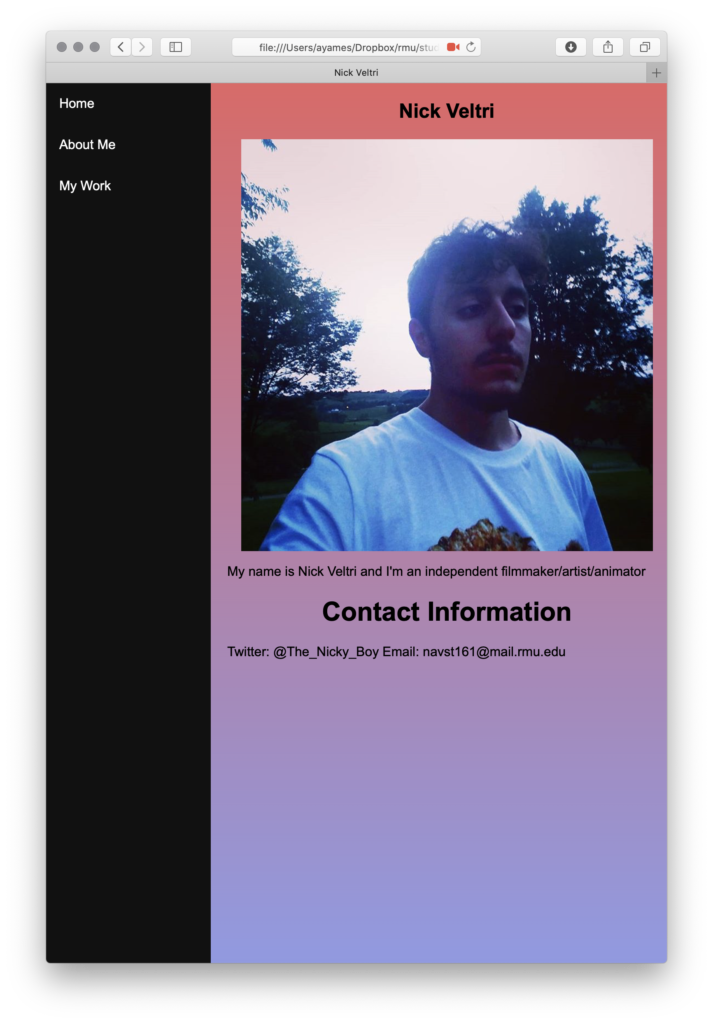
Your website has very good contrast. The black bar against the gradient background works well together and is very visually appealing. I would play with font more and change the sizes of your headers vs your body text, or make them distinctive in some other way. I would also maybe make the images smaller, to incorporate more images into the viewer’s current vision.
Thank you Harrison, I appreciate your feedback! Your suggestions are good, I’m gonna take all of them into consideration when I update this.
I really like the colors you chose for your website. Your style is shown throughout and I think it is important that you added your contact information for the viewers. Some things to think about is making your name a bit bigger so it stands out more. Another thing I would keep in mind is looking at different typefaces that you could use on the website. Overall, it looks nice!
Thanks Rylie, I’m glad you pointed out my style, as that’s what I really wanted to implement! Yeah I should definitely try different fonts as well, admittedly I regret not doing that right now.
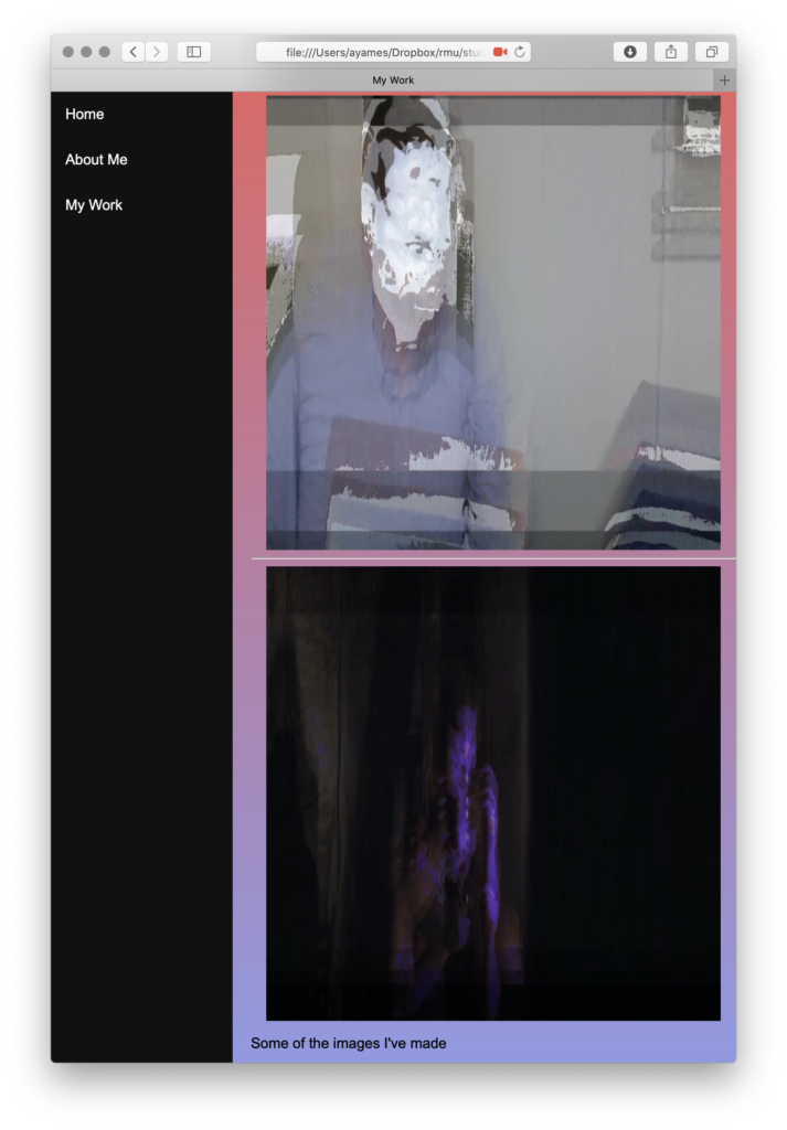
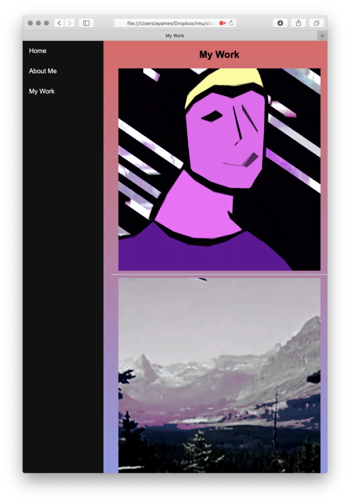
I never thought about doing a gradient for this project. I think that is really cool and different. Maybe the about me page could go into a bit more depth. Also where it says “some of the images I’ve made” could be a bit bigger and on the page where the images are. I cannot tell if the two images are the ones you have made or the bottom two. I would assume all four but the way that text is mashed in between could be changed.
Thank you Allee! I really wanted to do a gradient on this. I also agree, I should have went more in-depth on the about me section.
I like the use of color on your site and the sidebar navigation. Your work is easy to see and at a good size. If anything I would include some more information about yourself. Compared to the page with your work the about page and homepage seem kind of bare.


Your website has very good contrast. The black bar against the gradient background works well together and is very visually appealing. I would play with font more and change the sizes of your headers vs your body text, or make them distinctive in some other way. I would also maybe make the images smaller, to incorporate more images into the viewer’s current vision.
Thank you Harrison, I appreciate your feedback! Your suggestions are good, I’m gonna take all of them into consideration when I update this.
I really like the colors you chose for your website. Your style is shown throughout and I think it is important that you added your contact information for the viewers. Some things to think about is making your name a bit bigger so it stands out more. Another thing I would keep in mind is looking at different typefaces that you could use on the website. Overall, it looks nice!
Thanks Rylie, I’m glad you pointed out my style, as that’s what I really wanted to implement! Yeah I should definitely try different fonts as well, admittedly I regret not doing that right now.
I never thought about doing a gradient for this project. I think that is really cool and different. Maybe the about me page could go into a bit more depth. Also where it says “some of the images I’ve made” could be a bit bigger and on the page where the images are. I cannot tell if the two images are the ones you have made or the bottom two. I would assume all four but the way that text is mashed in between could be changed.
Thank you Allee! I really wanted to do a gradient on this. I also agree, I should have went more in-depth on the about me section.
I like the use of color on your site and the sidebar navigation. Your work is easy to see and at a good size. If anything I would include some more information about yourself. Compared to the page with your work the about page and homepage seem kind of bare.