Setup
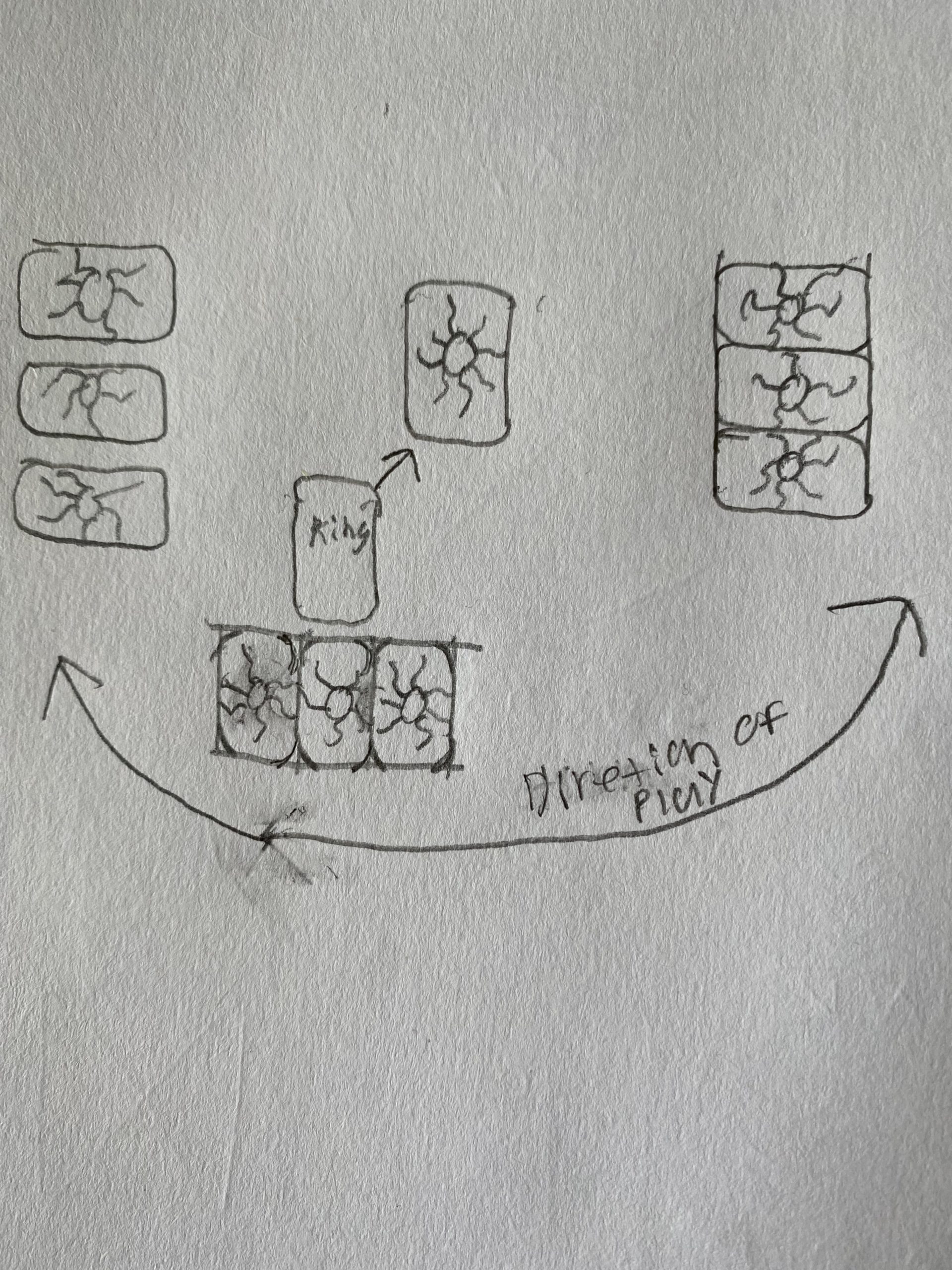
Take out the game board and place it on the table. Shuffle the CHANCE cards and place in the middle of the board. Players choose a grandmother character card, and place the corresponding piece on the start square. Each grandmother has an effect listed on her card. Marsha’s effect happens at the beginning of the game. Everyone else’s effects will happen as they become relevant (the specific card is drawn). The oldest player goes first.
Objective
The goal of this game is to beat the other grandmothers and collect the most yarn before the sale at the craft store closes.
Actions Players Take
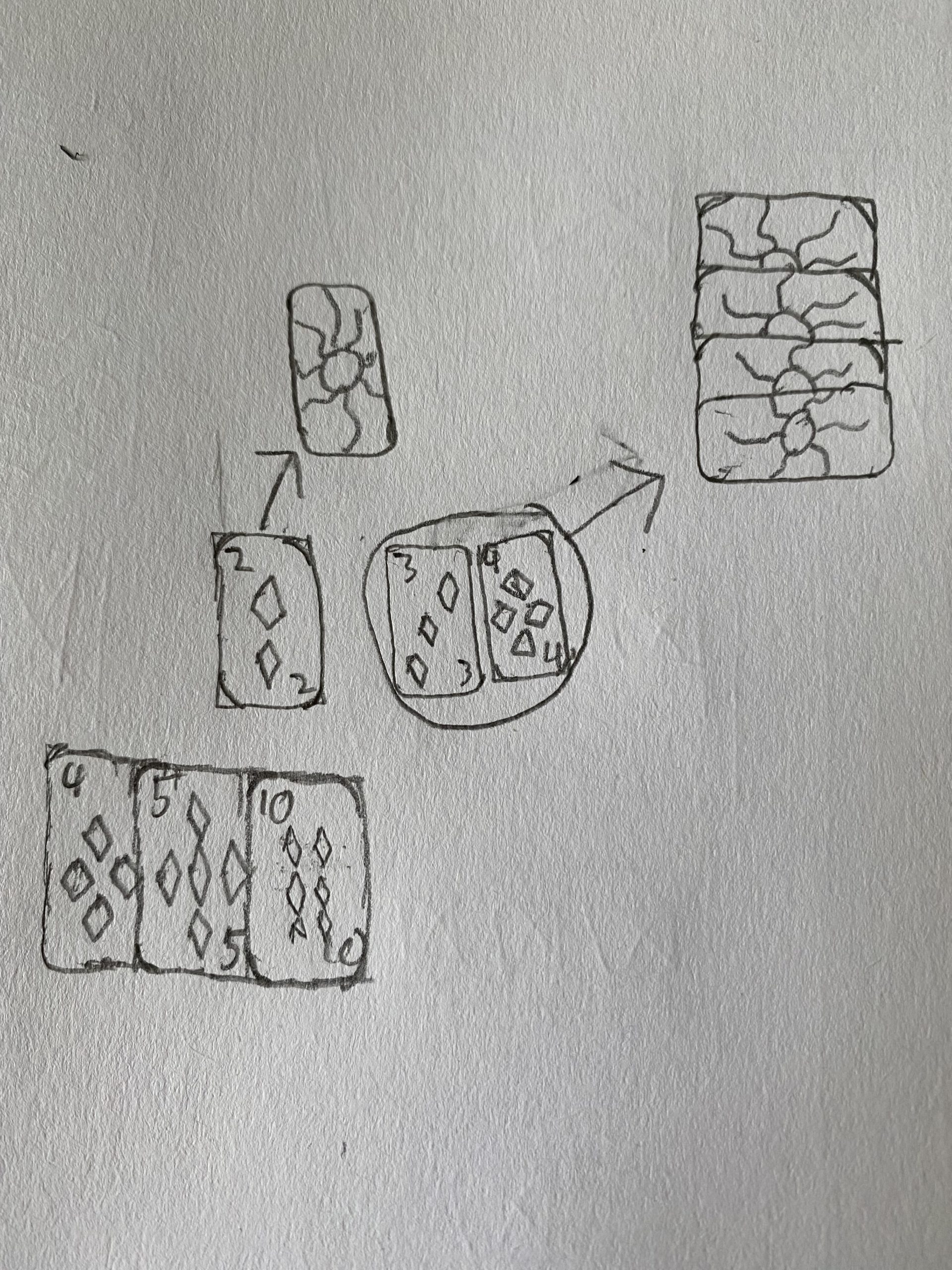
At the start of their turn, the player will roll a die and move that number of spaces. Spaces include yarn, chance, and blank spaces. If players land on a yarn space, they get a skein of yarn. If players land on a chance space, they pick up a chance card and do what it says. If the player lands on a blank space, they do nothing.
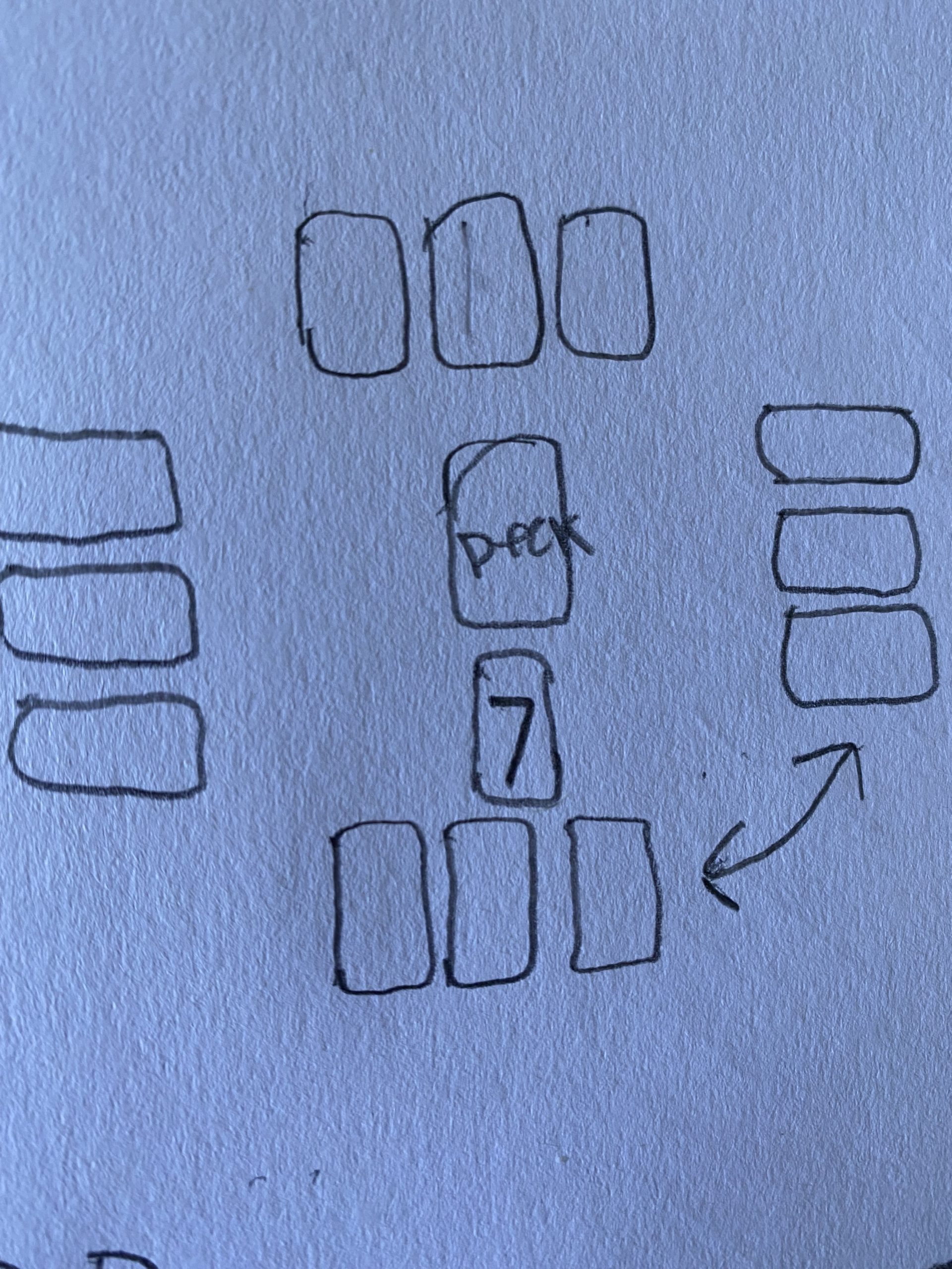
Chance Cards
+/- yarn cards: the yarn comes from and goes back to the craft store, unless otherwise noted
Grandkids: each grandmother has one visit from their grandkids. Whoever’s grandkids are visiting, they get +1 yarn. If you pull a grandkids card that does not have your grandmother name on it, you must give one yarn from your stash to that grandmother. If no one is playing that grandmother, you do not have to do anything.
Neighborhood Swap: you get a lovely pot roast (this does not affect the game, but it’s tasty) and you choose one of the other grandmothers to get 1 yarn
Canasta/Bingo: The grandmothers listed on that card receive 1 yarn. If you are not a grandmother listed on that card, you do not get any yarn
Estate Sale: Give 1 yarn to every other player from your own stash. If you do not have enough yarn for the amount of people playing, give 1 yarn to each person starting on your left and going clockwise until you run out of yarn.
Retirement: Receive 1 yarn from every other player. If a player does not have any yarn, then you do not get yarn from them (pretty simple)
Ending the Game
The craft store will kick you out when you have gone around the board 3 times. When you have gone around 3 times, you are done and must remove your piece from the board. Once you are off the board, your stash of yarn remains constant, and is not affected by any of the chance cards.
The grandmother with the most yarn in her stash wins.
Granny Squares Rules v.2
Setup
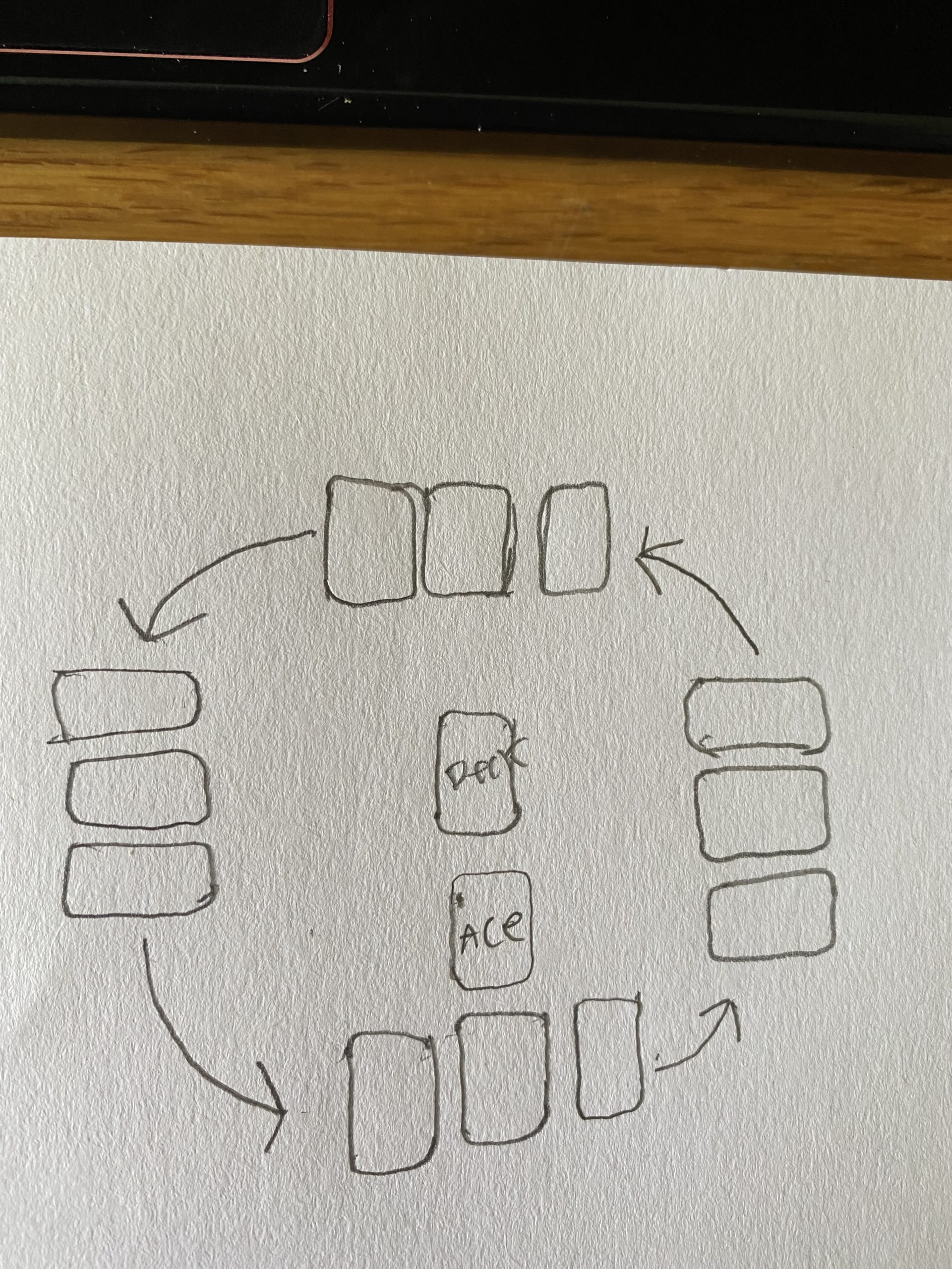
Take out the game board and place it on the table. Shuffle the CHANCE cards and place in the middle of the board. Players choose a grandmother character card and place the corresponding piece on the start square. Everyone starts with 3 yarn.
Each grandmother has an effect listed on her card. Marsha’s effect happens at the beginning of the game. Everyone else’s effects will happen as they become relevant (the specific card is drawn). Each time you go around the board, you will get one round token. The oldest player goes first.
Objective
The goal of this game is to beat the other grandmothers and collect the most yarn before the sale at the craft store closes.
Actions Players Take
At the start of their turn, the player will roll a die and move that number of spaces.
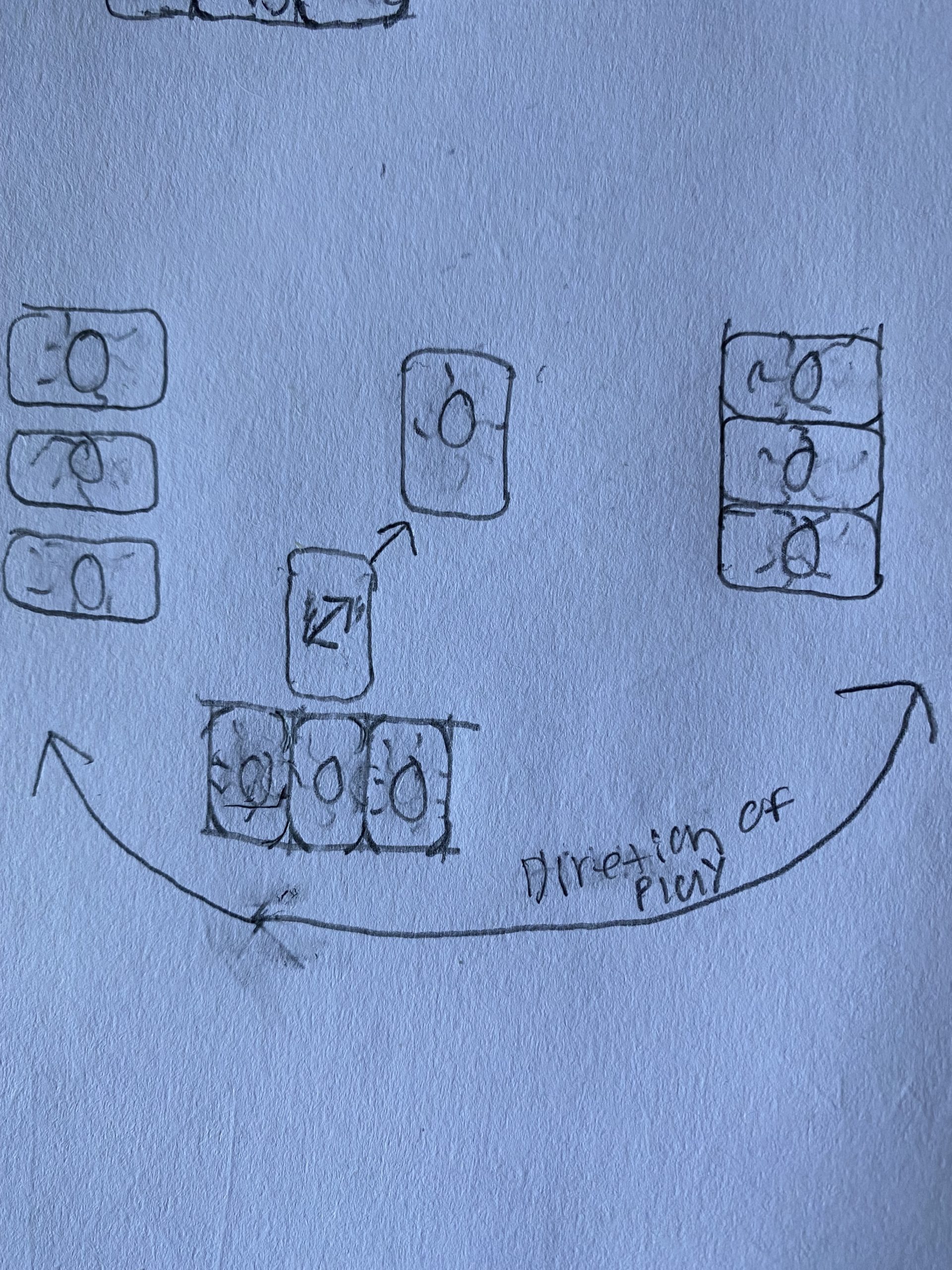
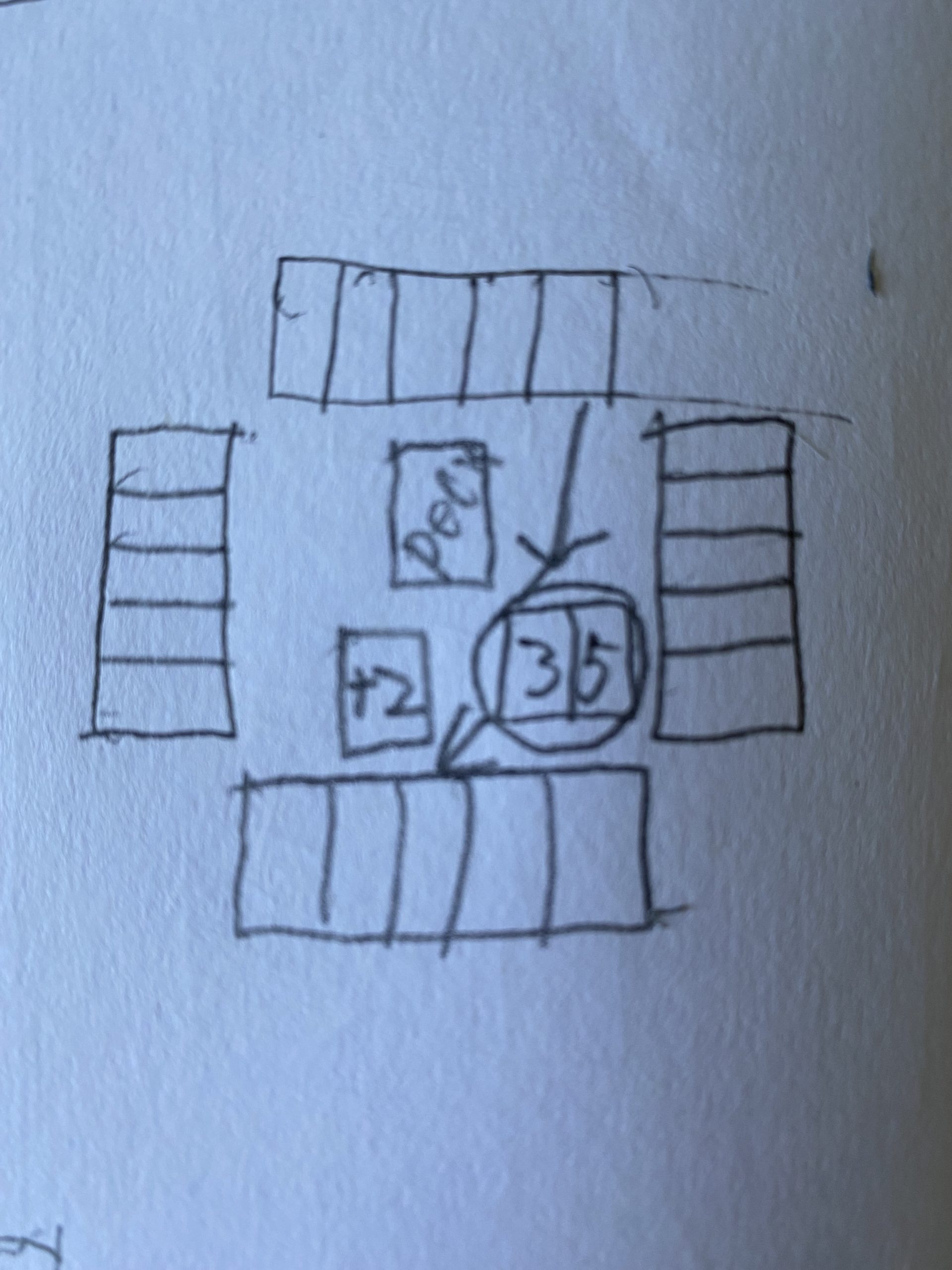
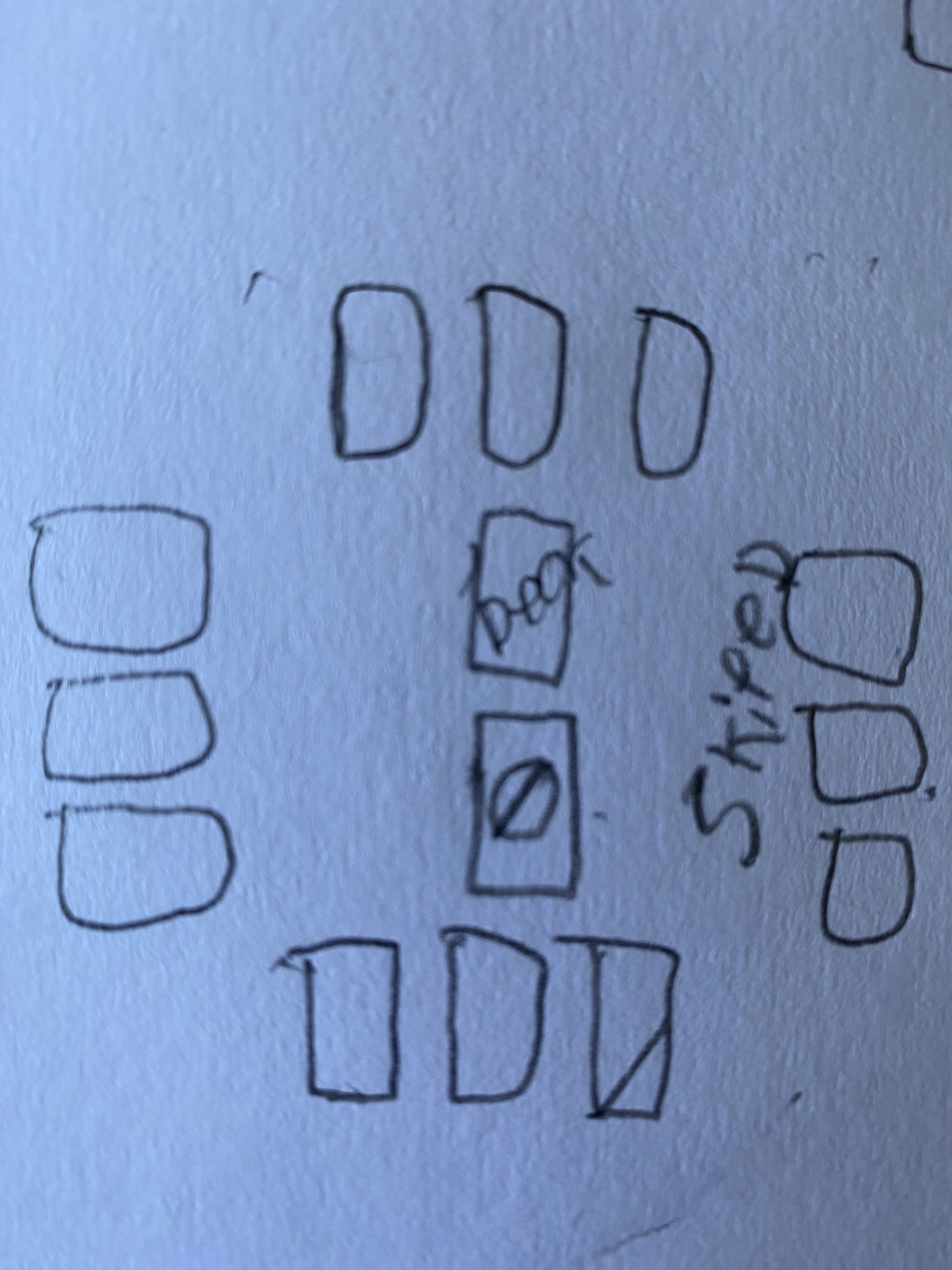
Spaces
Start: Where players start. Collect 1 yarn each time you go around the board and pass or land on this space. Do not collect yarn at the start of the game.
Chance: pull a chance card
+ Yarn: If you land on a colored yarn space that matches your grandmother color, you get +2 yarn. Otherwise, you get +1 yarn.
– Yarn: Lose 1 yarn. It goes back to the craft store.
Mobility Aids: Advance forward 2 spaces to Chance and pull a chance card.
Advance to Start: Move your character piece to the start space. Collect 1 yarn and 1 round token.
Blank: nothing happens on these spaces.
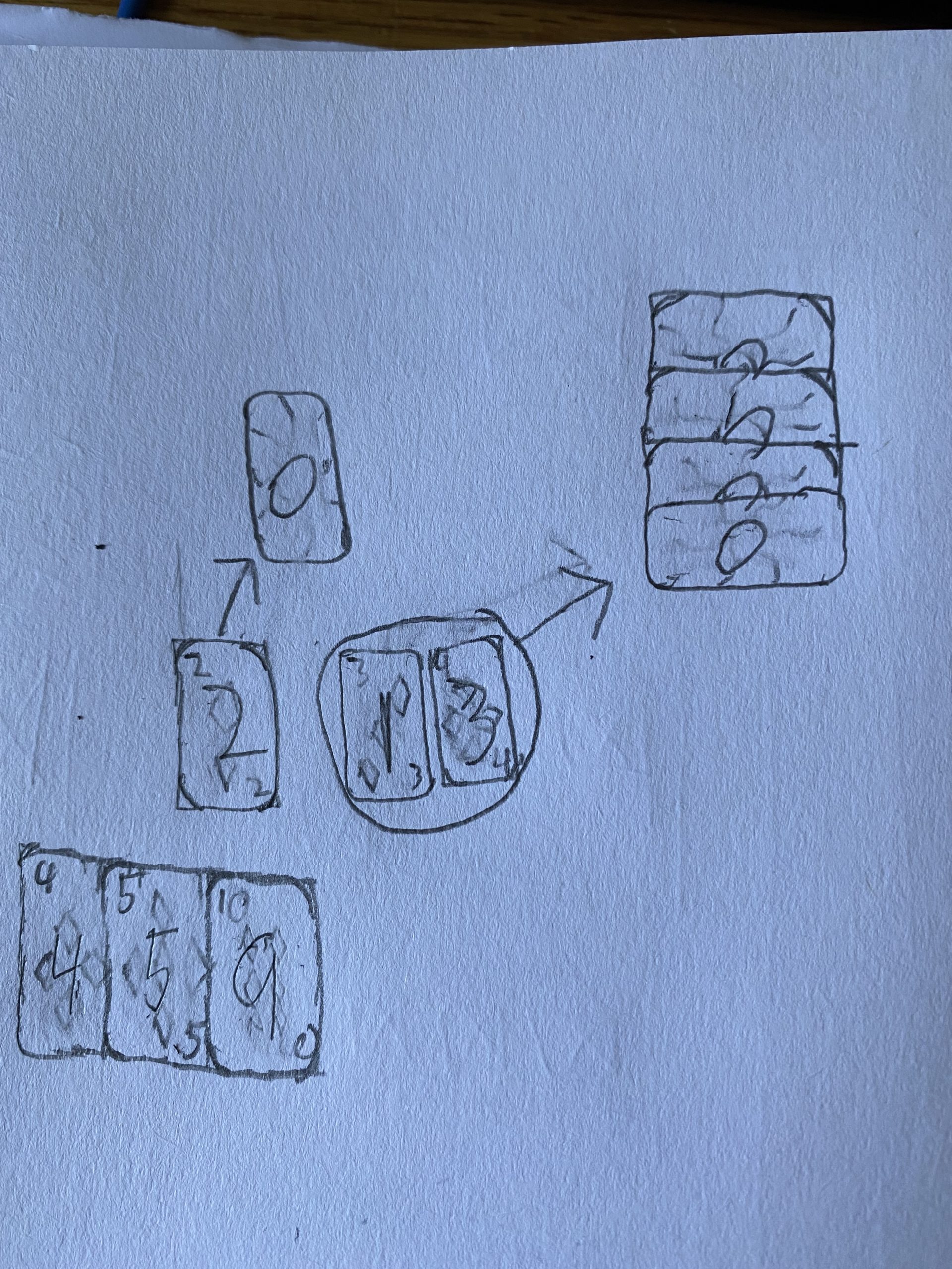
Chance Cards
+/- Yarn: the yarn comes from and goes back to the craft store, unless otherwise noted
Grandkids: each grandmother has one visit from their grandkids. Whoever’s grandkids are visiting, they get +1 yarn. If you pull a grandkids card that does not have your grandmother name on it, you must give one yarn from your stash to that grandmother. If no one is playing that grandmother, you do not have to do anything.
Neighborhood Swap: you get a lovely pot roast (this does not affect the game, but it’s tasty) and you give 1 yarn to the first member of the opposite granny gang sitting to your left. Dawn does not lose any yarn, but she can still gain yarn.
Canasta/Bingo: The grandmothers listed on that card receive 1 yarn. If you are not a grandmother listed on that card, you do not get any yarn
Bingo Hall Brawl: Each member of the Canasta Cadre must give 1 yarn to a member of the Bingo Brigade. Carol gives to Marsha, Ethyl gives to Heidi, Rosemary gives to Dawn. If a granny is not in play, disregard this card.
Canasta Combat: Each member of the Bingo Brigade must give 1 yarn to a member of the Canasta Cadre. Marsha gives to Carol, Heidi gives to Ethyl, Dawn gives to Rosemary. If a granny is not in play, disregard this card.
Steal: Take 1 yarn from a member of the opposite granny gang
Estate Sale: Give 1 yarn to every other player from your own stash. If you do not have enough yarn for the amount of people playing, give 1 yarn to each person starting on your left and going clockwise until you run out of yarn.
Retirement: Receive 1 yarn from every other player. If a player does not have any yarn, then you do not get yarn from them (pretty simple)
Ending the Game
The craft store will kick everyone out as soon as one person has gone around the board 3 times or collected 3 round tokens. The person who does this will earn 1 yarn for each member of her granny gang.
The grandmother with the most yarn in her stash wins.