There will be a file attached here as soon as I can get it to upload to my Google drive…….
https://drive.google.com/file/d/1Cqn06gLa3M5ABrJXq3nrojqCdoNInyAm/view?usp=sharing (I realized the video was 2GB)
The following is the script that I wrote for this presentation. I hit most if not all of the points when filming the video, but in the event that a more in depth look at my thought process is desired, it is pasted below.
Escape From Tarkov, often abbreviated EFT for the purposes of simplicity, is a tactical First Person Shooter set in the fictional sealed off Russian city of Tarkov. It was created around 2014, though open alpha access was not available until 2016, by Nikita Buyanov and has seen semi consistent updates since. In the story, Tarkov was cut off from the rest of the world and largely left to fall into chaos after an event known as the Contract Wars.
The Contract Wars can be blamed on a conglomeration of different companies called Terragroup that had its base in Tarkov. Terragroup was conducting illegal scientific experimentation and had largely mobilized its own military to enforce their will in the region.
You Play as a member of one of the two private military factions who fought in the Contract Wars, trapped within the city after the United Nations set up a perimeter. These factions are:
USEC- United Security, is a private military company formed from the merger of two others and used as a corporate military force by Terragroup.
USECs were deployed to protect sensitive information regarding Terragroup’s illegal operations in the region, as well as establish Terragroup as the De Facto ruling faction of the city, all without raising the alarm.
BEAR- Battle Encounter Assault Regiment, is a private military company established in secrecy by the Russian government to find evidence of Terragroup’s illegal activity.
BEARs were deployed directly into Tarkov and the surrounding region to assault Terragroup’s USEC forces and retrieve any and all digital, physical, or other forms of data pertaining to their activities. Unfortunately, the assault was not as successful as hoped, and the two factions began effectively a state-corporate war in the Tarkov region.
Because of the rapidly increasing level of violence and the steadily increasing geographical scope of the conflict, the United Nations deployed a peacekeeping force to Evacuate the city of civilians and seal it off from the remainder of the world. During this operation, UN peacekeeping forces assisted by the Russian Federation Govt. quickly swept the city and managed to create an impenetrable blockade around it, all while also eliminating a large part of the remaining warring factions and evacuating a large number of civilians.
This is where you enter the story. Whichever faction you chose, you are one of the lucky ones, or so they tell you, who didn’t fall when the UN had their way with the streets. You have your issued gear, and have established a small hideaway on the outskirts of town after being separated from your friends.
Your goal is now simply to escape the city of Tarkov, but it is a hostile place, and you are not the only one lurking between empty rusting cars. Scavengers, or Scavs, largely comprised of the homeless population, those who stayed to defend their homes, criminals, or those who simply wanted to watch chaos unfold, wander the streets. They are often drunk and are incredibly violent, having picked up scavenged weapons from the casualties left by the Contract Wars.
Other PMCs remain alive as well, and these characters are the most dangerous of all, as they are also players that could have any motivation you could dream of to leave you alone or take what they think they deserve. To overcome these odds, you will have to work with what remains of civilization within the walls of Tarkov, and venture into the dark truths about Terragroup’s research.
Gameplay:
There is one main facet of gameplay. A Raid.
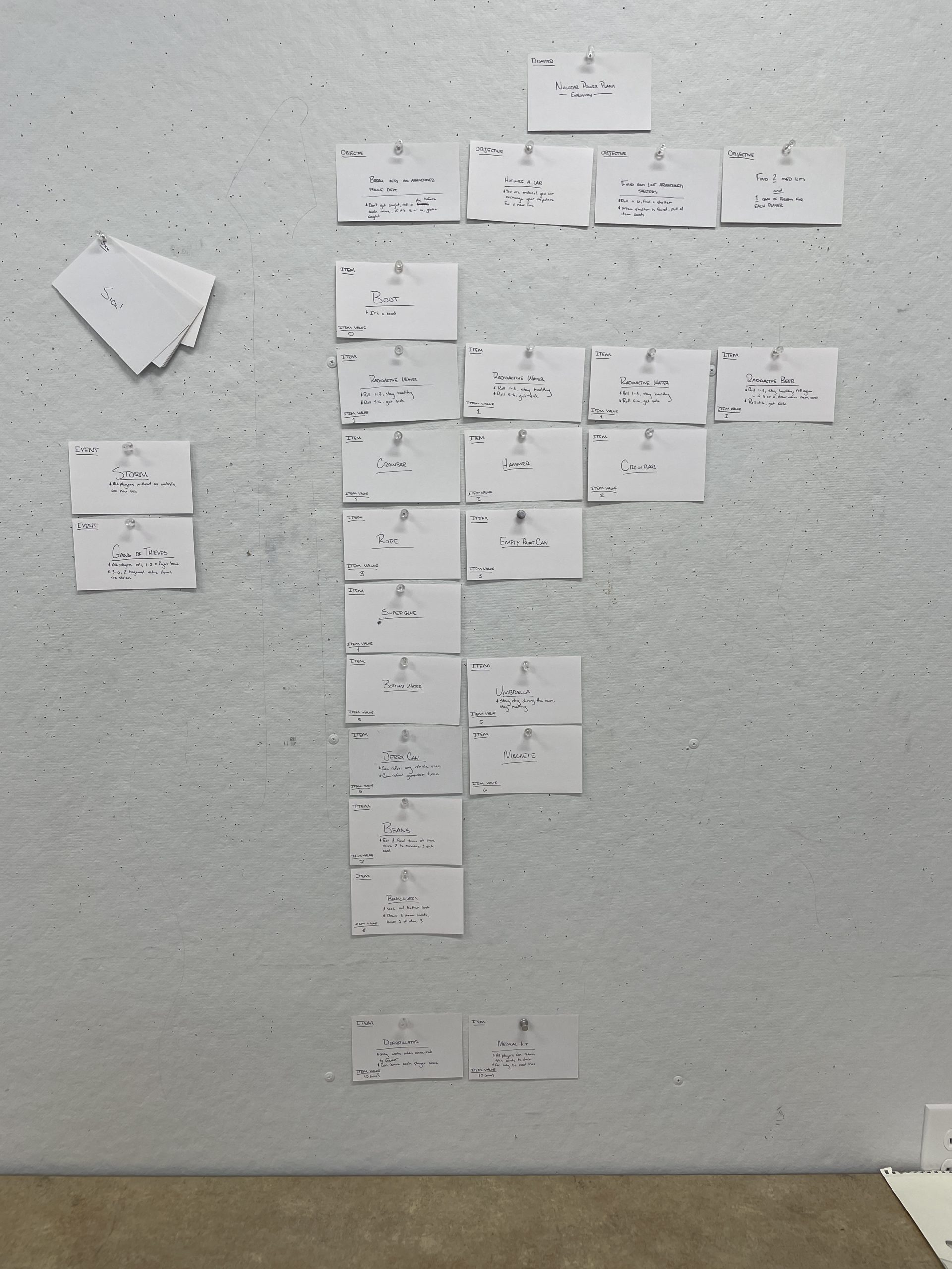
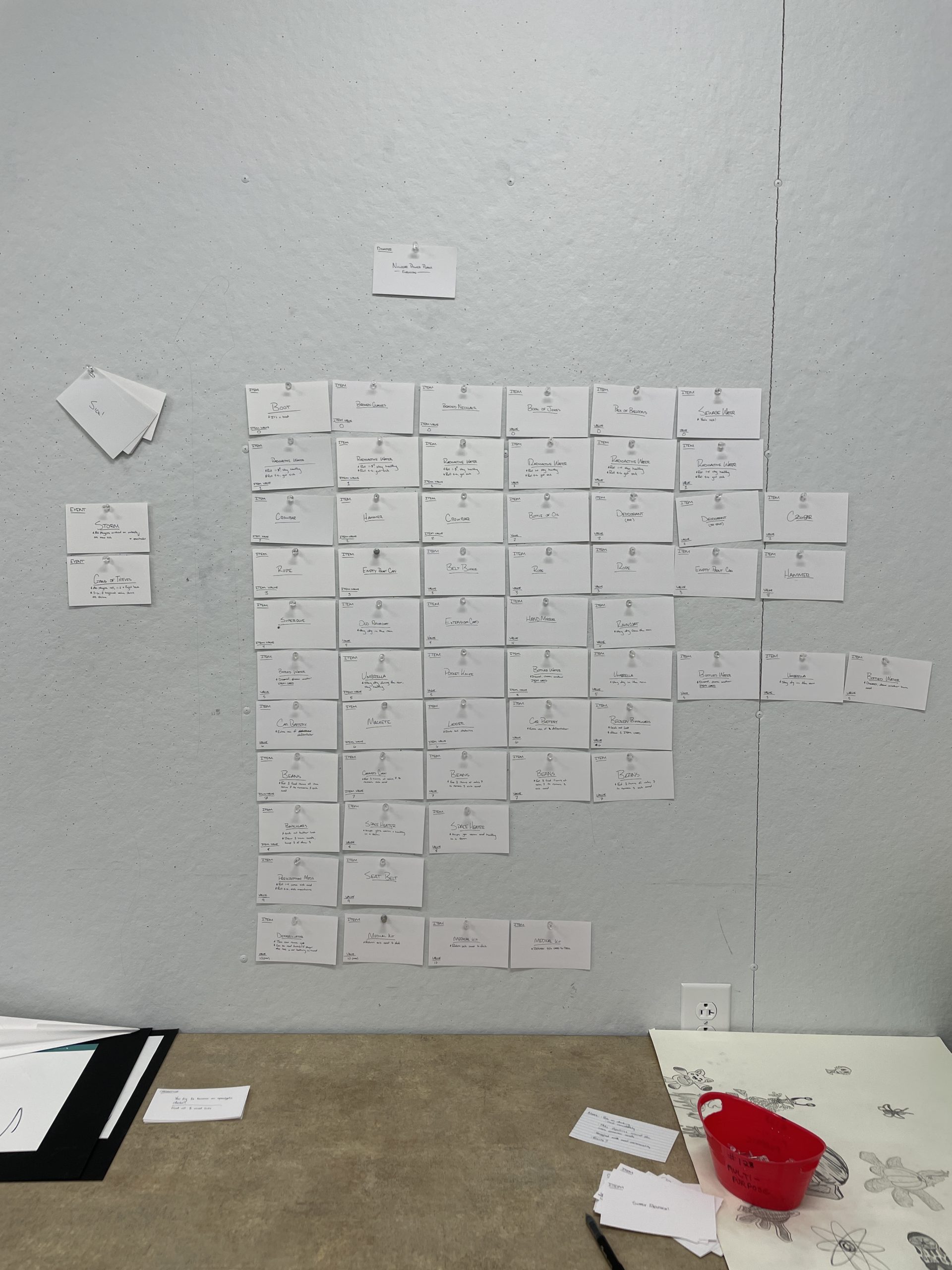
A raid is a time limited open world environment set somewhere in Tarkov. You succeed by passing successfully from the insertion point to the extraction point and doing whatever it is you wish to do along the way. If you run the clock down, Russian Regulars storm the map to quell th fighting, and your character goes missing in action. If you die in a raid, you are sent back to the main menu. The penalty for both of these outcomes is the loss of all the gear on your character’s person. Potentially Permanently, but we’ll get to that. Raid goals can vary depending on player level, faction, and location. A common goal may be to kill 4 Scavs or find three screwdrivers, which leads to one of the core tenets of EFT that makes it such a compelling game compared to many others out there.
The mantra of EFT’s development has always been, “As realistic as playable.” Equipment has weight, your character has weight. You need to bring ammo. You need to bring food. You need medicine. Do you know where you are? Is your gun brand new or do you need to worry about a jam? What’s around that corner? WHO is around that corner?
Each map in Tarkov is designed to instill these kinds of anxieties and practices into the players organically, as they learn over time, whether through success or failure, that there are certain things they need to do before they ever enter the Factory or the Woods maps. Inventory management is manual. You need to restock your ammo and fix your equipment between raids. Your character can get hurt, and if you don’t heal a broken leg, it’s liable to make you an easy target for a scav looking for a quick buck. Even so, if you don’t know your own way around, it may not matter if you aren’t hurt.
This realism carries over to combat, to a large degree. Characters can lean, jump, sprint vary their stance height or crouch altogether, prone out, vary walking speed to sneak, and even blindly fire over cover and corners. The guns are all 3d quixel megascans of real firearms, and as a result can be modified piece by piece. Wearing a heavy plate vest may stop a round, but it will slow your character down depending on the weight. Bullets are bullets, not a hitscan check. The game actually fires a bullet from the barrel of the weapons with each click of the mouse, and trajectory as well as drop is calculated in real time not only based on distance but also weather conditions and wind of the current environment. On top of this, they have a set mass and ability to penetrate certain types of cover. Wooden doors and drywall are not a great bullet stop, as it turns out. This creates an incredibly dynamic and rich system of combat where no two encounters are ever the same. This is only compounded when it is additionally considered that Nikita and the other developers for EFT design goals and missions on each map, as well as the flow of the very map itself, to drive players into each other.
Why fight? Remember how if you die, you get booted back to the menu? That gear remains in the live raid, on your character’s body. It can be taken from your corpse by any other player that happens to stumble upon it. Certain local gang leaders and traders offer insurance on your gear, but that only gets it back to you after a hefty wait and only if nobody took it. While in a raid, you can loot items in the environment as well, and these are often needed to help you to progress. With this, we have the stakes, and the driving force behind EFT.
You can even play as a scav and show up to an in progress raid if you run out of gear in your hideout. Scavs spawn with a random loadout.