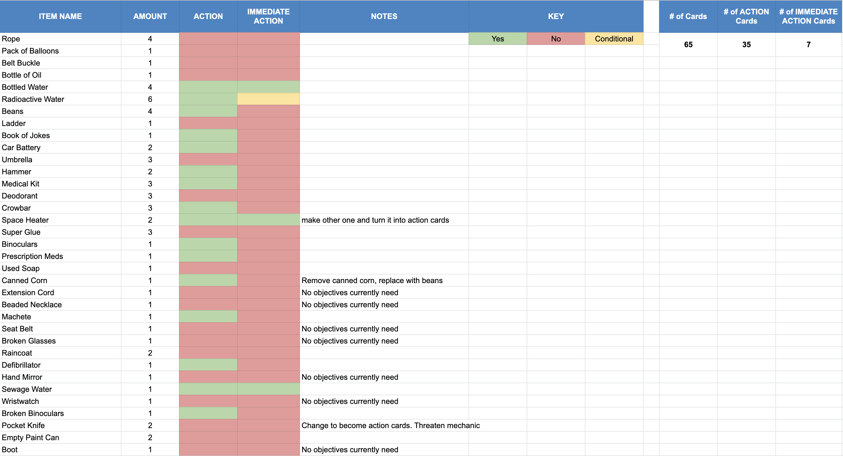
Fluxx
I enjoyed playing Fluxx, but only after I started to learn how to play. I like the idea of matching cards and that it has an equal balance of random and strategy. I enjoyed having the new rule cards show up but it does make the game feel pretty cluttered when it really gets going; especially with 6 people playing. That feeling of clutter makes me want to play the game less/want the game to end as soon as possible so it can go back to normal. It did certainly provide me with a lot of inspiration for my game
Love Letter
I immediately enjoyed the storyline of Love Letter but I think the mechanics were a bit clunky for me to understand. It didn’t make a ton of sense to me that each player was a suitor, but had cards with different characters on them. It created a disconnect that was maybe only mostly apparent to me. However, once I learned how it worked, I did begin to enjoy playing. I’m just not sure it would be something I would come back to again.
Munchkin Gloom
This was the first of the games that I was not able to play due to 2 close exposures to covid, so from here on most of my thoughts will come from the perspective of game reviews I watched in place of playing the games.
I really like the transparent cards with the ability to place others on top of each other and the idea story-wise that happiness is bad and gloom is good. It also seems that a lot of the actions are very direct and player-focused. It also seems to poke fun at popular video games and Dungeons and Dragons. I love games that have player-to-player interactions that can cause fun conflict in the room, and Gloom Munchkin certainly does that. If I had the chance to play it I think I would enjoy it.
Munchkin
Munchkin seems to be a relatively simple game with dungeoning and treasure-gathering. The class and race system is really interesting too, being able to be any combination of class and race. In terms of the combat, It’s seems it’s similar to Dungeons and Dragons in the sense that when a monster appears, you fight it. Additionally, your combined levels must be the same or higher in order to fight/defeat the creatures, and it even incorporates bonus for different abilities. I really like that if you don’t meet the combined level of the monster that you can run away if you roll a 5-6, but if you land on anything other than 5-6, you have “bad stuff” happen to you. I wasn’t able to play this game this semester but I was able to play in 4D studio a couple of semesters ago and I enjoyed it!
Bang!
I think the character and role cards not being attached is a fun way of keeping the story of the game fresh as there are many different combinations and can change the storyline for players. It’s also cool that it’s a team-based game based around eliminating other players as opposed to points or score that determine who wins. I also always like games that are designed to start mini conflicts between the players. Bang does this by making it a mystery what team each player is on. I also think it’s really cool that you can get into duels with other players.
Pandemic
Pandemic is another one of the games that I wasn’t able to play but I did watch a few videos on. I think that a face value, the game can come off a tad overwhelming, at least for me as someone who isn’t incredibly well-versed or experienced with board games. It does seem to simplify itself just a bit more as the rules become more apparent. The role cards are also interesting, giving players an added ability each unique to themselves which provides players with a sense of purpose. I also like that the different regions on the map all foster the growth of different kinds of diseases specific to the region. It’s also cool that you can move around the map, essentially controlling the spread of disease through your presence there as a researcher/doctor or whatever. I also have to give an honorable mention to the infection rate mechanic, which allows players to choose the difficulty level of the game.
Tokaido
I wasn’t able to play Tokaido. but based on the reviews that I watched, I think the first mechanic that caught my interest was how the players move around the board. Players can move as far forward as they want and get ahead of the others, but they can only move forward once they are the farthest back in the group. I have to say though, I don’t think that I would really enjoy playing this game, despite the beautiful presentation, because of the currency system. I have never really enjoyed using currency to trade or purchase items in card games. I’m not sure if there is a reason behind it, but it just doesn’t always make a ton of sense to me if it’s not done in a specific way.
8 Minute Empire
I like the idea of the game being completed in 8 minutes. I find that when I am playing board games, it’s usually to quickly pass time when my friends and I are bored or waiting for something. 8 mins is the perfect amount of time for a fast game to to take place. It’s interesting that you basically start the game with everything you’ll ever need; i.e. 8 money, 3 cities, and a bunch of armies. It’s nice that once the money is spent, the money goes into the bank, which also means it doesn’t return back into the game. The territorial control of moving armies around an establishing cities almost as spawn points is also a cool mechanic. It seems like based on the videos that I have watched, there isn’t much player to player interaction which is kind of unfortunate so I would at least try to play this game if given the opportunity, but it may get boring for me after a while.
Hanabi
I really like the idea of Hanabi, trying to set off fireworks. The first thing that’s jarring is that you actually hold your cards backwards instead of directed towards yourself. So everyone can see your cards except for you. I have to say though, despite Hanabi being a seemingly simple and small game, I don’t really enjoy games with point values and a goal to reach a certain amount of points. I would prefer if players were trying to get a certain object or amount of objects, whatever it may be. Not too much to say about it.
Carcassonne
To start, I really like the idea of building the map together as a group, even though the goal is to take as much control of as much land as possible. I’m not a fan of the fact that they add up to points at the end, but that’s just the way it is. I think Carcassonne has a great of making players interact with one another by restricting the placement of certain players’ pieces on occupied sections of the board, but players can strategize to share sections of the board if placed correctly. I also like that the scoring is done through a different board and matches the theme of the main game “board.”
Dominion
I was able to play Dominion a few weeks ago. Unfortunately, we didn’t get to finish the game but we did eventually score it at the end and declared a winner. I personally don’t like deck builder games. They just don’t really keep my attention like a game with a nicely designed board/map, whatever it may be. This also ties into my small but general distaste for card games with currency. Being able to see where the money is going and it getting recycled kind of kills the magic for me. Overall, though, the game is well made and works with a small amount of players. However, if we didn’t have Ames there to help us get the hang of it, I’m not sure we would have been able to learn it very quickly.
Photosynthesis
Visually, Photosynthesis is a striking game that I can imagine would pull players in and immerse them. However, I wasn’t able to play, so I’m only speculating. At first glance in the videos I have watched, it seems very complicated with tons of different chips, pieces, currency, etc. I think there is a lot to remember, such as point value, amount of spaces a shadow is cast, point trackers, light points, etc. While the game is visually one of the best I’ve seen, it’s more or less a no-go for me.
Takenoko
I enjoyed playing Takenoko, mostly because of the story line, but after opening the rules, it got complicated. Myself, Clay, and Max all did find ourselves getting the hang of the game, but were asking a lot of questions like can we take the bases of the bamboo shoots, does irrigation apply if not connected, etc. We also didn’t really use the player cards to track what was going on, which may have contributed to our general sense of confusion for a majority of the game. We did start implementing some strategy in the later game, but that was only after a pretty slow start at the beginning.
Settlers of Catan
I personally don’t enjoy resource management games. I’ve experienced some pretty intense games that use this as a main mechanic in their games like EU4, CK2, and other video games that take politics, war, resources, etc into account. Settlers of Catan is WAY simpler than those other games that I mentioned, but it generally has a similar feel and just isn’t really up my alley.
Splendor
This is going to sound incredibly redundant but because I don’t like games that involve buying and selling cards with currency, I have to say I’m glad I didn’t play Splendor. While I’ll admit it does have a cool premise, I just am not immediately interested in points and money for physical games. The game also has a lot to remember in terms of how many gems you can pick up and what controls that number, which can get confusing. I don’t like how everything changes based on player count, meaning that every time you play, unless your group is consistent, the rules are all different. This makes it difficult to learn.
Bohnanza
I really like Bonanza! I’ve been able to play it a couple times in both Game Design and in 4D studio. The game provides a lot of player-to-player interaction with trading being one of the most important things you can do. It adds strategy to a simple game with simple mechanics and is easily learned and taught. Also, the art is really nice to look at and is just overall a lot of fun to play. I also am pretty good at it so that adds to it a bit too.