What I like: Your art is organized very clearly and the overall structure of it is nice and concise
What I’d improve: Not sure, I don’t have any huge complaints about it
Thank you! I tried to make it as to-the-point as possible.
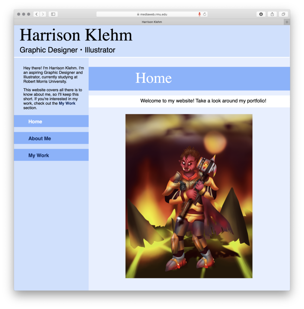
I like the structure of your site. The sidebar navigation is easy to follow and your color choices are easy on the eyes. The size of your work is good and makes it easy to see it along with some information on the pieces.
Some of the lines of text do seem to be creating tension on the right side of their containers and it can be distracting from the rest of the site.
That is a good point. I should have probably used more padding with the text to make it easier on the eyes. Thank you for the comments and criticism!
I can tell a lot of thought went into the design of your website. The colors and type look nice and you have a nice layout. The only thing that I would recommend is to put a photo of yourself on to the page that you have the animation of yourself. I think it would be nice to see them together. Looks really good!!
I don’t actually have any good photos of myself, nor am I very photogenic, so I’ve never really put images of myself up that often. Though I suppose entering the professional world that is something I have to embrace. Thank you for the comments and criticism! I’m glad that you think everything else works out.
Your art is super cool. The blues are very nice and the text is readable. Contact me spot could be made into a separate page. It is also interesting to see some text on the side that is not just “home”, “Artwork”, etc. You could also maybe show more about your Redbubble page on here. This is a nice project.
Those are some good points. Maybe I could have made a section specifically for my RedBubble projects as those are typically very different from my illustrations. Thank you for the comment!


What I like: Your art is organized very clearly and the overall structure of it is nice and concise
What I’d improve: Not sure, I don’t have any huge complaints about it
Thank you! I tried to make it as to-the-point as possible.
I like the structure of your site. The sidebar navigation is easy to follow and your color choices are easy on the eyes. The size of your work is good and makes it easy to see it along with some information on the pieces.
Some of the lines of text do seem to be creating tension on the right side of their containers and it can be distracting from the rest of the site.
That is a good point. I should have probably used more padding with the text to make it easier on the eyes. Thank you for the comments and criticism!
I can tell a lot of thought went into the design of your website. The colors and type look nice and you have a nice layout. The only thing that I would recommend is to put a photo of yourself on to the page that you have the animation of yourself. I think it would be nice to see them together. Looks really good!!
I don’t actually have any good photos of myself, nor am I very photogenic, so I’ve never really put images of myself up that often. Though I suppose entering the professional world that is something I have to embrace. Thank you for the comments and criticism! I’m glad that you think everything else works out.
Your art is super cool. The blues are very nice and the text is readable. Contact me spot could be made into a separate page. It is also interesting to see some text on the side that is not just “home”, “Artwork”, etc. You could also maybe show more about your Redbubble page on here. This is a nice project.
Those are some good points. Maybe I could have made a section specifically for my RedBubble projects as those are typically very different from my illustrations. Thank you for the comment!