Alexis Hay Review 2

I decided to take a look at Saint James Tea, https://www.saintjamesicedtea.com/?ref=onepagelove

This page caught my eye because it was pleasing to look at and there want too much going on to make it super busy. This website has a neutral background color and many images of fruit and their drinks. The natural background makes the bright colors of the fruit stand out. But also, to help this they kept the shadows of the fruits this gives a sense of depth and it doesn’t just look like a flat image of fruits and drinks.

The main background was a video that was made to look like a scrolling picture that consisted of a combination of fruits and their drinks. When you open the page, you clearly see the name, social media, where you can enter your email to get notifications, and also an option for flavors, and info. When you click on one of the two options everything stays the fixed location except for the name and the content. When clicking on info the name resizes and settles into the top left corner, and the background photo switches to the information and different pictures. There are no scroll options everything is right there in the first view. I think this makes it so easy to navigate and read, it is not overpacked and all the options are visible right away. I think that this website is done really well because of the simplicity and they didn’t try and add too much information, but also the put time to make what was on the page perfect.

Continuous-Scroll Site Review

The website that I am reviewing is titled “Windows of New York” ( http://www.windowsofnewyork.com ). This website is an infinite-scroll website that shows depictions of windows in New York City as drawings. The website shows the drawing and gives the location of the window in the city. Per each drawing, the background matches the color scheme being displayed and, per the assignment, the website holds hundreds of depictions of the windows of New York, making it a continuous scroll.

The aesthetics of this website are really great. The colors are muted, but not too dull. The color schemes used are eye catching whilst not being overwhelming and, as previously mentioned, the color scheme per scroll matches the window being displayed. The website is very minimalistic, which works in its favor. Simply, the website is what it advertises itself to be, a website about the windows of New York, nothing more, nothing less. The text used for each location is continuous throughout the website which gives it a sense os continuity. It [the text] is also in the same spot every time which contributes to the continuity of the website.

If I were to change anything about this website, it would probably be the minimalistic aspect of it. I, myself, am not a very minimalistic person. If I were to stylize this website I would add more to it in terms of text, maybe describing the location better or giving a background as to where the window leads, what building it belongs to, etc… Overall, I think this is a great website. It’s super interesting and fun and doesn’t demand a lot from the viewer.

Dea Vezio – Review 1

For the first review assignment, I decided to look at Target’s online webpage as I visit both the brick-and-mortar store and online shop frequently.

Right off the bat, this website is super appealing and pulls visitors in with their classic color scheme and graphics. Target is known for their red and white elements, so much so that their store credit card is called “Target RedCard.” At the top of the page, the categories listed are: Categories, Deals, What’s New, Pick-up and Delivery, and a search bar. Each one of these has a drop-down menu that includes an extensive list of subgroups that narrow down each section. This makes it easier for the site visitor to navigate their way around the page. Their graphics are simple, yet make a statement. They are placed in a geometric setting, with each new section placed in a rectangular box. Towards the bottom of the page, all of the available contacts, social media accounts, and customer service options are listed. This was worth mentioning because everything is labeled clearly. There is very little room for confusion on this site as everything is very descriptive, but uses easy to read language.

After analyzing the homepage, I decided to “shop around” on the site for a bit. As Target is a large retailer that has product ranging from clothing and personal hygiene to groceries and home decor, I narrowed my search down to their book section. I used their very handy “Categories” heading to select “Movies, Movies & Books.” This was very easy to navigate as it broke down their book selection into age group then into genre. I picked the first result on the page. There was a quick-add button, which I used, or a more detailed page with descriptions and reviews if you click on the image. The book is titled “People We Meet on Vacation” by Emily Henry (the paperback edition). After you add something into your cart, a pop-up appears on your screen to ask if you want to continue shopping or check out. I like this feature as it gives an approximate total for your items and some recommendations based on your items. The cart function is very simple and easy to follow along as the next steps are listed so you know what is expected of you, the consumer.

Overall, I think Target runs a great website. It is both user-friendly and visually appealing. The constant branding of that specific red shade reinforces brand loyalty, while also keeping engagement high with their geographic style ads.

www.target.com

E-Commerce Site Review

I decided to look at Dick’s Sporting Goods website for this month’s review. Overall the website is easy to follow. They have a wide range of categories displayed at the top which gives the user an idea of what they have or what they might be looking for. As you scroll the homepage you can find the “top-selling products” and “hot in your area” along with any new collections that may have come out. Along with a seasonal tab for valentines day gifts.

I decided to look for winter boots. I first decided to hover over the “outdoor” category tab at the top. This showed a drop down of more categories with sub-categories. I went to the “snow” section and clicked “winter boots” The site then displayed three more categories, Men’s. Women’s, and Youth. I clicked Women’s, which took me to another page. On the left, more filters/categories are displayed, and I clicked on my preferences. The page refreshes every time you add a new filter to your search. For each filter, it will show you how many shoes are available under that category. After filtering I found the item I wanted and added it to the cart. Once I click add to cart it gives me options to pick a size, to pick delivery or in-store pickup, and the shoe width if applicable. It then gives you the option to view the cart or continue shopping. Clicking on “view cart” shows you an estimated total, “continue shopping” takes you back to the previous page you were at

I think this site is effective because it’s easy to narrow down to exactly what you’re looking for

Alexis Hay Review 1

I decided to look at Shutterfly.com for my monthly review. Overall, this website is visually appealing and very easy to follow. At the very top they have different categories, and if you hover over them there are more options you can click on. They also have the discounts that they are currently offering at the top so you can see them easily. Also, on the front page they have different sections that include just for you, Valentine’s Day, and refresh your wall space, all of these feature a few products. However, on the homepage I would have made the search bar bigger so it draws your eye to it instead of it being tucked in the top right corner.

I decided to look at the wall art section, for a present for my mom’s birthday. She wants a picture with all her kid that she can hang in the living room.  Since I didn’t know exactly what I wanted I clicked the general wall art tab instead of one of the sections within the drop-down menu. On the wall art page they have example of the different types of photos you can get. I decided to look at the photo tiles and it brought me to a page with all the different styles of photo tiles they have.

After looking though, the different options I chose the Caption Hero Gallery of Four Metal Photo Tile. I liked the style of this one the most for what I wanted it to look like. After selecting that option, I had to personalize it by putting the photos I wanted in. This process was very easy, all I had to do was click add photo and upload the ones I wanted. Then I could place them in the slots I wanted and how I wanted them there. After personalizing it all I had to do was click add to cart, and I was brought to the checkout page which is like any other online shopping site.

In the end I think that Shutterfly has a super easy to use website, that makes it easy to achieve exactly what you want. I liked that even though I didn’t know what I wanted I could easily look at the options in the different sections.

E-Commerce Site Review

The site that I will be reviewing for this site review is Shopify ( https://www.shopify.com ). To briefly introduce this e-commerce site, Shopify is a commerce platform that allows users a quick way to launch a business startup and begin selling your desired product to clients anywhere around the world.

Focusing on the design principles, I believe that Shopify is set-up and designed brilliantly. It flows nicely and allows the user to understand the facets and implications of the use of the site easily. The way this site is set up allows the user to very quickly get a feel for how well the site will work for them. It very blatantly displays all of the business it is willing to support and outlines how simple the act of selling and handling commerce can be with this site.

What I would change about this site, however, is the size of the font that they use. It seems like a minuscule thing to pick at but, with the amount of information Shopify is presenting on one page, their font needs to be bigger. The paragraphs seemed jumbled and rushed so, I believe, if the font on this site was just slightly bigger, or there was less content in paragraphs, it would make navigating this site and understanding the facets of the business much easier.

Review 1 – eCommerce

For my first review I decided to go to UnderArmour.com because they are a brand that I like and have always generally had good experiences with their products. That being said, when I have bought their products I have usually done that in store. Overall the website was able to solve my needs of getting a hoodie, however I do feel that the website could take something away from pages 10-29 of Don’t Make Me Think!

I decided to get a new hoodie and while I was able to find the one I wanted I felt that it, while not confusing, could have been easier. When you arrive at the front page of the website you could choose a category to look under which ranges from new arrivals, men, women, kids, shoes, Stephen Curry’s brand and outlets. I’m not very picky when it comes to hoodies so I hovered over the section that said men and selected men’s tops and then scrolled down the page a little. When you scroll down there are filters and I selected hoodies and sweatshirts. I then scrolled down the page until I found one I liked. Once I found one I liked I clicked on it and it took me to a page where I could select a color, size and add it to my cart. So overall not a terrible experience.

One major issue that I came across though when I was on the website was the amount of popups that popped up when I was trying to find my way through the site. When I got onto the site it asked me about cookies, then a pop up asking me if I wanted to join their newsletter came up and then an ad for a sale they had going on popped up. While they were easy enough to close they still distracted me from what I was looking for. Another thing that was a little overwhelming was the amount of options that popped up when I hovered over the men’s tap. There were 39 options to choose from when I hovered over the men’s tap and while I understand that’s because they have a lot of products it was still distracting and it made me have to read each option carefully when all I wanted was to buy a hoodie. All the options are necessary for all the products they sell but I feel that condensing the options down would make for a better user experience. 

One thing that I will commend the website for is that once you do find what you are looking for it’s relatively easy to go from there. Once I found the tops option and got the page where I could specify what tops I wanted to look for, in this case a hoodie, all I had to do was look to the left of the page and select the filter that said hoodies and sweatshirts. After that the webpage was very simple and clean. I was easily able to scroll through all the options they had and there was nothing that popped up or another 600 things to choose from. I could just look through all the hoodies they had. 

When you hover over the taps for new arrivals, men, women, kids, shoes, Stephen Curry’s brand and outlets the text color doesn’t change as it stays white but a line appears underneath to make it easy to keep track of where you are. When I was still hovering over the men’s tap I could continue to look at everything as long as I kept the cursor within that tap. When hovering over the options the text color changes from a light gray to black and once again a line appears underneath to allow the user to easily follow where they are and know what they are possibly selecting. When I was on the page for men’s tops on the left side there were filters you can add to make your search more specific, as stated I wanted to look at all the hoodies they had so selected that filter. When you hover over the filters once again the text turns from a light gray to black and a line appears underneath. When you click on the filter you want the text stays black and it stays underlined. When you hover over a picture of a hoodie or sweatshirt an alternate picture is shown, usually the back of the item. 

Once you click on the item it takes you to the items page and you can choose the item’s color, if you want it to be regular cut or tall, the size and add to your cart, or bag as they call or choose if you want to pay with Paypal. When I added the hoodie to my cart it had a small pop up telling me it was added to my cart and it also gave me three similar products to look at and the option to continue shopping or go to my cart. Once in the cart the checkout process was similar to other websites in that you selected a shipping method, entered in your address and then your payment method, Under Armour offered card payment or Paypal. Overall the shopping cart experience was straightforward and easy to figure out and follow.

All in all I would say that UnderArmour.com is mostly easy to navigate and easy to use but I do also feel that they could condense their options down a little to make the user experience a little faster.

Allee Thompson-Review 4(last review)ITWD

I am going to be comparing two different artists portfolio’s since I do not have one. http://blublu.org/sito/blog/ The artist that goes by Blu is a street artist. The portfolio site is very interesting. It is done in a way that all the work is put into a journal/sketchbook. I find that very interesting. Although that is really cool navigation it can be easy to miss. The messy font seems to work with this but I can be a bit hard to read. Maybe there could be a bit more clean and readable. The second artist “Space Invader” http://www.space-invaders.com/projects/ . is also a street artist as well. His site has a cleaner and more recognizable navigation. He also has a very interesting interactive world map. It is very interesting that he keeps with an invasion theme and mission rather than a regular portfolio. The page even allows a translation preference. Overall I like the second site over the first site because it is more clean , easy to navigate through and that I can clearly read what is being said on the website. With that said I do enjoy the minimalism of the first site and its uniqueness in style to a regular portfolio.

Web Review 4

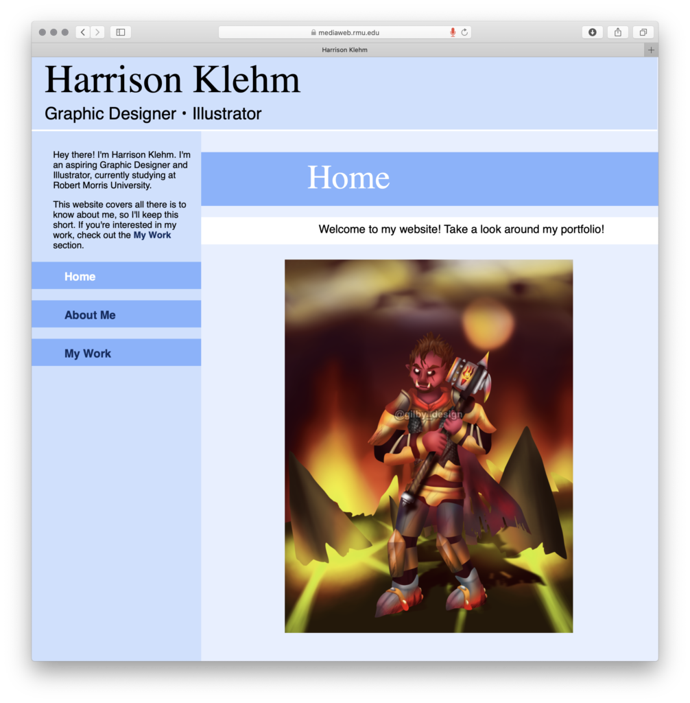
Considering my own portfolio, I chose to also take a look at other portfolios from around the web. One that stuck out to me, not in spite of it’s simplicity, but because of it, was http://zcole.me. This one was very helpful in designing my own portfolio website, as it was direct, concise, and to the point. This made me want to approach this project in the same direction, with putting my own spin on it. He introduces himself, he talks a bit about himself, and he showcases some of his work.

Web Review 3

I chose to review both bravofranco.com and sixpennkitchen.com. I personally preferred the aesthetic of sixpennkitchen, but felt bravofranco had more tools to actually use the site. It felt like there should be more to sixpennkitchen, as if that was just a home page that could navigate you to other websites, while bravofranco’s page felt more complete. Overall, I think that bravofranco’s page is more effective, as it has a better sense of unity and balance, but I do prefer the layout of sixpennkitchen