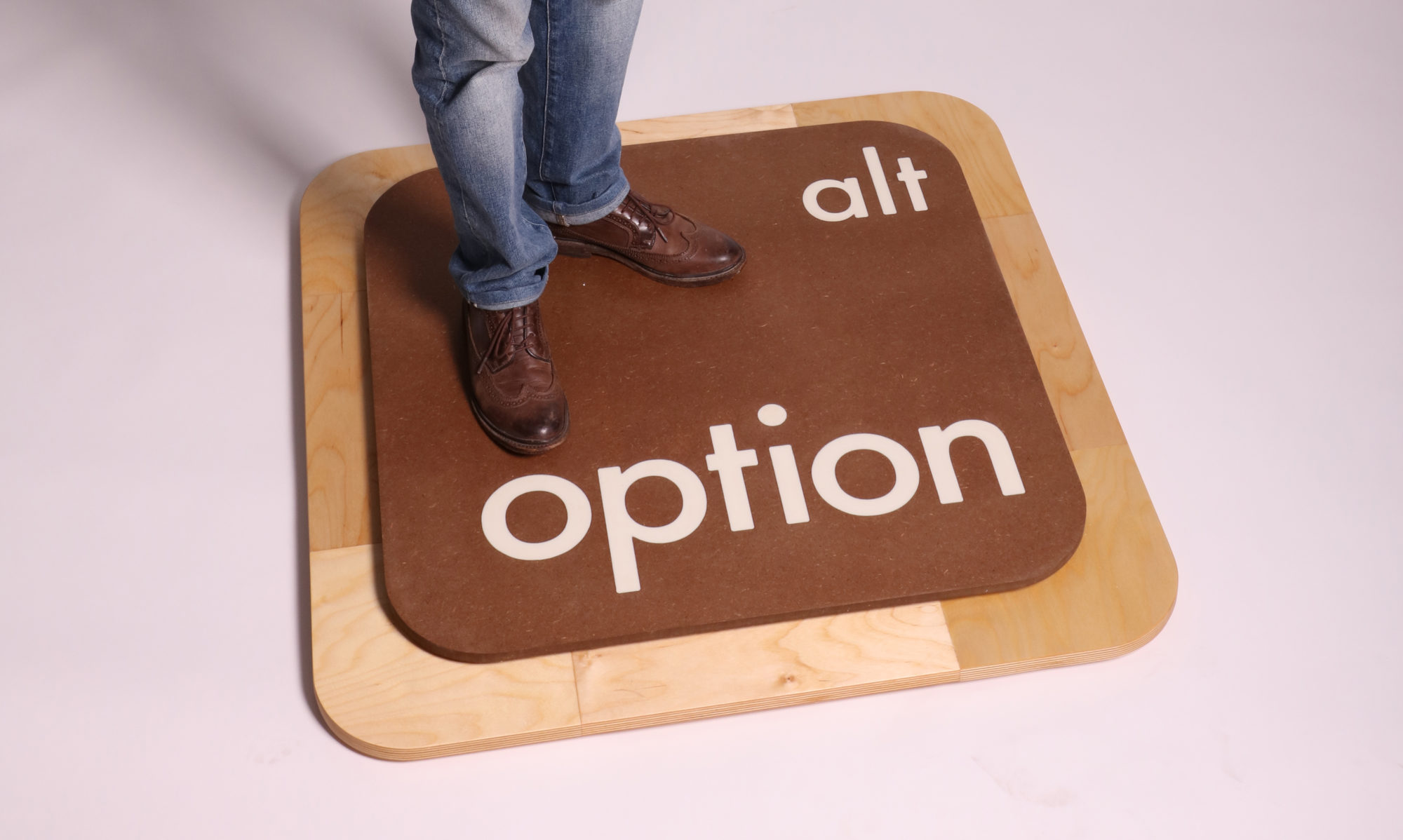
“The Cards We’re Dealt” Final Presentation
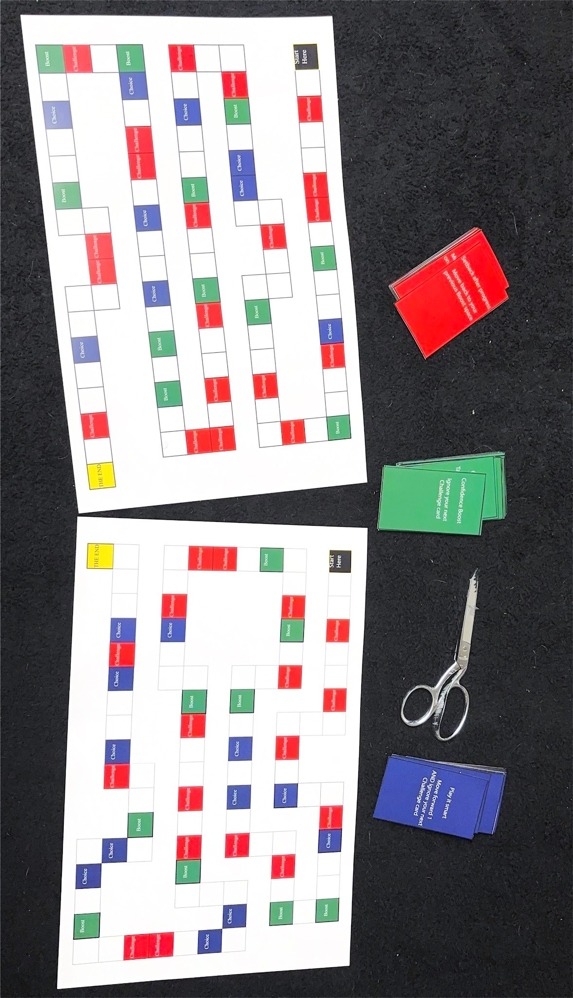
Game 3 Final Printout
Brayden Bauer Slideshow For Game Design 2 Final
This is my slideshow for my final presentation showing the process of my bug clicker game getting made.
The first version was made in scratch where it incorporates a wireframe style of coding where you just drag the code onto the file and edit the code once its in there. The mechanics for the first game is very simple. You clicker the lanternfly, it dies, and you get currency from it. The currency is pretty much used to upgrade your clicks so they are worth more for each click.
Version two is the same idea but I added separate pages and a few new features. The once is the currency where it can now be used to purchase businesses to gain money faster, or it can be used to upgrade the power of your click. The power does have a factor in this version because there is a boss page. The bosses health only grows so make sure you upgrade the power. Lastly there is a prestige page the player gets a permanent boost, however at the cost of losing all of the upgrades you had.
Final Presentation (The Allocation)
Game presentation (Aleah, Mason, Lauren)
Game Design II Final
The Wrong Move Revised Version – Sara Krim 4D Final
According to critiques I got in class, I decided to go back and revise some things on my project. For feedback, I got to change the panic color from red to yellow, and to make the music a little more quieter. I went ahead and fixed that, and tried to also play around with contrast, highlights, the flickering, etc.
Updated version: https://drive.google.com/file/d/19zhK9-GRPGBGi8jyph2oV3itrXdDKqpn/view?usp=drive_link
4D Final Critique Notes – Sara Krim
4D Final Feedback:
Lily:
- What works: Using light as a prop, the sound effects
- What I would do: Better audio (more clear and loud)
Gabby:
- What works: Variety of shots and settings
- What I would do: Add music or focus more on the sounds. Also add some sort of indicator on what the story is
Murrow:
- What works: Sound effects!!! And story
- What I would do: Work on camera movement and materials
Alieena:
- What works: The speed changing and light experience, the 360 interactive experience
- What I would change: Make it into a shot sequence for presentation purposes and story purposes, add music to heighten emotional feel (but do keep revving and things like that)
Chrystian:
- What works: Color scheme and grey pads/platforms work well for the PGH feel, definitely entertaining and something I would play in middle school
- What I would do: UI when controls pop up (background could be blurred for easier reading) maybe add a learning mode
Nikayla:
- What works: Camera movement following subject, crossfaded clock, story is fitting and relatable
- What I would do: Make the opening blackboard thing shorter, get different angles from where subject is sitting
Antonia:
- What works: Very humorous
- What I would do: Make it horizontal, better editing
Ethan:
- What works: Frame speed, lighting
- What I would do: Work with the cropping (it felt weird), maybe a black background?
Tyler:
- What works: Game works well and stopmotion really tapped into that with the graphics
- What I would do: Would crop better, get a tripod because it was shaky
Bedzok:
- What works: Making us actually scroll was super interactive and worked with the point of the story
- What I would do: Make this into a stop motion and have that on the instagram (but keep the photos
Saomi:
- What works: Editing is very smooth, makes sense, aesthetically pleasing
- What I would do: Maybe make it quieter
Sidney:
- What works: Spinning it, showing the “experiment”
- What I would do: Add more shots, close up of the movement and subjects
Noah:
- What works: The mix on animation and real life (being shown on tv) and animation helping cook
- What I would do: Maybe some foley work/sound effects
Gaige:
- What works: The animation art style, black and white to color
- What I would do: I would make the person in the animation do the adobe messed up, and then have him dance and then switch to irl person dancing, sound levels
Jana:
- What works: Its interactive and luck based (it fits that)
- What I would do: The negative and positive confuses me a bit. Maybe having the cards more random, maybe have them be like tarot cards and you pick the number, flip the card and your fortune is there
Kayla:
- What works: I like the message and the animation is good, loved the flicker
- What I would do: I would love to see more
Gavin:
- What works: The story, narrative game type of perspective (the hand is like granny or roblox if you know what I mean)
- What I would do: Footsteps are pretty sporadic and don’t seem accurate, maybe add some tense music
Final Crit Notes- Noah Schardt
Lily
Works: The lighting shots with the shadows were really cool!
Doesn’t: I didn’t like the long talking clips.
Gabby
Works: I enjoyed the lack of voiceover.
Doesn’t: I didn’t like the lack of all sound.
Murro
Works: The sounds along with the different mediums worked and how they changed intensity.
Doesn’t: I wish the perspective changed instead of just being the same.
Aileena
Works: 360 experience, SO cool especially on the phone.
Doesn’t: Viewing it on the laptop doesn’t work as well.
Chrystian
Works: The mechanics and the concept were really cool.
Doesn’t: Not necessarily that it doesn’t work, just that it is a hard level that doesn’t make sense for newcomers.
Nikayla
Works: I enjoyed the lack of voiceover or any lines.
Doesn’t: I didn’t like the over the shoulder angle.
Antonia
Works: Close ups and sound effects. The cat!
Doesn’t: Some of the editing was a little off.
Ethan
Works: I liked the added lighting on top.
Doesn’t: I wish there was audio or music.
Tyler
Works: The projection was awesome.
Doesn’t: The shakiness irked me a little.
Bekzod
Works: The format in which it was presented. It being on instagram is a perfect representation of this.
Doesn’t: It would be even better if each one were a reel so you could get the full effect.
Sara
Works: The different shots were REALLY cool.
Didn’t: The music choices didn’t fit in my opinion.
Saomi
Works: The drawings and the transitions between them were awesome.
Didn’t: The font was a little hard to read.
Sid
Works: The design of the animations are really good.
Didn’t: The speed was off a little bit and/or needed a strobe light to see it better?
Gaige
Works: The sound effects for each stage were really good.
Didn’t: The shakiness of some shots as opposed to others.
Nada
Works: The interactivity works really well.
Didn’t: Rules needed a little more explaining.
Kayla
Works: The ambiance and sound effects worked really well.
Didn’t: Posters being photos is a little off because it doesn’t match the rest.
Gavin
Works: The lighting and ambiance worked well.
Didn’t: The constant stepping noise even with no movement.
Final
Lily Clifford: the shadow works / needs more actions.
I like the camera angles / add some sound effects.
I like bird chirping sounds / need more frames to make the movement smoother.
Aileena Sargeant: I like the video / mute the motorcycle sound or fix it with sound effects.
I like everything about the game.
Nikayla Haynes: I like how the camera following the actor and his actions instead of static.
I liked the unique ideas / it needs a little more editing.
Ethan Bookbinder: so creative / the lighting change depending on the scene.
Kayla Bowman: I like the stop motion / the camera shakes everything else is perfect
Bekzod Nurboev: I like the instagram idea / I hope if its more longer
Sara Krim: I like how she share the game screen, sound effect / lighting was a little too bright,
Saomi Jimenez: I like the colors and the characters connection to the song lyrics. /
Sidney Crabtree: I like the way how it moves / the speed
Noah: I like how she mix the reality with hand draw/ the tv frame
Gaige Stebler: I liked the ending was unexpected
I like the details of the room /
I like the black and white / the sound of the steps not matching the video
Jimenez Finals Critique Notes
Lily
Works: Timing of dialogue/pacing of plot. 4th wall break
Would change: Upload format, wish it were full screen (landscape shot, but uploaded vertically)
Gabby
Works: Angles/shots well executed
Would change: I wish the environmental sounds were louder/clearer.
Muro
Works: Sound design and mixed media use, emotional appeal
Would Change: Top-down angle takes a second to get used to
Aileena
Works: Interactiveness, I like that the viewer can look anywhere with the 360 footage.
Would change: Add background music to boost the emotional aspect.
Chrystian
Works: Game rules. mechanics, and objectives are executed well
Would change: Add sound design
Nikayla
Works: Sense of relatability and being human, clock overlay
Would change: More shot/angle variety
Antonia
Works: Sound design. characters
Would change: Green screen effect could be less clunky
Ethan
Works: Smooth animation, great light design
Would change: Process was rather unorthodox, seemed to lack some planning
Tyler
Works: Smooth animation/transition between character movements, great projection
Would change: Need better camera setup
Bekzod
Works: Interactiveness/audience participation, creative concept
Would change: Reel version
Sara
Works: Great lighting and camera work, preparations & planning
Would change: Music choice
Sid:
Works: Great craftsmanship
Would change: Adjust framerate/speed
Noah
Works: Art style and music choice
Would change:
Gaige
Works: Excellent narrative and creative solution
Would change: Speaking audio quality
Nada
Works: Interactivity
Would change: Rule clarity
Kayla
Works: Transitions, lighting, and sound design
Would change: Posters feel a bit out of place in the art style
Gavin
Works: Color grading, camer control
Would change: Walking sound plays when the character/camera is still
4D final notes
Lily crawford
Use of light to show the murder worked well
Would have liked Dramatic music during interrogation
Gabby Thomas
Shot well
Looked at camera a couple times
Murro Gill
Very fluid and good sound effects
Longer
Aleena Sargeant
360 is cool
Could have had better angle
Custom Game
Good color scheme and setup
Better sound
Nikayla Haynes
Bloopers were funny and easy to follow story
Different angles
Antonia V
Cat person was great and good concept
Green screen could’ve been better
Ethan
Very good lighting
Could have had sound
Tyler Lucas
Good visuals
Wanted more donkey kong
Bekzhod
The concept of making someone scroll ia cool
Want more
Sara
Good quality
Clips were little too long or short
Saomi J
Very clean transitions and very personable
Wanted more to the background
Sid Crabtree
Good design
Speed of spinning
Noah S
Very good work with mixing animation and real life
Consistency in art
Nada
Good concept
Should have more rules
Kayla B
Good quality of animation and audio
Wish it was longer and understood more story
Gavin
I like the lack of color
Sound effects could be adjusted
Final review
Lily Clifford
1.Humor is good
2.Need to work on the voice part
1. Add little more activity
2. The part with no talking is good
- I like the photos
- it would better if there’s is little music
- I like the colors
- If lava was red it would be awsome
Nikayla Haynes
1.Starting is good
2.I would try from different angels
- I like the cat part
- I would change the size of the peson
- Ethan Bookbinder
- It would be nice if there is music
- . Light part was cool
Kyla Bowman
- Idea is good and simple
- I would fix the shadow comming from another object.
Sara Krim
1I like the music chanbges based on the person’s emotion
2.I might try in darker room to show better
Saoimi Jimenez
I like the color it would be nice if there was a anmiations
Noah
I like the animation it was smooth
Gaigge Stebler
I like the animation and the humor
Jana Almatani
Thre game was fun but little confussion
Kayla
I like the animations
Gavin
Need to work on the footstep sound
Final Critique Notes
Lilly Clifford
One thing that works: the timing of the conversation was well paced.
One thing that doesn’t: potentially move the angle over a bit to refrain from the glare on the camera.
Gabriella Thomas
One thing that works: im not sure if this was meant to be some sort of thriller but the silence gave the video an eerie feeling.
One thing that doesn’t: the close up shot with the coffee cup before walking away should have been slightly trimmed to prevent seeing it be picked up again
Murro Gill
One thing that works: the sound effects were very soothing.
One thing that doesn’t: there were a few shots where your finger came into view but weren’t extremely distracting
Aileena Sargeant
One thing that works: the still shots were fascinating
One thing that doesn’t: im sure this happened when uploading the video/rmu wifi but the quality was a bit grainy
Guy in the wife beater🧍🏽♀️
One thing that works: both the color scheme and quality of the game itself look great
One thing that doesn’t: possibly add a clear objective/goal to the game
Antonia Valeri
One thing that works: I love that the idea was a person shrinking into a doll house while using the house from coraline
One thing that doesn’t: the green screen cut out quite a bit but overall this was great
Ethan Bookbinder
One thing that works: the lighting matching on both the photo and the background page worked really well
One thing that doesn’t: i have no recommendations, s/o jjk
Tyler Lucas
One thing that works: the projection/stop motion worked out really well
One thing that doesn’t: possibly framing the projection a bit more
Bekzod Nurboev
One thing that works: I like that we were made to scroll the projection on our own phones, very interactive
One thing that doesn’t: rather than leaving it as photos alone possibly turn them into a stop motion video
Sara Krim
One thing that works: the music change used to build up the suspension was amazing.
One thing that doesn’t: I think possibly making the light fade back to the regular kind would’ve made it seamless
Saomi Jimenez
One thing that works: the drawings were very cute & because I’ve seen the trend it’s very fitting
One thing that doesn’t: possibly move the song credits out the way
Sidney Crabtree
One thing that works: the outer rims movement was quite mesmerizing
One thing that doesn’t: the inner rims movement makes the images loose detail very easily
Noah Schardt
One thing that works: the incorporation of animation and real world visuals went together extremely well
One thing that doesn’t: no complaints I loved this
Gaige Stebler
One thing that works: the animation at the beginning was quite smooth, sid dancing was my favorite part
One thing that doesn’t: the baby audio could have been slightly turned down
Nada Almatani
One thing that works: the graphic quality on this video look really nice
One thing that doesn’t: the rules were a bit confusing at first but after testing it’s cool
Kayla Bowman
One thing that works: the lighting tracked very well with the door being opened
One thing that doesn’t: possibly try white text
Gavin Raabe
One thing that works: the hand in frame like old indie games was a nice touch
One thing that doesn’t: the walking audio could have been synced a bit better