
The websites I chose were peterallen.com and Six Penn Kitchen. Starting with Peter Allen, the site was very easy to navigate and was nicely organized. In the book they talk about having broad headings that trickle down into more specific categories which is what Peter Allen does. Their headings include: Menu, Drinks, Reservations, Directions, and Contact Us. When you hover over Menu, it has a drop down that breaks the categories down into Lunch, Dinner, Dessert and Late Night. Which ever you click on takes you to that specific menu. But when looking at Six Penn Kitchen, instead of a drop down menu, when you click “Menu” it takes you to a menu where you can then narrow it down with a heading bar at the top. Both sights have great navigation located at the top of their sites, the headings are clear as to what their topic is about and when you hover over them, they make it clear what you are hovering over (changing color or underlining). They both have a place to reserve a table, with Peter Allen it is a separate tab, but with Six Penn Kitchen it is a link that sits above the navigation bar. Both sites have a nice navigation flow to them that leads you from one page to another. But looking at the bigger picture I think that Six Penn Kitchen has the better navigation because you have to click on the heading itself to find the smaller categories. I feel like that makes it easier to find things because you are already in the broad heading.
Website Review #3
For this website review, I chose Six Penn Kitchen and one of my personal favorite restaurants, The Interchange Lounge. As I explored each restaurant’s page, I could tell that Six Penn Kitchen definitely has a more professional and sophisticated website then Interchange Lounge. That is because of the bigger customer base as well as location. While Six Penn is located in the heart of Pittsburgh, the Interchange Lounge is located off of Route 51 on a side road. Six Penn’s website is balanced, clean, and sharp. The layout is great and definitely emphasizes the food as well as the location. The Interchange Lounge does a decent job at explaining what their restaurant is all about but it needs to be polished just a bit. According to Steve Krug’s “Don’t Make Me Think” a website should follow these five important concepts to make sure users see and understand the website as best as possible:
• Creating a clear visual hierarchy on every page
• Taking advantaged of conventions (both naming and graphic)
• Breaking pages into clear defined areas
• Making it obvious what constitutes a clickable link
• Minimizing noise
I believe that Six Penn Kitchen follow each concept well, where as the Interchange Lounge follows some but not all.
Six Penn Kitchen’s website it truly eye-catching with the graphics, photographs, typography, etc. One can definitely see the sense of hierarchy on the home page as well as every other page. Every page is unique and showcases it’s proper meaning. The noise level is extremely low which is fantastic for users. The nice white ribbon banner on the top is an awesome way of showing what it clickable link and what is not. The Interchange Lounge on the other hand needs some work. There really isn’t a sense of hierarchy or emphasis on any page. The images of the food need to be the prominent thing that users see and they just missed the mark. The layout is bland and does not distinguish each page. Every page has the same style and feels archaic. It is definitely a shame that the Interchange logo is not even clickable. The couple things they did manage to do alright is making the different selections clickable and stand out while minimizing noise.
Overall, Six Penn Kitchen’s website is great, stylish, and easy to explore while the Interchange Lounge has some ways to go to be of the same caliber as some of the most recognized restaurants in the Pittsburgh area.
Site Review #3
For our third site review, I will be analyzing Peter Allen’s Italian Restaurant’s website and Six Penn Kitchen’s website.
The first thing I noticed was how Peter Allen’s site adjusted to my browser window by using a different layout. Six Penn Kitchen made me have to scroll horizontally in order to see more of their information if my browser window was too small. So Peter Allen’s has an adjustable layout. Both sites utilize “persistent navigation”, which Krug describes as a “set of navigation elements that appears on every page.” They avoid the “happy talk” on their main home pages and stick to their message on each subpage such as dinner foods with their dinner page instead of being on their gallery page.
I noticed each site strives to have an image towards the top third of their web pages with information and links following afterwards meaning they have similar layouts. They tend to emphasize their product and service as well as the overall emotional feel they want their restaurant to portray to its customers. Personally, I feel that both sites are balanced when it comes to their imagery and information. They have clean navigation and they allow the user to “browse first or ask first” in Krug’s words. Each site gives the user freedom to explore, but also quickly find the information they are looking for. The unity is tied together by having their logo and “persistent navigation bar” on each page along with similar wireframes, color scheme, and typographic selections.
In contrast to the examples shown on page 62 of Steve Krug’s “Don’t Make Me Think–Revisited”, both sites would be considered easy to navigate and find information within a user’s first visit. In the figure shown on page 62, most sites require subsequent visits in order to memorize the paths to specific pages of information. However, each section is clearly labeled and has specific information pertaining to the labeled sections therefore making the sites user friendly.
As another observation, every page on both websites sticks to their overall message and identity. Krug talks about how people do not always enter a site through the home page anymore, which can tend to be a problem. In contrary, Peter Allen’s and Six Penn Kitchen successfully deliver their message and overall identity on every page while leaving their layouts clean with quick access to the homepage. No matter where a user enters the site, they know what site they are on.
I have a personal preference towards Peter Allen’s Restaurant because I feel like the information is not as concentrated and squished on their website. Their identity is brighter and more uplifting than Six Penn Kitchen’s identity appeal. I also like how their website is adaptable to the browser window, which is good for mobile phones and tablets.
–Katie Carlton
Site Review #3
For my third website review, I chose to compare the sites Burgatory.com and Mad Mex.com. Both sites, upon visiting the homepages, are stylized with images and graphics as well as multiple textures. Both restaurants are dedicated to a more casual dining experience and at first glance their websites show that by not being too minimalistic or use too many “fancy” fonts that some more high-end restaurants use.
Burgatory makes it clear that they are a specialized burger place by having a large hamburger graphic at the forefront of their page. Burgatory differs from MadMex a lot in their use of navigation. In Burgatory’s case, their navigation is off to the right side of the page, and contains a drop down to certain categories, contrary to MadMex’s site, where they have a traditional horizontal navigation bar near the top of the page, but do not have any drop down menus.
I feel like Burgatory also has MadMex beat in balance qualities on their site, Burgatory has information stacked almost equally on their website, while MadMex has information leveled on one side of the site more than the other. One case of this imbalance is in the navigation bar at the top of MadMex’s site, where the left side is larger font than the right side of links. While this does use a little bit of emphasis to show that those are the most useful and used links, it looks a little odd.
Burgatory shows its emphasis on certain menu items by the “slideshow” of items (separated by burgers and shakes) on it’s front page. The large text it shows on top of the floating image, the emphasis is on their product and the name of a specific product, as well as the menu which is referenced when hovering over the image in different spots.
In the case of making links on their sites easy to find, both sites do a good job. MadMex has their links highlight with an underline to indicate it can be clicked, Burgatory has their links highlight in a different color when hovered on.
Both sites has a little problem with noise. MadMex’s site has an automatic slideshow showing different promotions and events at the restaurant, as well as a weird stack of links on the front page that is not organized into the top or bottom navigation bars of the site, and is visible before the introduction of the establishment. These things take away from the experience of the website and can disrupt the process of getting the wanted information from the site. If these links were put into the categories in the navigation bar at the top of the website, I think it would make the website a little easier to go through, as well as navigate to desired pages. As for the slideshow, making it click-through instead of automatic would be a little less distracting. Burgatory’s noise issue is just in top of their homepage, where their single burger/milkshake highlight slideshow is. In this part, the slideshow is bordered by both the logo and the navigation bar on both sides of it, as well as a gift card graphic/link right below the navigation bar on the right. With the buttons to go left or right in the sideshow so close to other links, I found that sometimes when looking at a menu item in the slideshow and going to the next one, I would be at the giftcard page because I accidentally clicked it instead of the “next” arrow.
Overall, I prefer to navigate through Burgatory’s website over MadMex’s website, Burgatory offers the eye a lot in terms of their design and graphics, as well as the organization of their information, which is easy to seek out and read. MadMex for the most part is clean, but with faults in terms of their organization of text, and their odd choice of link emphasis and the displacement of links.
Website Review #3
I chose to review www.no9park.com and www.peterallens.com, which is where the bravofranco.com link takes you. The No. 9 Park website is very clean and elegant, and it gives you the feeling that this is a very fancy restaurant. The color palette is simple, but the flat dark background and sophisticated light blue serif font work very well together. Overall the site is very well balanced, although the home page is a little odd for my taste. I wish the image on the top right were a little lower, and the text on the navigation bar on the left a bit higher. It seems like each of those elements are pushed too far to the top and bottom of the page. Everything on the page works well together and creates a nice sense of unity. I think there’s a bit too much emphasis on the images and not enough on the logo. I would make the images a little smaller so that the logo doesn’t compete for attention. The layout is very well done and easy to navigate. There is no unnecessary information or clutter.
Www.peterallens.com is very different. You immediately get the feeling that this restaurant is not as fancy or expensive as the first. The page is busier and is more colorful. The page is mostly consumed by a large animated gif that instantly draws your attention. On top of the image is a big chunk of text that you don’t really want to take the time to read. Their navigation is simple and effective. The site is relatively balanced, but it would be better if the logo were smaller or the image did not move. You aren’t sure where to look because of the animation and prominent logo on top of it. The site uses the principle of unity well, but when you scroll down to the bottom of the home page everything changes and it almost looks like another site. Like I said, there needs to be more emphasis on one element of the page and less on another. Their navigation is successful and easy to understand.
Krug stresses the important of creating a clear visual hierarchy. Both sites are decent at this but could use improvement because of the competition between the images and logos. Other than that, all of the elements have a clear hierarchy.
He also says to take advantage of conventions. Both sites do this. We have seen countless websites in these layouts before and they are nothing out of the ordinary. The user recognizes where things are and understands how the sites work.
Krug says to break pages into clearly defined areas. The No. 9 Park site is much better at this because it just has a simple navigation bar and an image on the right. On the other hand, the Peter Allens site is still broken down, but it is definitely more squished together than the first.
The next important thing is to make sure the user knows what is a clickable link. The user is sure that the No. 9 Park navigation links are clickable because there is not much else on the page to click, and it just seems like it would make sense. The Peter Allens site is pretty successful as well, and some of the links change color or produce a drop down menu when you hover over them.
Finally, Krug says to minimize noise. The No. 9 Park site is better at this because of its incredibly clean design. They only included what is absolutely necessary, and the colors and even lack of textures contribute to this. The Peter Allens site is noiser and busier and could use some cleaning up. But maybe their site works for the “image” they want to achieve as a less fancy, less expensive restaurant.
The No. 9 Park site is more effective in my opinion. Although the Peter Allens site is busier and may be more attention grabbing to some, to me the elegant minimalism of the first site attracts me most.
Review 3
The two websites I compared were Burgatory and BRGR, both are burger restaurants in the Pittsburgh area. The Burgatory web site is straighter forward, where I think the BRGR web site could be a little confusing. Burgatory’s balance is strange because with the sky and grass in the background, it seems symmetrical at first, but with the restaurant logo and burger and shake images on the left side and on the other side is the navigation tabs, it makes the design look more asymmetrical. This applies to the home page and the submenus. BRGR’s is asymmetrical because of the grainy orange background and all the tabs have pictures when you click on them. For unity, I think Burgatory’s website is kind of crammed with a bunch of things on the home page, but I think it’s enough information that is still appealing to a viewer where as BRGR, I think there’s too many tabs on the homepage making it confusing to search for what you are looking for.
I like how Burgatory emphasis’s the theme of the restaurant making it look like purgatory. But something I think that stands out as far as elements for the restaurant, I like how they have the big burger in the middle of the page where you can click the arrows to see their popular items for the time, which is effective for advertising. What is also unique about that is when u put your cursor on the burger, it shows additional information as well. BRGR, however, they have a really small slideshow at the bottom of the page where you have to scroll down to and it doesn’t really stand out which I don’t find effective because viewers want to see that stuff as soon as they open up the home page. When I first opened the site, there was nothing that stood out to me. Burgatory also has a good layout with everything being right there as soon as you open the website and easy to navigate to find what you’re looking for. BRGR though as I said before, has too much information on the home page and doesn’t really have an appealing layout.
Steve Krug mentions five things that makes a web site easy to understand for users. First is clear visual hierarchy. Burgatory’s is very successful in its design and straight to the point. It sets the theme, but it also elements that stand out to you where BRGR is too plain and doesn’t have anything that stands out as soon as you open the page. The same applies to graphics as well and titles. Burgatory’s also breaks down the different pages well but also on the home page doesn’t have too many options yet where BRGR has so many options on the first page. An example would be having a different tab for food and drink or news and team. Some of these things should be under the same tab then broken up more under that page. If it’s on the home page, it would make the user think more than they need to. Both of these sites though have obvious buttons for clickable links so nothing really blends in. All of this put together explains the noise for each website. Everything you need to know for Burgatory is rite there broken into simplest terms, where BRGR has too much noise on its site.
It’s obvious at this point that I think Burgatory’s web site is better than BRGR’s. Burgatory has a good system breaking down the information you need to know advertising its latest products and specials on the home page and not too many tabs. You can’t have two things on the homepage that could mean the same thing, which BRGR does and viewers won’t be sure at first where to look to find what they’re looking for, hence the goal for a web site is clearly stated on the name of the book Don’t Make Me Think.
Review 3
The websites for Six Penn Kitchen and Peter Allen’s are both very interesting websites. They both feature photos as their main focus of the hierarchy of the website. They both balance text and images on each page of the website. Though on Peter Allen’s the image is so dominant I over look some of the other aspects of the page like the navigation on the top, but as you scroll down the page a larger home navigation follows you down and has a drop shadow which makes the text hard to read. The main emphasis on every page is the image which has a movement involved like cheese falling onto pasta. As a whole the entire site is unified with the same layout on every page which is easy to navigate. On the Six Penn Kitchen site the nav bar does not move with the scroll which I do not mind the pages are set up almost always with an image and use a white or green text on a black background. The lay out of each page differs depending on the content, as in there is no images on the menu page and on the news and events page, each event has its own space paired with an image going down the page. As far as unity for Six Penn Kitchen, the entire site has a theme and every page matches that theme with out having the exact same layout on every page making it more interesting and less predictable. Peter Allen’s page really grabbed my attention at first with it’s large moving image but as I navigated through the page I got annoyed with the drop down nav bar that followed you down the page and the menu page did not give you a menu but more links which seems like a good idea but really was more work than it needed to be. Six Penn Kitchen was also interesting and with the dynamic layouts through out the site I felt it was a more interesting and better done site than just show casing a moving photo. The navigation was nice and mindless like in Krug mentions in Don’t Make Me Think. Every link I clicked on took me right to where I expected it to and not more unnecessary links. But at times the site for Six Penn Kitchen did seem a little wordy while Peter Allen was more image than words, Krug mentions how omiting needless words is a better design choice. But also Peter Allen’s had to much going on with the images and as stated in the book making the images create to much noise and is distracting from the actual site. Both sites have interesting aspects I feel Six Penn Kitchen meat most of Krugs ideals.
Review 3
The two websites that I looked at for the third review were Burgatory.com and Sixpennkitchen.com. When visiting Sixpennkitchen.com, I immediately noticed that the logo of the restaurant was displayed to the left corner as is typical for websites, but it was not that much larger than the other text on the web page and the logo seemed to blend in a bit with the main navigation bar. Burgatory.com was a bit different in the way that the page length was altogether shorter and the navigation bar was to the right side of the webpage. I noticed that when on a separate page, both websites have the feature that if you click on the logo in the left corner, you are immediately taken to the home page. Both of the websites include a site i.d. , utilities and sections on each page but neither one includes a search bar anywhere. Both of these websites include the feature that if using the navigation bar and clicking on something like the menu, the title would then be highlighted in order to show a visitor where they are on the website. Neither website above has an overload of extra words or information, Burgatory keeps their pages simple with little content and more of a basic design. While Six Penn Kitchen is a bit more sophisticated with their website, including more of a description under such tabs like the Events part of the website. Although both websites contain imagery that is interesting, Burgatory is on a higher level when it comes to catching a visitor’s attention. Their images of the Burgers at the restaurant are up close, interactive and larger than even the logo on the home page of the website. This gives the visitor an idea of what Burgatory is really about and what makes them Burgatory without using text or a basic welcome and introduction on the home page. These burgers on the home page also give Burgatory the chance to let the visitor navigate to the menu by running their mouse over the burger being displayed and clicking the menu dialog box that pops up. On the home page of Six Penn, you cannot click on any of the images or navigate any other way besides the navigation bar at the top of the page. This makes their website a little less interesting mostly because it isn’t as interactive to a visitor. When looking for the utilities at the bottom of the site, I noticed that neither site included one. For the needs of the two businesses, this seemed to be alright and did not change the use of the website when it came to navigating through it. Altogether both of these websites are mostly successful for their own individual uses, style and needs for their businesses.
Review #3
For review number three I choose to look at the website http://www.azulbarycantina.com/ for Azul Bar Y Cantina. The website fits the home style restaurant that it is. Besides the main photo being pixelated it is very easy to use and has some very cool artwork for their banner.
I also chose to compare Azul’s website to the website no9park.com No. 9 park. I did this because both of the websites are closely related. Even though No. 9 Park website’s layout is better that Azul’s. Azul has more emphasis using a darker blue background contrasted to a bright yellow and white fonts.
No. 9 Park has a better all around website in my opinion, because of how the logo, photos, information, and navigation bar are all closely related in color and size. They also use a softer and less eye popping blue for text. No. 9 park is much better at grabbing my attention because of how it looks more professional and put together. The color scheme and font speak to a higher level than Azul’s website does for me.
Review 3 Lindsay Smith
For this Restaurant website review, I chose Peter Allan’s Italian restaurant and No. 9 Park. First, I looked at the home pages of each of the sites. These are two very similar restaurants in the choices that they offer and the theme that they have. They are both very elegant or high class restaurants, therefore their website should show that right off the bat. I believe that they both show that they are higher class on their home page in the layout and the pictures that they use. They use pictures of food on white plates that look clean and professionally done. The clarity of the navigation on both of the sites makes your choices practically mindless like Krug talks about in the reading. They also don’t have a lot going on on the homepage which makes the picture of the food the center of attention. This shows how they use the important things Krug talked about in the reading. He talked about keeping the noise down. Noise is referring to the extra stuff on each page. Both of these sites keep their extra stuff to a minimum so that the food is the central focus. This is carried though out both of the sites. This helps to unify the site. Also, This shows how Krug was talking about getting people off on the right foot. The pages and easy to navigate and you can clearly find the menu, about the restaurant, contact, and other necessary parts. Krug, also, talks about making navigation easy and effortless. Next, I looked at the menus for these places. The next thing the Krug talks about is omitting needless words. The menus on these sites are short and to the point. They give enough information for the customer to know what they are ordering, but not too many words that they don’t even want to finish reading. I know I hate when restaurants have such long and complicated descriptions because its hard to understand and it makes me loose attention to it. The next thing I looked at was the layout of the actual site. Did everything look like it lined up and look like it was supposed to be there. I believe that Peter Allan’s website looked pretty good. There was a nice header at the top. The text was easy to read. I would have to say that there was a bit too much white space in the menu portion of the site, though. It started to hurt my eyes to look at all that white. Also, I don’t like how the heading part comes down when you start moving the page. I believe that it should stay visible, but it looks like it is delayed in coming down the page. No. 9 Park’s website looked cool. I like how well the side navigation works for their site and I like the contrast in the colors of the pictures to the side navigation. One thing I do not like is that the information under each of the pictures is lined up with just the picture and not the entire grey box. I believe that is looks okay for all the section but the menu. I believe that it looks completely messed up for the menu sections and throws off the balance of the site. In my opinion, I believe that Peter Allan’s Italian Restaurant is the better website at drawing your attention for a few reasons. The first reason is the layout. No.9 Park has some issues with its layout that make it look off balance. Peter Allan’s is layer out in a way that balances it and unifies each page together. Another reason that Peter Allan’s website is better at drawing your attention would be the pictures. Their pictures move and the movement makes the food looks so much more appetizing than static pictures. No. 9 Park show pictures that are not always of the food and do not seem to be as intriguing to me as Peter Allan’s. All in all, these are both decent websites, but I believe that Peter Allan’s is definitely the better of the two.
Oculus Rift Terms & Conditions
http://gizmodo.com/there-are-some-super-shady-things-in-oculus-rifts-terms-1768678169
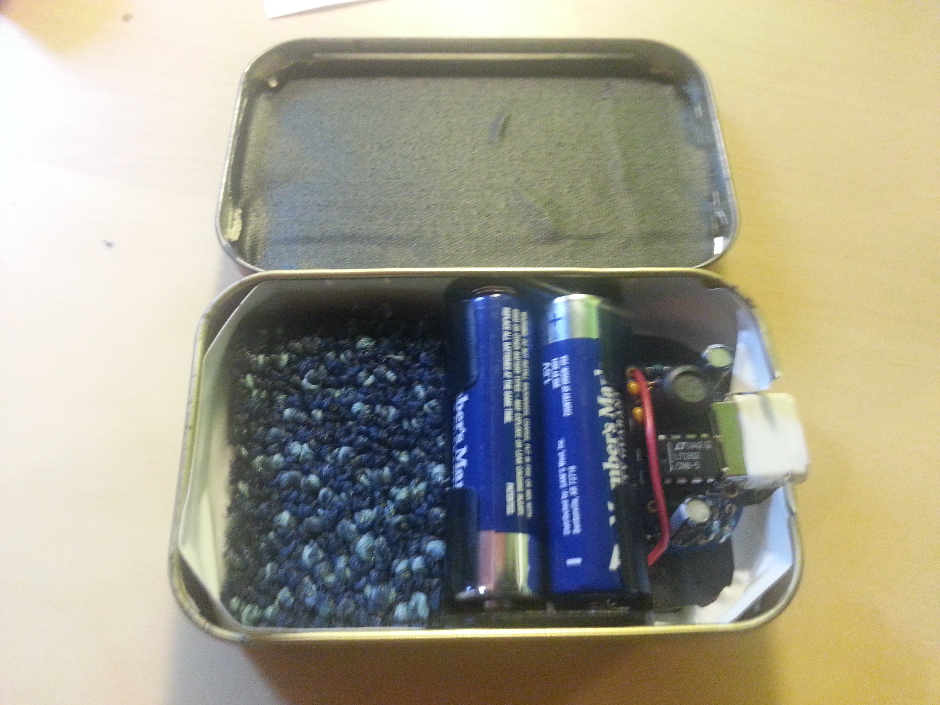
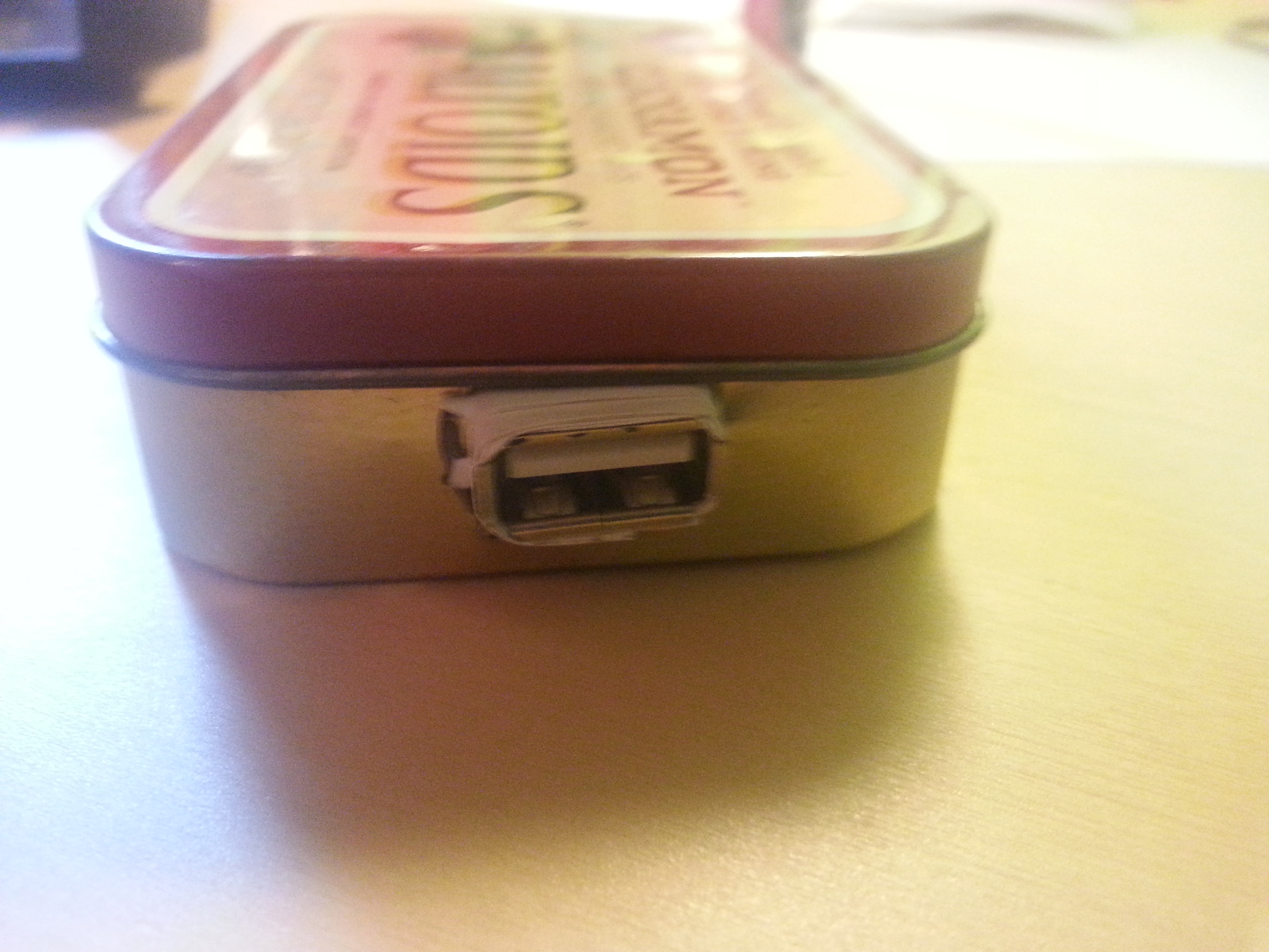
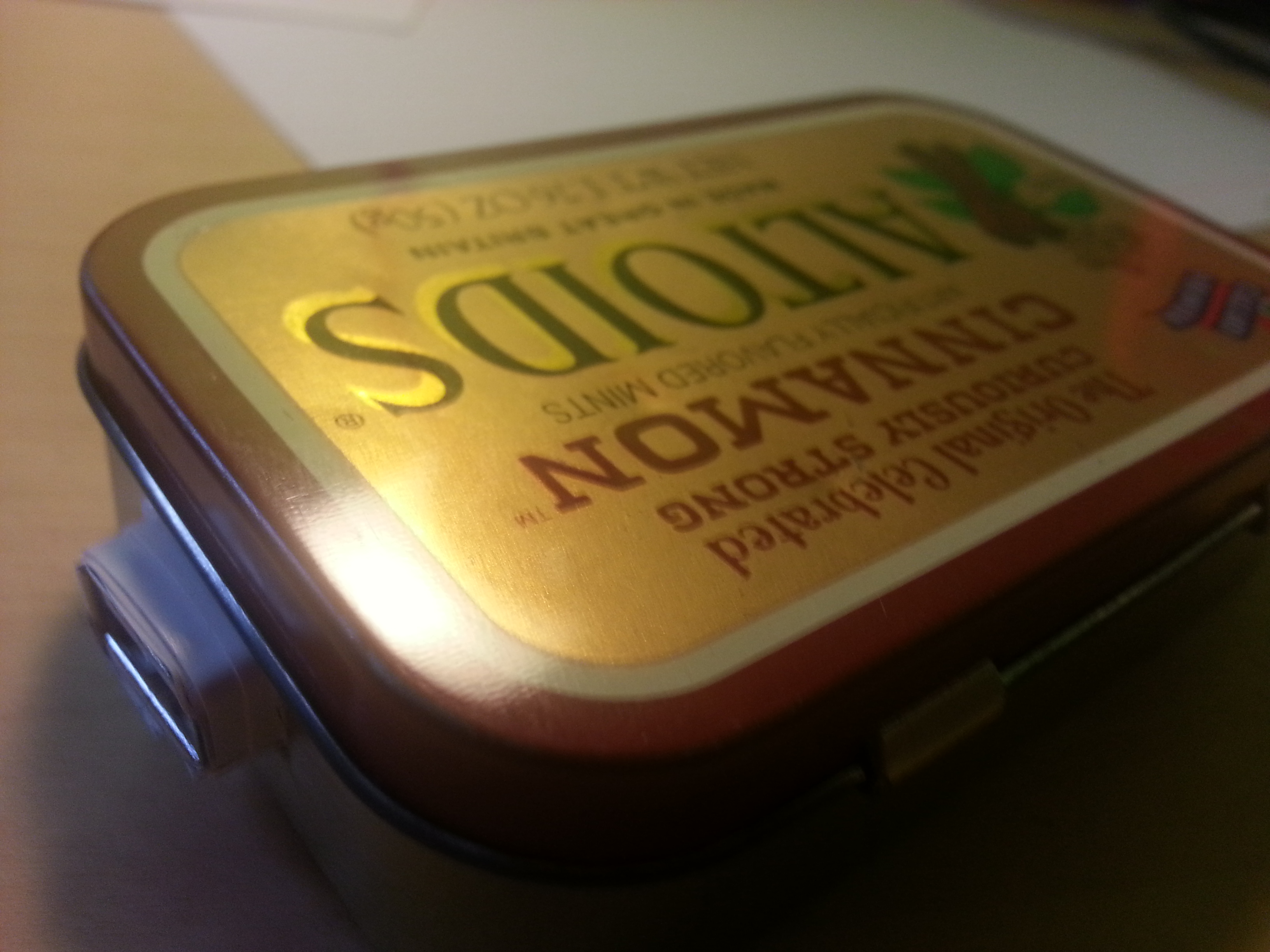
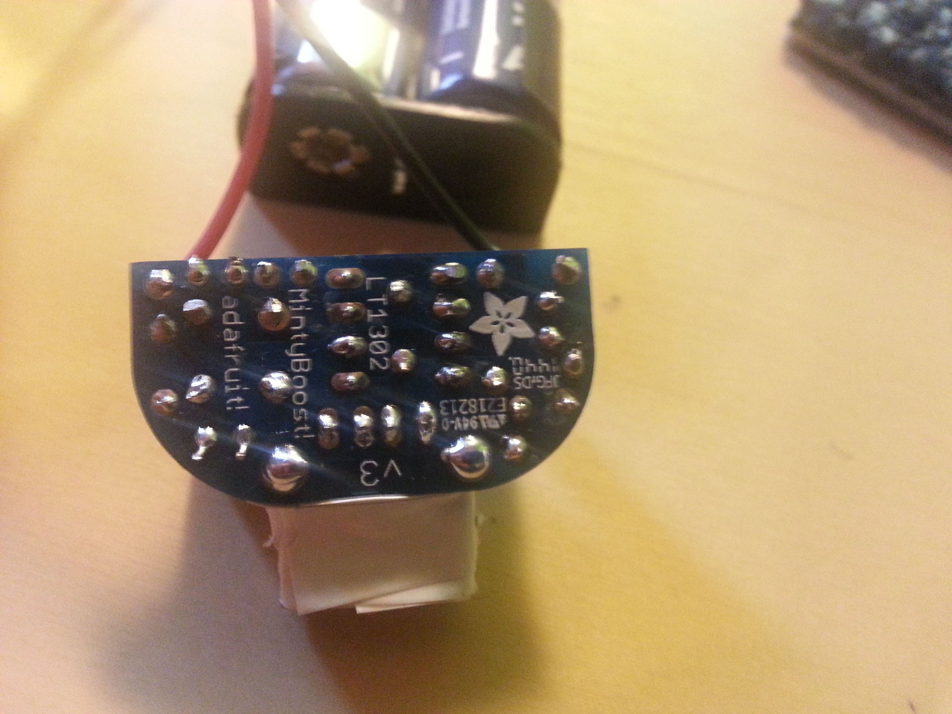
Minty Boost
Terms & Conditions May Apply Review – Nicholas Milliron
This documentary hooked me in from the very beginning with the eery montage of people accepting terms and conditions on the computer with strange music playing in the background. From the get go, they established how much of a threat these terms and conditions have become, stating that it would take 180 hours a year for you to read every term & condition you sign up for. Which wouldn’t be a problem if they didn’t include anything harmful, but they do. The most astonishing one discovered in this documentary is the fact that Instagram owns all the right to photos posted on it. However, after doing some digging, Instagram’s policy on this has now changed: http://www.copyrightlaws.com/creators/instagram-and-copyright-what-are-the-terms-of-use/.
I have been incredibly interested in internet anonymity ever since the whole Edward Snowden vs. the NSA stuff in late 2012. Like a lot of americans, it opened my eyes to what the government really is up to, as that was all you saw on the internet and tv for weeks. The really interesting part, was the mainstream media wasn’t quite sure how to handle it. CNN and Fox News weren’t sure whether or not to label him a hero or a traitor. Luckily, I am an avid reader of Reddit, so I was able to get an unbiased view of what was happening.
Anyways, the whole NSA whistleblowing revealed to me, just like this documentary reinforced, that all Internet privacy laws really went out the window as soon as the Patriot Act was put into place. There was some things that were new to me from this documentary that I previously didn’t know about. I knew that companies like Facebook sells your info to other companies, but the ad networking flow chart displayed in the film was astonishing. The fact that that many different companies have information on me is terrifying.
More terrifying than all of that is not that companies have my info, but the government does and uses it to their advantage. All the examples in the movie, from the police in the Netherlands using GPS info for speed traps, the Cold Case writer mis taken for a murderer, the kid who was questioned at school by Secret Service for a dumb Facebook post, and the man who quoted a movie on Facebook and got the SWAT team called on him were all flat out disturbing. The worst part is that there’s all these examples, and so many whistle blowers and still NOTHING gets done to change what is happening. I was hoping this documentary at the end would bring a call to action, but instead ended with just a website, trackoff.us. It’s just about how to protect yourself on the internet, not how to protect everyone else. Hopefully Mark Zuckerberg ended up watching the documentary, and as he was asking not to be recorded, he will start to respect our anonymity and not record us. He won’t though, and neither will all of the big companies, and that’s why there is no call to action in this documentary. Money rules the world, and until that stops happening, nothing will be done to protect the citizens of the world.
Terms and Conditions May Apply
In this documentary, they pursue exactly what it means when we check the terms and conditions box on many websites. They go into detail about many of the major points of large websites. After the first viewing of each point they go into extreme detail of exactly each point means.
Before watching this movie I knew about some of the things they were doing. I had the idea that “If I’m not doing anything wrong and it helps national security what do I care if the government listens to my phone calls.” I think I would still keep this thought-process if it were just that. However, I have learned that the government can access every single time you press a key on your phone. This rose the question to me, why in the world would the government need to know every time I press a key? That is not ok with me.
Another point that aggravated me was that these large companies are selling my information. I don’t even want the websites to know as much about me as they do, never the less sell it to someone for a prophet. To me, that seems wrong. I can some what understand websites wanting to know information to better serve you, but that should be encrypted information that is safe. It seems like a responsibility of the company that is taking so much information to keep it safe from others, not sell it.
After this movie I wanted to through my smart phone off a cliff and go back to the good ol days of a flip phone. I think companies and the government have way too much of a foot hold in our personal lives. I understand when the government says its for national security but national security doesn’t need to document every time I add bills up on my calculator. As for the companies, I truly believe that they would be out of business if only 50% of there users fully read and understood there terms and conditions. It is intrusion of ones personal matter and should not be kept on file.
Terms and Conditions May Apply (Bonus)
Everyone who has been on the internet has most likely agreed to a site’s terms and conditions. I think it’s safe to say that most, if not, all of those people didn’t read a single word of those terms and conditions. The same goes with any privacy policy. Terms and Conditions May Apply shares some scary facts about this phenomenon that could open some eyes. One being the fact that most websites, mainly social media, that you sign up for own anything you upload. This can be given to the government if requested. Sites like Facebook, Instagram, and LinkedIn can and will use this policy. The film points out that this all started in 2001 with the Patriot Act. Before 9/11, the government was ready to pass privacy laws that would prevent citizens from having their personal information searched by authorities without their permission, but once the world trade center went down, these laws were given up on and the Patriot Act was signed. This act lay the groundwork for our internet privacy to become nonexistent. Google’s privacy policy was given as an example. In 2000, Google’s privacy policy said users were given anonymity, but in 2001, it was changed to their users’ information being “anonymous except when legally obligated.” This means that if the government asks for personal information about a user, Google will give them it. The crazy thing is that these sites can change their policies without anyone really knowing it. Facebook did this awhile back, changing everyone’s information back to the default of being publicly available. This can be done because the original policy said so. There are loopholes throughout every agreement and moments where they outright say something the user wouldn’t agree to had they actually read the thing.
There are arguments that “if you have nothing to hide, then you shouldn’t be worried” about spying and actions of that nature, but complete privacy is a basic human right. Even if you have nothing to hide, any authority could interpret something you said to mean whatever they want. For example, the film shows a 7th grader who made a statement of FaceBook about the president. He said that Barack Obama should watch out for “suicide bombers.” This was a statement of concern, not a threat, but sure enough the FBI came to his school and placed him in custody. Another example given was a writer on Cold Case being placed on a list because he searched Google for terms like “dead body,” “decapitated head,” and “murder wife.” He was just doing research for a murder mystery TV show. These provide ample evidence that the authorities having our information is more of a good thing than a bad thing. It places us all at risk and rarely does anything to “protect us.”