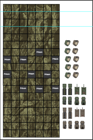
I like the direction this is going visually; the grid system makes the play space feel structured and intentional, and the repeated terrain texture gives it a cohesive identity right away. The placement of labeled tiles like the prisons suggests clear points of interest, which helps anchor gameplay and gives players something to orient around instead of the board feeling purely open.
What I’d push on is clarity and hierarchy; right now everything on the board has a very similar visual weight, so it’s a little hard to immediately distinguish what’s most important. The units and assets on the side are strong, but they feel somewhat disconnected from the board itself. It might help to exaggerate key spaces or introduce contrast so players can quickly read what matters at a glance. Overall though, the foundation is solid; it feels like a system that could support meaningful movement and interaction once the visual hierarchy is tightened.