
In a world where people are often easily stereotyped based solely on looks rather than the content of their character, Don’t Judge a Book by its Cover is a game that challenges this issue in today’s society. With digitally illustrated character polaroids and small cards that contain a short statement about a person’s life experience or story – players are tasked with stereotyping, assuming, and making generalized judgments on various real people to attempt to match a statement with the person who said it.
The goal of the game is to match all character polaroids, to their personal statement cards.
However, there is no true winner to this game, whether played with a single person, or a group of people – making judgments on others based solely on appearance is wrong, and this game is meant to spread awareness and provide players with a sense of empathy, as you don’t truly know what someone is going through.
Here are some photographs of my artistic approach, including drawings, final cards, and my process of gaining photos of people and their statements/stories:
RULES:
This is the game statement, and rules given to players along with a stack of fifteen character polaroids, and 15 statement cards.
Probably the most basic rules I have come up with in a game.

DESIGN AND ILLUSTRATIONS:


Using the image provided by the person I asked, I opened the image in Procreate and created two ‘copies’. Creating a basing sketch of their head shape, I then drew only the necessary loose details that were needed to make the sketch fit the person it was representing.
I chose to draw each person as I wanted to create a sense of consistency in the game, similar to the quick details we might get from a person when we pass them in a hall. Below is a quick time-lapse of my portrait for the game!
Next, let’s talk about the final character polaroid art that I printed out on cardstock:
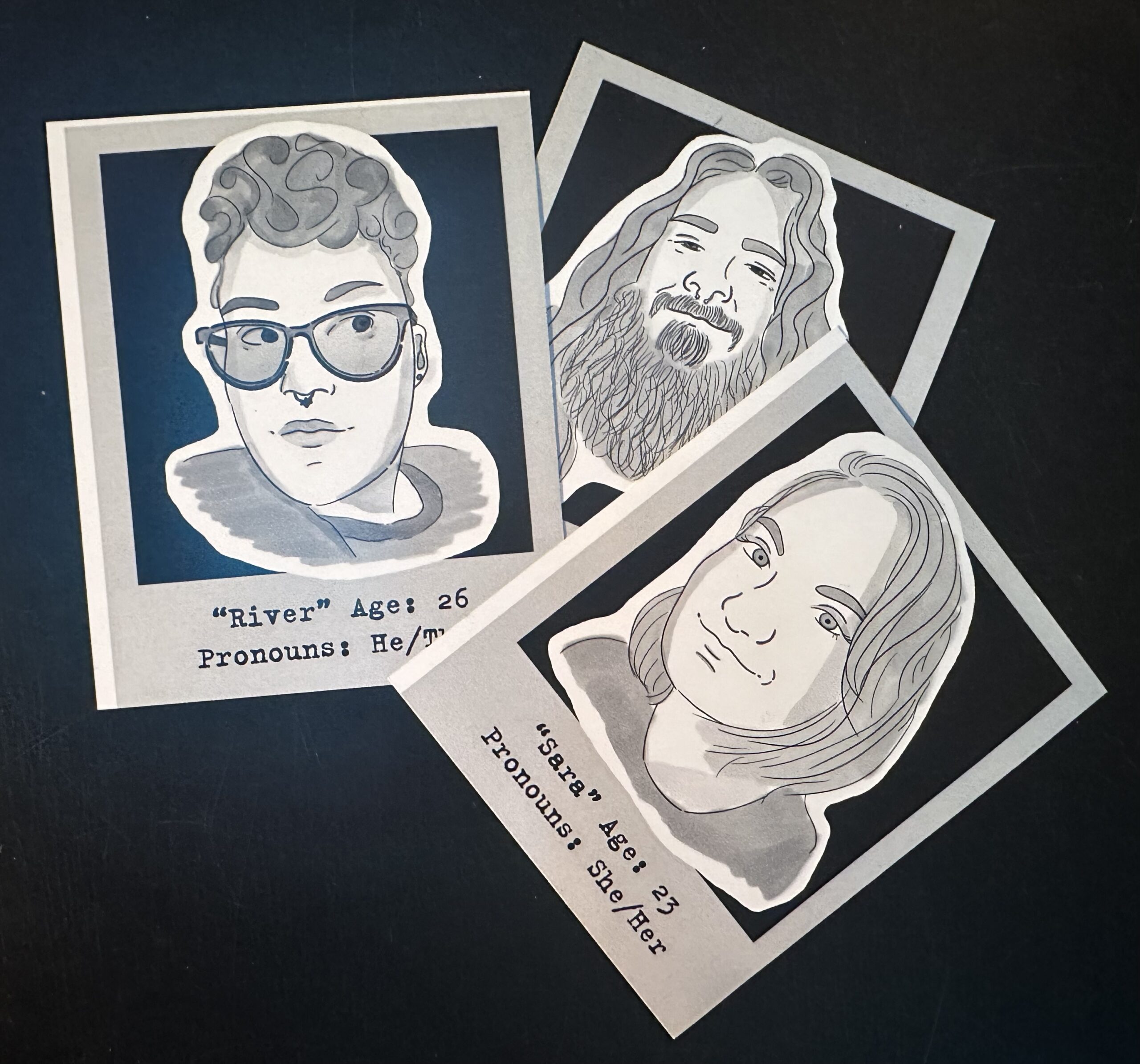
For the final card design, I wanted the cards to feel old like you had found them in a box hidden away. I wanted the monotone colors of the drawings to embrace the feeling as well, so by choosing Polaroids it gives the feeling of “who are these people? And where are they now?” I also chose the have the drawings be almost cut out on top of the Polaroids to give it a unique flair.
The only details written on the cards are the names/nicknames of the people, as well as their age, and pronouns. I decided that these would be the only details you would receive as it is often the bit of information you can get from conversations about other people, and through basic ice breakers.
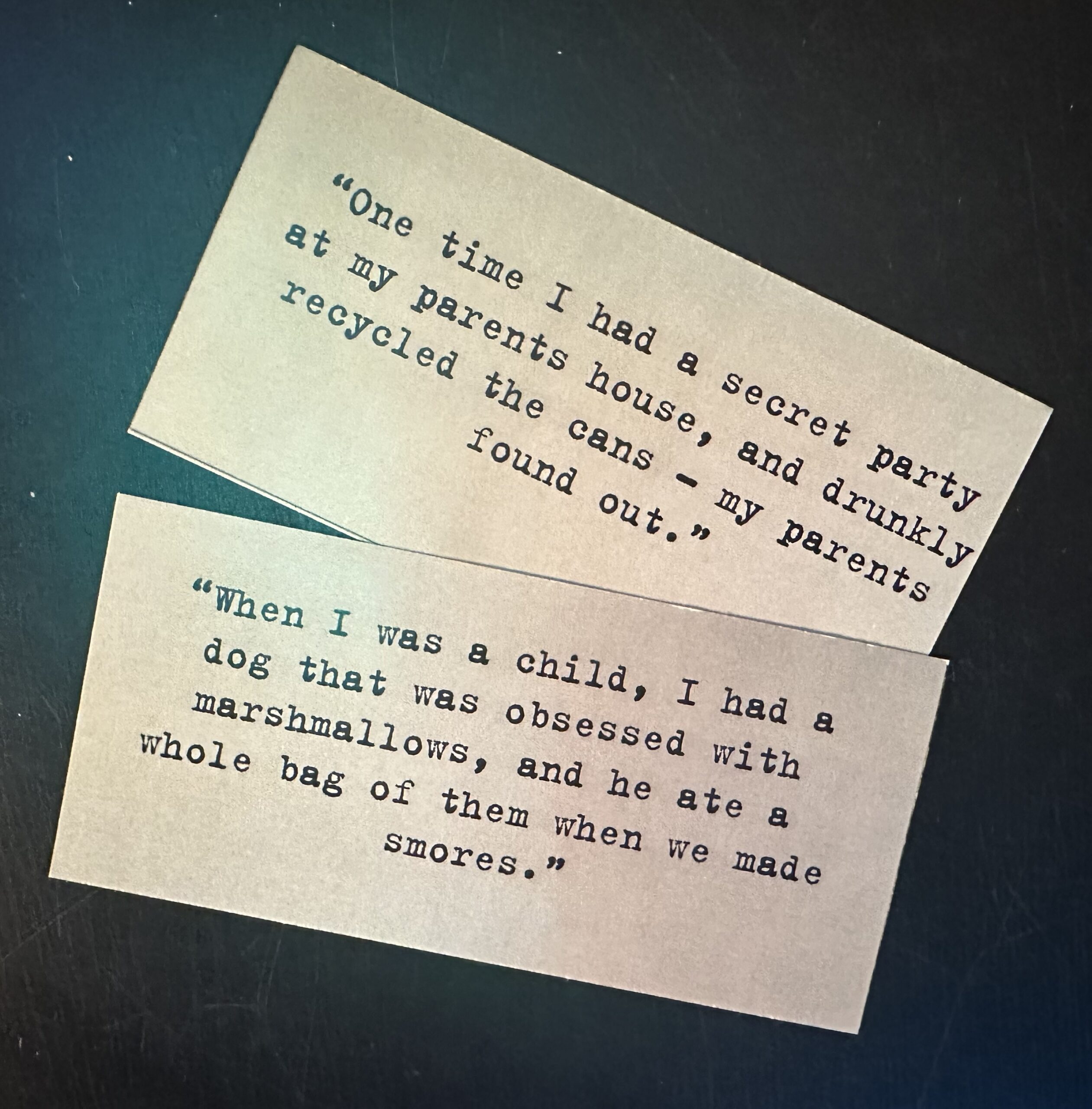
STATEMENT CARDS:
Still following the “aged” mood I was going for, these cards are printed on cardstock with a yellowed background with a typewriter font to add more mystery. The font I used was LTR NCND Variable which can be found on Adobe Fonts.
Now let’s go through my process of how I got permission to use people’s photos and statements:
I decided from the start that I wanted about 30 people, first asking my friends, then family, and then reaching out through social media. It was an extremely time-consuming process, as people were quite picky about which photo to use, and they wanted their sentences to be “cool” or “meaningful.” So much so, that I ended up having my last entry turned into me around 11 pm the night before the project was due.
The other factor that was quite tedious was drawing everyone. For those I was closest with, I wasn’t as worried about making it perfect, but for some, I devoted over an hour or so to the basic sketch. As you saw from my sketch time-lapse, I made the basic form and practically traced the details, this process didn’t always work as some images were further away than others, and drawing open smiling mouths can be tricky! By the end of the design process, I ended up only really getting 15 people to agree to the project, and to give me all the materials I needed following this prompt I shared: I need one nice photo of you, your name/nickname, age, and pronouns and then a single sentence/statement about something that has happened in your life, it can be happy, sad, weird, or a mix. I also clarified that other people will be reading these statements and that their real pictures will not be shown (I asked River and Amber permission to use the pictures they gave me, as shown above.)
Following this, let’s talk about the first playtest!
1.) What Questions did your players have?
I had about five or so people play my game, and they approached it pretty excited, commenting on the art and unique concept. Early on players wanted to know who each person was, but I of course didn’t reveal this until all cards were matched respectively. A few players recognized some of the people who I drew, which didn’t add much to figuring out who said what statement, given most of the statements were pretty unique and broad. Also, two of my playtesters were in the game! They didn’t snitch on themselves either, thank you, Beck and Amber!
2.) How quickly did they learn to play?
Extremely quickly, and there was some unintended teamwork at play with a fairly large group. Following the basic principles of matching, agreeing on the match, and the I would check all of the cards, and set aside the correct matches.
3.) What confused players?
Players did seem to get a little annoyed after mismatching the same cards over and over, so mentally being able to keep track of who you matched with what card is key.
4.) What made players excited?
Players enjoyed finding out who did what, and the stories behind the people in the game. It was also fun to see the two players that were included in the game and see the reactions of other players to their statements.
5.) What did your players enjoy doing?
When they started to get the characters matched to the statement you could tell it was relieving and fun for players. They also enjoyed looking at the art and reading the statements since quite a few were fun and unique.
6.) Did any aspect of the game frustrate players?
Yes, it took about 4-5 times matching and changing which card belonged to which character, I could tell players were getting a bit frustrated with starting over each round.
REVISIONS FOR VERSION 2:
Based on the feedback I received, I think version two will give players a bit more information on the character polaroids, such as “occupation,” “relationship status,” and “hobby” though this takes away a little bit from the concept of knowing nothing about the people shown, it still provides the same depth of empathy and “you truly don’t know what someone is going through” still stands. Doing this also may reduce the number of rounds players must do to completely match all the cards. Furthermore, as I suspected, players also wanted to be in the game. So I am considering taking it from fifteen to about twenty or twenty-five character polaroids and statement cards. Though this will add more to match, many of the people I will be adding in are different ages than those initially in version one. (Version one was ages 20,40, and 80, version two will be 5, 20, 70, and 100). This variety can make it easier to match cards as well.
I hope everyone enjoyed playing my game as much as I enjoyed creating it. Thank you to those who were involved in the design process and gave me feedback before first playtesting!
I absolutely love how you used real people and experiences to make this game. You put in a ton of effort, just with collecting the responses, not to mention the very beautiful drawings you made. I look forward to seeing future iterations of this!