
CASE STUDY~ Please check out my first post about this game, where I go over the drawing process if you’re interested!
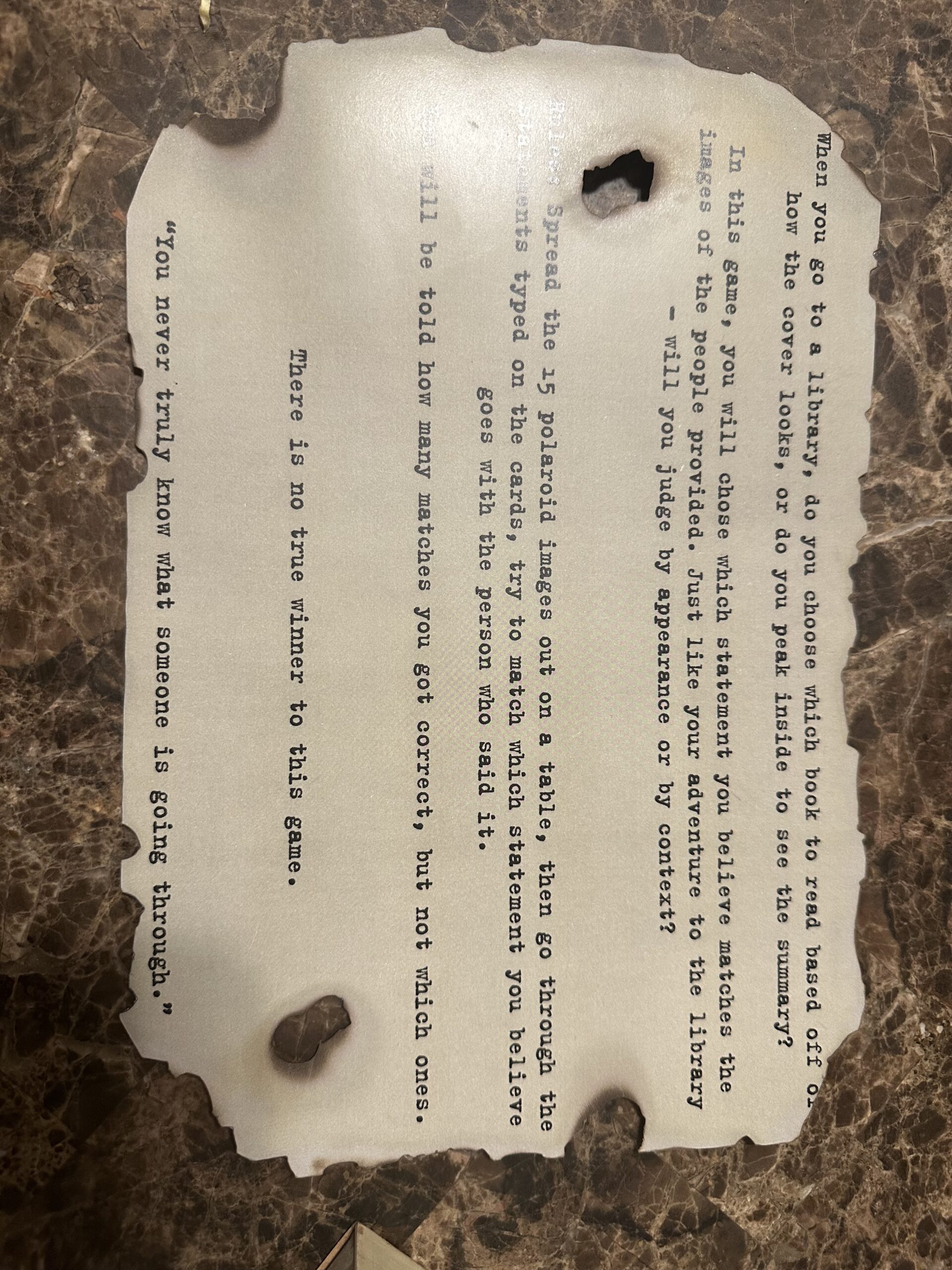
Summary: The game, “Don’t Judge a Book by its Cover” is about assumptions, and basing judgments on people based on a picture of them. The game has over 20 different people, with a variety of different statements based on an event or experience a person has dealt with in their life. These statements can be humorous, sad, or surprising.
Primary Audience: The primary audience is generally people over the age of 15 as some of the cards are more serious topics that a younger audience may not fully understand the weight of.
Design and Thought Process…
Iterative Design:
Basic Idea: Based on the idea of finding an old book, and judging its contents based on the old, worn cover. The character cards are based on Polaroids in black and white, to also “age” the design concept. More people were added through the versions, and new statements were used, but the design stayed consistent with the versions.
Version 1 Design: The statement cards are an old yellow parchment style, and the font is comparable to typewritten. I wanted the impression when seeing the game for the first time to be “This looks old, and like a crime scene game.” The character cards are loosely based on the standard style of a Polaroid photo, as it gives some room for the character’s names, age, and pronouns. For the rules sheet, I used the same yellow and carried the same typewritten font over.
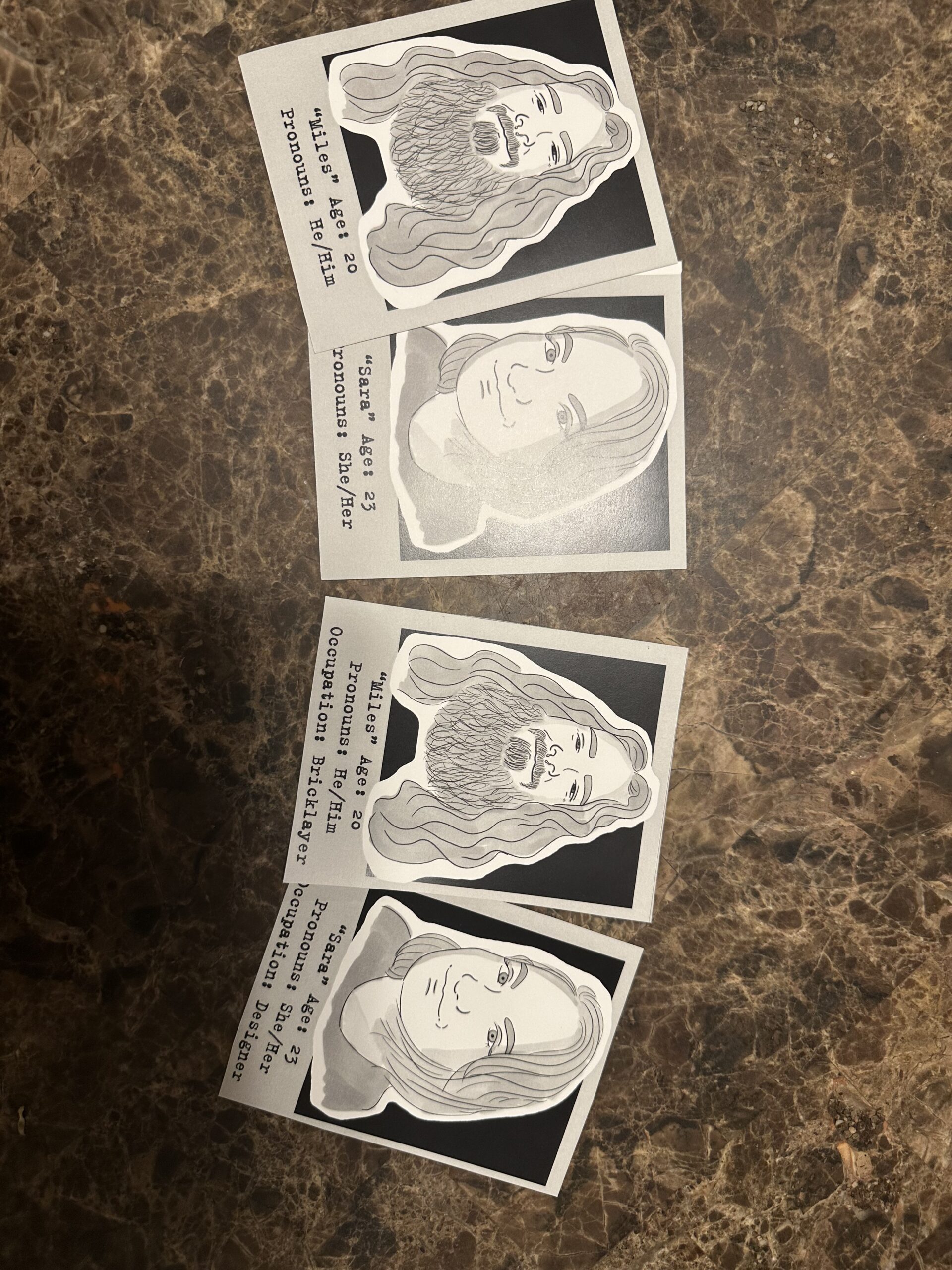
The Polaroid Cards above are the Version 1 (Left) and Version 2 (Right 2) designs for the cards.
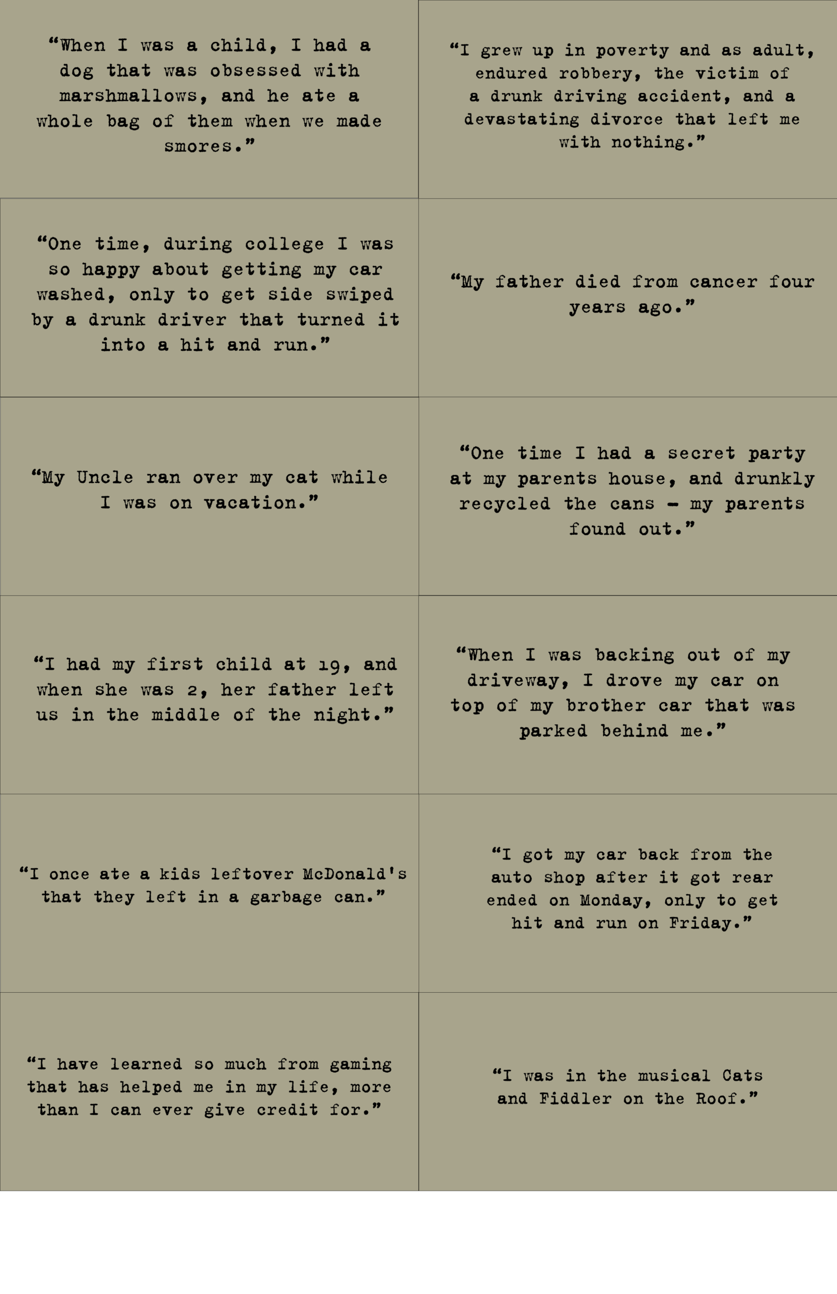
Above: Some examples of the Statement Cards from Version 1
Version 2 Design: I chose to stick to the same design concept but added a few more details and styling to the second version. For the Polaroid character cards, the art style was consistent, but I added an “Occupation” to the cards as I noticed many players were spending a lot of time using the age of the character to match rather than any other detail. It makes the game a bit easier, but it also shows how much players are paying attention.
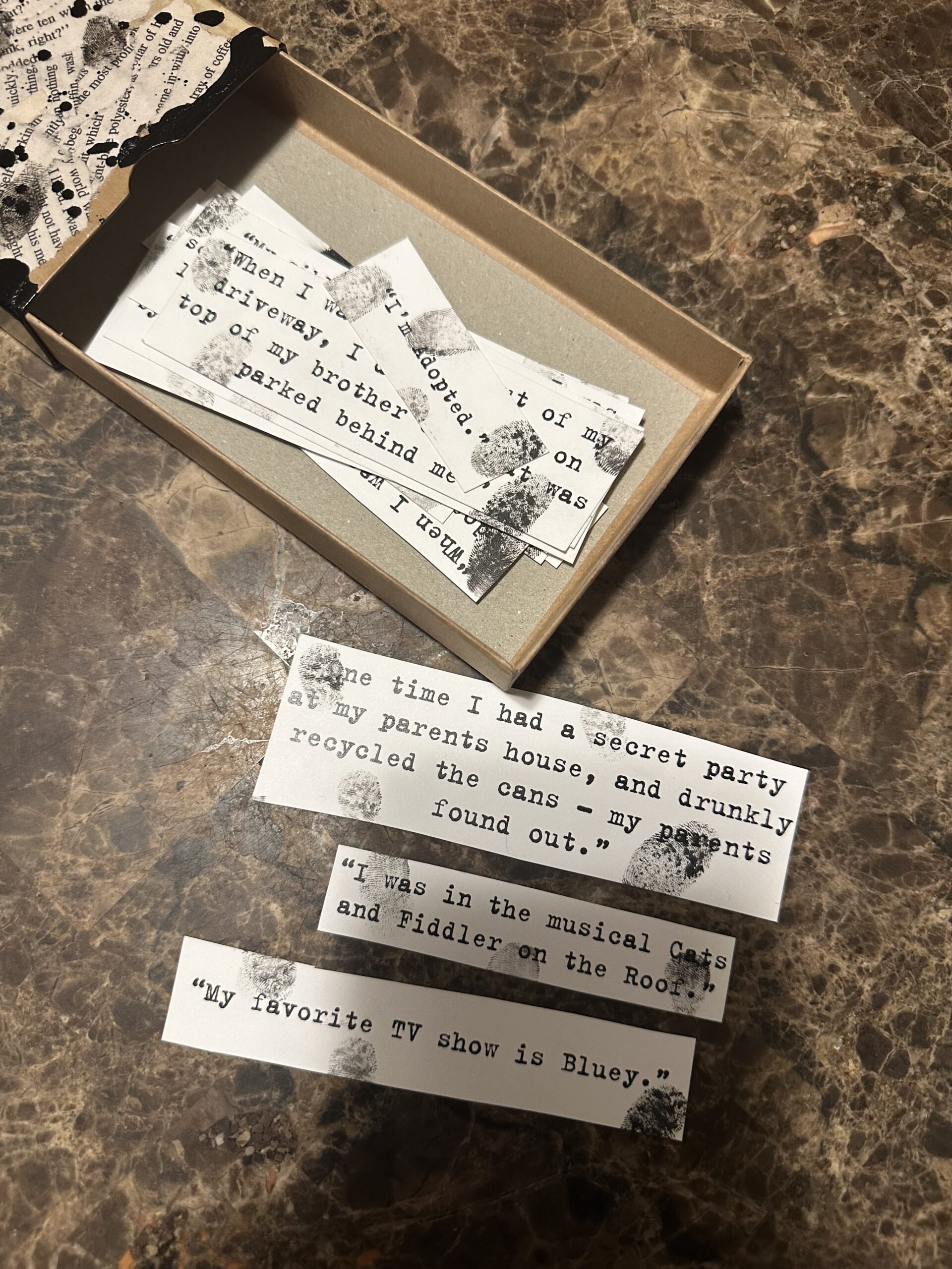
For the statement cards, I decided to make them more like slips of paper, due to a happy accident of the yellow coloring I used before not printing correctly. (I didn’t want to waste any paper) So I ended up cutting the cards down just to have the words fit, and used stamping ink to apply my own thumb prints on the paper’s design.
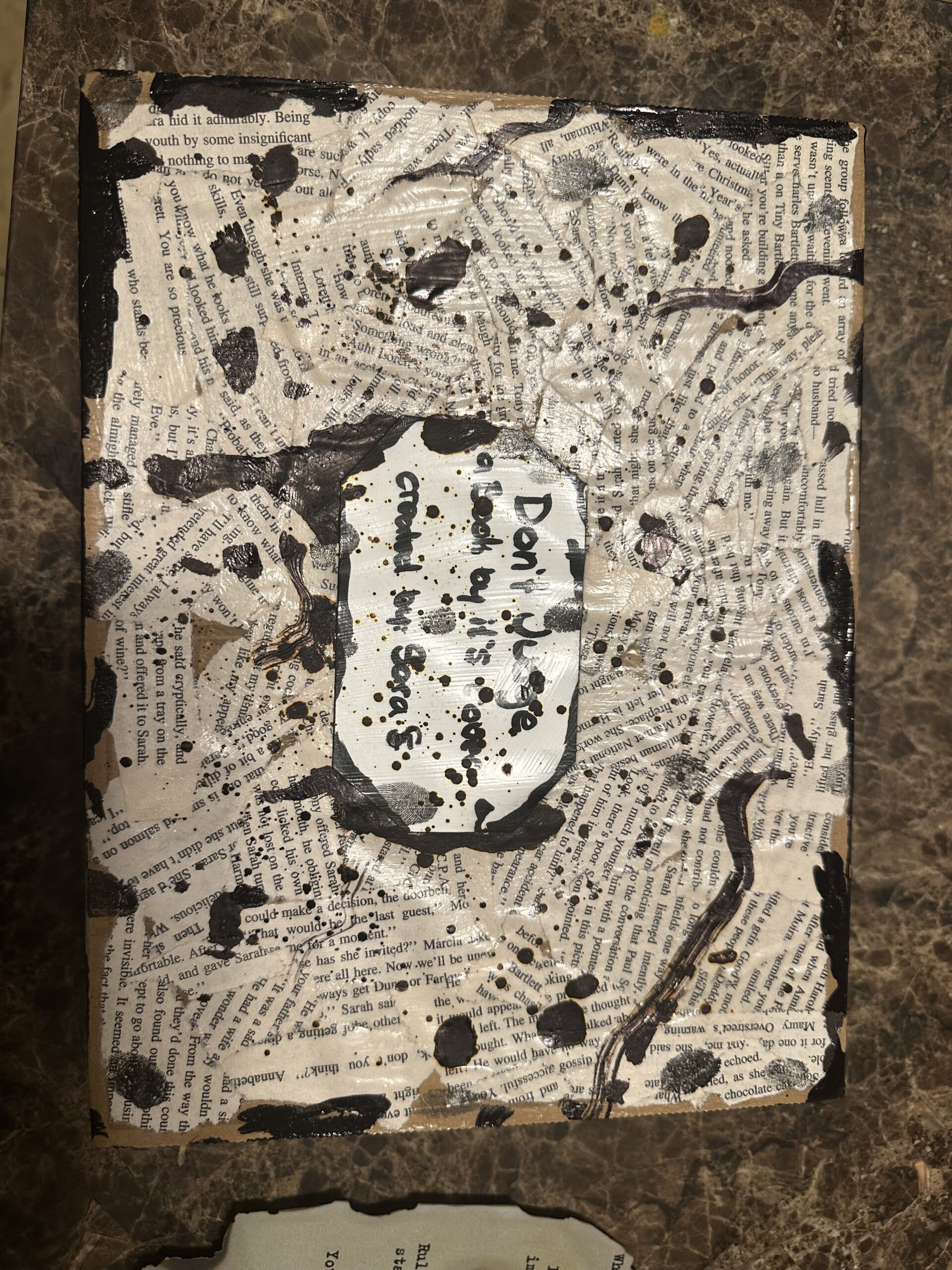
I did design to include a box, and I had two other smaller boxes I used as well (I recycled!) To make the boxes have consistency and style, I painted the parts of the boxes that were printed on with posca pens and brown acrylic paint to age it. Then I used an old pile of book pages and applied modge podge to the paper and box (Think like paper mache) and used lots of alcohol ink and the same stamp ink to apply my finger prints. For the rules paper, I reused the same page as before, but I CAREFULLY, used a lighter torch and burned the edges.
Game Mechanics: The game was intended to be super simple, spread the character cards out, and then the statement cards out in a different area on a table. Then, carefully read each character card and observe their name, age, pronoun, and occupation, while also observing what they look like. Then read the statements aloud, and decide who fits what statement, based on the content of the statement itself, or the information provided on the character cards. After each statement has been matched with a person, the game master (Me) will check and take away the ones that are correct. The game continues until all cards have been matched correctly.
Player Goals: Understand the concepts of judging others based on appearance, and little information given about them – you never truly know what someone is going through.
Gameplay Sequence: Place all the character cards out, and then all the statement cards, observe and read/look at all the cards. Try to match the correct cards with the people, repeat until all cards are matched.
Game Board and Components:
Version 1: The game contains 15 Polaroid Cards, 15 Statement Cards, as well as a rule set.
Version 2: The game contains 18 Polaroid Cards, 18 Statement Cards, as well as a rule set, two small boxes labeled “Statements” and “Polaroid” Cards, all packed into a bigger box with the title of the game on the face of the box
Rulebook and Playtesting
Rulebook Sample:
Playtesting Notes:
The biggest lesson I learned was that not everyone took the time to observe as much as they could about the people in the game, but players also didn’t stereotype and judge people as much as I assumed they would! Players would often build thoughts and ideas about who did what, and I think after multiple rounds of playing, people became a little overwhelmed with the concept of getting the cards matched incorrectly all the time.
Game Maker’s Play Test Notes – Don’t Judge a Book by it’s cover (Combined for Versions 1 and 2)
- What questions did your players have? Who are these people, and can I be in the next version were the two biggest questions
- How quickly did they learn to play? The rules are quite simple, so they worked together and figured out the concept quickly.
- What kinds of interactions did the players have? Laughter, surprise, and empathy in general when cards were matched correctly. Some cards were humorous, and some were a bit sad. I think they learned a lot about being empathic with others.
- What confused players? They would match a card incorrectly and not remember to move it during the next round, so they would keep getting cards wrong.
- What made players excited? Seeing their friends on some of the cards, and getting matches correct
- What did your players enjoy doing? Reading all the statement cards
- Did any aspect of the game frustrate players? Getting matches wrong multiple times.
Game Reflections:
I enjoyed the process of creating this game and the meaning behind its purpose. It was really enjoyable to connect with people during my process of developing the game, hearing some of their stories, and seeing their reactions to my drawing of them. I hope to make another iteration of the game that will allow people to play without the need of having me around, as well as some changes in how hard it is to match some of the cards. But all in all, I think the game was a huge success!
This game teaches a good lesson, and the serious tone of everything can show just how real life can get. I love the touch of making it black and white to add to the aging factor of everything. as well as the aesthetic of the old notes too
I agree! I love the aesthetics of this game!
I genuinely love this game so much. You put so much time and effort into it and I love that you used real people’s experiences instead of just creating your own
This is such a thoughtful concept; it challenges biases in a creative, engaging way. I like how it mixes humor and seriousness to make people reflect. Definitely a meaningful experience for the right audience. Also the art style is really impressive makes it even more fun to play