Review #2

For my one page website I decided to review brand.strv.com.  SRTV is a software development company that prides itself on beautiful design and intuitive functionality. Their “brand” section is an entire one page site devoted to sharing with potential customers the ideas behind their design while also showing off what they are capable of creating.


The experience begins with a fullscreen animated welcome screen with an arrow at the bottom prompting you to scroll down.  Upon scrolling, the welcome screen moves up and leaves the screen. The user is greeted with a page of mostly white space with a short paragraph about the company accompanied by some graphics in the center and a vertical menu on the left.  The menu allows you to skip up and down within the page, but it acts as a bit of a distraction from the experience.  Someone who wasn’t aware that the page was meant to be navigated as one page might take this as a typical homepage and use the navigation menu to, well, navigate.


As far as color and texture goes, the site keeps things simple.  Everything is flat, clean, and simplistic.  The majority of color on the screen is dominated by black, red, and white.  In fact, there’s a section on the page that shows these three colors and states that the company never uses anything else but these three.  The only use of other colors is when examples are given of what NOT to use, and even these are crossed out with red lines of the same color.  


Overall, I like the consistency within this site and I think the company who created it did a great job of portraying their brand’s idea and thought process.  As someone interested in design I learned a bit from this and might use some of their ideas of design in the future.
I give this site four <div> tags out of five, and I’ll throw in a bonus hex color code of #EFOD33 to honor their brilliant shade of red.

Review 2 thinkbear.net

thinkbear.net Review

Thinkbear.net is a portfolio website displaying Jens Nielsen’s work as a digital designer. It is a single page site sectioned off into four different areas. When you scroll, it goes to the next page. The website gallery also has left and right arrows to scroll through more work. The layout is very simple and intuitive. Everything is clearly laid out for one to learn more about the designer and his works.

The site is able to stay consistent without losing clarity. It sits in the perfect medium. Although very simple, the website has clear visual hierarchy on what is most important and the order to look at things. His name is the largest considering this is a portfolio of his. The social media links are grouped close together and are the same size. Each area of the website is clearly sectioned off when you scroll and each has a purpose. The different items that can be clicked are pretty noticeable and some are even animated. His photos zoom in when you hover over them indicating that you can click on them. They then take you to the actual Instagram photo. Overall, the site has good spacing and is lacking any clutter. It has a very crisp and organized feel to it.

Texture: The use of shadows and rotation on the website display creates a really intuitive 3d effect. The background is a very clean and minimalistic. The portrait on the first section has a grainy texture to give a really rugged look when combined with the black and white.

Color: The first web paige has a black and white background with very vibrant colors for the social media buttons. It then rotates to very vibrant colors involving his work. Then it alternates back to black and white for his summary and finally ends on more of his work in color. The alternating pages works really well. The background is a light shade of grey that does not distract from the important details on the pages.

In conclusion, thinkbear.net is a very well designed site with a simple purpose that executes quite flawlessly. It is simple, but intuitive. Everything is easy to read an navigate due to the lack of clutter and good hierarchy. The buttons and objects are easily defined. Each area looks unified to the whole site. The logo and social media buttons follow you as you scroll on every page except the photograph gallery and really help with the unity.  The site definitely creates a smooth and relaxing experience while you learn more about the artist himself.

Tristan Coyle

Review Number Two

The website that I chose to review is https://onepagelove.com/luca. Luca is a restaurant, and on the site is a full menu and a list of the workers, along with various other things. The color and texture of this website is very fun and pleasing to the eye. The color of this website, in my eyes, is defiantly a strong suit. The order in which the site is laid out is easy to understand, and it has a great sense of flow to go along with it. the list of different things to look at are put in place in a way that a small child would be able to understand. The way to get from one page to another is simply by scrolling up and down due to the fact that this is in fact, a single page website. It is very easy to understand and read what you are looking at in this website for a few reasons. One being that it clearly tells the reader what they are looking at in the top of each section. Secondly, it is broken off into different colors for each section giving the eye an easy understanding that it is looking at a different part. The location of things in this website are mostly centered and easy to keep your eye on. The layout of finding the Hierarchy in this page is also very easy to do, being that the top of each section will have the title of what we are looking at, and the there is a clear level of importance. This site has little sections at the bottom or middle of the pages that have a small box around text saying something like “map”. This is easy for the reader to tell that you can in fact click on those parts. There is a clear understanding of that can and cannot be clicked on in the page. And lastly, the amount of cluster that is put into this page is at a minimum. There is not much that makes this website too much to look at, and there is a great layout of clarity to view. Overall, I personally feel that this website is very well done. It has clear points of importance, and there is a comfortable amount of space between everything. You can easily navigate between the different pages, and you can clearly tell that is clickable. This website is one that anyone could easily use.

Review #2

https://www.zalarob.com

This website is the page of a german family business that revolves around the sustainability of natural resources with oak being a main contributor. The color pallet consists of soft whites, tans, charcoal gray; neutral earth tones. For the sections with a mainly white background, the outline of wood texture is overlapped to give variation in what you’re looking at. Being a single page site the general direction of the page is scrolling vertically, top to bottom, with some sections giving you the option to click right or left to slide through photos.

This website exhibits good design. Even though it was in a different language I was still intrigued by the design. As a whole it was easy to navigate with clear direction of where to find specific information. The text “Don’t Make Me Think” stresses the importance of the sites ease and readability for the user. This website uses the design elements of symmetry through its images and text and emphasis through its headings to assist in this. Each section is clean cut with minimal text to avoid clutter. Overall I love the design of this website, it’s simple and clean cut. I’m not used to single page sites so this was definitely a good one to look at. Although it is only one page it incorporated a lot of different elements into it to add variety such as a slideshow, interactive button, with varying layouts dependent upon the section. Chapter 3 mentioned a photo where if you toggled over a face a blurb would appear with their name. This concept was used with a bock of wood where different diets of the wood slab highlighted different information. I was very impressed and think this website definitely helps the family business.

Demo: CSS Dropdown Menu

I chose to create a dropdown menu using CSS. The menu should have a list of links that appear when you hover over the parent div. You can make the menu have as many links as you like. When you hover over each option, the background color should change as an indicator of which link you are about to click.

HTML
Make a parent div to hold everything- the main button and all the links that will appear when you hover over it. Mine is called “dropdown”.

Inside that div, make a button that will contain all of the links. Mine is called “menu”.

Also inside the parent div, but not inside the button, make a div that is the parent of all links that appear when you hover over the button. Mine is called “dropdown-content”.

Inside this div, create as many links to other pages as you want using .

Close all divs by using two

tags. This is all of the HTML needed.

CSS
Start your CSS with an id for your button. In this case, mine would be #menu. Use an id because it is unique. This is the only element that is visible at all times. Style it with background colors, changes to the text, and any other changes you like. How the button looks does not impact the functionality of the dropdown menu.

Next in your css, make a class for the div that holds all of your links. Mine is .dropdown.content. Add display:none to hide all of this until you hover over it. Add a width and background color.

Add .dropdown-content a. Adding “a” means these declarations will only affect links. Style the links however you want, but be sure to add display:block. Adding text-decoration:none stops the links from having an underline or color change when clicked.

Next, add the rule .dropdown-content a:hover. This will only make changes to the content when you hover over it. You can add a color change here so that each link’s background changes when you hover.

The final rule will be dropdown:hover .dropdown-content. Add the declaration display:block. Without this, the dropdown menu does not appear on hover.

Web Review #2

While searching for a one page website to write my review on I stumbled across a website named “Scroll For Your Health”. Although it caught my eye among a list of websites due to it’s blandness, upon visiting I quickly realized that it’s far from bland. “Scroll For Your Health” initially doesn’t offer aesthetic value besides giants white words with a solid black background that reads scroll for your health and some small different colored ribbons bordering the webpage. The ribbons turned out to be interactive and when clicked on they redirect the user to other sites that have nominated, mentioned, or criticized “Scroll For Your Heath”. I found this to be an extremely good idea allowing me to read up on what other people thought of the website. After reading a pleather of good reviews I decided to scroll through the website and find out what all the hype was about. As you scroll down, div shapes begin to fall into place to create pictures of various fruit and facts about the fruits appear in the upper right corner. Each fruit has a selected color that matches such as red for strawberries, orange for oranges and yellow for bananas. Although the site is extremely well made and teaches healthy food fact through an interesting interactive way, the site could use some improvements. First off there are only three facts about each food, I personally would find it more interesting if there were more facts for each food. Also I think it would be cool if the fruit pictures were interactive in the sense that if you clicked on one it would redirect you to something like more pictures of the selected fruit. Besides more content for the viewer to read “Scroll For Your Health” is extremely fun to play with and definitely gives me a few ideas for my own website.


Review 2

For my second review, I am reviewing the single site, NeoBred. I love the use of colors through out this website. The background was black and most of the text was white. Only headers and words needing emphasis were one of four colors (pink, yellow, hot pink, and cyan) that were used. With the black and white, the four other colors pop really well and achieving the emphasis that was desired. Also having the black background and that only one section is displayed at a time, the reader may think that it is actually a multiple page website. The text is a neat and precise font, which gives me a clean texture feeling.

In order to move from section to section, the reader has to scroll up and down. There is also numbers that you click on to go to the next page of information in each section. On the right, there is a menu section that will cause you to be able to move from each section as well. The headings are located on the left, and only a few lines of the text on the right. Below the headings are numbers that you click to move forward to the second lines of text in each section. There also is a count that tells you which section you are on out of the total number of sections.

I believe this site is designed well. I picked this site from onepagelove.com because the color popped and got my attention. As I looked throughout the rest of the site, I saw that NeoBrand used the colors really well. It was very easy to navigate from section to section. Also I really liked the fact that there are only a few lines of text for each section, because it makes it easier for the reader to follow. Overall, I think this is an aesthetically and functionally pleasing website.

Is Invisible- Site Review

http://isinvisible.com/

“Is Invisible”, surprisingly and unfortunately, is not a website looking to sell invisibility cloaks and comic book X-ray specs, rather recommending a products and gadgets designed to be as minimalist as possible.  The general theme of its wares can be described as “clean efficiency”. It’s worth noting the website doesn’t actively sell goods, rather acting as a hub for minimalist products.

Much like the gadgets and gear the site advertises, the website is all about efficiency. Nothing is flashy. The color scheme of the site itself is monochromatic, existing entirely within the gray-scale. The products themselves are showcased in color, but even then they’re more muted than saturated. It’s about displaying a realistic look at the products, not demanding attention towards any one thing. Further safeguarding the calm design the website doesn’t house video or banner advertisements. No need for Ad-block here.


The products are split into two columns, one on either side of the screen. There’s a simple picture of each product, the price, and then the next product. Rinse and repeat. The name of the site sits at the upper left corner of the page and will scroll down with the page. A question mark sits in the lower right. Clicking it pulls up a what is essentially a text box explaining the idea behind the website, as well as naming the two people maintaining the site. Clicking on any of the products opens up another page, to the site that sells the desired product.


Being a single page site, the only real navigation is scrolling up or down. This design choice is perfect for the site, again keeping with the minimalistic theme. As a person well versed with the internet, scrolling down was a natural progression to navigate the site. Someone less accustomed may have trouble, as there’s no obvious hint that there’s more below. This could be seen as a flaw, but given the nature of the site it’s perfectly acceptable. Adding even an arrow pointing down, or having the next product picture visible at the bottom of the page, would disrupt the clean looking site.


As implied, the website is perfectly designed for its purpose. The benefit of the sites theme matching the theme of the products it advertises is subtle but brilliant. It’s clean, minimalist, but still extremely clear on with how to navigate. It’s incredibly well designed for its purpose. The only thing that doesn’t work is the prices. They certainly aren’t minimalist.

~Jeremy Molinari

Intro to Web: Review 2

Studio Dunn is an interior design practice in London. My first thought of the website was that it was very modern looking. It almost reminded me as if I were looking at a home magazine. I think that the color and texture used made it very distinctive as to what the website was there for. I also enjoyed the navigation technique for this single page website. You did not have to scroll up, down, right, or left; instead there were arrows on the right side of the page that pop up as your mouse scrolls over them that lead you to the next set of images. Because this is a website for interior decorating, there are a lot of images used. The arrows made it much easier to navigate and I feel like it made the website look cleaner. In the upper right hand corner there is a button with three lines, symbolizing more content, which takes you to the “about me” portion of the website. Here there is a short summary about the company, its history, and what they do. They also provide contact information in this section. The only issue is that in my browser, the words began to run together at the end of the type. It would be more beneficial to the reader to make sure that the words are spread out enough on every browser. I think the use of images and the arrows makes the site extremely easy to navigate.  There is not a lot of buttons that have to be clicked, which can be confusing to some people. I like the short and sweet About Me section, as it is almost as if they let the work shown in the images speak for itself. Overall, I think that the design for this website was done extremely well. It has a very modern look to it, which greatly fits the Interior Design theme. It is easy to navigate and appealing to look at.

ARTM2210: Review 2

The site I chose to review is [https://2016.cssconf.com/]. I chose this site because the choice of color pallet immediately drew my eyes to it. The contrast of bright colors such as bold blue, magenta and lime green on the pastel pink really stood out to me.

Another thing I think worked well for this site was it’s use of transparent, gradient, organic-blob shapes and transparent zig-zag boxes. As I scrolled through the site, I was happy to see these shapes repeated. What disappointed me, however, the middle of the site, because the color and textures used in the previous section just disappear, which I found odd and inconsistent.

The site is divided into three sections: About, Videos & Slides, and Sponsors. I felt the ‘About’ section and ‘Sponsor’ section were both executed very well. However, I felt the ‘Videos & Slides’ section was extremely bland and repetitive. I understand that the designer probably felt that by taking a minimalistic approach, the site’s design wouldn’t take away from the content it was showcasing; however, I feel the site would look much better if they would have continued the colorful shapes and textures throughout this portion (as seen in the ‘About’ and ‘Sponsor’ sections).

Another thing I think worked well for the site was it’s use of alternating background colors to divide the sections of the site. For example, the ‘About’ section of the site has a light pink background, then the next section, ‘Videos & Slides’ has a white background, then the third section goes back to the light pink background. This helps clearly differentiate the sections without having to read through all of the content or rely heavily on the navigation bar in order to find what you’re looking for.

Overall I really enjoyed this site. However, I found it rather strange that a website that was built to showcase a CSS Design conference would have a very boring ‘Videos & Slides’ section. But besides the odd inconsistent portion, I would definitely consider this one-page-website to have a successful use of color and texture.

Challenge set 2

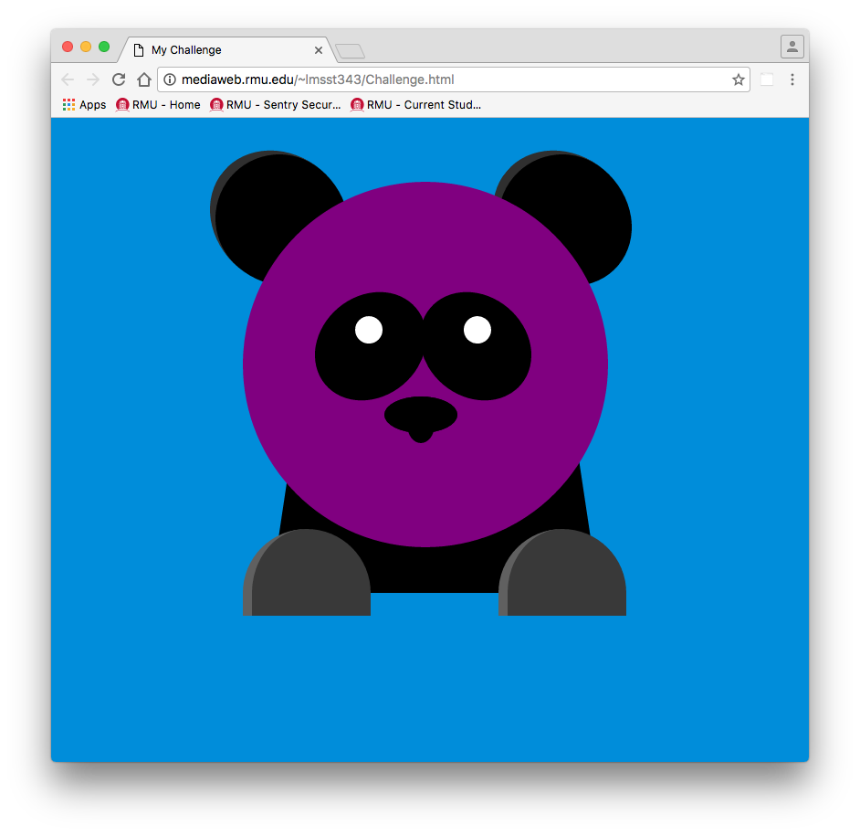
Color Change panda by Lindsay


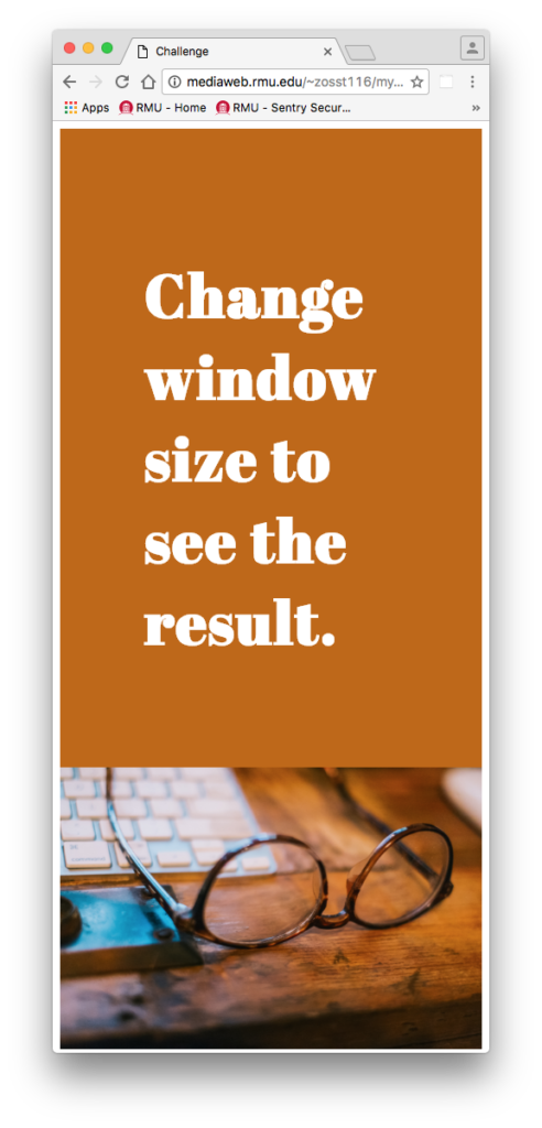
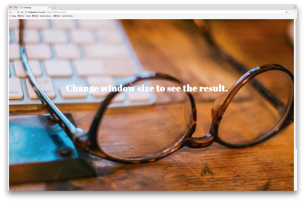
Background change with window resize by Zane

Review #1

For my first review, I decided to take a look at the website of one of my favorite clothing brands, Supreme. Their website is supremenewyork.com, and they’re based on a skateboard/streetwear company Supreme that has been around since 1994. I personally have never liked their homepage, it’s very minimalistic and the setup is nice, but the look isn’t very pleasing. Nonetheless, the homepage is extremely easy to navigate. It shows you the logo and gives you options to visit an about page, an information page, review clothing catalogs from previous seasons, and also an option to shop online. The online shop for Supreme’s website is very cool, and is personally one of my favorites. It opens up with small rectangles pictures of all the sites various clothes, with options to click on them, or simply browse the site’s catalog. The site runs very smoothly, and in essence is very pleasing to work on. They do a good job of keeping everything up to date, and overall I really like the site.