


Web Review 4
Considering my own portfolio, I chose to also take a look at other portfolios from around the web. One that stuck out to me, not in spite of it’s simplicity, but because of it, was http://zcole.me. This one was very helpful in designing my own portfolio website, as it was direct, concise, and to the point. This made me want to approach this project in the same direction, with putting my own spin on it. He introduces himself, he talks a bit about himself, and he showcases some of his work.
Web Review 3
I chose to review both bravofranco.com and sixpennkitchen.com. I personally preferred the aesthetic of sixpennkitchen, but felt bravofranco had more tools to actually use the site. It felt like there should be more to sixpennkitchen, as if that was just a home page that could navigate you to other websites, while bravofranco’s page felt more complete. Overall, I think that bravofranco’s page is more effective, as it has a better sense of unity and balance, but I do prefer the layout of sixpennkitchen
Harrison Klehm — Review 4
For my final web review, I chose to review another portfolio site that is built in the same style as mine.
https://www.christammar.com/projects
This is a very well designed portfolio site. It is similar to mine in regard to its minimalism. The layout is quite simple and easy to navigate, making it work very effectively as a portfolio. The layout focuses primarily on images and uses words only where necessary. The navigation is also well done, and extremely simple. There are only two buttons at the top, which are “Projects” and “Contact.” The colors are extremely simple and minimalistic, which lend to a modern design, which is good for a Graphic Designer’s portfolio. As for texture, due to the website’s simplistic nature, it is all kept very simple. It is mostly white pages with images and minimal text on it, all to keep a modern feel.
Like Steve Krug mentions in Don’t Make Me Think, non-essential information should be cut from a website. This portfolio website takes that to the extreme, in that text is extremely minimal. I think it is done sort of well, however many of the images are left without context and it may be rather confusing as to what each of them represents.
However, another topic to consider covered in Don’t Make Me Think would be how quickly a user can use a site without thinking. And one key feature this site lacks, in particular, would be titles for some of these sections. The images act as links in this site, and when you hover over them, they turn nearly fully white with an eye icon over them. This is what indicates to the viewer that the image is clickable. However, the images alone do not make it fully clear what each image is supposed to represent, especially that in the bottom right. Without any headings in the image or any words to match it whatsoever, the viewer can be lost in this type of website.
My website aims for clear navigation throughout the entire system of pages. I have it split into three sections instead of two, as to not let each section get too cluttered. I also make frequent use of headings as that is what website viewers typically look for when they are looking for something in particular. I also use images for navigation, but in the My Work section, where it is clear that those images are my illustrations due to the presence of other illustrations in the area.
My website also uses quite a bit more words. Though I agree words should be kept minimal, I believe this website’s words are kept minimal to a fault. It feels like some important information is being left out. I am also unable to learn about the designer himself, as the website is primarily just images of his work, and very little about how it was made, or about him himself.
Nick Veltri Review #2
Web-expert.it is absolutely the most aesthetically pleasing website I’ve ever seen. I chose this website because it immediately grabbed my attention. On this web-page, it seemed like the page was animating as I was scrolling down it, showcasing the talent of this web design group very strongly. Animations are literally designed to move on the page as you scroll. The pallet used expresses a very strong understanding of color theory. The sepia-tone pictures contrast very well with the blur and red overlays.
Harrison Klehm: Web Review 3
For my web review I reviewed the following websites:
http://www.no9park.com/#intro
https://burgatorybar.com/
Both websites follow the standard format of having the navigation bar at the top alongside the logo. They both additionally have some buttons on the right side of the screen used for quick navigation across the page, though it is a bit harder to notice this in No. 9 Park’s website. Overall, the websites are functionally pretty similar, aside from their aesthetic differences.
In terms of some of the issues these sites have, Burgatory’s website changes the conventional navigation system a bit using terms like “Order Up” and “Happenings” that are not immediately obvious. Krug goes over this in his book early on as part of one of his rules, where buttons should be straightforward and not require people to think. No. 9 Park’s navigation, on the other hand, follows these straight forward conventions well.
Both websites are well balanced in that they are symmetrical and keep the reader’s eyes flowing in a natural direction. Emphasis is placed properly where the more important elements are made bigger or more visually obvious. Both websites make the headings and sections distinct and separated for easy navigation. They both maintain unity as each page within this website maintains the same styles. No. 9 Park goes for an elegant style, while Burgatory goes for an informal style that makes use of heavy typefaces and textured type for the top headings. The layouts are all kept relatively simple where most things can be found by clicking links on the homepage. One does not need to go far to find what they need. Of these important principles Krug mentions, these websites do them properly for the most part.
Another thing that Krug mentions is to limit text to what is essential. Otherwise, the reader will typically only scan the text and not read everything written. The Burgatory website does this well in that the text is very minimal, whereas the text in the No. 9 Park site is very lengthy. Though some of it may be necessary, it could certainly be condensed.
In general, the two sites are both very effective, but I think that the No. 9 Park site is more effective. It uses a mix of typography, photography, and design to give the reader an image of what the place looks like, and it has convenient and easy to use navigation. It has a good sense of priority and lists the important topics first, making it easy for viewers to find what they’re looking for. The Burgatory website’s difficult navigation makes it a bit harder to navigate, as even a few seconds of thinking can make a website user frustrated and not want to visit it. Otherwise, I think that the design is minimalistic to a fault, and some of the orange text is hard to read compared to the background. No. 9 Park, on the other hand, excels in this type of contrast and uses images effectively to enhance the website design. As such, I believe that No. 9 Park is the superior website.
Harrison Klehm — Web Review 2
For my second web review, I chose to review the Pest Stop Boys website.
https://www.peststopboys.co.uk/
The Pest Stop Boys’ website uses an excessive amount of colors and animation. While it certainly is impressive how they can add all of these effects in CSS, it is overdone to an extent and makes the information hard to read. In the website’s defense, however, there is little information that is actually needed to be shared. The website offers a quick introduction and ends with the contact information, all in a very large font. This would be more understandable if the text didn’t have animations when hovered over, making it extremely more distracting. Aside from the readability issues, however, the website is an excellent work of art and utilizes advanced CSS features well.
Like mentioned in the second chapter of The Principles of Beautiful Web Design, color is very important to a composition. This also applies to websites. The website here uses an extremely diverse set of colors, though it does well to incorporate value as well, as it separates dark colors from the bright colors. The cursor is a blob of inverted color, where everywhere the cursor is placed, the colors are inverted. This makes an interesting effect that is not extremely distracting, due to the small size of the blob. As for texture, this website uses simple colors without any texture or gradients. While texture does help a website immensely, this website works well without a large use of it. The minimalism mixed with the large selection of colors makes up for the lack of texture and gradients.
The navigation of this website is extremely simple. It is a relatively small scroll from the top of the page to the bottom, and all information is aligned in a similar way. As mentioned on page 34 of Don’t Make Me Think, the most important information should be more prominent. This does not always mean larger, but it should definitely stand out. This website does an excellent job of displaying what is especially important. Phrases such as “we stop” before “insects” and “contact us” before the contact information are made smaller because they really are not as important as the content following them. For instance, once someone sees phone numbers and emails and other information, they will often not need to think to know that it is contact information. The website is straight to the point in this regard, making the user’s trip quick and interesting. As such, this website can be scanned rather easily and the point is made very clear and understandable.
In a general review of the website, it works very well as a composition. The advanced yet not extremely overwhelming effects of this website show a great level of expertise and may reflect on the work of the Pest Stop Boys themselves. It is overwhelming in some aspects, however. The “Our mission” statement is on a lower contrast background, and all of the text is animated, making it majorly distracting. The color changes when hovering over text, as well as the movement of the text itself, may be disorienting as well. Despite that, the website still leaves a good impression on the viewer, marking a very good website, with the mentioned flaws being distractions that prevent it from reaching perfection.
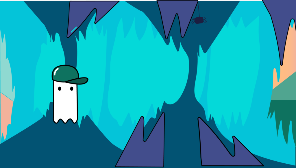
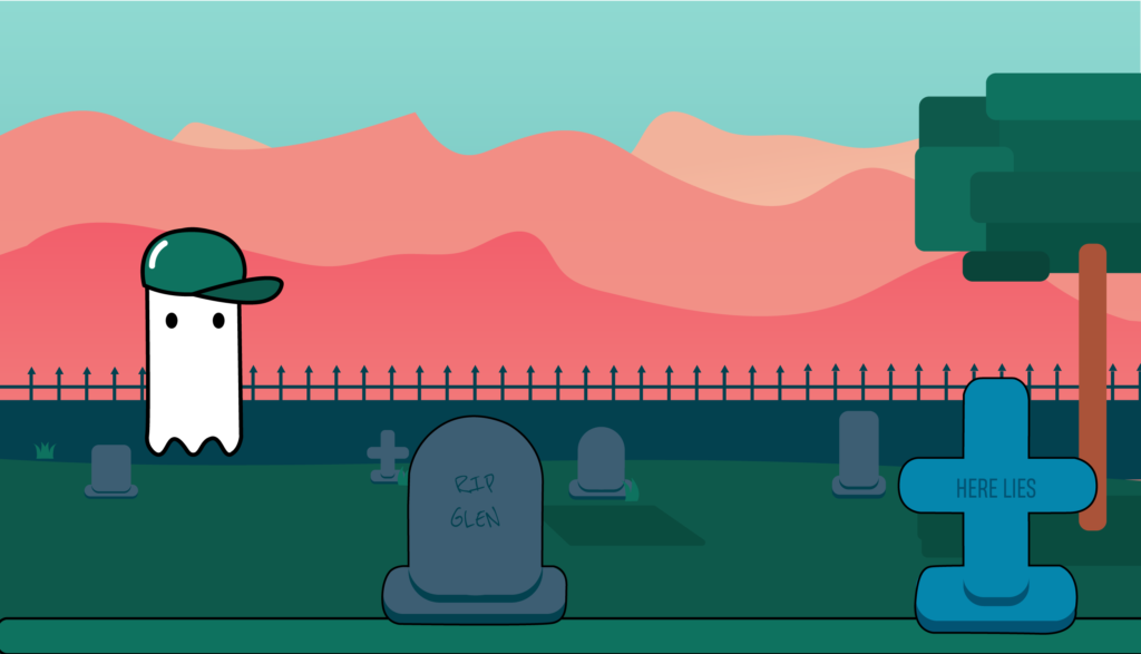
Glen the Ghost The Game
Check out my full project on my website !!
https://tueldesign.com/glen-the-ghost-the-game


Glen Plushie 

Project wireframe
Scott Garner
Jennifer Whitney
Mouna Andraos(By: Trent Burns)
About Mouna Andraos
Mouna Andraos is a Co-Founder of Daily tous les jours. She Co-Founded this with Melissa Mongiat in 2010. The art studio in which they created is best known for it’s work in public places and is based in Montreal Canada. Mouna holds a Masters degree from New York University’s Interactive Telecommunications Program (ITP) and a Bachelor degree from Concordia University. She was a research fellow and is an alumnus of Eyebeam Center for Art and Technology in New York City, and in an adjunct professor at Concordia University’s Design and Computation Arts department, and UQAM’s École de Design. Prior to Co-Founding a design studio, Mouna worked under the label Electronic Crafts exploring the intersection of mass-produced electronics and handmade crafts to create playful, sustainable, or participatory objects.
Her Works
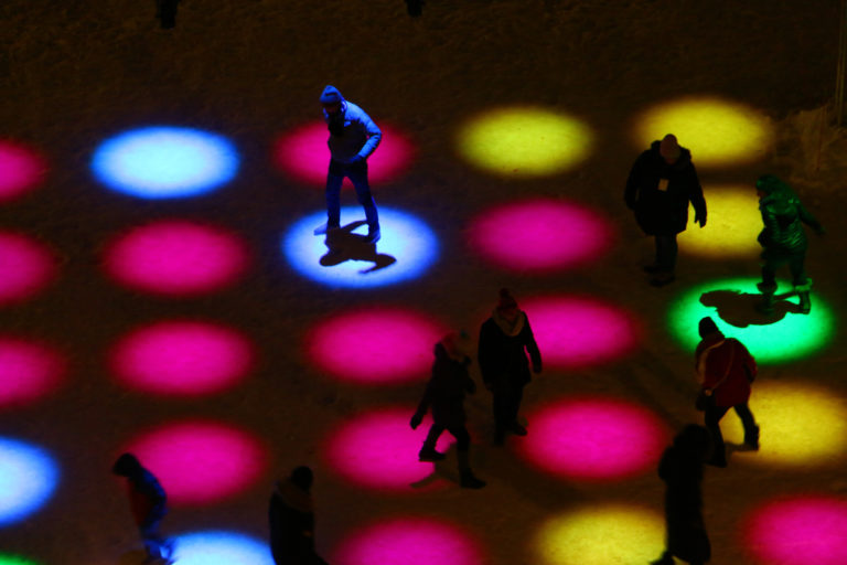
Score is an interactive game created where the rules change each match. Players are prompted to step on different circles and must pay attention to the rule as they change and become more complex.
Musical Shadows is interactive pavement. It uses light sensors that are able to play different tones and music as your shadow moves or dances around, playing interactive music based on movement. The music will actually change throughout the day based on the intensity of the sun.
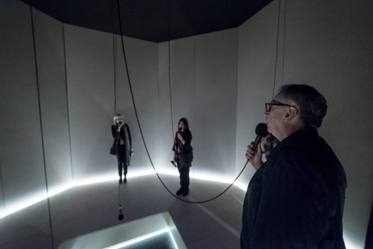
I heard there was a secret chord is an art installation that plays the song hallelujah. The sound can get louder or quieter based on how many people are listening to that song at a given moment and it displays the amount of people listening to that song. All of this takes place in an octagon room with microphones hanging from the ceiling.
Musical Swings
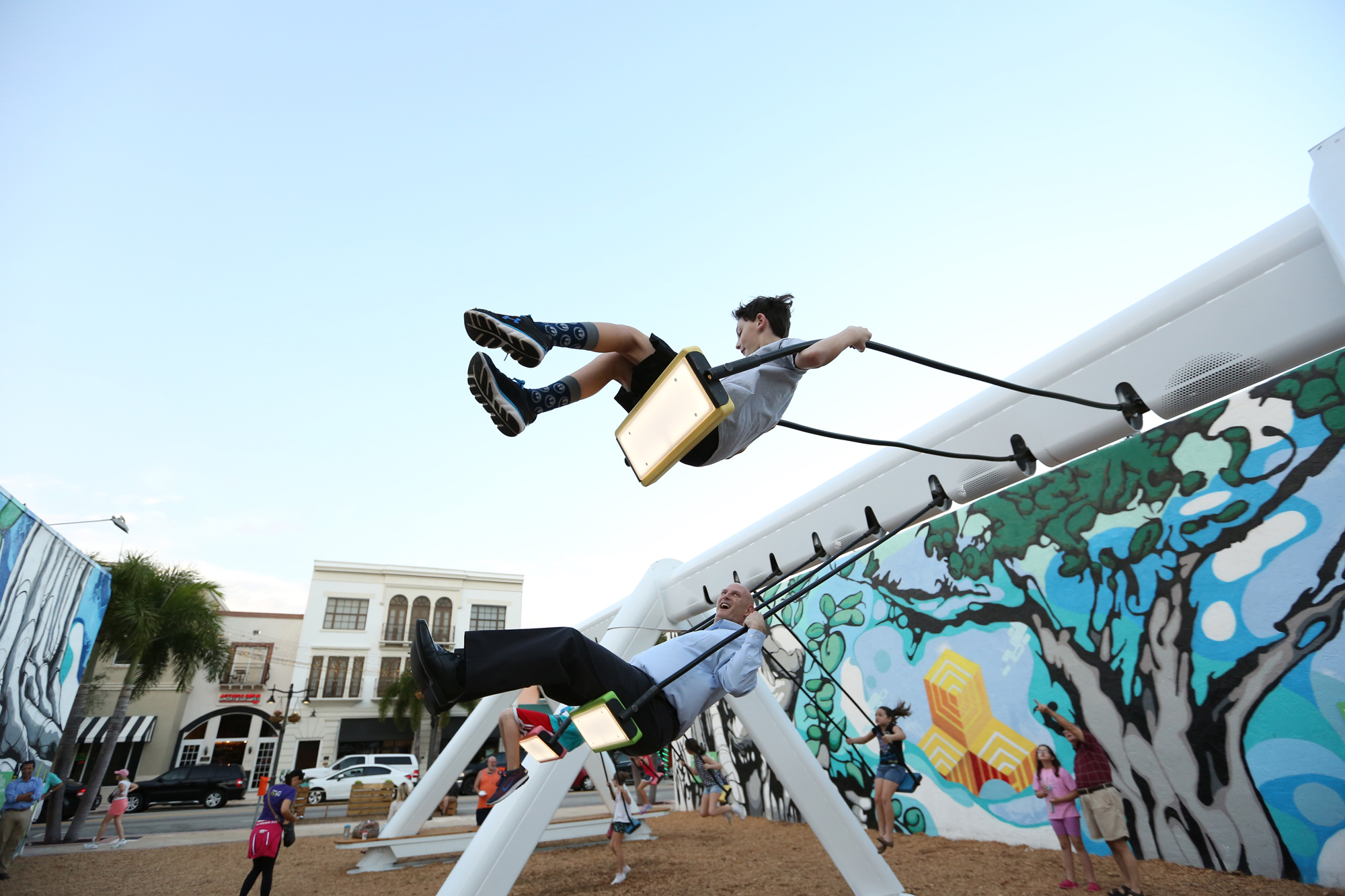
This is my favorite one of her artworks that she was part of. This art installation consists of 21 musical swings that are all interactive. Each swing allows you to play music with your entire body by swinging and prompts you to collaborate with others and swing at the same time. Swinging at the same time will play better sounding music.
The Musical Swings installation was created in 2011, the installation has become a celebrated icon of Montreal’s entertainment district, returning seasonally every spring. As a result of its success, a touring version of the Musical Swings was created and has been traveling the world, receiving a number of international awards and recognitions. A new permanent version of the work is also available for cities around the world.
Each swing triggers notes from a classical instruments: piano, guitar, harp and vibraphone. A color code indicates which instrument is played and invites the public to try different seats. The higher the swing, the higher the note. When the swings move together in unison, they create a musical composition through which unique melodies can emerge if participants cooperate. The gentle, kinetic quality of the acoustic sounds blends seamlessly into the environment in which it is located in.
Collaboration is rewarded when participants swing at the same rate, triggering more complex melodies. This system allows for the people swinging to feel like they are writing and playing music with their entire bodies and encourages team work in order to produce the best musical sounds.
Conculusion
This designer really focuses on having the public come together and create something better. By having people come together and play games, dance, and make music she is creating a better world where people can interact with each-other in a fun manner.
Marioneta & Hyunghwan Byun | By: Hannah Tuel
About Marioneta
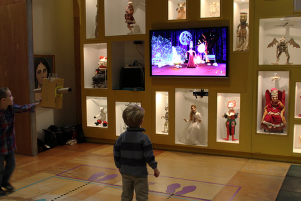
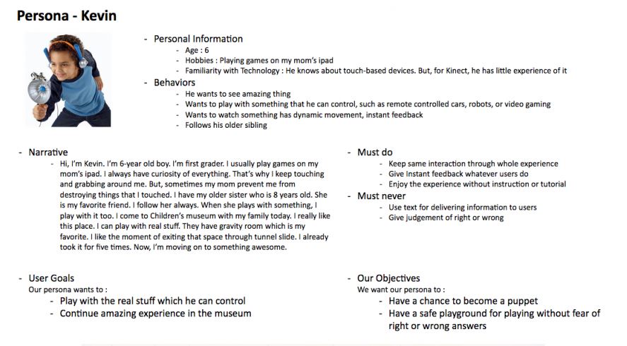
Marioneta is an installation for the Children’s Museum of Pittsburgh which uses the Microsoft Kinect v2 to allow guests to embody a collection of antique puppets in a virtual environment. The focus is on creating an experience wherein elements in the world react to the users’ actions through these puppets.
Why antique puppets?
Puppet models in the experience are based on a collection of puppets donated to the museum by Margo Lovelace. The original puppets are carefully exhibited in a large display case on the wall in the museum. Many of the puppets in the museum’s collection are antiques, fragile or valuable and not suited to hands-on play by the museum’s young visitors. Marioneta uses technology to make museum puppets available for imaginative and interesting play.
What is the experience like?
The experience is composed of auto-rotating seasonal stages and season-related interactive objects that have visual and audial feedback. Users can throw a pumpkin in the fall, pick up an ice ball in winter, play with cowbells in spring, and break a lantern filled with fireflies in summer.

Who worked on this project?
A team of students worked on this project including:
Christina Tarn as Producer
Maria A Montenegro as Tech/Programming Lead
Emily Chang as Programmer
Alex Moser as 3D Artist/Techinical Artist
Hyunghwan Byun as Experience Designer
I decided to look more into Hyunghwan Byun because I aspire to become a UX designer. It would be helpful for me to learn more about his work and his design process.
Link to project website:
http://www.etc.cmu.edu/projects/marioneta/index.html
About Hyunghwan Byun

Hyunghwan is an Experience Designer who wants to be a connecting point between technologies and human. He wants to design human-centered and amazing experience. He studied Materials Science and Engineering during undergraduate program before coming Entertainment Technology Center at Carnegie Mellon University. His experience covers various fields including Game Design, Sound Design, Film and Physical Computing.
Hyunghwan’s Experience:
Interaction Designer, Seerflix Inc. | 2015 – 2016
Experience design, rapid prototyping, UI design, qualitative user research, concepting, design system development, for Web-based interactive 3D authoring application
UX Designer, Adobe | Sep 2016 – Present
Experience design, rapid prototyping, qualitative user research for AI and machine learning features as part of the Photoshop team
Hyunghwan Byun’s Work
Marioneta
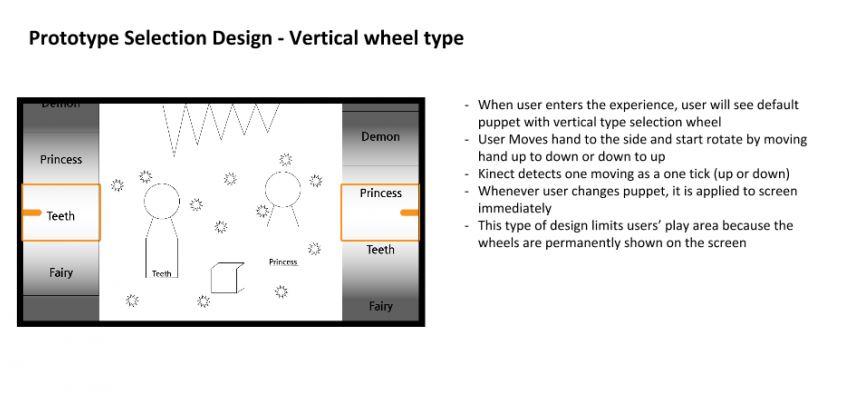
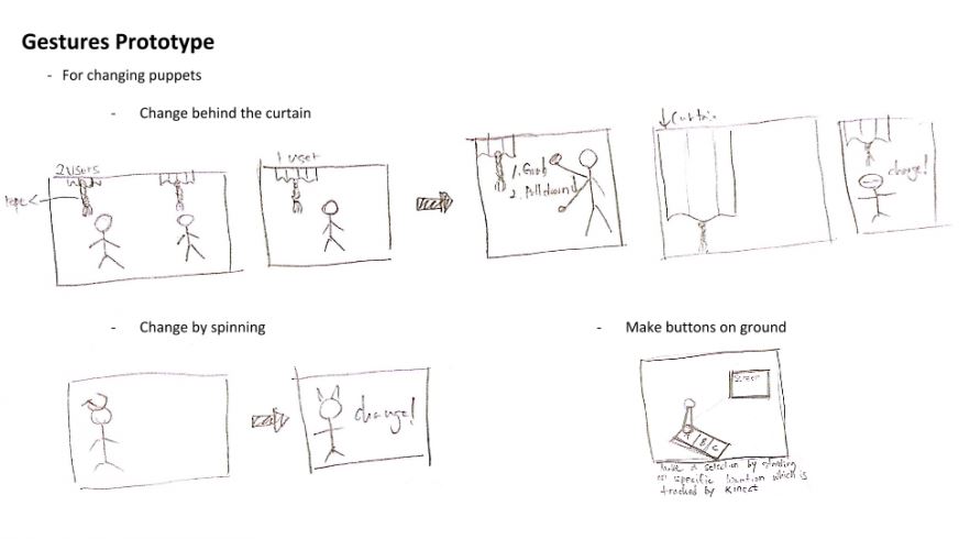
Here, he explains the design goals as well user journey maps, prototyping selection design, coming up with user personas, and gesture prototyping and more.
https://byun.design/marioneta
DESIGN GOALS
- Updating an old installation in the Children’s Museum of Pittsburgh
- Give a chance for kids to become a puppet in an intuitive and simple way. We’ll know our success if the kids enjoy our experience without confusion.
- Give a safe playground for playing without fear of right or wrong to kids. We’ll know our success if the kids move their bodies freely without hesitation.
- Avoid using text on the screen. If it needs, we’re going to use large, short words or voice. We’ll know our success if the kids understand how to play with the environment.

Toy Train’s Adventure VR Prototype
This particular work interested me because I am interested in game design and VR.
https://byun.design/toy-trains-adventure-vr
ABOUT
This prototype is a 2-week long one-man project running on the Google Cardboard VR platform. The objective is moving rabbits around a map to a safe area to avoid the lion’s threat. The player helps moving rabbits by keeping the train’s route safe.
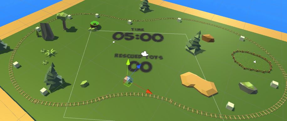
GAME OBJECTIVE
- In the given time, move rabbits as many you can to a safe area
- The train can move only one rabbit at a time
- A player should avoid the lion’s collision on the train
- A player can destroy the lion’s threat by placing the mushroom bomb
GAME DESIGN
Rabbit spawner
Rabbits are spawned at one of the spawning positions randomly.
The spawning cycle is determined by the remaining time to create gradually increasing difficulty.
Lion spawner
Lions are spawned at one of the spawning positions randomly.
The spawning cycle is determined by the remaining time to create gradually increasing difficulty.
Lions are set to Navmesh agent and avoid props on routes automatically.
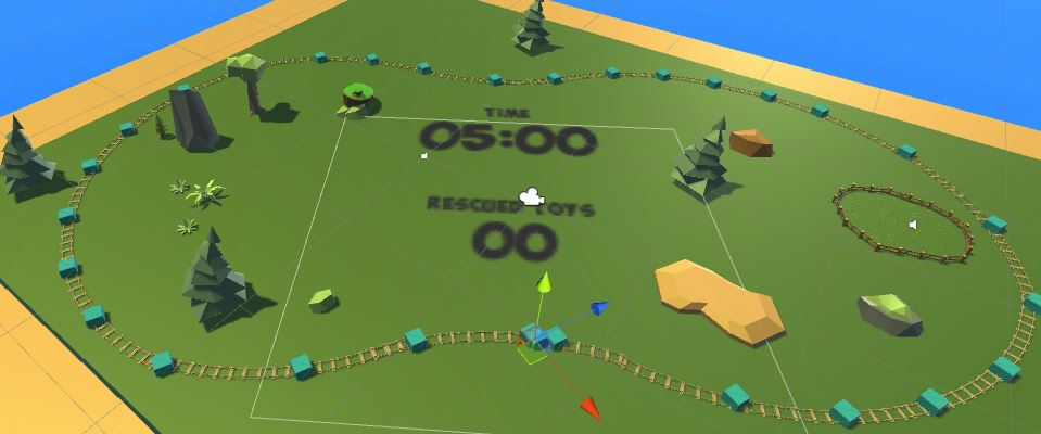
Mushroom spawner
The mushroom bomb is spawned at the position the player gazes at.
The mushroom bomb is spawned with a particle system and it destroys colliding lions.
I really enjoy how he breaks down the individual parts in the game design. He also talks about Future Improvements that he would make to improve the game.
Object Selection Tool | Photoshop
This is his process of how he created a tool for photoshop.
You can find more information on his process by visiting his website:
https://byun.design/objectselectiontool
A Selection Tool with Intelligence
The Object Selection tool is a Photoshop tool that automatically creates a selection around the borders of the object users highlight. The tool simplifies the process of selecting an object in an image with the help of a semantic understanding of the image.
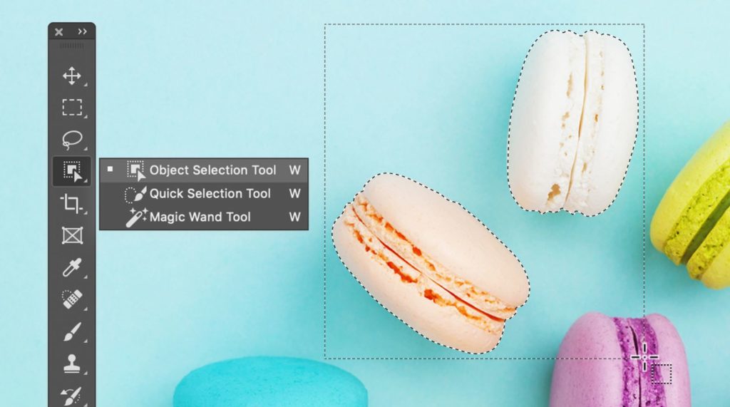
Select an Object EffortlesslyCreate a rectangular selection around the object. The tool automatically snaps the selection to object remove over-selected area or include less-selected area
HOW IT WORKS
Create a rectangular selection around the object.
The tool automatically snaps the selection to object.
Remove over-selected area or include less-selected area
Curvation Pen Tool | Photoshop
This is another tool that he created for Photoshop. It is neat to see someone’s work with Adobe and how huge of an impact they can make.
https://byun.design/curvaturepentool
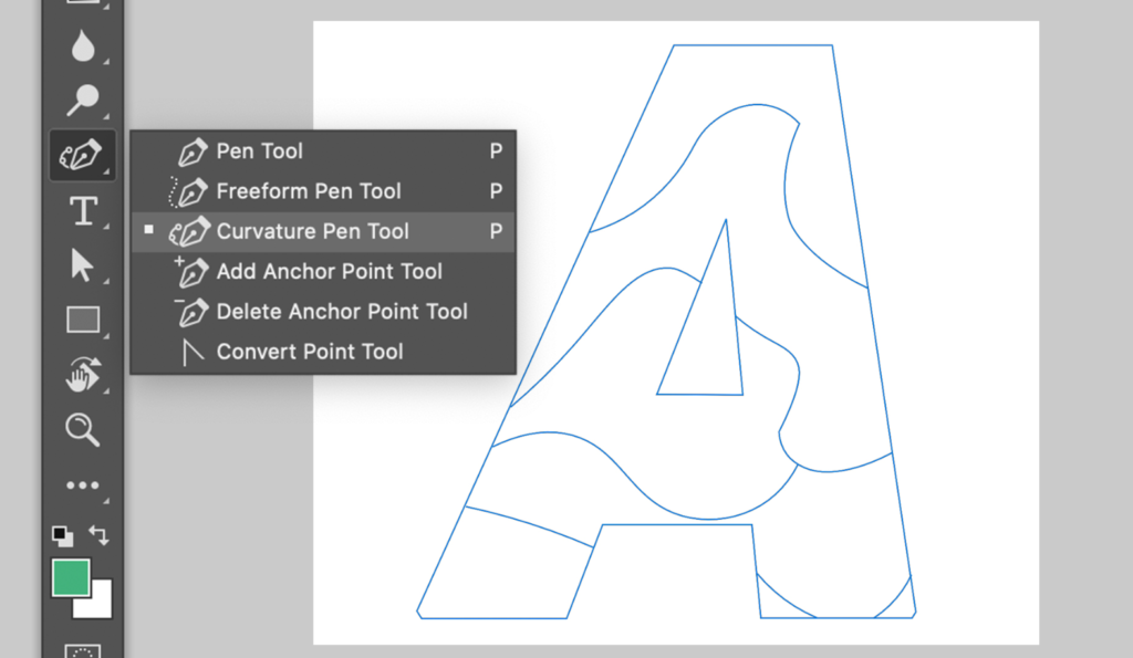
DRAW PATHS NATURAL
Curvature Pen tool in Photoshop is designed for users to create precise paths without dealing with confusing Bezier handles that we see from the traditional Pen tool. Path drawing is as simple as just placing points on the canvas.

Overview & My Thoughts
Overall, I really enjoyed looking into this Marioneta Project, understanding the process and the goals behind the project. Since I was able to experience this piece in the Children’s Museum I was really able to see the curiosity and care-free nature that it brought out of people including myself.
Throughout this research assignment, I didn’t realize that I would find another designer that I admire. Hyunghwan Byun has become a designer I look up to. Not only does he break down the process behind what he does, but he also pays close attention to detail along the way. I believe this is what makes him so successful and also land a job at Adobe. The impact that he is making with interactivity and UX Design is the same impact that I strive to make in the corporate field.
Artist Research by Brady Geyer
Daniel Rozin
Overview:
Daniel Rozin is an interactive artist, educator, and developer. His works are most prominent in the area of interactive digital art and often strive to make the viewer a part of the piece. His sculptures take the forefront of the pieces with the digital computerization in the background, out of site. Having done hundreds of exhibitions, Rozin is a very well known interactive artist having art all across the world.
Work:
Daniel Rozin in his work finds an idea and explores it through many ways often repeating a concept. He has done many works like kinetic sculptures, proxxi prints, and glass sculptures, but is most known for his many mechanical mirrors. Rozin uses many different items and mechanically rotates them to display the reflection of the viewer. Daniel stated, “The two main ideas that my work investigates are viewer participation and image creation”, and the mechanical mirrors do exactly that. The three works I will be highlighting are Self Centered Mirror, Yves and Marilyn / New York Skyline Proxxi composite, and Wooden Mirror.
Self Centered Mirror –

- 34 panes of mirror, Wood. Size – 120 Inches W 30 inches H 25 inches D.
- This piece puts the viewer in a position where all mirrors are focused on them and removing anyone else from their view. Displaying a sense of narcissism to the viewer.
Yves and Marilyn / New York Skyline Proxxi composite –

- Digital print. Size – 24 inches by 30 inches Print
- This work utilizes Rozins proxxi print method. A method that allows the user to see different images depending on the distance from the piece. From far it is the Yves and Marilyn Photo, and when closer the New York Skyline photo. This interactivity allows the viewer to discover this interesting print.
Wooden Mirror – In Depth

- 830 square pieces of wood, 830 servo motors, control electronics, video camera, computer, wood frame. Size – W 67” x H 80” x D 10” (170cm , 203cm, 25cm).
Overview – The first mechanical mirror Rozin had ever built, now displayed in the Children’s Museum of Pittsburgh. Utilizing a camera, computer, stepper motors and wood blocks, this piece allows the user to see themselves in an uncommon way.
Interactivity – The user faces the piece and discovers slowly what it is by noticing the reflection. In the picture displayed, the camera is set up so the discovery is quick with the user instantly realizing it is them being displayed. Inside the Children’s Museum of Pittsburgh I noticed children often try to make it move a lot by running back and forth triggering the steppers to switch and make noise.
How it Works – At its simplest the Wooden Mirror uses a camera, computer, stepper motors, wooden blocks and a light. The camera sends the video image of the viewer to the computer which decides the areas of the image are light/dark which sends messages to the stepper motors to turn the wooden blocks in a certain direction to replicate the light and dark areas. There is also a light that will help promote the bright areas by having the brightest parts of the image have the wooden block face the light.
Conclusion –
Daniel Rozin is a well experienced interactive artist that looks to explore concepts deeply. Finding a concept that utilizes the interactivity of a user along with displaying an image. His works in the Self Centered Mirror, Yves and Marilyn / New York Skyline Proxxi composite, and Wooden Mirror execute his philosophy perfectly. Certainly an artist to study and look out for in the future.
Dalziel & Pow | By: Alexa Headley
Overview
Dalziel & Pow is an independent creative agency based in London. Starting in 1983, David Dalziel and John Pow designed pubs, clubs and bars. Not so long after, they shifted into working with high street brands such as Timberland, Volkswagen, Google and more. These guys along with the creative agency they built have changed the game for a retail and brand experience. They come alongside these businesses to strengthen their brand by using much more than a logo and flyers to engage the companies audience.
As an agency, they have four different areas of expertise:
- Strategy & Transformation
- We define insights, strategies and bold, new ideas for consumer engagement, brand differentiation and growth.
- Branding & Communications
- We invent and reinvent brand personalities, and bring them to life across physical and digital channels.
- Digital Experience
- We create digital journeys and touch points to serve, sell or inspire, telling brand stories in ways that captivate audiences.
- Brand Environments
- We design engaging spaces that meet the needs of the new consumer and forward-thinking brands.
Each area of expertise has the same focus of engaging the whole brand. Like any equation, they are presented with a problem and with their team present a solution to encompass the identity of the company’s brand.
Aside from Dalziel & Pow’s website being exceptionally organized and appealing to look at, the examples of their work make what they do so special. I am going to walk through three examples of their work and focus in detail on one.
Work
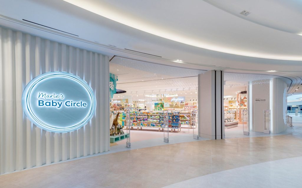
- Marie’s Baby Circle
- https://www.dalziel-pow.com/work/maries-baby-circle
- After watching the video or reading the name of the client, you can assume this project has something to do with babies. Marie’s Baby Circle is a store based in South Korea that focuses on coming alongside first-time mothers in their journey of parenthood.
- Challenge: This company came to Dalziel & Pow with the challenge of creating a place for mothers to find “knowledge and reassurance” in their journey along with making a trip to the store a more appealing option than ordering online.
- Solution: D&P used all of their areas of expertise to create a multi-function store that does way more than sell baby items. They built an interactive wall of animated characters that react by just a touch. Each section of the store has design elements according to its specific area whether that is strollers, baby food, clothing, sleep, baby showers and more. They created a “rest” room for mothers to breastfeed, change diapers and take a breather from the chaos that comes with shopping.
D&P accomplished the company’s goal of making first-time mothers feel welcomed along with creating a space that is engaging to visit.
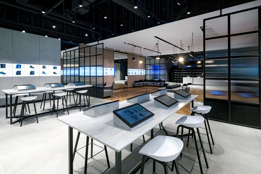
- Eobuwie
- https://www.dalziel-pow.com/work/eobuwie
- I tried to look up the definition of the word, Eobuwie, and I came up empty. Either there is not one or I did not look hard enough. Nonetheless, Eobuwie is one of the largest footwear retail companies in Central Europe.
- Challenge: Focusing on their store in Poland, Eobuwie came to D&P wanting to engage their customers in-store rather than the usual online ordering.
- Solution: D&P’s concept behind the store is very clever. There are two sections of this store. The first section is known as their “arrival zone.” This is for quick transactions and searches on their built-in tablets. The back end of the store is a relaxing space for a slower-pace journey of shoe shopping. Customers sit on the couch and browse on a tablet to see hundreds of shoe options. If they want to try on a pair, they simply type it into the tablet and a worker brings out the pair. They also use a screen that wraps around the room that rotates through different shoes to create a minimalistic approach to the overwhelming abundance of shoe options.
D&P accomplished the company’s goal of engaging their customers in an in-person retail experience.
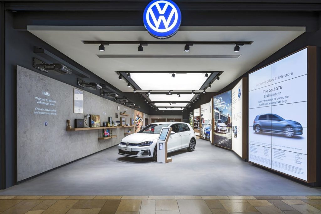
- Volkswagen
- https://www.dalziel-pow.com/work/volkswagen
- If you did not recognize the first two companies, hopefully this is a brand you are somewhat familiar with. Volkswagen is a car company from Germany. In German, the word, Volkswagen, means “people’s car.”
- Challenge: For a long time, people loved having the pleasure of owning a car. Nowadays, people prefer using app-based car services over owning one. Volkswagen came to D&P to see if they could bring back the joyful narrative of owning a car.
- Solution: “Human stories beat technical specifications.” D&P represented passions, dreams and everyday experiences throughout this store with Volkswagen. They set up wall length lightboxes that displayed “..everyday benefits of owning a Volkswagen…” They had ipads where you could personalize your own vehicle. If you wanted to test drive one of the vehicles, there is a space for that in their parking lot. Last but certainly not least, they incorporated light projection animations on a wall. These animations were playful ways to tell different stories of Volkswagen.
D&P accomplished the company’s goal in creating a very hands-on experience that represented a fun narrative of owning a car.
Work In-Depth
Out of the few pieces of D&P’s work I presented, I want to put the microscope over the Volkswagen project to see how the goals accomplished made an impact on the brand.
Audience
The Volkswagen product is normally geared towards adults because they are the ones who can drive and purchase it. Though this is true, D&P saw a greater message that includes more than the adult audience. Adults, teenagers, kids, and entire families experience transportation in a vehicle everyday. Even though not everyone in the audience can purchase the product, they are still involved in the experience of it. If younger kids do not like the comfort and experience of a vehicle, that has the potential of changing an adult’s choice in a car. Therefore, some of the design of the store was geared towards younger and older audiences alike. For example, the interactive light protections on the wall was fun for the customers to press the buttons and see things move. When families walk into this store, the kids are just as entertained as the adults because they are both interacting with the design. D&P did a really good job in helping Volkswagen identify their audience.
Story-telling
Similar to the idea of knowing who your audience is, everyone loves a good story. If someone walks into this store with their family who loves to go on road trips and sees interactions, pictures and stories gearing towards road tripping with the family, they might be more inclined to buy the product. People like products but I think they value the experience they’ll have using the products even more. D&P showed customers different ways they can use a Volkswagen car (road tripping, packing, shopping, etc.) and the joy that comes when you do own one. D&P did a great job showing the things you can experience by owning a Volkswagen.
Hands-on
Have you ever watched a How-To video? Those videos usually consist of how to make a product or attain a certain outcome. In a way, D&P took customers through that experience by their design. By using the ipads in the store, you were able to customize your own Volkswagen car. In the store, they had different fabric and parts of the car to display the items that make-up the vehicle. One of the light projections they had was changing the outside color and design of a car by a click of a button. This process of building something engages customers because people love seeing how things are made. Going back to the idea of knowing your audience, the hands-on experience is also for kids. Kids love to touch things, therefore, when they see the color of the car change, they experience can enlighten and engage them. D&P did a wonderful job of including the customers in the experience of building cars.
Overall
Dalziel & Pow do a wonderful job of engaging the whole brand of a company in their work. Their work is clean, intentional, purposeful and engaging. I am blown away by the experiences they create and how they engage people into those environments. I would love to work in a creative environment such as this one!