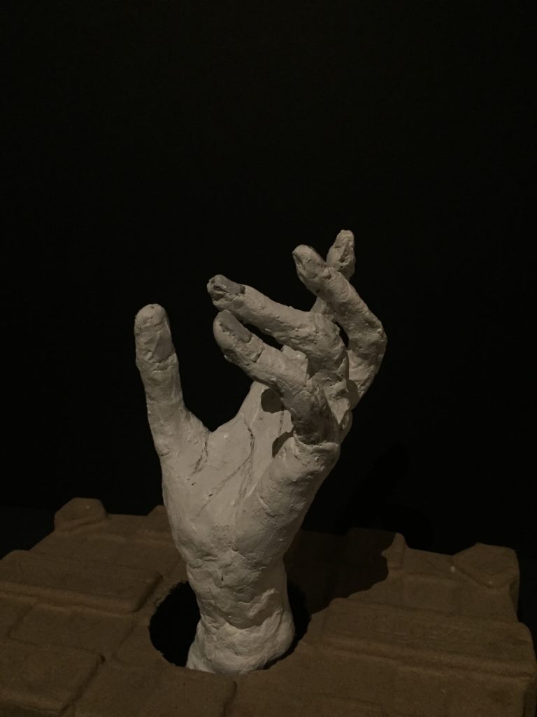
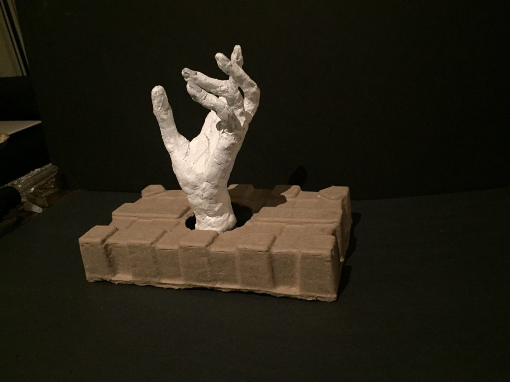


Ryan: 3D Studio Final


Ethan: 3D Studio Final


Emma: 3D Studio Final


Aletta: 3D Studio Final


Rachel: 3D Studio Final


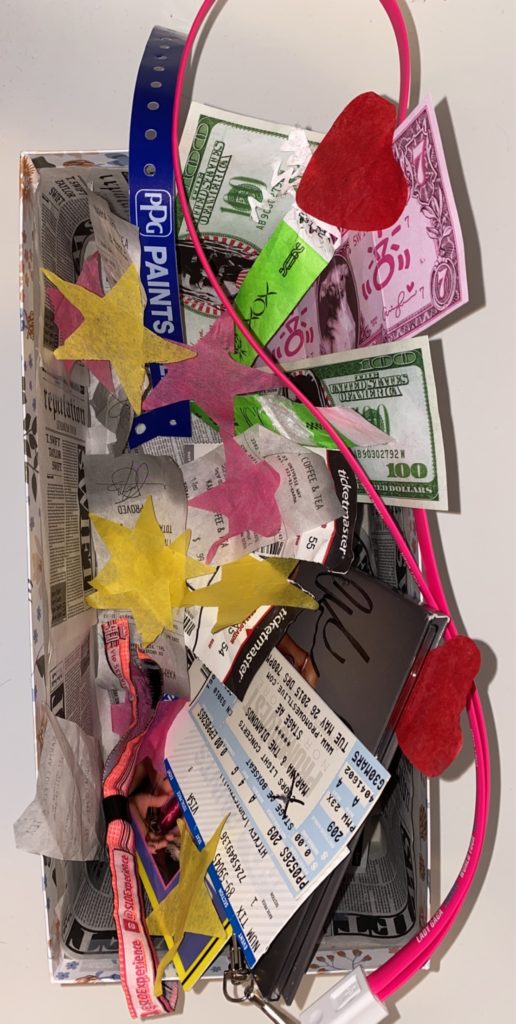
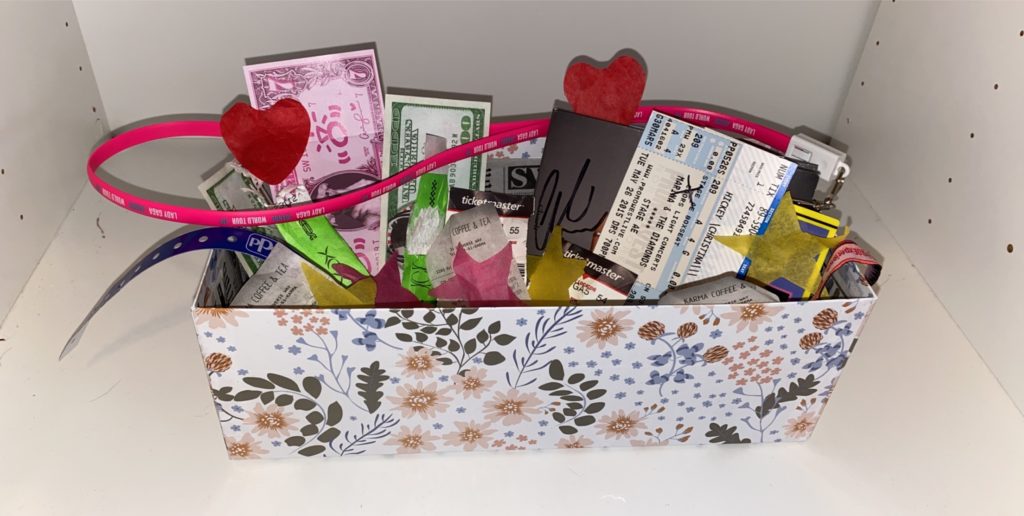
Gabby: 3D Studio Final


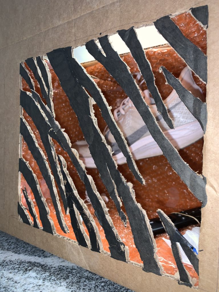
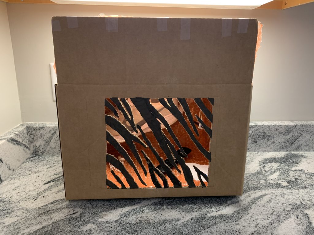
Spencer: 3D Studio Final


Allee Thompson-Review 4(last review)ITWD
I am going to be comparing two different artists portfolio’s since I do not have one. http://blublu.org/sito/blog/ The artist that goes by Blu is a street artist. The portfolio site is very interesting. It is done in a way that all the work is put into a journal/sketchbook. I find that very interesting. Although that is really cool navigation it can be easy to miss. The messy font seems to work with this but I can be a bit hard to read. Maybe there could be a bit more clean and readable. The second artist “Space Invader” http://www.space-invaders.com/projects/ . is also a street artist as well. His site has a cleaner and more recognizable navigation. He also has a very interesting interactive world map. It is very interesting that he keeps with an invasion theme and mission rather than a regular portfolio. The page even allows a translation preference. Overall I like the second site over the first site because it is more clean , easy to navigate through and that I can clearly read what is being said on the website. With that said I do enjoy the minimalism of the first site and its uniqueness in style to a regular portfolio.