
The process of developing the graphics was AI guided, mostly because illustration is more of a weakness than a strength to me, and I couldn’t find a photo showing what I was looking for.
Unless stated otherwise, any AI image generation was done in ChatGPT.
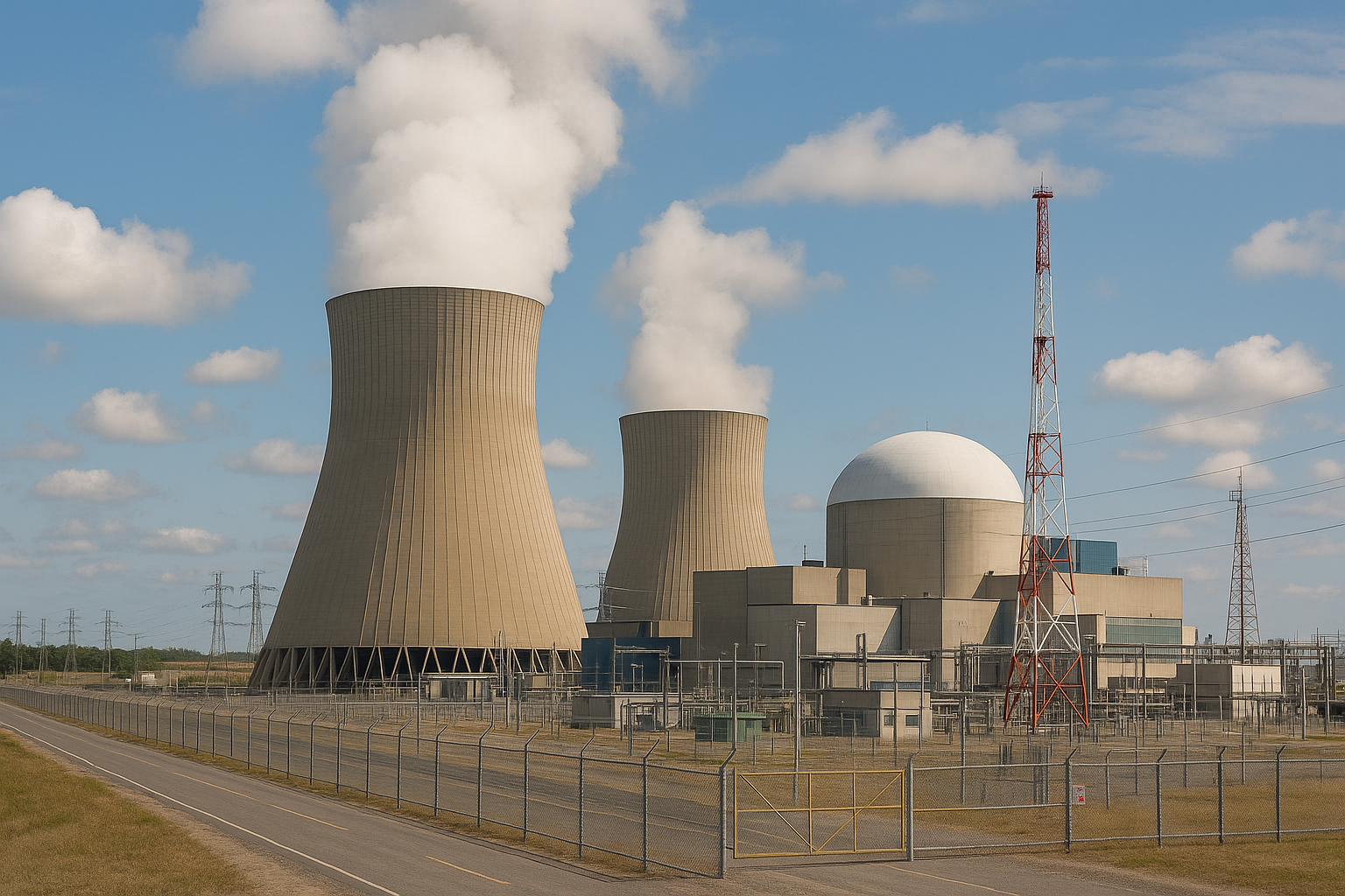
I started by generating a reactor image that I could use as the base of the design, with both a normal and ‘post-apocalyptic’ vibe…
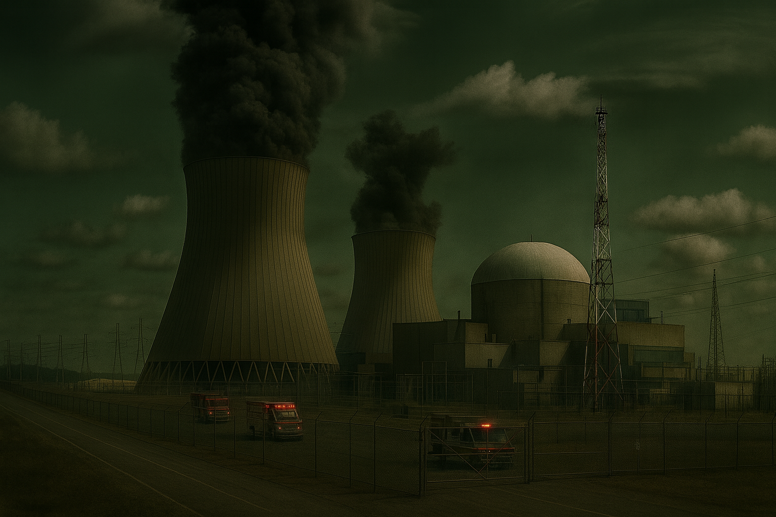
I decided to go with the post-apocalyptic vibe. This was the prompt that generated the image:
Prompt used:
A striking daytime photo captures a nuclear power plant beneath a brooding sky, with thick black smoke rising from two towering cooling structures. The scene is punctuated by a smooth-surfaced reactor building, a lattice communication tower, and flashing emergency vehicles, all framed by grim, muted grays and occasional vivid reds, enhancing the dramatic atmosphere of the image.
I knew I had to design red, yellow, and green markers for the gameplay, and I ended up with this AI graphic:
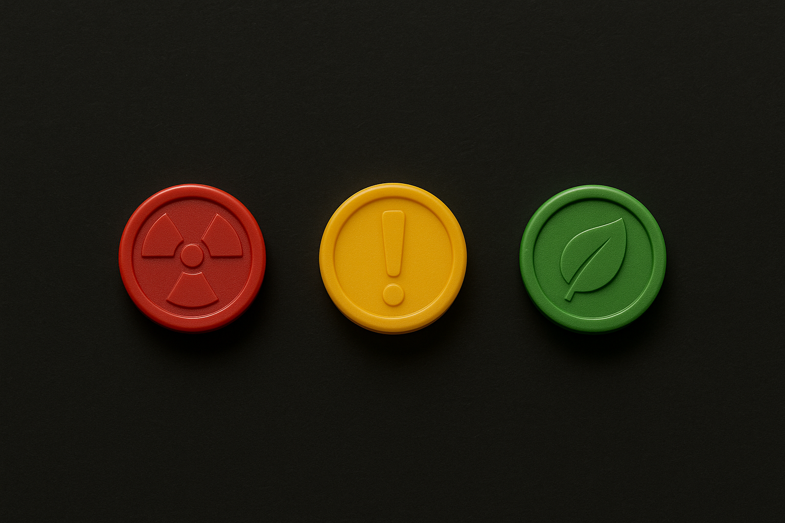
Prompt used:
Three small, glossy plastic game tokens arranged in a row on a dark matte background. Each token is embossed with a simple symbol: a red token with a nuclear hazard icon, a yellow token with an exclamation warning icon, and a green token with a leaf eco-symbol. Soft, even studio lighting, clean shadows, photorealistic texture, top-down view.
I decided that the box should look like the dark reactor photo wrapped around the box. I also included a deck of cards with the reactor wrapped around the box.
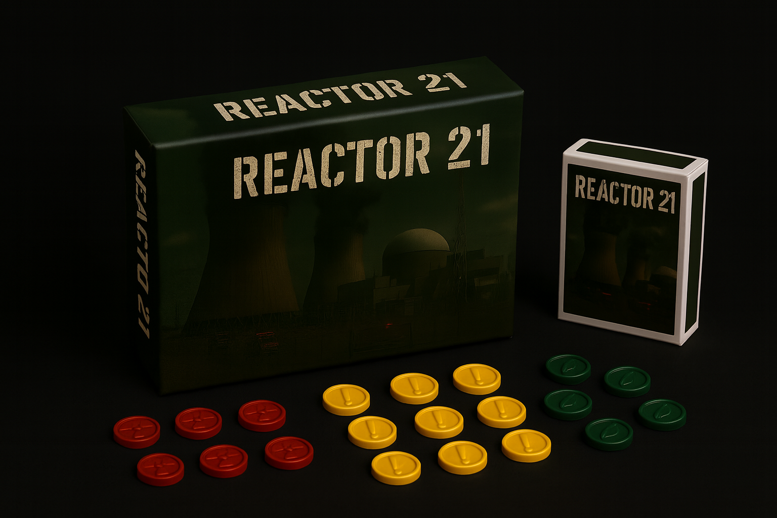
Prompt:
A realistic product-photography scene on a solid black background. A large rectangular board game box titled “REACTOR 21” lies flat on the table. The box uses a military stencil font for all text. The artwork on the box is a dark, dramatic image of a nuclear power plant with cooling towers emitting thick black smoke and emergency vehicles below. The box is 18 inches long and dominates the left side of the frame.
To the right of the box is a standard-sized Bicycle-style deck of playing cards, standing upright. The deck has the same nuclear-reactor artwork framed inside the classic Bicycle-style layout, but with the title “REACTOR 21” in a military stencil font instead of the Bicycle logo. White borders and the familiar tuck-box shape are clearly visible.
In front of the box are multiple small game tokens, each exactly 0.5 inches in diameter, arranged closely together: four red tokens embossed with a radiation symbol, six yellow tokens embossed with an exclamation point, and five green tokens embossed with a leaf symbol. The tokens are thick like premium bingo chips. All tokens are proportionally tiny compared to the 18-inch box. Lighting is soft, even, and neutral to ensure the red, yellow, and green tokens are equally visible without glare.
The overall image has a dramatic but clean studio aesthetic, with sharp details, accurate object proportions, and a cohesive, cinematic tone.
The actual game board was composed mostly in Photoshop, and it will get a separate post as it was a completely different process.