
I think we brought up the connection between sodas and advergames in class. I don’t personally agree, but the consensus is that all sodas taste the same, and that it’s the experience that comes along with the drink that differentiates them. Video games give the unique opportunity to create a totally unique and fantastic experience that exists outside of our real life, so in a world where a semi-made-up “experience” sells your product, a made-up video game experience seems like a no-brainer. That’s my takeaway from this.
Resolving Conflicts with Playtesting
I don’t think there was anything in this reading that wasn’t obvious. You can have all these ideas of what a game should look like and play like and be received like, but you really won’t know any of that until you make the game and hand it off to someone who didn’t make the game. Even if you’re not consciously influencing what’s happening in your gameplay – you’re still influencing it to fit your idea of your game. Passing it off to other people allows them to not only play your game in ways you didn’t account for. Especially when you play the game for the sake of testing it, people who know to look for errors or ways to expand the game can offer insight and critiques that you couldn’t think of yourself.
Thoughts on Cards Against Calamity
I think I could be an awesome streamer, and playing this game only supported that belief. I speak a language that everyone speaks. As mayor of that island town, putting beer before box and fish was a decision that needed to be made. But nobody else had the gumption to sign those papers.
But seriously, as someone who thinks there’s more games out there than our species was ever designed to have, this game didn’t do anything to make me think otherwise.
Week 2 thoughts
Pepsi Man
This game is notorious, I think I first found out about this game in middle school. It has a cult meme following, especially since the song is unironically kind of catchy. I don’t think it would be a stretch to say that these memes actually improved my perception of the brand. Although this was likely not the intended avenue for this to happen, it is interesting that it had the intended result. They used the wrong formula and got to the right solution.
Sneak King
I never owned an Xbox but if I did and was aware of this promotional game, I probably would have gotten it. As a kid, I bought lots of Cheerios cereal because there were pamphlets with chapters of the second Spiderwick Chronicles book in the boxes. I eventually got all of them and compiled them into the complete book which I thought was pretty cool. When Sneak King came out, I was six years old and my access to games was limited to pretty much whatever I could find for cheap. I would have definitely been in the target market for this advergame.
Chex Quest
This reminded me of all of the different versions of Doom that I have played. In middle school, I would play it on a calculator. This is all to say that I would play whatever I could get my hands on and Chex Quest looks to be far from the worst advergame that one could pick out.
M&M Kart Racing
This is not one that I have ever played, and from the looks of it, no one should ever play it. In hindsight, I don’t think that I ever had any truly bad advergames although I did have some games that were just rip offs of other more successful games that had characters from TV put into them.
America’s Army
Every FPS game I’ve ever known has to be compared to the gold standard: Counter Strike. CS was released several years before AA and in my opinion outclasses it mechanically and in terms of strategy. As a game, I see no reason that someone would choose AA. I don’t doubt that CS also had an effect on recruitment amongst young men when it was released and even today.
Vote!!!
This is a silly looking game, but amongst the ones that we discussed, probably the most compelling in terms of persuading me in any given direction. The creators clearly understood how to appeal to a young demographic.
Darfur is Dying
This is just a smart choice for something to pick as a game for change. Every time that I watch Hotel Rwanda, I feel empathy for everyone in that situation, and wish that I could help. It makes a lot of sense to develop this global issue into an interactive thing.
The McDonalds Game
I think this is pretty clever, although I also feel that I’m pretty aware of all of the ethical issues surrounding eating at McDonalds and I don’t think that this game swayed me in any way. I really just didn’t want to read the text parts of this game. I figured most of it out through trial and error and pretty quickly got a Game Over. I played a few more times and still didn’t bother to play “right”. My assumption was that it probably eventually ends in a loss since it is showing an unsustainable business growth model.
Monopoly
I had heard on John Green’s podcast about the original version of the Monopoly rules and the ironic history of the IP being stolen by a corporation and the rules changed to what they are today. The rules variant that we played in class was even less fun than the retail version of the game. I got the gist of what it was going for just by skimming the rules sheet and really didn’t feel the need to play much of it. One thing that happened with our playthrough was that since it was clear before we started who the winner would be, we each had different expectations of the play.
Thoughts on Call of Duty 2: Dr. Jones
Dr. Jones brought up Full Spectrum Warrior in one of his classes last year. I’m a guy that tries to find everything funny. It makes everything easier. Hard to find something funny about any of those military training games.
I’ve never been one for shooting or gore in games or movies. It kind of makes my stomach sink. And it’s one thing when it’s sweaty teenagers digitally shooting their friends from up the street. It’s another entirely when games using basically the same engine are used to train our nation’s military.
I know there’s more to it than that, and that they’re an effective teaching tool and save on resources and time. But knowing the people I know who play those kind of games and have been through that kind of training – killing is fun for them. That doesn’t make them all ax murderers and threats to society as a whole, but the value they assign to a human life that isn’t their own does unnerve me.
Games we talked about briefly that one day we talked about 100 games
Factorio looks terrifying. It looks like one of those Minecraft modpacks where they add oil and nuclear reactors. My weirder sister loved those. So, naturally, I did not love those. I’m pretty sure I have seen seventeen games that look exactly like Outer Wilds. I remember a bunch of people played the one a few years ago. You work in a fire tower and your brother dies. Or something like that. Gris looks like the scene in Blade Runner 2049.
Post thoughts on Detroit, Michigan
I remember when this game was like the game. I’m not someone who watches other adults play video games on the internet, but there’s a lot of people who are. And those people loved watching other adults play this game. I’d see it on the YouTube front page all the time. All of this to say, I had no clue the game was about black people. I thought it was just about robots. It’s nice to know that so many people took to a game about addressing inequality and prejudice in our world. I wish everyone had to play that black robot game.
Post thoughts on Assassin’s Creed
I don’t see the point of this. If I want to learn about ancient Egypt, I’m not looking to Assassin’s Creed. I’m probably going to – I don’t know – pick up a book.
Post thoughts on Monopoly
I love Monopoly. Money is so cool. I usually try to keep to myself in Monopoly games. I don’t think I have ever made it to the hotel stage of property ownership. I just like having the cash. In this class, I had to play with the woman rules, which prevented me from accumulating the cash surplus I’m accustomed to.
Week 1 thoughts
Painstation
This is not what I imagined when it was first brought up but it honestly makes a lot of sense. What better way to establish stakes for the game than putting your body on the line. People generally care about winning trivial games just for bragging rights so having a negative consequence for losing is a natural next step to engage people. You can be sure that anyone participating with this game is giving it their full attention.
Getting Over It
I have seen many people play this although I never ventured to try it myself (I’ve only played Mario Maker levels that are derivative of it). My understanding is that the controls are frustrating to pick up and it is easy to lose all of your progress and go back to the start. Because it is so difficult and annoying to progress in this game, the developer has made a final reward that is prefaced with a warning saying that people who are streaming shouldn’t show and spoil it for people who didn’t earn it themselves. Although I’m sure it is possible to find what is behind this wall somewhere online, I have always held off in case I do eventually decide to play it. I also remember that there is an unlockable golden pot for beating the game 100 times which sounds like an impossible amount considering that most people probably never even beat the game once. It is worth noting, however, that this game, like many others, quickly developed a community of people who like to speedrun it. This is especially impressive given the difficulty of the controls but obviously some people find it rewarding to play.
Calvin Ball
I grew up reading Calvin and Hobbes but I had never even considered trying to play it in real life before. I think that we as a class struggled with this because we are used to having clear rules set out for us. People had a natural inclination to want to fall into patterns of repeating what they were doing. It is admittedly difficult to rewire your brain to not do something twice.
Cow Clicker
This struck me as being pretty clever. The twist of irony that people came to play the parody game of the whole clicker genre is such a good narrative. I also think that the art for some of the cows is pretty creative. I won’t say that I am above playing a clicker game ever in my life, although I do think that after you’ve been invested in one, it is hard to want to play another. If Cow Clicker was the first one that I had ever stumbled upon, I can definitely see the appeal.
The Graveyard
I was previously familiar with this game because it had some popularity with some content creators when I was probably in high school. I think that by virtue of being something sold on Steam and that has semi realistic graphics, people have certain expectations of what the experience will be like. This made for some good gag videos of people who would go into the experience blind and be surprised that it is pretty limited in terms of what you can do in the game world. I do think that this still falls into the category of games because there is still player input and I honestly don’t think I knew that there were different endings that you could achieve.
Townscaper
I am surprised that I had never heard of this one before because it seems right up my alley. The animation of adding new things and having the existing structure adapt to it is so satisfying to watch. I could easily see myself spending a long time playing with this even though there isn’t a specific goal that you have to work towards.
Post thoughts on McDon’s
No computer game could ever infuriate me. I’m too advanced to do that. But seeing everyone in the class rake it in on that McDonald’s game – while I could barely keep five cows alive – almost got me there. I think everyone above the age of 6 knows there has to be something sinister going on behind the scenes at McDon’s for their fries to be so delightful, so this game didn’t really open my eyes to anything. The boardroom and corporate sectors were a nice touch, though. In terms of showing corruption. Imperialism and livestock mutilation might not be enough for some people.
Pollinator 3.0
Brought to you by River and Ronan. Collaboration of the Century.
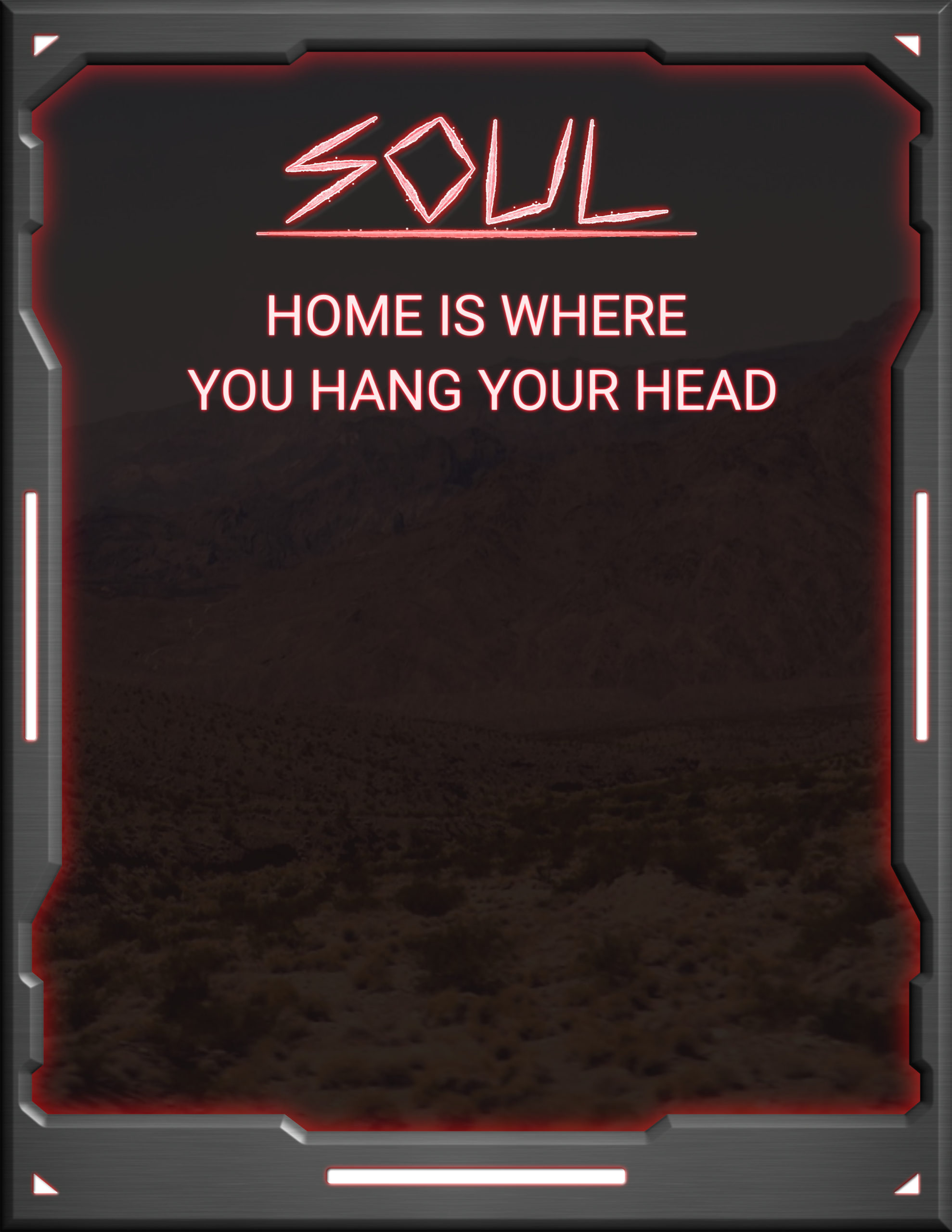
Soul: Home is Where You Hang Your Head final Playtest
the real challenge with this project has been making a lite version of a lot of the mechanics for Soul so the game can progress without a DM present and without getting too interrupted. I have managed to simplify enemies, build a character, and make simple powers that create interesting challenge and mechanics without distracting from the story, which is about grief. It goes through the various stages and offers the player a choice at the end: to keep going or give up. I think that the various simplifications to systems have helped to make it an engaging story with a simple and effective message.
This playtest was mostly about making changes to the story, and finding a way to present a meaningful message about grief and mental health without coming across as oppressive or overbearing. I found players resonated much more with this than a strictly 100% realistic depiction of mental illness.
Frankie Ronan Podcast
10/10 Hottest Podcast of the Year.
Gallery test reflection
On April 11, I had the first at-scale test of my game idea. I use the term “game” lightly. This was more of a non-objective experience. My goal with this experience was to engage gallery goers and challenge them to consider the effects of parking minimums by making them be the ones to create the issue themselves. Timelapse: (I will likely reframe this video to focus attention straight down on the board but I had some trouble with the Premiere plugin) https://www.youtube.com/watch?v=GWzSKgk6lwQ
The inspirations for this experience were many. I liked the idea of having many players sharing the space of the game board with their moves affecting future play. This reminded me of an experiment that Reddit has done twice on April fools day, once in 2017, and again five years later in 2022. This is r/place, a huge canvas where every user of the website was allowed to place a single pixel every set amount of time (I think it was 10 minutes). Very quickly communities organized to create larger artworks that would not be possible with only an individual’s ability. There was also a sense of limited space and several works came at the expense of other existing ones, similar to graffiti on a wall. I liked this idea of overwriting existing spaces.
I wanted the rules to be easily digestible because it is difficult for people to understand a new game, especially if they were only going to be “playing” for a few minutes and knew that they likely would never have to play again. Any kind of in depth system would work to deter players. In the end, the rules page was one page of a few clearly bulleted points and I summarized these verbally for many players (although a couple of people still struggled to understand the rules).
I looked at Blokus for its system of deploying tile pieces through touching the corners of the same color pieces. This achieves an even distribution of colors because it doesn’t allow for two pieces of the same color to touch sides. However, later in the game as the board fills up, players are forced to use smaller and smaller pieces which didn’t fit as well with my model of having many different players. I also looked at Tetris, which in my opinion is one of the finest games ever created. The “tet” of the game’s name implies that every piece consists of 4 tiles which I liked a lot. Limiting the number of spaces on a piece also allowed for more interesting shapes to be created. It’s not possible to create different multiple shapes out of three or less touching triangles, but four would allow for a few interesting permutations of layouts.
An earlier version of my game had parking spaces disconnected from the development pieces. This allowed players to designate one area of the board as a massive parking lot, which is interesting in its own right, but I didn’t think would be as engaging to play. I considered having a requirement that the parking was built adjacent to the development or perhaps just in the same neighborhood area. By integrating the spaces into each piece, I feel that the problem of having players responsible for placing their own parking wherever they want was solved. This also removed a huge barrier to entry from the original idea which was to have players reference a spreadsheet to determine how much parking was to be built. This was in line with reality and would make people who did choose to engage with it to maybe understand the issue to a greater depth, but I think may have also deterred people from engaging to begin with. It also made it easier for players to break the rules by just not building separate parking spaces.
Another observation was that when two parking spaces were built adjacent to each other, it made an area that was big enough to house one of the matchbox cars that I had placed on the board. I initially put the cars on the board to draw a stronger connection to the road play rug that I referenced in my write up but it was interesting to see what players did with them once left to their own devices. I think this allowed for a non-intended play experience that I’m glad people were able to _. This also seemed to appeal to some of the children in attendance, although in placing the height of the table at a comfortable height for adults, I didn’t account for it being accessible to people any shorter than Max.
https://forms.gle/orqd5S8aE8PmvxKR8
I placed a QR code on the board with the pieces that linked to a form to encourage any kind of written feedback. Knowing that people are unlikely to take the time to write a lot, I tweaked the usual playtest form from this class to have only two questions that allowed for extended response and one multiple choice question for any game. I also made all of the questions optional to allow someone to submit any feedback that they may want to write, even if they don’t want to respond to every question.
By nature of this layout, the longer that the game plays out, the fewer pieces will be able to be played. If players played “perfectly” to optimize the number of pieces played, it would be possible to cover the entire surface of the map in parking. This, however, calls into question what the players motivations are in the game. Is playing as many pieces as possible the main objective of the game? For example, Anne Marie chose to play exclusively green spaces. This shows that different players have different, potentially conflicting goals, and mirrors the real development of a shared city space. Everyone makes changes that leave a lasting impression on the space.
A change that I would make would be to limit the number of pieces that have parking available on the edge of the piece. The ones that have parking in the middle of the piece diminish the redevelopment that is possible and accelerate the pace of the game which allows for some more creative placement.
This experience had the desirable effect of engaging people in a topic that I think about often and enjoy spreading awareness of and I was able to gather some valuable verbal feedback. I had a good discussion with Michelle Patrick, and although she apparently found the game “difficult to play”, I think that at the stage she experienced it, that was kind of the point. We discussed potential changes that the school could make that would benefit the majority of students on campus. This in turn sparked another conversation on a following day about what other needs some students might have.
I think that in many ways, this test was a success. Some future changes that I would like to make are trying new board layouts, re-keyframing the animations on the projection, and trying some tweaked rules such as limiting the areas that can be developed from virgin land to maybe three neighborhoods and only allowing spreading to a new space when there are no legal moves in the existing ones. This could serve to demonstrate the “sprawl” across the map as it fills up.