Rainfalls Treasures — Collecting Micro-Minerals From Precipitations
The Impression(s) of the Game (why is it fun): Abundantly tiny pieces of organic materials from artificial rain could become the source of farmland decorations for better cleansing of environments.
Brief Info: Rainfalls Treasures is a strategic and narrative game in which the players wear and turn on the special vacuum for minerals collections in case the rain shows the colors cues for the treasures for achieving enough amounts for enhancing the better appearances of the farm ground.
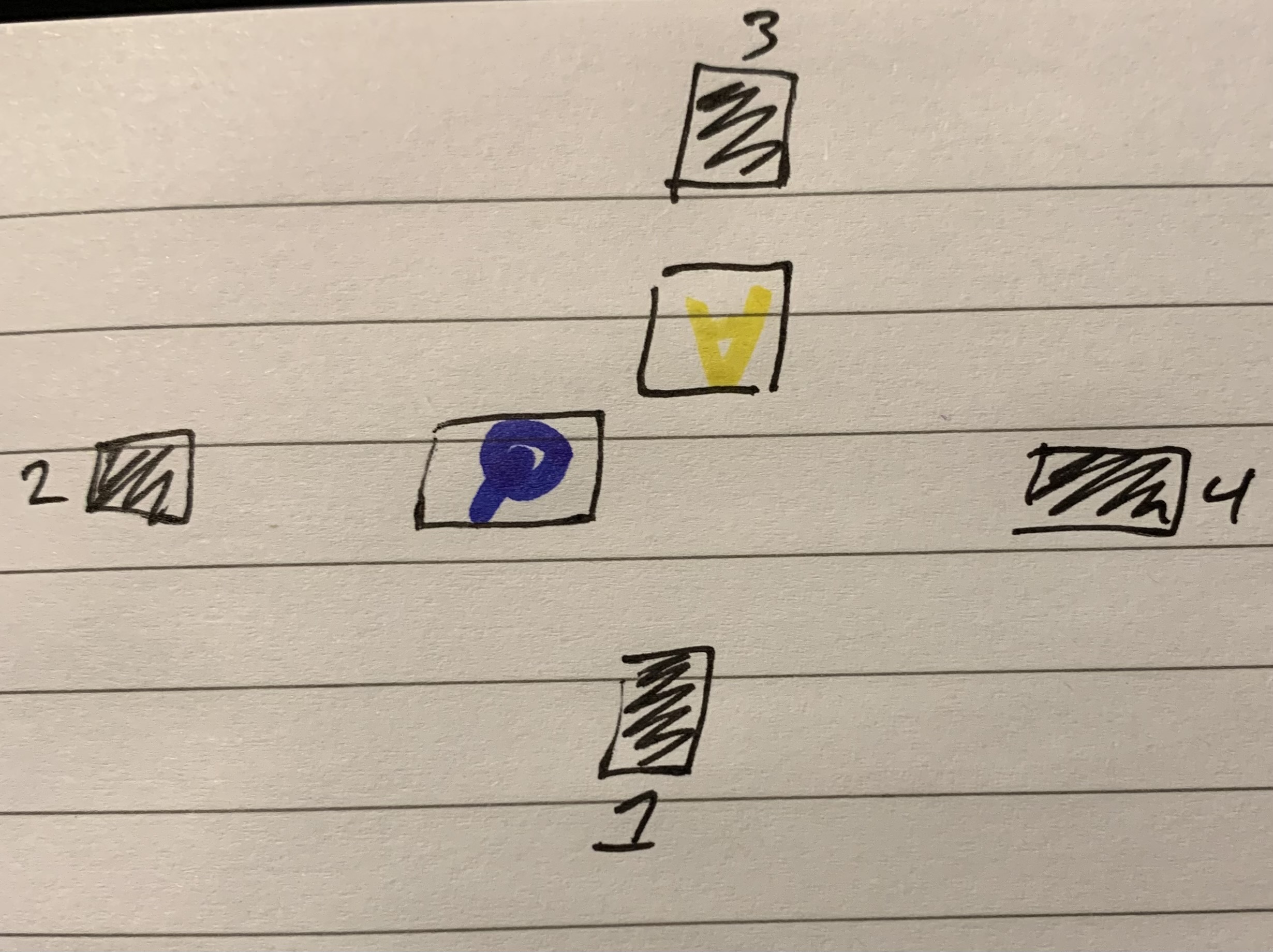
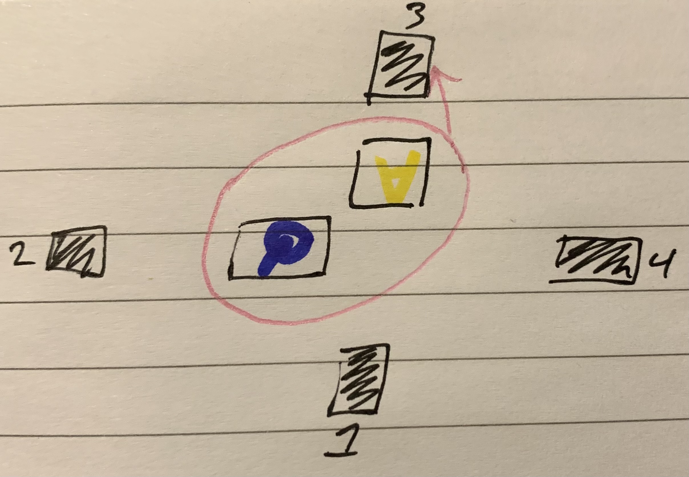
Beatbox Treasures — Amounts of Precious Items By Hitting The Rhythmic Lights
The Impression(s) of the Game (why is it fun): The amounts and lengths of each musical beat determine the quantity of the treasures.
Brief Info: Beatbox Treasures is a rhythmic game in which the players slash the dropping beats from the treasure case and not miss any of them to prevent harm from dropping and treasure lost due to inaccurate targeting by using different squares figures and directions of knives.
Silent Rhythmic Track — Skilled Runner Crossing Musical Beats Free of Noise Interruptions to Others
The Impression(s) of the Game (why is it fun): Obstacles runners stay on the destinated blocks without tapping into the calming space and falling off the route.
Brief Info: Silent Rhythmic Track is an adventurous rhythm game in which the players complete the musical obstacles challenge without tapping to the quiet spot (otherwise the neighbor will chase you for a while at first time, the second time you lost) and falling off the path by using big step crossing, occasional jumping, and sliding left and right to avoid annoying reserved spaces.
Sync Laser-Focus — Hitting the Laser Spot Instead of the Canvas
The Impression(s) of the Game (why is it fun): Following the sync beam’s locations and directions from song beats without empty targeting the object and miss catching the light that will cause damage to the canvas.
Brief Info: Sync Laser-focus is a rhythm action game in which the players use postures with a laser catcher to follow the rhythmic laser directions by pinning and sliding in four directions (etc.).
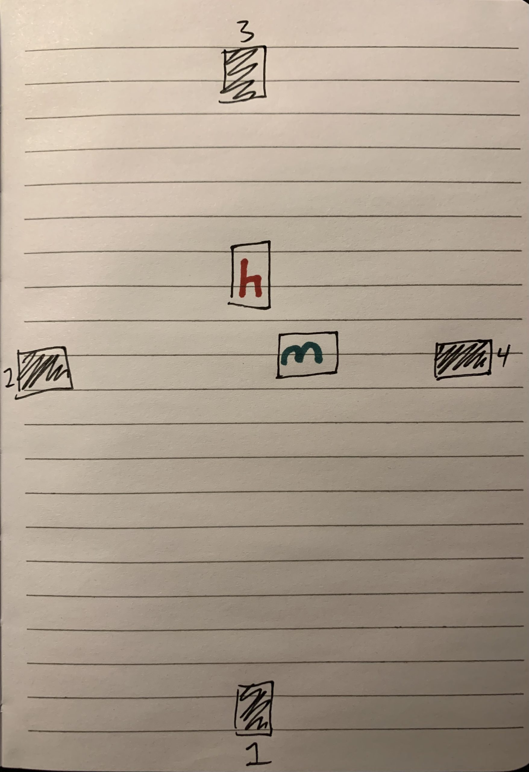
Musical Gestures — Heads-up, Hands Hitting, and Feet down
The Impression(s) of the Game (why is it fun): The beats field is divided into three sections vertically, which the head, hands, and feet will need to respond to the upcoming rhythmic beats.
Brief Info: Musical Gestures is a rhythm action game in which the players use physical postures to follow the rhythmic beats by using straightforward closed hands in four directions horizontally and an open hand for each heavy beat; heads lifting for jumping up and down arrow, feet sliding for left and right arrow (etc.).