
Projection
Perfect Human
Lonely Bear story full
I’m adding all of them together so I know they are uploaded.
1
2
3
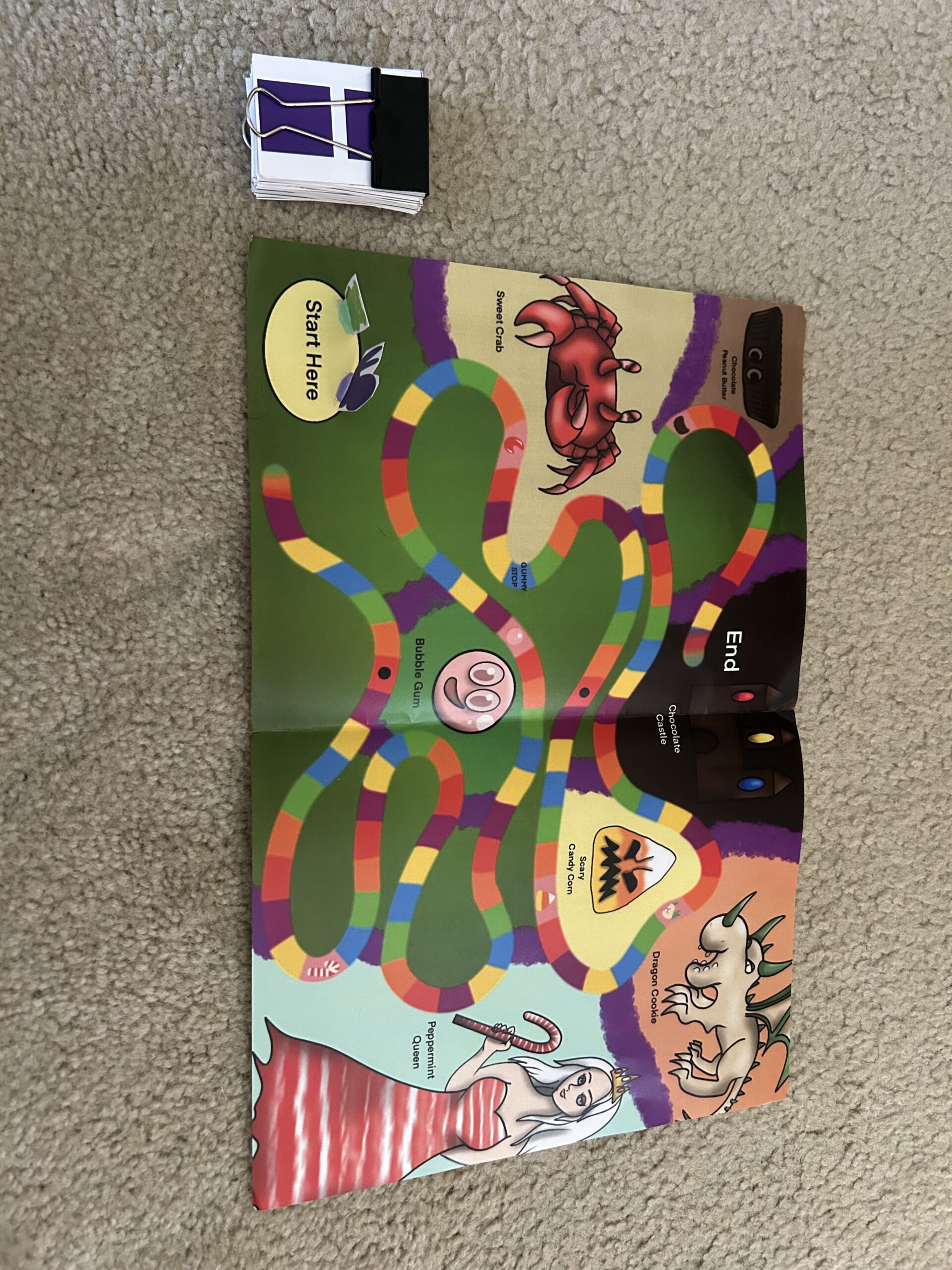
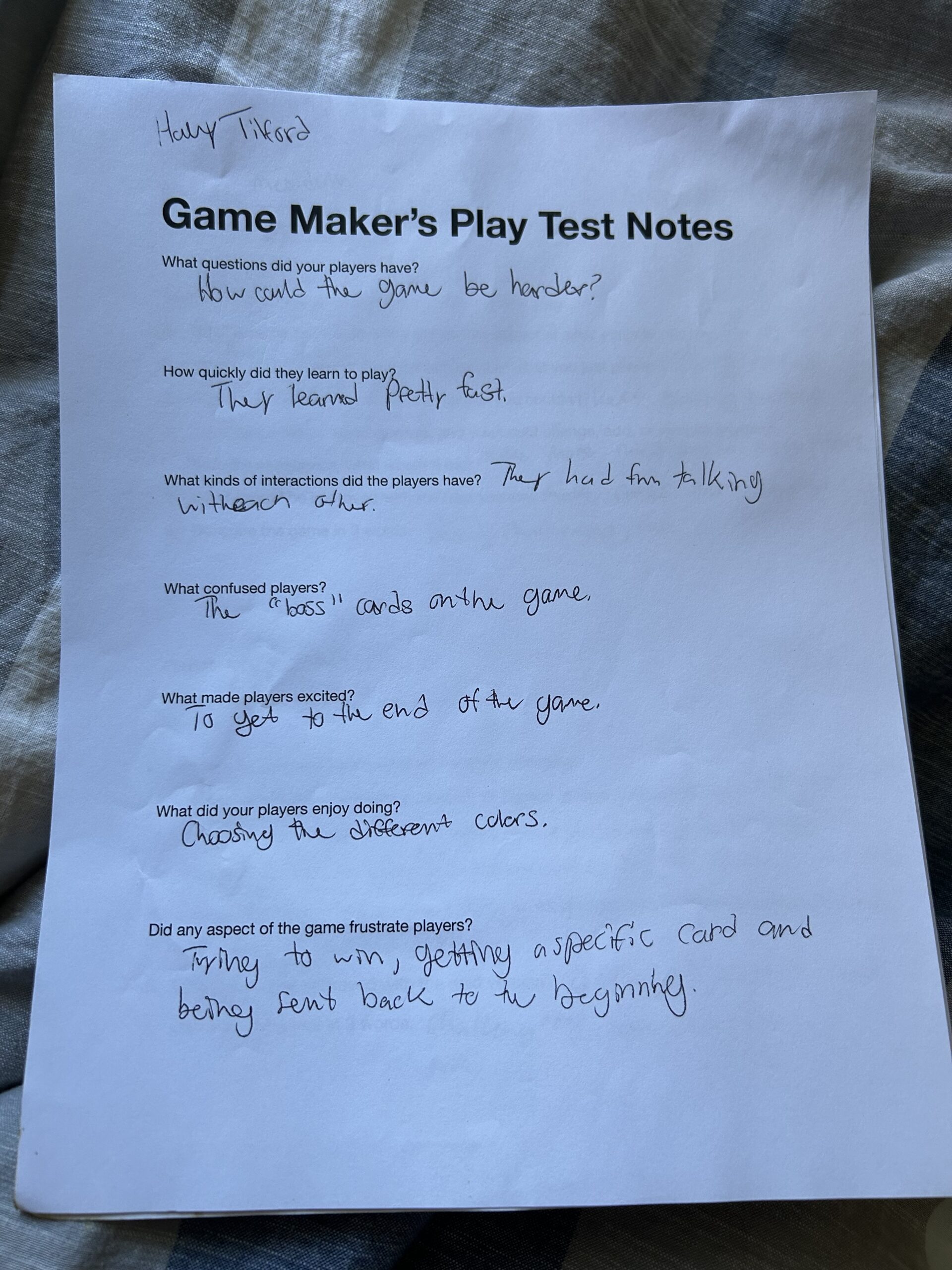
Candy World game
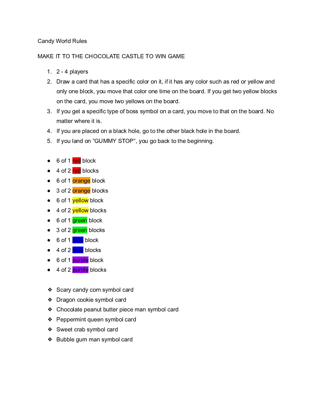
First Attempt: For my game, I did not have it the first week we were doing games. So, I had a family member try it at home. They liked the game overall, but they wish I had more characters. Originally, I had two characters. The game I was going off of was Candy Land. Similar but had less rules to it. He also suggested I add more rules to the game. Unfortunately, I don’t have any pictures from the first try of my game.
Second Attempt: I was able to bring my game to class the second week we were trying them out. seems like a lot of people liked it. I noticed some people got a little confused over the rules in this one. But some requested to me that maybe in another change for the game, I added more rules to the game to make it little more engaging.
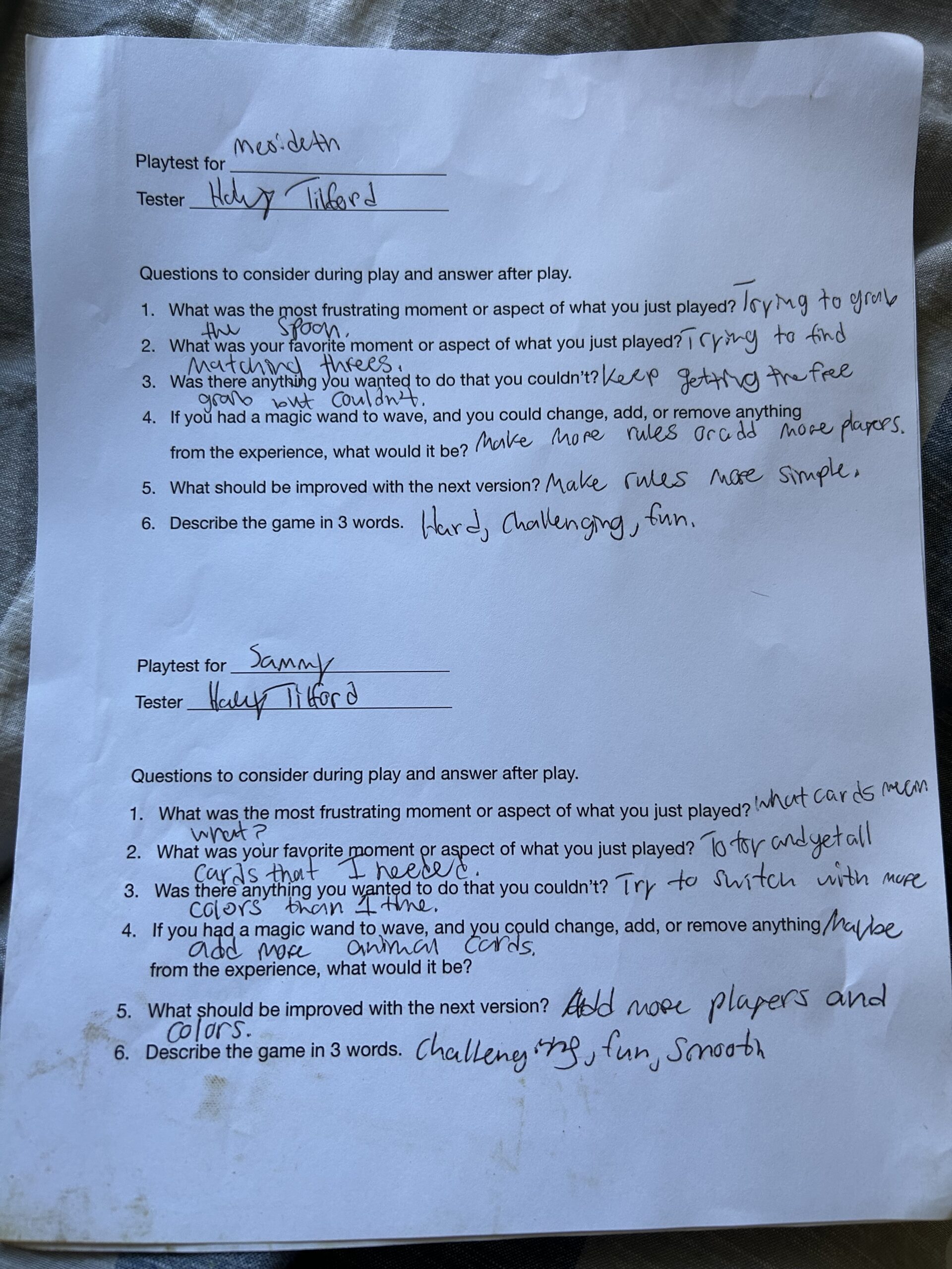
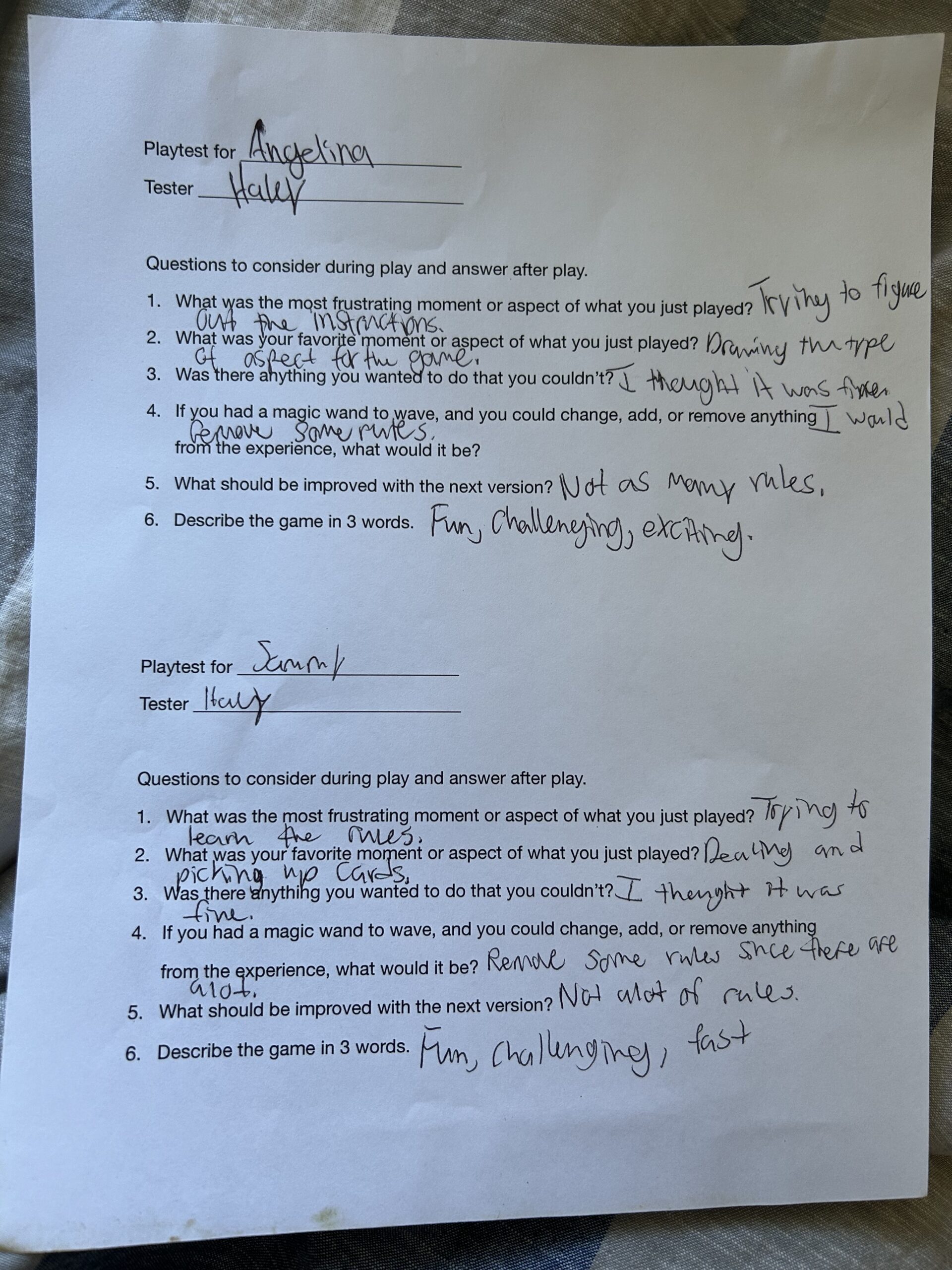
At home family answers: Questions to consider during play and answer after play.
- What was the most frustrating moment or aspect of what you just played? Trying to understand where to go.
- What was your favorite moment or aspect of what you just played? Trying to get a good card.
- Was there anything you wanted to do that you couldn’t? Try to get a three color card.
- If you had a magic wand to wave, and you could change, add, or remove anything from the experience, what would it be? Making more cards, add three colors or go back two.
- What should be improved with the next version? Make more cards and more rules.
- Describe the game in 3 words. Fun, exciting, interesting.
Lonely Bear Part 2
Review 4
I think how my group’s website would compete with Burgatories website would be a difficult challenge. Since both of our websites are closely related with layout, pictures, and the menu bar. I think we have multiple options to click more than Burgatory with the navigation on our website with different restaurants. The colors are a lot brighter on our website which may not be a good thing to some viewers for sensitivity reasons. Burgatory is easier to see since it has darker colors. Even the textures are a bit different with each other since our website is a lot more color full with pictures than Burgatories. Our effectiveness with guiding through our content I think is better than Burgatories because we have a top bar and a bottom bar so not just one but two to choose from to get to certain areas. But overall I think ours does stand out good because of the layout and colors. Seems that our classmates/viewers really liked it.
Review 3
How I think Burgatory and Franktuary are placed out and the balance of them is done nice. They both show a lot of unity and emphasis to their websites on how clean and simple it can be used. But in my opinion, I think Burgatories site is better. Buragtory seems to have many more options to select from as to saying the menu, order online, about info, join their team, and even a communication tab. Were as to Franktuary they only have a couple selection buttons and when I looked through them, it wouldn’t come up to the right page. I definitely feel like Buragtory is better at getting someone’s attention because of how many options they have to look through and all of the nice details with pictures and the sites layout motion.
Review 2
For the website I chose it was called “Creative South, Pure Imagination.” The color and texture of this website was very bright and curvy. It had some little illustrations and movement when the mouse was moved with the title. How one navigates to one section to another is by scrolling up and down for three different sections. The design elements I think that are easy to read for this website is that the wording is big and bolded, and it is spacious where everything isn’t crammed. I think the design of the website is well done. Its colorful and bright and overall, I think it all goes well with the movement of what is put into the one-page site.
Review 1
The product I chose for the review site is a table lamp. The products site was Amazon, and it is smooth to find the product that anyone will want. The website has a search bar which makes it even easier to find what anyone needs. The process doesn’t make me think much since its so easy to find the product I am searching for. Sometimes advertisements come up on different websites as well and that makes it sometimes easier to specifically find the product I might be looking for. Even once the product is in the shopping cart, it would show you other options of the product that are similar if I wanted to buy something else too. The shopping cart I think will confuse people sometimes because of the taxes that are added towards the end. This is because in the beginning it doesn’t show how much it is total and if you are using a credit/debit card it will say the full price is red which may be confusing to others. But other than that, I think amazon is a good and easy way to purchase any items for anyone that they are specifically looking for in the world.